The Catalog
of
Nautilus Designs
When I first established
this page, I had only a small collection of designs to feature. Since then, the
list has grown and grown, as has the popularity of the page. Examination of the many designs reveals
relationships between them. Cross-pollination has occurred when designers
who viewed the page produced new boats incorporating features they saw here.
What began as a passive collection has become an active inspiration. (Ken
Anslow records some interesting thoughts about creative cross-pollination and
differing visions evoked by a writer's words. Read them on his blog.)
Originally, the catalog was limited to versions of the Nautilus
that I considered compatible or consistent at least in part with Jules Verne's
description. As the collection has grown I've expanded the criteria for
inclusion. Sometimes a Nautilus is here because it has a prominent
feature similar to a design already included, sometimes because it is true to
Verne's spirit if not his words, sometimes because it purports to be Verne's Nautilus,
and sometimes simply because I find it cool. The result is a much more
diverse collection. Although interesting in their own way, the versions
from the original League of Extraordinary Gentlemen graphic novel and
the movie's very different "Sword of the Sea" design, are still
excluded because these are not the Nautilus of 20,000 Leagues under the Sea,
or even Mysterious Island, but a new generation. I have included a representation
of the first generation Nautilus from Alan Moore's Extraordinary
Gentlemen sequel, The Black Dossier. I’ve organized the
designs in roughly but not strict chronological order to provide something of an
historical perspective. Most illustrations are more or less the same
scale for comparison.
Some of the designers identify their creations as the Nautilus,
some as other submarines inspired by the Nautilus or from the same era,
and at least one as not related to the Nautilus at all. I invite
you to look for the relationships among them all.
In 1999 I conducted an extensive survey of illustrated
editions of 20,000 Leagues and added the interesting designs I found, dated from 1932 to 1992. These
are usually identified with the word
"illustrated" and are mostly 2D CorelDraw recreations. At
least one of these was originally published many years earlier than the
edition I saw and the same may be true of others. Because of the
unavailability of these illustrations, I've taken the liberty of including small
copies of some copyrighted images. I will remove any of these if the
copyright holder has a problem with this.
A note on the links:
Some of the design write-ups include off-site links. As the Catalog is
over a quarter-century old, it's understandable that many of the linked
pages have disappeared from the Internet. In some cases I've found a
captured copy in the Internet Archive and updated the link
accordingly. However, the Internet is constantly changing and I'm
bound to fall behind.
There's a unique story behind each of the designs
featured here. When the designer provided some explanation I've included
it in my description.
|
|
One designer, Paul Kreutzer, wrote a feature-by-feature narrative describing
his design process that you can read here. |
| Some years
later Greg Merkle offered his illustrated analysis here. |
| After
studying the designs here, including the discussions by Kreutzer and
Merkle, Benjamin Rinelli provided his
own reasoning for a a Nautilus design. |
| Another designer,
Roman Ceano with help from his daughter Rose imagined an interesting and
plausible illustrated back
story that builds on Jules Verne's own semi-sequel Mysterious Island. |
| Igor
Spajic explains how he settled
on details of his Nautilus design, and offers some thoughts about
alternate power systems that might offer a sense of wonder to today's
readers equivalent to the way electricity amazed mid-19th century
readers. |
Note that many of the
elevation graphics were done from images from several angles so positioning and
proportion of details may be inaccurate.
|
I've presented some of these designs in 3D form using MetaStream technology.
These are simplified gray scale models constructed in RayDream Studio without frills, but by examining them from all sides in the MetaStream window you can get a good impression of the models' appearance.
To view them in 3D, you will need JavaScript enabled and a
MetaStream 2 plug-in, unfortunately now only available here, for PCs and Macs.
Please e-mail me if you have any problems downloading the plug-in
or viewing the models, or to comment on the models.
 Click the small knot logo
(example left) associated with an individual design below to Click the small knot logo
(example left) associated with an individual design below to
 view the model in a new window.
Some models have a 360° animation created in Carrara accessed by clicking the
Carrara logo (example right). view the model in a new window.
Some models have a 360° animation created in Carrara accessed by clicking the
Carrara logo (example right).
Click the wire frame image at right for general information about the 3D models. |
 |
|
 |
Note: If these special pop-up
windows are opening empty (just a white box) please click here
for a possible fix.
|

T
he earliest
depictions of the Nautilus are Hildibrand’s many engravings (of Alphonse
de Neuville's and Edouard Riou's drawings) that graced the pages of the original
publications. The full submarine as shown submerged matches Verne's words
although details are lacking in the long-range views. The deck views show more
detail, although they are not strictly consistent. Generally, the pilothouse and
lantern are very small, not "medium height", and the mounted longboat
rather high.
The submarine in the 1916 silent movie in the surface views seems partly based on original illustrations with a small pilothouse forward.
The deck is narrower and there seems to be a prow, not unlike submarines of the time.
The underwater views of the Nautilus are less accurate. Although cigar shaped, the hull is much shorter than it should be in proportion to the width. There are two sets of diving planes, one somewhat forward and one somewhat aft.
The ram has been replaced with torpedo tubes. (See my 20,000 Leagues page for information on a video of this film).
~ c. 1920 ~
 Milo
Winter illustrated the 1954 Rand McNally Windermere Readers edition of 20,000 Leagues
under the Sea. His design features large hull plates, overlapping fore
to aft. The paintings of Illinois watercolorist Winter (1888-1956) first
appeared in a 1922 juvenile edition published by Rand McNally &
Company. You can see the color plates in Zvi Har'El virtual library - F.
P. Walter's translation. The pilothouse and lantern appear very similar, suggesting fore
and aft windowed structures with lanterns set on top. All of Winter's
paintings show the Nautilus
on the surface and I've made no attempt to extrapolate such
hidden features as salon windows, prop, or diving planes. As with all the
illustrator collections, proportions and feature locations and shapes vary from
illustration to illustration, so the recreation is approximate at best.
Milo
Winter illustrated the 1954 Rand McNally Windermere Readers edition of 20,000 Leagues
under the Sea. His design features large hull plates, overlapping fore
to aft. The paintings of Illinois watercolorist Winter (1888-1956) first
appeared in a 1922 juvenile edition published by Rand McNally &
Company. You can see the color plates in Zvi Har'El virtual library - F.
P. Walter's translation. The pilothouse and lantern appear very similar, suggesting fore
and aft windowed structures with lanterns set on top. All of Winter's
paintings show the Nautilus
on the surface and I've made no attempt to extrapolate such
hidden features as salon windows, prop, or diving planes. As with all the
illustrator collections, proportions and feature locations and shapes vary from
illustration to illustration, so the recreation is approximate at best.
 The
1929 film The Mysterious Island starring Lionel Barrymore
featured this design, not identified as the Nautilus, in an
alternative version of Nemo's history. The sub is much smaller than the deck railings imply
- they're more likely to trip people than keep them on board. It features a
fairly large, raised, triangular ram and a wheelhouse strikingly similar in
shape to Goff's much later Nautilus. As his design is the
inspiration to many it's fascinating to consider that he may have drawn on
parts of this design. The wheelhouse has ports on
five sides, a circular hatch on top, and a periscope. The short deck has a
rectangular hatch at its aft end. The hull is teardrop shaped with
prominent torpedo tubes with
outer doors on each side of the bow. There is a rectangular diver hatch on the lower bow and
a relatively small rectangular window with sliding protective panels on the
upper hull side. Not a salon window, this one opens on the control room.
What may be a string of oval-shape ports is located on the hull side further
aft. Two larger, similar features
The
1929 film The Mysterious Island starring Lionel Barrymore
featured this design, not identified as the Nautilus, in an
alternative version of Nemo's history. The sub is much smaller than the deck railings imply
- they're more likely to trip people than keep them on board. It features a
fairly large, raised, triangular ram and a wheelhouse strikingly similar in
shape to Goff's much later Nautilus. As his design is the
inspiration to many it's fascinating to consider that he may have drawn on
parts of this design. The wheelhouse has ports on
five sides, a circular hatch on top, and a periscope. The short deck has a
rectangular hatch at its aft end. The hull is teardrop shaped with
prominent torpedo tubes with
outer doors on each side of the bow. There is a rectangular diver hatch on the lower bow and
a relatively small rectangular window with sliding protective panels on the
upper hull side. Not a salon window, this one opens on the control room.
What may be a string of oval-shape ports is located on the hull side further
aft. Two larger, similar features  appear on the miniature's upper hull.
The sub has dual screw propellers on the graceful stern and a large double
rudder. There are no dive planes. See many screen grabs from the movie at NautilusSubmarine (free membership) here
and here
and photos of the movie miniature(s) here.
See photos of Josef Keller's scratch-built replica here.
appear on the miniature's upper hull.
The sub has dual screw propellers on the graceful stern and a large double
rudder. There are no dive planes. See many screen grabs from the movie at NautilusSubmarine (free membership) here
and here
and photos of the movie miniature(s) here.
See photos of Josef Keller's scratch-built replica here.
(Thanks to Lyle Simoneaux for pointing out this
design and providing the basis for the side view graphic.)
.
~ c. 1930 ~
 Anton
Otto Fischer (1882-1962) illustrated the John C. Winston Company
Anton
Otto Fischer (1882-1962) illustrated the John C. Winston Company  20,000
Leagues edition published about 1932. This design features a low,
eight-windowed cabin at each end of a flat deck. There is what is likely a
dinghy running a good length of the deck between the cabins. A drawing of the
Nautilus breaching gives a view of the spar and a dive plane far
forward. Another drawing shows a rather small, rectangular window in the
side of the hull. I've placed the window arbitrarily, but not speculated
on any other un-pictured features. See Fischer's 20,000 Leagues
illustrations on Mr. Door Tree's "Golden Age" blog here
(Internet Archive).
20,000
Leagues edition published about 1932. This design features a low,
eight-windowed cabin at each end of a flat deck. There is what is likely a
dinghy running a good length of the deck between the cabins. A drawing of the
Nautilus breaching gives a view of the spar and a dive plane far
forward. Another drawing shows a rather small, rectangular window in the
side of the hull. I've placed the window arbitrarily, but not speculated
on any other un-pictured features. See Fischer's 20,000 Leagues
illustrations on Mr. Door Tree's "Golden Age" blog here
(Internet Archive).
 Czech
painter and illustrator Zdeněk Burian (1905-1981) is
well known around the world for his paintings of dinosaurs and other prehistoric
life, but he also illustrated novels, including a Czech translation of 20,000 Leagues under the
Sea, Dvacet tisíc mil pod mořem, published in 1937 by Jos.
R. Vilimek. There are near a dozen illustrations that show the Nautilus,
including several beautifully executed gouache plates. Details vary from illustration to
illustration, but my graphic is true to most of them. The hull is
spindle-shaped with a rather small pointed ram. Both the wheelhouse and
lantern housing appear retractable. I've depicted them fairly large, but
one or two of the illustrations show them smaller and at least one closely
matches an original Hetzel illustration's appearance. There is a fairly
long deck with a slightly raised, wide center portion. It's not clear
where the boat is stored, but there is a large rectangular hatch with a sliding
cover in the center of the deck. The hull has a spindle-shaped swelling on
each side of the deck. There is no dive plane amidships, but on the upper
aft hull, arrays of three fins with a tab control surface at the aft end of
each. The submarine has a small four-bladed propeller mounted below the
centerline in a notched-out section in the stern. The rudder is shown
Czech
painter and illustrator Zdeněk Burian (1905-1981) is
well known around the world for his paintings of dinosaurs and other prehistoric
life, but he also illustrated novels, including a Czech translation of 20,000 Leagues under the
Sea, Dvacet tisíc mil pod mořem, published in 1937 by Jos.
R. Vilimek. There are near a dozen illustrations that show the Nautilus,
including several beautifully executed gouache plates. Details vary from illustration to
illustration, but my graphic is true to most of them. The hull is
spindle-shaped with a rather small pointed ram. Both the wheelhouse and
lantern housing appear retractable. I've depicted them fairly large, but
one or two of the illustrations show them smaller and at least one closely
matches an original Hetzel illustration's appearance. There is a fairly
long deck with a slightly raised, wide center portion. It's not clear
where the boat is stored, but there is a large rectangular hatch with a sliding
cover in the center of the deck. The hull has a spindle-shaped swelling on
each side of the deck. There is no dive plane amidships, but on the upper
aft hull, arrays of three fins with a tab control surface at the aft end of
each. The submarine has a small four-bladed propeller mounted below the
centerline in a notched-out section in the stern. The rudder is shown  with
somewhat different appearance among the illustrations. One is smaller than
I've shown it here, but several show this large, rather fragile looking
mechanism. The windows are the most interesting features of Burian's design.
There are three on each side, all with external sliding protective covers.
One of the large ones is in the location of the salon, but there is a second
identically sized one in the same position on the aft hull. Some years ago
I saw an drawing with a similar arrangement; that egalitarian artist placed a
large window in the crew quarters so that they could have the same view of the
oceans as Nemo. Burian's design adds a third, smaller window even further
aft, in the location of the engine room.
with
somewhat different appearance among the illustrations. One is smaller than
I've shown it here, but several show this large, rather fragile looking
mechanism. The windows are the most interesting features of Burian's design.
There are three on each side, all with external sliding protective covers.
One of the large ones is in the location of the salon, but there is a second
identically sized one in the same position on the aft hull. Some years ago
I saw an drawing with a similar arrangement; that egalitarian artist placed a
large window in the crew quarters so that they could have the same view of the
oceans as Nemo. Burian's design adds a third, smaller window even further
aft, in the location of the engine room.
This Czech
page shows a a portion of Burian's plate of the Nautilus in the
Maelstrom, used as cover art for a recent Czech edition of Dvacet tisíc
mil pod mořem published by Albatros. The new edition, in Czech,
is not a translation Verne's text - the story is retold by Ondřej Neff -
but it reproduces Burian's illustrations. This page,
again in Czech, shows more of Burian's 20,000 Leagues artwork.
~ c. 1940 ~
 Kurt
Wiese (1887-1974) illustrated the 1946 Rainbow Classics edition of 20,000
Kurt
Wiese (1887-1974) illustrated the 1946 Rainbow Classics edition of 20,000  Leagues under
the Sea. His design features similar large, flat, streamlined cabins
at each end of the deck. One illustration shows what may be the dinghy
midway between these structures and looking very much like them. An
underwater view shows a square salon window that I've placed approximately but
no features other than the ram are pictured. I've made no attempt to
recreate un-pictured details. Wiese's Nautilus resembles Fischer's,
most obvious in his drawing of the submarine breaching. There is some
difference in detail, but this drawing is nearly identical to that by the
earlier artist, so there can be little doubt Fischer was a source for Wiese's
concept.
Leagues under
the Sea. His design features similar large, flat, streamlined cabins
at each end of the deck. One illustration shows what may be the dinghy
midway between these structures and looking very much like them. An
underwater view shows a square salon window that I've placed approximately but
no features other than the ram are pictured. I've made no attempt to
recreate un-pictured details. Wiese's Nautilus resembles Fischer's,
most obvious in his drawing of the submarine breaching. There is some
difference in detail, but this drawing is nearly identical to that by the
earlier artist, so there can be little doubt Fischer was a source for Wiese's
concept.
 Henry
C. Kiefer (1890-1957) drew this Nautilus for the Classics
Illustrated 20,000 Leagues under the Sea (No. 47), first published in
1948. The illustrations are not 100% consistent, but the forward part of
the hull is tapered to a point. There are two large port holes on the each
side of the hull. There also appears to be a port on the top forward hull
for the wheelhouse. the boat is mounted forward of the small, oval railing
surrounded deck situated around the hatch. One graphic shows a diving
hatch on the bottom, but another shows one on the side. There are
unfortunately no images that show the stern. A new printing of this classic publication with the original graphics at
amazon.
Some pages from a 1952 reprint are viewable here
(Internet Archive).
Henry
C. Kiefer (1890-1957) drew this Nautilus for the Classics
Illustrated 20,000 Leagues under the Sea (No. 47), first published in
1948. The illustrations are not 100% consistent, but the forward part of
the hull is tapered to a point. There are two large port holes on the each
side of the hull. There also appears to be a port on the top forward hull
for the wheelhouse. the boat is mounted forward of the small, oval railing
surrounded deck situated around the hatch. One graphic shows a diving
hatch on the bottom, but another shows one on the side. There are
unfortunately no images that show the stern. A new printing of this classic publication with the original graphics at
amazon.
Some pages from a 1952 reprint are viewable here
(Internet Archive).
~ c. 1950 ~
 Harper
Goff began working out the design of the Nautilus in a series of
drawings. The one captured here (courtesy of the folks at Disney Sub and
NautilusSubmarine) is very different from the the eventual cinematic
version. It has a more or less spindle shaped hull with bulges at the
sides for salon windows and on the lower aft portion
Harper
Goff began working out the design of the Nautilus in a series of
drawings. The one captured here (courtesy of the folks at Disney Sub and
NautilusSubmarine) is very different from the the eventual cinematic
version. It has a more or less spindle shaped hull with bulges at the
sides for salon windows and on the lower aft portion  where the keel expands to
accommodate the diving room with side hatch. There is a large, tapered ram
that flares into the hull. The wheelhouse is a complex structure with
three large windows and a set of lantern ports on the upper part. The
superstructure changes to a large deck aft with a circular hatch at the aft
end. A boat is mounted in the aft end of the deck. There are two pairs
of dive planes, but no side fairings or protective rakers. Knowing what
the design would become, it's possible to see similarities, but otherwise they
might not be noticed.
where the keel expands to
accommodate the diving room with side hatch. There is a large, tapered ram
that flares into the hull. The wheelhouse is a complex structure with
three large windows and a set of lantern ports on the upper part. The
superstructure changes to a large deck aft with a circular hatch at the aft
end. A boat is mounted in the aft end of the deck. There are two pairs
of dive planes, but no side fairings or protective rakers. Knowing what
the design would become, it's possible to see similarities, but otherwise they
might not be noticed.
Josef Keller has realized this design as a beautiful three-foot
long illuminated model. See photos at NautilusSubmarine (free
membership required). Josef has posted photos of all his models on this page
of his Airbrush Artwork web site.
 Before
the Disney Nautilus took its final cinematic form it went through several
variations. The story is that the Disneys wanted a simple cigar-tube hull rather as described in the novel
(perhaps like that at the top of the page or possibly like that shown just
above) and not unlike contemporary
submarines. Harper Goff preferred an intricate Victorian appearance but
could not convince the studio heads.
Before
the Disney Nautilus took its final cinematic form it went through several
variations. The story is that the Disneys wanted a simple cigar-tube hull rather as described in the novel
(perhaps like that at the top of the page or possibly like that shown just
above) and not unlike contemporary
submarines. Harper Goff preferred an intricate Victorian appearance but
could not convince the studio heads.  If a picture is worth a thousand
words, how much is a physical model worth? Goff scratch-built this concept model
over a long holiday weekend. Walt Disney was taken by the model and Goff's
concept prevailed. The original model that Goff built is unfortunately lost but documented in a number
of photos (many of which can be found at NautilusSubmarine,
membership needed). My recreation is based partly on these photos, but mostly on
Tom Scherman's later reconstruction.
If a picture is worth a thousand
words, how much is a physical model worth? Goff scratch-built this concept model
over a long holiday weekend. Walt Disney was taken by the model and Goff's
concept prevailed. The original model that Goff built is unfortunately lost but documented in a number
of photos (many of which can be found at NautilusSubmarine,
membership needed). My recreation is based partly on these photos, but mostly on
Tom Scherman's later reconstruction.
As with Goff's early concept just above, Josef Keller
has scratch-built this design as well. See photos at NautilusSubmarine,
with an updated version here.
He's posted photos of all his models on this page
of his Airbrush Artwork web site.
 The
unavailability of a Cinemascope camera for some miniature filming led the Disney
crew to build the so-called anamorphic Nautilus model.
Longitudinally compressed, the model was intended for filming with a standard lens. This
film, spiced into the the rest of the movie, would be stretched horizontally when
projected through a Cinemascope lens. (Read about this at NautilusSubmarine
- free membership.) Wayne Orlicki noticed that details of the anamorphic model
as seen in photos and
The
unavailability of a Cinemascope camera for some miniature filming led the Disney
crew to build the so-called anamorphic Nautilus model.
Longitudinally compressed, the model was intended for filming with a standard lens. This
film, spiced into the the rest of the movie, would be stretched horizontally when
projected through a Cinemascope lens. (Read about this at NautilusSubmarine
- free membership.) Wayne Orlicki noticed that details of the anamorphic model
as seen in photos and drawings differed from the final version shown in most scenes in the movie, and
so represents another intermediate step in the evolution of the iconic design.
My graphic is based on Wayne's enhanced drawings of the model stretched as it
would appear projected in Cinemascope. Differences from the earlier and
final Nautilus are evident. Apart from the position of many
features, the arch is different, and the wheelhouse has a prominent structure on
top, likely the camera obscura that was not used in the film. Lastly,
there's a flag pole where we expect the dorsal fin. Read about Wayne's
analysis and animator Fred's realization of the anamorphic Nautilus as a
3-D model in this NautilusSubmarine topic.
Fred's model in both squeezed and stretched versions is available at Shapeways.
drawings differed from the final version shown in most scenes in the movie, and
so represents another intermediate step in the evolution of the iconic design.
My graphic is based on Wayne's enhanced drawings of the model stretched as it
would appear projected in Cinemascope. Differences from the earlier and
final Nautilus are evident. Apart from the position of many
features, the arch is different, and the wheelhouse has a prominent structure on
top, likely the camera obscura that was not used in the film. Lastly,
there's a flag pole where we expect the dorsal fin. Read about Wayne's
analysis and animator Fred's realization of the anamorphic Nautilus as a
3-D model in this NautilusSubmarine topic.
Fred's model in both squeezed and stretched versions is available at Shapeways.

H
arper Goff's design for the Disney film is his own successful elaboration on Verne's design. Rather than the stark utilitarian exterior that Verne described and Neuville and Riou drew, Goff
(1911-1993) extended the ornate Victorian interior decoration to the hull and deck. He enhanced the monster impression by adding reptilian fins and protuberances and gave the pilothouse a crocodilian look. I think he wanted movie viewers to come away with an impression equivalent to that of Verne's readers in the previous century. People used to the sailing and steam ships of the mid-1800s and unfamiliar with submarines would see and remember a low sleek hull as monster-like. Moviegoers in the 1950s knew what a submarine looked like, but they had never seen anything like this Nautilus. The basic hull, exclusive of the additions, seems to have Verne's width but a somewhat shorter length. Two sets of diving planes are incorporated in the structures along the side of the hull. The round salon window is placed much farther aft than Verne's interior description allows, but then the salon, dining room and library seem to have been combined into one room. Incidentally, some details of the submarine and some scenes in the film pay clear homage to the 1916 film. (My
20,000 Leagues page has information on videos of both classic films.)
Look at the Nautilus designs that precede this,
excepting Goff's prototype, and then those that followed. Thanks to the
Disney film Goff's design became the iconic representation of the Nautilus.
Where a closely derivative design differs subtly from Goff's, and the
illustration or other source provides sufficient information, I've included it
in the catalog. There are unfortunately, many book, album, and other
package covers that meet the subtle difference criterion but lack the detail
needed for me to illustrate them here.
 Phil
Cormier pointed out this version of the Nautilus, from a 1954 three-reel
set View-Master 20,000 Leagues under the Sea. View-Master
took pains not to resemble the Disney movie version that was released at about
the same time. Not strictly following the text, the sub is roughly
cigar-shaped with the hull top considerably flattened to form a deck. A
row of vicious rakers is set on each side of the deck, which has what appears to
be a raised hatch amidships. Wayne Orlicki informed me that the hatch
conceals a retractable conning tower, not shown in my image. The pilot
house in this concept has two parts, one mounted on either side of the
hull. The salon window is approximately amidships and a single set of dive
planes is set on the stern. The lower stern with rudder and prop (as well
as the whole lower hull) is not visible in the images I've seen so the rudder on
my recreation is speculative.
Phil
Cormier pointed out this version of the Nautilus, from a 1954 three-reel
set View-Master 20,000 Leagues under the Sea. View-Master
took pains not to resemble the Disney movie version that was released at about
the same time. Not strictly following the text, the sub is roughly
cigar-shaped with the hull top considerably flattened to form a deck. A
row of vicious rakers is set on each side of the deck, which has what appears to
be a raised hatch amidships. Wayne Orlicki informed me that the hatch
conceals a retractable conning tower, not shown in my image. The pilot
house in this concept has two parts, one mounted on either side of the
hull. The salon window is approximately amidships and a single set of dive
planes is set on the stern. The lower stern with rudder and prop (as well
as the whole lower hull) is not visible in the images I've seen so the rudder on
my recreation is speculative.
There's a fascinating discussion about this Nautilus
at NautilusSubmarine.com
(free membership required) featuring several different interpretations with
plans and illustrations. See some of these design variations below.
 In
1955 Robert Maynard created this working, rubber-band-powered,
"hurry-up, make-it-fast" model of Goff's Nautilus using little
more than sketches scribbled in a dark theatre while watching the movie.
As he described it in the 10 Nov 1955 issue of Model Engineer, the
30-inch-long model could dive using only dive planes and forward motion, staying
under water for 35 feet of a 100-foot-long run. Maynard, who built the
model for his 6-year-old son, actually received photos and plans from Disney
Enterprises in response to an air-mail request, but he'd already started the
build and used these only for detailing. Some differences, the large
rudder for example, were practical considerations for a working boat. Some
were simplifications for the quick build cycle. Considering, the lengths
aficionados go to to achieve accuracy today, I think Maynard did a remarkable
job. There were even Nemo, Aronnax, and Ned Land figures visible behind
the salon window. (Thanks to Jim Alves for telling me about this model.)
In
1955 Robert Maynard created this working, rubber-band-powered,
"hurry-up, make-it-fast" model of Goff's Nautilus using little
more than sketches scribbled in a dark theatre while watching the movie.
As he described it in the 10 Nov 1955 issue of Model Engineer, the
30-inch-long model could dive using only dive planes and forward motion, staying
under water for 35 feet of a 100-foot-long run. Maynard, who built the
model for his 6-year-old son, actually received photos and plans from Disney
Enterprises in response to an air-mail request, but he'd already started the
build and used these only for detailing. Some differences, the large
rudder for example, were practical considerations for a working boat. Some
were simplifications for the quick build cycle. Considering, the lengths
aficionados go to to achieve accuracy today, I think Maynard did a remarkable
job. There were even Nemo, Aronnax, and Ned Land figures visible behind
the salon window. (Thanks to Jim Alves for telling me about this model.)

T
his Nautilus,
designed by Jack McCoy, appeared in
a July 1987 Scale Ship Modeler article by Tom Hershey. It has a large fish tail, reminiscent of Goff's, but distinctive. Although the article describes a centerline propeller, the drawings place it below the hull.
There is no launch and no deck railing. Like
Jeff Phillip's boat below, the lantern is taller than the wheelhouse to light the sea in front of the Nautilus.
The salon window seems to be correctly placed within the salon area, but rather high for the
tall-ceilinged room described by Verne.
The most distinctive feature of the design is the large, wing-like diving plane. The article had only elevation and section views, so I may not have got the shape right, but there was no mistaking the size.
When I first posted this design I added this: "According to the article Tom
based his design on Verne's novel, but I suspect he
read an abridged version and, in part because he specified colors for the
components of the boat, may have been influenced by accompanying
illustrations".
Since then David Merriman and Rory McLeod have independently pointed out that this
design actually first appeared in the 1955 Book of Submarines by
Jack McCoy (reprinted
in 1966), and is in fact McCoy's design. I found a copy in my local
library. Unfortunately it had been rebound and only half of the Nautilus
frontispiece illustration remained, but it was enough to confirm my comment on
the colors.
 Henry
Pitz (1895-1976) illustrated the 1956 Doubleday Junior Classics edition
Henry
Pitz (1895-1976) illustrated the 1956 Doubleday Junior Classics edition  of 20,000 Leagues.
Pitz shows a flat deck with a single structure forward that includes a
cabin-like pilot house and what appears to be the lantern. The only other
feature visible is a long triangular ram. As with other illustrator
recreations, I've left out un-pictured features.
of 20,000 Leagues.
Pitz shows a flat deck with a single structure forward that includes a
cabin-like pilot house and what appears to be the lantern. The only other
feature visible is a long triangular ram. As with other illustrator
recreations, I've left out un-pictured features.
 Edward
A. Wilson (1886-1970) illustrated the 1956 Easton Press 20,000 Leagues edition.
Wilson's
Edward
A. Wilson (1886-1970) illustrated the 1956 Easton Press 20,000 Leagues edition.
Wilson's  concept combines some contemporary submarine features with those
described by Verne. His Nautilus includes a long spar with an
oddly turned up ram, as if it had been bent in an attack. The wheelhouse
is substantial with a row of globular ports on the forward side and a
forward-facing lantern mound on the aft side. The deck has a small
structure that might be a vent at its forward end. There is a second
forward-facing lantern, with a similar hunched shape, on the hull aft of the
deck. The hull is cigar-shaped with dive planes or fins near the forward
and aft ends. The oblong salon window, protected by a closed panel, is located
amidships. There are a number of smaller ports and what may be lights on
the upper hull, and what may be a larger port, or light, on the lower bow and
several more ports or lights on the lower hull. A diving hatch with ladder
is located on the lower hull aft. The design has a rather small propeller
mounted under the stern. See Wilson's illustrations on Captain Jack's
Mobilis in Mobile site here
and here
(in French).
concept combines some contemporary submarine features with those
described by Verne. His Nautilus includes a long spar with an
oddly turned up ram, as if it had been bent in an attack. The wheelhouse
is substantial with a row of globular ports on the forward side and a
forward-facing lantern mound on the aft side. The deck has a small
structure that might be a vent at its forward end. There is a second
forward-facing lantern, with a similar hunched shape, on the hull aft of the
deck. The hull is cigar-shaped with dive planes or fins near the forward
and aft ends. The oblong salon window, protected by a closed panel, is located
amidships. There are a number of smaller ports and what may be lights on
the upper hull, and what may be a larger port, or light, on the lower bow and
several more ports or lights on the lower hull. A diving hatch with ladder
is located on the lower hull aft. The design has a rather small propeller
mounted under the stern. See Wilson's illustrations on Captain Jack's
Mobilis in Mobile site here
and here
(in French).
 I
don't known the date for this Nautilus, found on the Look and
Learn History Picture Library, but because of its simplicity, I think it's
early. The web site does not identify the artist. The design uses
the cylinder with tapered ends approach, but otherwise mostly ignores Verne's
description. A domed wheelhouse is located where the cylindrical hull
begins. No other details of the upper hull are visible. Four large
searchlight lanterns are mounted on the forward hull, two facing forward, two
down. Uniformly sized ports are positioned along the side of the hull,
fore and aft of the large rectangular, slab-like dive plane. The rudder is
just discernable aft of the screw. See the original illustration here.
I
don't known the date for this Nautilus, found on the Look and
Learn History Picture Library, but because of its simplicity, I think it's
early. The web site does not identify the artist. The design uses
the cylinder with tapered ends approach, but otherwise mostly ignores Verne's
description. A domed wheelhouse is located where the cylindrical hull
begins. No other details of the upper hull are visible. Four large
searchlight lanterns are mounted on the forward hull, two facing forward, two
down. Uniformly sized ports are positioned along the side of the hull,
fore and aft of the large rectangular, slab-like dive plane. The rudder is
just discernable aft of the screw. See the original illustration here.
 Vynález zkázy
(Deadly Invention in Czech but titled The Fabulous World of Jules Verne in English),
Vynález zkázy
(Deadly Invention in Czech but titled The Fabulous World of Jules Verne in English),  the
masterpiece of filmmaker and animator Karel Zeman (1910-1989), features
several slightly different versions of this submarine along with other
vehicles from Verne's novels. As Ishmael points out, this is not the Nautilus
but the pirate's submarine tug from Facing the Flag (Face au drapeau).
The film is particularly notable for its
visual style, with live actors in sets that match original illustrations
from Verne's novels. I include it in the catalog because the submarine has characteristics of the Nautilus
and I think that Zeman borrowed freely from 20,000 Leagues illustrations
for its depiction. It has a sharply pointed ram, and several variations of a more
modern conning tower, with a large light facing forward. There is a small deck
below the conning tower (one variation has two large lights
or possibly ports on the forward end of the deck). Some scenes show no
ports on the hull, some show large ports near the bow and some show a large oval
salon window and slightly smaller ports farther astern. One scene shows a
large anchor on the hull just aft of the ram. At least one scenes shows a
narrower hull, but most imply the bulbous shape I've depicted in my
graphic. The submarine has a
rectangular airlock port in the lower hull for excursions on the sea bed.
You can find the DVD at amazon.
See some of the original Face au drapeau
illustrations by Léon Benett here.
the
masterpiece of filmmaker and animator Karel Zeman (1910-1989), features
several slightly different versions of this submarine along with other
vehicles from Verne's novels. As Ishmael points out, this is not the Nautilus
but the pirate's submarine tug from Facing the Flag (Face au drapeau).
The film is particularly notable for its
visual style, with live actors in sets that match original illustrations
from Verne's novels. I include it in the catalog because the submarine has characteristics of the Nautilus
and I think that Zeman borrowed freely from 20,000 Leagues illustrations
for its depiction. It has a sharply pointed ram, and several variations of a more
modern conning tower, with a large light facing forward. There is a small deck
below the conning tower (one variation has two large lights
or possibly ports on the forward end of the deck). Some scenes show no
ports on the hull, some show large ports near the bow and some show a large oval
salon window and slightly smaller ports farther astern. One scene shows a
large anchor on the hull just aft of the ram. At least one scenes shows a
narrower hull, but most imply the bulbous shape I've depicted in my
graphic. The submarine has a
rectangular airlock port in the lower hull for excursions on the sea bed.
You can find the DVD at amazon.
See some of the original Face au drapeau
illustrations by Léon Benett here.
~ c. 1960 ~
 This
design appeared on the cover of the
Regent Classics edition of
This
design appeared on the cover of the
Regent Classics edition of  20,000 Leagues under the Sea, published by the Thames Publishing Company in
London about 1960. Hugh Marchant has provided the possible artist's name Glanville
from the cover art. The hull has a tapered shape with mid-hull dive
planes, as described in the novel. There is no ram. The cover art
view, from above, hides the keel location. There is a vertical fin on the
tail and no horizontal fins. I've chosen to extend the tail below the hull
in my graphic to accommodate the rudder, but this area is also out of view in
the artwork. There are two short and wide rectangular windows forward of
the plane and another aft. The long deck has a large conning-tower-like
wheelhouse forward and a similar but smaller lantern housing aft. Both of
these may be retractable as in the novel. There appears to be a hatch or
possibly an inset boat on the deck. I've included a small copy of the dust
jacket image for reference. The same Nautilus appears in slightly
different jacket art for a Purnell edition, published about the same time.
This illustration clearly has a boat set in the deck amidships. (Thanks to John
Smeathers for providing a publication date and confirming the artist name.)
20,000 Leagues under the Sea, published by the Thames Publishing Company in
London about 1960. Hugh Marchant has provided the possible artist's name Glanville
from the cover art. The hull has a tapered shape with mid-hull dive
planes, as described in the novel. There is no ram. The cover art
view, from above, hides the keel location. There is a vertical fin on the
tail and no horizontal fins. I've chosen to extend the tail below the hull
in my graphic to accommodate the rudder, but this area is also out of view in
the artwork. There are two short and wide rectangular windows forward of
the plane and another aft. The long deck has a large conning-tower-like
wheelhouse forward and a similar but smaller lantern housing aft. Both of
these may be retractable as in the novel. There appears to be a hatch or
possibly an inset boat on the deck. I've included a small copy of the dust
jacket image for reference. The same Nautilus appears in slightly
different jacket art for a Purnell edition, published about the same time.
This illustration clearly has a boat set in the deck amidships. (Thanks to John
Smeathers for providing a publication date and confirming the artist name.)
 The
1961 film Mysterious Island featured Ray Harryhausen's Nautilus.
My reconstruction graphic is based on a few images I've been able to see.
It's seen only above the waterline and the stern section is not visible in these
images. However Arthur Strubelt provided me a production sketch of the Nautilus
sinking that shows the stern as I've illustrated it. It may be that
Harryhausen began with Goff's concept and made so many changes that there's
almost no resemblance in the finished design. Not obvious in my side view,
there are two barbed raker flying arches. Two lower arches connect to the
trapezoidal profile wheelhouse. The wheelhouse has a single large window
facing forward and incorporates an upper-level deck with ornate railings on a
rectangular extension. Four lighted view ports are visible in the upper
hull, one far forward and three aft. The design has rather stubby side
fins on the stern, ending in short dive planes. A similar vertical fin,
probably incorporating a rudder, is visible on the bottom. I've assumed a
corresponding fin atop the tail. There are two small propellers, one
mounted on either side of the tail below the horizontal fins.
The
1961 film Mysterious Island featured Ray Harryhausen's Nautilus.
My reconstruction graphic is based on a few images I've been able to see.
It's seen only above the waterline and the stern section is not visible in these
images. However Arthur Strubelt provided me a production sketch of the Nautilus
sinking that shows the stern as I've illustrated it. It may be that
Harryhausen began with Goff's concept and made so many changes that there's
almost no resemblance in the finished design. Not obvious in my side view,
there are two barbed raker flying arches. Two lower arches connect to the
trapezoidal profile wheelhouse. The wheelhouse has a single large window
facing forward and incorporates an upper-level deck with ornate railings on a
rectangular extension. Four lighted view ports are visible in the upper
hull, one far forward and three aft. The design has rather stubby side
fins on the stern, ending in short dive planes. A similar vertical fin,
probably incorporating a rudder, is visible on the bottom. I've assumed a
corresponding fin atop the tail. There are two small propellers, one
mounted on either side of the tail below the horizontal fins.
 This
simple Nautilus graces the cover of the LP recording of an RCA Edizioni
Letterarie Italian radio play adaptation, Ventimila leghe sotto i mari.
The design has a spindle-shaped hull decorated with some some essentially
gratuitous graceful fins that complement the narrow ram. The large salon
window is well forward, consistent with the novel, but a row of smaller ports is
added. The cruciform tail incorporates the dive planes and a double
rudder. The The somewhat elevated deck has the wheelhouse forward and a
similar lantern housing aft. See the cover illustrations and some
associated, similar, or derivative graphics at Mobilis
in Mobile.
This
simple Nautilus graces the cover of the LP recording of an RCA Edizioni
Letterarie Italian radio play adaptation, Ventimila leghe sotto i mari.
The design has a spindle-shaped hull decorated with some some essentially
gratuitous graceful fins that complement the narrow ram. The large salon
window is well forward, consistent with the novel, but a row of smaller ports is
added. The cruciform tail incorporates the dive planes and a double
rudder. The The somewhat elevated deck has the wheelhouse forward and a
similar lantern housing aft. See the cover illustrations and some
associated, similar, or derivative graphics at Mobilis
in Mobile.
 A
Japanese artist who signed this series of drawings "Kyo -
62",
apparently produced this original Nautilus art for a 20,000 Leagues
story book. This
A
Japanese artist who signed this series of drawings "Kyo -
62",
apparently produced this original Nautilus art for a 20,000 Leagues
story book. This  simpler
design, which
appears in one drawing, has a narrow spar and a cruciform arrangement of
saw-tooth fins on the forward hull. A structure that could be a retracted
wheelhouse or possibly just a large hatch is located amidships on the upper
hull. The round salon window is on the centerline. Another
structure located on the lower hull might also be a large hatch. The stern
has cruciform tail with integrated rudders and dive planes. The original
artwork, acquired by Creature Features from a collector in Osaka, Japan, was for sale on
ebay.
Kyo's second design is feature just below.
simpler
design, which
appears in one drawing, has a narrow spar and a cruciform arrangement of
saw-tooth fins on the forward hull. A structure that could be a retracted
wheelhouse or possibly just a large hatch is located amidships on the upper
hull. The round salon window is on the centerline. Another
structure located on the lower hull might also be a large hatch. The stern
has cruciform tail with integrated rudders and dive planes. The original
artwork, acquired by Creature Features from a collector in Osaka, Japan, was for sale on
ebay.
Kyo's second design is feature just below.
 Kyo's
series
for a 20,000 Leagues storybook features this more complex Nautilus
in in three
Kyo's
series
for a 20,000 Leagues storybook features this more complex Nautilus
in in three
 drawings. The design has similar small spar but the serrated
vertical fairing on the bow is is more intricate. The larger upper fairing
protects a possibly retractable wheelhouse with four forward-facing circular
ports. A deck extends aft. A second structure with rectangular
windows and retractable vertical booms is located on the deck amidships.
Aft of the deck there is a hatch on the top of the hull. The salon window
housing recalls Goff's design as does the notch in the keel. The cruciform
tail is more elegantly shaped than Kyo's simpler design just above.
The original
artwork, acquired by Creature Features from a collector in Osaka, Japan, was for sale on
ebay.
drawings. The design has similar small spar but the serrated
vertical fairing on the bow is is more intricate. The larger upper fairing
protects a possibly retractable wheelhouse with four forward-facing circular
ports. A deck extends aft. A second structure with rectangular
windows and retractable vertical booms is located on the deck amidships.
Aft of the deck there is a hatch on the top of the hull. The salon window
housing recalls Goff's design as does the notch in the keel. The cruciform
tail is more elegantly shaped than Kyo's simpler design just above.
The original
artwork, acquired by Creature Features from a collector in Osaka, Japan, was for sale on
ebay.
 Italian
illustrator Sergio Toppi created this Nautilus for an edition of L’isola
misteriosa (Mysteriois Island) or possibly 20,000 Leagues under the Sea.
The design is simple with a spindle-shaped hull and a large but narrow angular
ram. The pointed tail fins that must encompass a rudder, complements the
shape of the ram. The large salon window is positioned higher than most
designs and Verne's description. The raised deck amidships has a wheelhouse
forward and a lantern housing aft. The large dive planes are placed
aft. The small propeller seems too puny, especially when the large ram is
considered.
Italian
illustrator Sergio Toppi created this Nautilus for an edition of L’isola
misteriosa (Mysteriois Island) or possibly 20,000 Leagues under the Sea.
The design is simple with a spindle-shaped hull and a large but narrow angular
ram. The pointed tail fins that must encompass a rudder, complements the
shape of the ram. The large salon window is positioned higher than most
designs and Verne's description. The raised deck amidships has a wheelhouse
forward and a lantern housing aft. The large dive planes are placed
aft. The small propeller seems too puny, especially when the large ram is
considered.
 This
Nautilus appeared on the cover of the 1963 Airmont Classics
edition of 20,000 Leagues under the Sea. The artist is not
identified. The stepped arch is a
This
Nautilus appeared on the cover of the 1963 Airmont Classics
edition of 20,000 Leagues under the Sea. The artist is not
identified. The stepped arch is a clear reference to Goff. The keel
and some of the lines show a more subtle influence. The ram is a collared
spike on the prow of a gracefully tapered hull. There are three smaller
ports forward of the large salon window and no visible dive planes. The
notched keel hints at a dive port. The large, somewhat blocky wheelhouse
has three rectangular ports on the side but none forward. The tall lantern
tower functionality is clear; the use of rest of the superstructure is less clear but
may be a deck and possibly a reference to Goff's skiff. The stern is not shown.
clear reference to Goff. The keel
and some of the lines show a more subtle influence. The ram is a collared
spike on the prow of a gracefully tapered hull. There are three smaller
ports forward of the large salon window and no visible dive planes. The
notched keel hints at a dive port. The large, somewhat blocky wheelhouse
has three rectangular ports on the side but none forward. The tall lantern
tower functionality is clear; the use of rest of the superstructure is less clear but
may be a deck and possibly a reference to Goff's skiff. The stern is not shown.
 Although
similar to that on the cover the
Nautilus illustrated on the introduction page of the 1963 Airmont Classics
edition of 20,000 Leagues under
Although
similar to that on the cover the
Nautilus illustrated on the introduction page of the 1963 Airmont Classics
edition of 20,000 Leagues under the Sea differs
considerably.
The ram has a triple collar and the keel fairing has a forward-facing
barb. The keel notch
clearly accommodates a dive hatch. The wheelhouse is more like Goff's with
large forward-facing oval windows with lights mounted above. There appears
to be a large oblong side window as well. The superstructure atop the hull
is more graceful; the vertical striations may indicate a deck rail. Like
the cover Nautilus, this one has a large salon window and three other
ports, but they are spaced differently and one appears to be
forward-facing. There are still no dive planes on the hull, but the large
tail fin may be canted to the side. If so, it might serve as both a dive
plane and rudder.
the Sea differs
considerably.
The ram has a triple collar and the keel fairing has a forward-facing
barb. The keel notch
clearly accommodates a dive hatch. The wheelhouse is more like Goff's with
large forward-facing oval windows with lights mounted above. There appears
to be a large oblong side window as well. The superstructure atop the hull
is more graceful; the vertical striations may indicate a deck rail. Like
the cover Nautilus, this one has a large salon window and three other
ports, but they are spaced differently and one appears to be
forward-facing. There are still no dive planes on the hull, but the large
tail fin may be canted to the side. If so, it might serve as both a dive
plane and rudder.
 Japanese illustrator Shimizu
Kouzou did the cover illustration for this 1964 Gakken edition of 20,000 Leagues under the Sea.
The design has cigar-shaped hull with a ram that appears slightly
down-turned. There are rows of saw-tooth rakers on the forward hull and a
large keel on the aft hull. Below the salon window there may be dive
planes on the fairing the runs the length of the hull. Likewise the fins
at the stern may incorporate a rudder. No obvious propeller is
visible. The large wheelhouse is a complex structure
that may be topped with a tall conning tower. The triangular feature atop
the forward hull resembles the capble cutters found on WW I and II
submarines. I found this Nautilus on Jacques "Captain
Jack" Romano's impressive Mobilis in Mobile website. See the
cover illustration there.
Japanese illustrator Shimizu
Kouzou did the cover illustration for this 1964 Gakken edition of 20,000 Leagues under the Sea.
The design has cigar-shaped hull with a ram that appears slightly
down-turned. There are rows of saw-tooth rakers on the forward hull and a
large keel on the aft hull. Below the salon window there may be dive
planes on the fairing the runs the length of the hull. Likewise the fins
at the stern may incorporate a rudder. No obvious propeller is
visible. The large wheelhouse is a complex structure
that may be topped with a tall conning tower. The triangular feature atop
the forward hull resembles the capble cutters found on WW I and II
submarines. I found this Nautilus on Jacques "Captain
Jack" Romano's impressive Mobilis in Mobile website. See the
cover illustration there.
 Scottish
illustrator and Francophile William McLaren (1923-1987) did drawings and paintings
for the 1966 J.M.Dent & Sons Illustrated Classics edition of Twenty
Thousand Leagues under the Sea. McLaren's drawings are not
consistent, but I've tried
Scottish
illustrator and Francophile William McLaren (1923-1987) did drawings and paintings
for the 1966 J.M.Dent & Sons Illustrated Classics edition of Twenty
Thousand Leagues under the Sea. McLaren's drawings are not
consistent, but I've tried  to
capture the essence of his concept in my recreation. The hull is
spindle-shaped but shown with rounded ends in some drawings. A four-bladed
prop is mounted on the stern. One drawing shows a noticeable keel, but the
rudder isn't obvious. That same view shows a blunt ram. A pair of
large dive planes is located amidships and a small rectangular salon window
forward. The deck, which is clearly reversed in some illustrations, has
what appears to be a glass-paneled pilothouse forward and a tall, tower-mounted
lantern just aft. An oval-ended deck with a round hatch extends from the
aft side of the pilothouse. Since the tower allows the lantern to shine
over the pilothouse, I've chosen that orientation rather than the tower-forward
depiction.
to
capture the essence of his concept in my recreation. The hull is
spindle-shaped but shown with rounded ends in some drawings. A four-bladed
prop is mounted on the stern. One drawing shows a noticeable keel, but the
rudder isn't obvious. That same view shows a blunt ram. A pair of
large dive planes is located amidships and a small rectangular salon window
forward. The deck, which is clearly reversed in some illustrations, has
what appears to be a glass-paneled pilothouse forward and a tall, tower-mounted
lantern just aft. An oval-ended deck with a round hatch extends from the
aft side of the pilothouse. Since the tower allows the lantern to shine
over the pilothouse, I've chosen that orientation rather than the tower-forward
depiction.
 Pierre
Garcin sent me photos of this model, which may be from a 1960s ORTF (Office de
Radiodiffusion Télévision Française) production of Mysterious Island.
The model has an interesting history. Fabrice Mestrot (president of
TOYMANIA and a collector of toy boats and subs) found it in 2002 at the Paris
Arsenal antique show. The antiquarian at the show had gotten it in a small
navy craft shop in the old harbor of St-Malo, Brittany. The owner of that
shop bought it from a retired sailor and fan of Jules Verne, who told him he
found the sub through a special effects specialist associated with ORTF before
its restructuring at the end of 70s. (The photo from which my image was
made is © 2007-P.Fautrat/Envie d'Image.)
Pierre
Garcin sent me photos of this model, which may be from a 1960s ORTF (Office de
Radiodiffusion Télévision Française) production of Mysterious Island.
The model has an interesting history. Fabrice Mestrot (president of
TOYMANIA and a collector of toy boats and subs) found it in 2002 at the Paris
Arsenal antique show. The antiquarian at the show had gotten it in a small
navy craft shop in the old harbor of St-Malo, Brittany. The owner of that
shop bought it from a retired sailor and fan of Jules Verne, who told him he
found the sub through a special effects specialist associated with ORTF before
its restructuring at the end of 70s. (The photo from which my image was
made is © 2007-P.Fautrat/Envie d'Image.)
 Vaughn
Bodé illustrated a number of classics rewritten for “reading challenged”
children in the 1960s. 20,000 Leagues under the Sea was published
for schools by Frank E. Richards in 1967. Bodé took a simple approach to
his Nautilus. The ram consists of the saw-tooth ends of extended
horizontal and vertical fairing. There is a long deck with the wheelhouse
far aft. This structure has an arch and large circular windows but little
in common with Harper Goff's. The hull is cylindrical with what may be an
octagonal cross-section. There are large almost Goff-like salon windows on
the lower hull amidships, but no obvious dive planes. The propeller is
protected by the aft extensions of the fairings. You can see many of
Bodé's illustrations on the Atomic
Surgery blog.
Vaughn
Bodé illustrated a number of classics rewritten for “reading challenged”
children in the 1960s. 20,000 Leagues under the Sea was published
for schools by Frank E. Richards in 1967. Bodé took a simple approach to
his Nautilus. The ram consists of the saw-tooth ends of extended
horizontal and vertical fairing. There is a long deck with the wheelhouse
far aft. This structure has an arch and large circular windows but little
in common with Harper Goff's. The hull is cylindrical with what may be an
octagonal cross-section. There are large almost Goff-like salon windows on
the lower hull amidships, but no obvious dive planes. The propeller is
protected by the aft extensions of the fairings. You can see many of
Bodé's illustrations on the Atomic
Surgery blog.
 The
cover of a Japanese early science fiction title published in 1968 by Gakken as
part of their complete collection of boys and girls world literature features
this Nautilus by Doi Sakae. The design has a cigar-shaped
hull that narrows toward the bow, ending in a sturdy ram. Except for the
large saw-tooth rakers and the fishtail most of the details are hard to
interpret. There may be small cockpit-like wheelhouse on the upper bow just
forward of the rakers and possibly a dive plane amidships below what appears to
be the salon window. Jacques "Captain
Jack" Romano points out the resemblance to Shimizu
Kouzou's Nautilus on an earlier Gakken
cover (see above) and speculates that Doi Sakae drew on it
for inspiration. See the cover on this page
of Captain
Jack's Mobilis in Mobile website where I found it.
The
cover of a Japanese early science fiction title published in 1968 by Gakken as
part of their complete collection of boys and girls world literature features
this Nautilus by Doi Sakae. The design has a cigar-shaped
hull that narrows toward the bow, ending in a sturdy ram. Except for the
large saw-tooth rakers and the fishtail most of the details are hard to
interpret. There may be small cockpit-like wheelhouse on the upper bow just
forward of the rakers and possibly a dive plane amidships below what appears to
be the salon window. Jacques "Captain
Jack" Romano points out the resemblance to Shimizu
Kouzou's Nautilus on an earlier Gakken
cover (see above) and speculates that Doi Sakae drew on it
for inspiration. See the cover on this page
of Captain
Jack's Mobilis in Mobile website where I found it.
 Don
Irwing illustrated the 1968 Classic Press, Inc. (Santa Rosa, California)
edition of 20,000
Don
Irwing illustrated the 1968 Classic Press, Inc. (Santa Rosa, California)
edition of 20,000 Leagues
under the Sea. The simple design is a slightly modified spindle with a
plain, needle-shaped ram. The only features visible are large: wheel
house, dive planes, and salon window. The tail isn't visible in the images
I have, so I've left it off my illustration here. Thanks to Jürgen
Guerrero Kommritz for telling me about this Nautilus.
Leagues
under the Sea. The simple design is a slightly modified spindle with a
plain, needle-shaped ram. The only features visible are large: wheel
house, dive planes, and salon window. The tail isn't visible in the images
I have, so I've left it off my illustration here. Thanks to Jürgen
Guerrero Kommritz for telling me about this Nautilus.
 In 1969
comic illustrator Gino D'Antonio did the art for a Look and Learn Ltd
publication of 20,000 Leagues under the Sea. There is no spar but
the rakers on the upper forward hull, minus an arch, are a nod to Goff.
There are circular hatches just forward of the wheelhouse on either side of a
cutwater. The wheelhouse with angled sides and hemispherical windows
resembles the 1956 version but is much simpler. The large structure just
aft looks like it could house a boat, but the illustrations don't show that it
actually does. The deck extends aft to a large rectangular hatch much like
in the Hetzel illustrations. D'Antonio's hull is fish shaped with
pectoral fins forward and a large fishtail at the stern. There are two
forward looking lanterns set in the upper hull and large circular salon
windows. The propeller is hidden in a large cylindrical shroud. See
the entire set of comic panels on the Bear
Alley blog.
In 1969
comic illustrator Gino D'Antonio did the art for a Look and Learn Ltd
publication of 20,000 Leagues under the Sea. There is no spar but
the rakers on the upper forward hull, minus an arch, are a nod to Goff.
There are circular hatches just forward of the wheelhouse on either side of a
cutwater. The wheelhouse with angled sides and hemispherical windows
resembles the 1956 version but is much simpler. The large structure just
aft looks like it could house a boat, but the illustrations don't show that it
actually does. The deck extends aft to a large rectangular hatch much like
in the Hetzel illustrations. D'Antonio's hull is fish shaped with
pectoral fins forward and a large fishtail at the stern. There are two
forward looking lanterns set in the upper hull and large circular salon
windows. The propeller is hidden in a large cylindrical shroud. See
the entire set of comic panels on the Bear
Alley blog.
~ c. 1970 ~
 Cartoonist
Rowland B. Wilson, who did Cartoonist
Rowland B. Wilson, who did  many cartoons for
well-known national
magazines, drew one about Captain Nemo's treatment of his crew that featured
this Nautilus. The cartoon shows the Nautilus in an elaborate
underwater seascape with the crew on the sea bottom in diving suits wearing helmets
reminiscent of Goff's salon windows. The caption: "The men are in
an ugly mood, Captain Nemo. They don't consider this shore leave."
The submarine, high in the background and partially hidden by a school of fish, clearly evokes
Goff's classic, but is very different. There are jagged rakers, but no arch,
and the wheelhouse has a large two-part widow, not globular eyes.
Similarly the salon window has a large lower half and a smaller upper part
that might be a set of lights. There is a row of lights or possibly small
ports on the upper hull. The lower hull features a downward facing port
or light as well as three down-facing searchlights. The overall hull is
more delicate that Goff's especially the tail, which features what might be
dual propellers. My rendering here is not exact but captures the look of
Wilson's Nautilus. I don't know when the cartoon was published
and have arbitrarily placed it here in the chronology. many cartoons for
well-known national
magazines, drew one about Captain Nemo's treatment of his crew that featured
this Nautilus. The cartoon shows the Nautilus in an elaborate
underwater seascape with the crew on the sea bottom in diving suits wearing helmets
reminiscent of Goff's salon windows. The caption: "The men are in
an ugly mood, Captain Nemo. They don't consider this shore leave."
The submarine, high in the background and partially hidden by a school of fish, clearly evokes
Goff's classic, but is very different. There are jagged rakers, but no arch,
and the wheelhouse has a large two-part widow, not globular eyes.
Similarly the salon window has a large lower half and a smaller upper part
that might be a set of lights. There is a row of lights or possibly small
ports on the upper hull. The lower hull features a downward facing port
or light as well as three down-facing searchlights. The overall hull is
more delicate that Goff's especially the tail, which features what might be
dual propellers. My rendering here is not exact but captures the look of
Wilson's Nautilus. I don't know when the cartoon was published
and have arbitrarily placed it here in the chronology.
|
 Years
before
their 20,000 Leagues animated film, Hanna-Barbera featured
a Nautilus
in the first TV episode of Josie and the Pussy Cats, "The Nemo's a No No Affair",
broadcast in September 1970. The design is fishlike with the large
glowing red salon/control room windows serving as the eyes and large pectoral
pr pelvic fins that may serve as dive planes. (These appear to be
rigged for flapping but never move in the animation.). Similarly large
tail fins complete the fishlike appearance. There is an incongruously
small propeller and Goff-like rudder. The design has a rotating screw
ram at the bow and Goff-inspired serrated rakers including a supported flying
arch. Years
before
their 20,000 Leagues animated film, Hanna-Barbera featured
a Nautilus
in the first TV episode of Josie and the Pussy Cats, "The Nemo's a No No Affair",
broadcast in September 1970. The design is fishlike with the large
glowing red salon/control room windows serving as the eyes and large pectoral
pr pelvic fins that may serve as dive planes. (These appear to be
rigged for flapping but never move in the animation.). Similarly large
tail fins complete the fishlike appearance. There is an incongruously
small propeller and Goff-like rudder. The design has a rotating screw
ram at the bow and Goff-inspired serrated rakers including a supported flying
arch.
|
 Industrial
designer and Imagineer George McGinnis was tasked with adapting Goff's
iconic Nautilus for a Disney World 20,000 Leagues under the Sea
ride. Although differing in detail, above the waterline the ride Nautilus
looked very much like the film version. Ride patrons would certainly
feel like they were boarding the real thing. The deck was much shorter
and the missing skiff hinted at by a depression in the rear deck. There
were large hatches at the bow and stern for embarking and debarking.
Below the waterline the ride Nautilus differed greatly from the film
submarine. There was no ram and the lower hull was designed for ride
functionality and to accommodate a row of patrons on each side, each seated at
an individual circular porthole. As the ride was run on tracks and the
separate vehicles were linked, the small propeller at the stern was likely to
create a wake rather than propel the boat. Industrial
designer and Imagineer George McGinnis was tasked with adapting Goff's
iconic Nautilus for a Disney World 20,000 Leagues under the Sea
ride. Although differing in detail, above the waterline the ride Nautilus
looked very much like the film version. Ride patrons would certainly
feel like they were boarding the real thing. The deck was much shorter
and the missing skiff hinted at by a depression in the rear deck. There
were large hatches at the bow and stern for embarking and debarking.
Below the waterline the ride Nautilus differed greatly from the film
submarine. There was no ram and the lower hull was designed for ride
functionality and to accommodate a row of patrons on each side, each seated at
an individual circular porthole. As the ride was run on tracks and the
separate vehicles were linked, the small propeller at the stern was likely to
create a wake rather than propel the boat.
|
 Disneyland
Vista Records released a long-play record and read-along book Disneyland
Vista Records released a long-play record and read-along book  of 20,000
Leagues under the Sea for children with this Nautilus on the cover. Clearly inspired by Harper Goff's design for the film, this is a
severely compressed version consisting of little more than the wheelhouse. The movie-version
ram is there and a rather clunky-looking raker arch. The breather vents on the aft part of the structure are sharply
serrated, looking more like reversed rakers, and the dorsal fin rakers appear a little irregular, although partially obscured by a giant squid tentacle in the illustration.
The far aft section of the superstructure has a row of lights or small
ports. There
are two hatches that correspond to hatches of the Goff design and a fish tail
with a serrated trailing edge. There are no dive planes, propeller, or
salon window. The entire lower hull is an Aladdin's lamp-shaped bulbous half spindle with no
outstanding features. of 20,000
Leagues under the Sea for children with this Nautilus on the cover. Clearly inspired by Harper Goff's design for the film, this is a
severely compressed version consisting of little more than the wheelhouse. The movie-version
ram is there and a rather clunky-looking raker arch. The breather vents on the aft part of the structure are sharply
serrated, looking more like reversed rakers, and the dorsal fin rakers appear a little irregular, although partially obscured by a giant squid tentacle in the illustration.
The far aft section of the superstructure has a row of lights or small
ports. There
are two hatches that correspond to hatches of the Goff design and a fish tail
with a serrated trailing edge. There are no dive planes, propeller, or
salon window. The entire lower hull is an Aladdin's lamp-shaped bulbous half spindle with no
outstanding features.
|
 In
the early 1970s artist and illustrator Franco Caprioli drew this Nautilus
for a Mysterious Island comic. The comic was published in many
languages. The design has a spindle-shaped hull with a long, slender
ram. A long deck extends from the wheelhouse almost to the end of the
hull. The wheelhouse has three large windows and a searchlight on
top. A boat is embedded in the aft section of the deck just forward of a
dorsal fin. The fin and the salon window with its five lamps are likely
inspired by Goff. Similarly the notch in the keel for the divers hatch
is Goff-like. A mysterious structure at the forward end of the notch
looks like an unlikely rudder. The actual double rudder is in the tail
fins, aft of a small propeller. The dive planes are positioned aft
extended from a side fairing. In
the early 1970s artist and illustrator Franco Caprioli drew this Nautilus
for a Mysterious Island comic. The comic was published in many
languages. The design has a spindle-shaped hull with a long, slender
ram. A long deck extends from the wheelhouse almost to the end of the
hull. The wheelhouse has three large windows and a searchlight on
top. A boat is embedded in the aft section of the deck just forward of a
dorsal fin. The fin and the salon window with its five lamps are likely
inspired by Goff. Similarly the notch in the keel for the divers hatch
is Goff-like. A mysterious structure at the forward end of the notch
looks like an unlikely rudder. The actual double rudder is in the tail
fins, aft of a small propeller. The dive planes are positioned aft
extended from a side fairing.
|
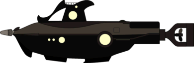 The
Nautilus from the Rankin Bass Festival of Family Classics animated 20,000 Leagues under the Sea owes a lot to Harper Goff's iconic design but has a
unique cartoony look. The hull has a shape similar to Goff's but
shortened. The barbs are fewer, more scroll-like and heavier (in most views -
the submarine differs slightly in some scenes). The large wheelhouse
has an open bridge on top and backward leaning barb/fin. The deck
extends to the stern and a tail very different from the classic. The large
salon window is well aft and there are three smaller ports forward. The
salon window is hooded by a side fairing that runs the length of the hull,
flaring to horizontal fins aft. The
Nautilus from the Rankin Bass Festival of Family Classics animated 20,000 Leagues under the Sea owes a lot to Harper Goff's iconic design but has a
unique cartoony look. The hull has a shape similar to Goff's but
shortened. The barbs are fewer, more scroll-like and heavier (in most views -
the submarine differs slightly in some scenes). The large wheelhouse
has an open bridge on top and backward leaning barb/fin. The deck
extends to the stern and a tail very different from the classic. The large
salon window is well aft and there are three smaller ports forward. The
salon window is hooded by a side fairing that runs the length of the hull,
flaring to horizontal fins aft.
(Thanks to Vincente Nieto Martin
for pointing out this design.)
|
 The
1973 Pendulum Press edition of 20,000 Leagues Under the Sea, (a black and
The
1973 Pendulum Press edition of 20,000 Leagues Under the Sea, (a black and
 white
Weekly Reader edition, later published as a Now Age Illustrated Series
Paperback, and finally in color but with somewhat muddier graphics and some
illustrations deleted, as Marvel Classic Comics number 4) was illustrated by Romy Gamboa
(pen) and Ernie Patricio
(ink). Details of the design vary among the many illustrations, but it
has a very large barbed ram and a somewhat fish-like shape. The
wheelhouse is distinguished by forward-looking window "eyes", and just
under them, twin nozzles for the water jets described in the novel. There
is a small deck and hatch atop the wheelhouse. The hull has dorsal
and side fins and a vertical tail. There is a double set of salon windows
under the side fins and a dive hatch on the side. A large rudder is
mounted aft of the propeller. You can find copies of the Pendulum edition
at amazon,
among other places. A large image of the original cover is viewable in the
Comic
Book Database.
white
Weekly Reader edition, later published as a Now Age Illustrated Series
Paperback, and finally in color but with somewhat muddier graphics and some
illustrations deleted, as Marvel Classic Comics number 4) was illustrated by Romy Gamboa
(pen) and Ernie Patricio
(ink). Details of the design vary among the many illustrations, but it
has a very large barbed ram and a somewhat fish-like shape. The
wheelhouse is distinguished by forward-looking window "eyes", and just
under them, twin nozzles for the water jets described in the novel. There
is a small deck and hatch atop the wheelhouse. The hull has dorsal
and side fins and a vertical tail. There is a double set of salon windows
under the side fins and a dive hatch on the side. A large rudder is
mounted aft of the propeller. You can find copies of the Pendulum edition
at amazon,
among other places. A large image of the original cover is viewable in the
Comic
Book Database.
 David
Grove's beautiful gouache illustrations for the 1973 Fearon/Janus/Quercus
edition show a broad, rather modern, organic-shaped hull. There is a large
rectangular salon window and a number of small ports aft. The pilothouse,
with short rectangular ports, is integral with a solid, open-topped deck
enclosure. The boat is recessed in the hull aft of enclosure. The
hull flares out to narrow side fins. At the tail these become horizontal
fins with dive planes. There is a tall vertical fin above the
ring-enclosed four-bladed propeller. The lower hull has large cylindrical
structure, perhaps a ballast tank, below the side flare on either side.
David
Grove's beautiful gouache illustrations for the 1973 Fearon/Janus/Quercus
edition show a broad, rather modern, organic-shaped hull. There is a large
rectangular salon window and a number of small ports aft. The pilothouse,
with short rectangular ports, is integral with a solid, open-topped deck
enclosure. The boat is recessed in the hull aft of enclosure. The
hull flares out to narrow side fins. At the tail these become horizontal
fins with dive planes. There is a tall vertical fin above the
ring-enclosed four-bladed propeller. The lower hull has large cylindrical
structure, perhaps a ballast tank, below the side flare on either side.
 Hanna-Barbera
produced an animated film of 20,000 Leagues under the Sea featuring this Nautilus. The design has a
slightly fish-shaped lower hull with a long flat deck. The retractable
narrow ram affixed to the bow appears only the attack scenes. (Interestingly,
the submarine looks like a motorboat when making its attack passes.) The large
superstructure has a rectangular forward-facing window beneath a searchlight,
and an open bridge on top. There's a row of smaller round ports along
the sides although some views show two large ports instead. The lower
hull has large rectangular observation windows forward with three good-sized
round ports amidships. The lower deck has a dive hatch on the
side. There's a small propeller on the lower hull but no dive planes are
evident. You can view the German version of the animated film on YouTube. Hanna-Barbera
produced an animated film of 20,000 Leagues under the Sea featuring this Nautilus. The design has a
slightly fish-shaped lower hull with a long flat deck. The retractable
narrow ram affixed to the bow appears only the attack scenes. (Interestingly,
the submarine looks like a motorboat when making its attack passes.) The large
superstructure has a rectangular forward-facing window beneath a searchlight,
and an open bridge on top. There's a row of smaller round ports along
the sides although some views show two large ports instead. The lower
hull has large rectangular observation windows forward with three good-sized
round ports amidships. The lower deck has a dive hatch on the
side. There's a small propeller on the lower hull but no dive planes are
evident. You can view the German version of the animated film on YouTube.
(Thanks to Vincente Nieto Martin
for pointing out this design.)
|
 Dan
Thompson scratch-built a Nautilus model in the 1970s. He
based it on photos of Harper Goff's Disney creation, but adhered to the
dimensions stated in Jules Verne's text. Dan captured most of the Goff
details, remarkable considering the minimal references he had, but stretched the
hull to Verne's full proportional length. You can see photos of his model here.
Dan
Thompson scratch-built a Nautilus model in the 1970s. He
based it on photos of Harper Goff's Disney creation, but adhered to the
dimensions stated in Jules Verne's text. Dan captured most of the Goff
details, remarkable considering the minimal references he had, but stretched the
hull to Verne's full proportional length. You can see photos of his model here.
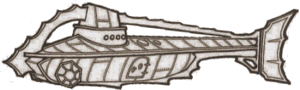 This Nautilus
appeared in the 1974 Troubador Press Science Fiction Anthology coloring book,
illustrated by Mark Savee. Although it is much smaller it reprises
some features of the Goff classic, including a saw-tooth arch. The forward
end of the arch continues into an integral ram on the bow. The aft end
extends over a conning tower-like wheelhouse all the way to a fishlike tail
rudder. The conning tower has a row of small ports on the side, but no
forward-looking navigation windows. The seven-sided salon window on the lower bow is
inspired by Goff. The diving hatch on the lower hull is either very large
or betrays the small size of this submarine. There are no dive
planes or propeller visible. See the coloring book here
This Nautilus
appeared in the 1974 Troubador Press Science Fiction Anthology coloring book,
illustrated by Mark Savee. Although it is much smaller it reprises
some features of the Goff classic, including a saw-tooth arch. The forward
end of the arch continues into an integral ram on the bow. The aft end
extends over a conning tower-like wheelhouse all the way to a fishlike tail
rudder. The conning tower has a row of small ports on the side, but no
forward-looking navigation windows. The seven-sided salon window on the lower bow is
inspired by Goff. The diving hatch on the lower hull is either very large
or betrays the small size of this submarine. There are no dive
planes or propeller visible. See the coloring book here
(Thanks to Wayne Orlicki who
found this Nautilus and posted it at NautilusSubmarine.)
 The
Editorial Bruguera Joyas Literarias Juveniles 20.000
Leguas de Viaje Submarino comic featured this Nautilus by
illustrator Edmond Fernández Ripoll, who signs his
The
Editorial Bruguera Joyas Literarias Juveniles 20.000
Leguas de Viaje Submarino comic featured this Nautilus by
illustrator Edmond Fernández Ripoll, who signs his  work simply Edmond.
The most striking impression of the design is the Mohawk row of rakers that
graces the semi-ellipsoidal superstructure. Another unique feature is the Monitor-like
extended deck that has a more graceful shape than is implied by my elevation
graphic. There are hatches on either side of the superstructure
just forward of the large wheelhouse windows. The similar cylindrical
feature just aft of the superstructure houses a crane used to hoist marine catch
into a hold. The lower hull has a row of large rectangular windows and
smaller ports. The stern has an unusual helical propeller and a large
rudder.
work simply Edmond.
The most striking impression of the design is the Mohawk row of rakers that
graces the semi-ellipsoidal superstructure. Another unique feature is the Monitor-like
extended deck that has a more graceful shape than is implied by my elevation
graphic. There are hatches on either side of the superstructure
just forward of the large wheelhouse windows. The similar cylindrical
feature just aft of the superstructure houses a crane used to hoist marine catch
into a hold. The lower hull has a row of large rectangular windows and
smaller ports. The stern has an unusual helical propeller and a large
rudder.
 I
haven't been able to determine the provenance for this
Nautilus which appeared in a Spanish comic book of Veinte
Mil Leguas De Viaje Submarino. The design, like Ripoll's,
has a substantial volume above the hull, but also expands its capacity with a
bulbous hull. The superstructure has large globular eye-like ports on
either side and there are large observation windows on the lower hull.
There are several Goffian touches: the saw-tooth rakers running up the
superstructure, two "alligator eye" searchlights atop it, a dorsal
fin, and the notch in the keel. There may be a Goff-like salon window on
the side of the aft hull. The design has a thick fairing, possibly with
rakers, on the sides of the hull and tall vertical tail fins above and below a
small propeller.
I
haven't been able to determine the provenance for this
Nautilus which appeared in a Spanish comic book of Veinte
Mil Leguas De Viaje Submarino. The design, like Ripoll's,
has a substantial volume above the hull, but also expands its capacity with a
bulbous hull. The superstructure has large globular eye-like ports on
either side and there are large observation windows on the lower hull.
There are several Goffian touches: the saw-tooth rakers running up the
superstructure, two "alligator eye" searchlights atop it, a dorsal
fin, and the notch in the keel. There may be a Goff-like salon window on
the side of the aft hull. The design has a thick fairing, possibly with
rakers, on the sides of the hull and tall vertical tail fins above and below a
small propeller.
(Thanks to Lyle Simoneaux for pointing out this design.)
 This
Nautilus appeared in the Air Programs International animated
classic Mysterious Island broadcast in 1975. First seen in the
cavern under Lincoln Island, only the upper half is visible, although the
reflection in the water gives the impression of a full view. Close-up
views when the castaways come alongside conflict in detail; my graphic is a
combination of the two views. The design has a spindle-shaped hull with a
serrated fin on the bow. There are ports or lights on the hull and large
slanted fins on the aft hull. The wheelhouse is located at the forward end
of the long superstructure. The deck atop the superstructure includes what
could be a skylight and a conning tower with periscope. The castaways gain
access via a long ladder on the side of the hull leading to a hatch in the side
of the superstructure. The Nautilus appears in part 3.
This
Nautilus appeared in the Air Programs International animated
classic Mysterious Island broadcast in 1975. First seen in the
cavern under Lincoln Island, only the upper half is visible, although the
reflection in the water gives the impression of a full view. Close-up
views when the castaways come alongside conflict in detail; my graphic is a
combination of the two views. The design has a spindle-shaped hull with a
serrated fin on the bow. There are ports or lights on the hull and large
slanted fins on the aft hull. The wheelhouse is located at the forward end
of the long superstructure. The deck atop the superstructure includes what
could be a skylight and a conning tower with periscope. The castaways gain
access via a long ladder on the side of the hull leading to a hatch in the side
of the superstructure. The Nautilus appears in part 3.
(Thanks to Vincente Nieto Martin
for pointing out this design.)
 Spanish
artist José de Huescar created this Nautilus
for
Spanish
artist José de Huescar created this Nautilus
for  Pif Gadget (number
366) published by Éditions Vaillant. The
hull is organically spindle-shaped, with Verne's "overlapping" hull
plates. It has a ram with serrated edges, probably with a triangular
cross-section. A hemispherical wheelhouse with four circular ports, one on
each side and one each fore and aft, is positioned atop the forward hull.
There is a large oval salon window just forward of a large horizontal fin that
extends to the stern. The elaborate, flared vertical tail matches the
fins. With the scaled hull and the flared fins the design could be an
exotic fish, but seeing the ram as its beak, the scales slick feathers, and the
fins swept-back wing and tail feathers, to me the submarine in the original
artwork resembles a diving sea bird. See the original illustration
on Captain Jack's Mobilis in Mobile web
page.
Pif Gadget (number
366) published by Éditions Vaillant. The
hull is organically spindle-shaped, with Verne's "overlapping" hull
plates. It has a ram with serrated edges, probably with a triangular
cross-section. A hemispherical wheelhouse with four circular ports, one on
each side and one each fore and aft, is positioned atop the forward hull.
There is a large oval salon window just forward of a large horizontal fin that
extends to the stern. The elaborate, flared vertical tail matches the
fins. With the scaled hull and the flared fins the design could be an
exotic fish, but seeing the ram as its beak, the scales slick feathers, and the
fins swept-back wing and tail feathers, to me the submarine in the original
artwork resembles a diving sea bird. See the original illustration
on Captain Jack's Mobilis in Mobile web
page.
(Thanks to Lyle Simoneaux for pointing out this design.)
 The
cover of an audio book recording of 20,000 Leagues under the Sea read by
James Mason
The
cover of an audio book recording of 20,000 Leagues under the Sea read by
James Mason  and
published by Caedmon in 1977 featured this very un-Disney Nautilus.
Still, this fishlike design features a Goff-inspired raker arch. There is
a double-cone spar at the tip of the spindle hull. The short deck is
dominated by a conical conning tower topped with a tall lantern tower.
There is a large circular salon window forward on the hull, forming the fish's
eye and at least nine fins to complement the appearance. The design
includes a small hatch on the deck and what is probably a large diving hatch on
the hull bottom. The propeller is large and many bladed. A
high-resolution image of both sides of the album cover posted at Nautilus
Submarine .com reveals his signature and gives Star Trek artist Rick
Sternbach credit.
and
published by Caedmon in 1977 featured this very un-Disney Nautilus.
Still, this fishlike design features a Goff-inspired raker arch. There is
a double-cone spar at the tip of the spindle hull. The short deck is
dominated by a conical conning tower topped with a tall lantern tower.
There is a large circular salon window forward on the hull, forming the fish's
eye and at least nine fins to complement the appearance. The design
includes a small hatch on the deck and what is probably a large diving hatch on
the hull bottom. The propeller is large and many bladed. A
high-resolution image of both sides of the album cover posted at Nautilus
Submarine .com reveals his signature and gives Star Trek artist Rick
Sternbach credit.
 Artist
Jean Bruneau designed this Nautilus as a paper cut-out model to
commemorate the opening of the Jules Verne Museum in Nantes on the 150th
Artist
Jean Bruneau designed this Nautilus as a paper cut-out model to
commemorate the opening of the Jules Verne Museum in Nantes on the 150th  anniversary
of Verne's birth. The slim design has a rectangular cross-section
(consistent with the simple paper model design) that
tapers to a pointed raised ram at the bow. The hull continues straight
back and then rises to the diamond shaped wheelhouse at the forward end of the
deck. The deck extends past a rather tall hatch and ends at a sloped lantern
housing that faces aft. There's no boat. The hull tapers to a narrow
stern with an oval vertical fin and a small propeller. The circular salon
window is positioned high on the hull forward of a row of smaller ports, running
aft. The wide dive planes are set below the hull centerline.
Bruneau featured a very similar Nautilus (with a round cross-section) as
the ace of spades in his 1978 commemorative deck of Jules Verne playing
cards. Fred has provided cleaned-up hi-resolution images of the
cut-out sheet and enhanced renders of the completed model at NautilusSubmarine
(free membership necessary).
anniversary
of Verne's birth. The slim design has a rectangular cross-section
(consistent with the simple paper model design) that
tapers to a pointed raised ram at the bow. The hull continues straight
back and then rises to the diamond shaped wheelhouse at the forward end of the
deck. The deck extends past a rather tall hatch and ends at a sloped lantern
housing that faces aft. There's no boat. The hull tapers to a narrow
stern with an oval vertical fin and a small propeller. The circular salon
window is positioned high on the hull forward of a row of smaller ports, running
aft. The wide dive planes are set below the hull centerline.
Bruneau featured a very similar Nautilus (with a round cross-section) as
the ace of spades in his 1978 commemorative deck of Jules Verne playing
cards. Fred has provided cleaned-up hi-resolution images of the
cut-out sheet and enhanced renders of the completed model at NautilusSubmarine
(free membership necessary).
(Thanks to Nemo Jr, Lewis Crow, for
discovering this design.)
 The
Return of Captain Nemo, a 1978 television series, featured this Nautilus.
The
Return of Captain Nemo, a 1978 television series, featured this Nautilus.
 The
design has a set of large windows in the bow, with a row of smaller windows set
high on the hull along the sides. A pair of large diving plane fins are
located forward of amidships with smaller fins much further aft. The
design has two small propellers mounted on the aircraft-boom-like stern,
which features something like a horizontal stabilizer. No rudder in
apparent in the production model photos I've seen, but one may have been fitted
to the aft end of the keel. The lower hull includes large bay doors below
in the single-window section amidships. This Nautilus has a large
wheelhouse/conning tower dominating the deck with large bridge windows forward
and a cannon on top. The sloped after section of this structure is the
only part that comes close to resembling Harper Goff's Nautilus.
You can see photos of the filming miniature here.
(The updated, more accurate graphic above is courtesy of Lyle Simoneaux.)
The
design has a set of large windows in the bow, with a row of smaller windows set
high on the hull along the sides. A pair of large diving plane fins are
located forward of amidships with smaller fins much further aft. The
design has two small propellers mounted on the aircraft-boom-like stern,
which features something like a horizontal stabilizer. No rudder in
apparent in the production model photos I've seen, but one may have been fitted
to the aft end of the keel. The lower hull includes large bay doors below
in the single-window section amidships. This Nautilus has a large
wheelhouse/conning tower dominating the deck with large bridge windows forward
and a cannon on top. The sloped after section of this structure is the
only part that comes close to resembling Harper Goff's Nautilus.
You can see photos of the filming miniature here.
(The updated, more accurate graphic above is courtesy of Lyle Simoneaux.)
The three parts of the TV series were released as a movie, The Amazing Captain Nemo,
available at amazon.
 Scale
Model Ships Unlimited produced this Goff-derivative Nautilus as a
fiberglass kit with a detailed plan. The most noticeable deviation from
the original is the heavy, oddly barbed ram, as if Goff's spar were dipped in
molten metal and stretched and hammered as it cooled. Goff's elegant
rakers are more crudely realized, in some places merely as steps in the
hull. The basic shape of the wheelhouse is retained but the two large
globular ports are replaced by four smaller, flat ports. The dorsal fin
has no rakers and sweeps up instead of down giving this Nautilus, along
with the ram, a very different profile. There is no propeller guard and,
less noticeable in the standard view, the aft side rakers flare out to wide
horizontal fins. The last major difference is in the salon widows.
The signature Goff assembly is replaced by a geometric pyramid with smaller
ports on each flat face. Lights or four more ports are set in the hull
side around the pyramid. (The design image is from a photo of Ed Sutton's
nicely finished version of the model.)
Scale
Model Ships Unlimited produced this Goff-derivative Nautilus as a
fiberglass kit with a detailed plan. The most noticeable deviation from
the original is the heavy, oddly barbed ram, as if Goff's spar were dipped in
molten metal and stretched and hammered as it cooled. Goff's elegant
rakers are more crudely realized, in some places merely as steps in the
hull. The basic shape of the wheelhouse is retained but the two large
globular ports are replaced by four smaller, flat ports. The dorsal fin
has no rakers and sweeps up instead of down giving this Nautilus, along
with the ram, a very different profile. There is no propeller guard and,
less noticeable in the standard view, the aft side rakers flare out to wide
horizontal fins. The last major difference is in the salon widows.
The signature Goff assembly is replaced by a geometric pyramid with smaller
ports on each flat face. Lights or four more ports are set in the hull
side around the pyramid. (The design image is from a photo of Ed Sutton's
nicely finished version of the model.)
~ c. 1980 ~
 Octopus
Books Limited published their Treasury of Children's Classics
Octopus
Books Limited published their Treasury of Children's Classics  edition
of 20,000 Leagues under the Sea in 1980. The Nautilus,
pictured on the cover, at first glance looks like a World War I or II fleet
submarine. Closer examination reveals features popularly associated with
Nemo's Nautilus. The net cutter rig atop the bow sports three
Goffian raker teeth with a mirrored hook on the lower bow. A serrated fin
on the keel and reverse rakers on an arch aft of the conning tower continue the
theme. The narrow tower wheelhouse has large Goff-like globular ports on
either side and a large forward, facing port on the low slanted forward part of
the structure. Smaller hooded, globular glass features on the narrow top
of the tower may correspond to Goff's alligator-eye lights or may be
ports. The stern is obscured by a giant octopus, but there may be a fin
atop it. There are no salon windows visible but a feature on the side of
hull amidships might be a very small dive plane.
edition
of 20,000 Leagues under the Sea in 1980. The Nautilus,
pictured on the cover, at first glance looks like a World War I or II fleet
submarine. Closer examination reveals features popularly associated with
Nemo's Nautilus. The net cutter rig atop the bow sports three
Goffian raker teeth with a mirrored hook on the lower bow. A serrated fin
on the keel and reverse rakers on an arch aft of the conning tower continue the
theme. The narrow tower wheelhouse has large Goff-like globular ports on
either side and a large forward, facing port on the low slanted forward part of
the structure. Smaller hooded, globular glass features on the narrow top
of the tower may correspond to Goff's alligator-eye lights or may be
ports. The stern is obscured by a giant octopus, but there may be a fin
atop it. There are no salon windows visible but a feature on the side of
hull amidships might be a very small dive plane.
 Science
fiction illustrator Vincent Di Fate created this 1980 Nautilus
design for Di
Fate's Catalog of Science Fiction Hardware. See this and other
artwork on his web
site. (I had some problems linking to the
specific artwork. Find it in the Science Fiction gallery, page 4.
It's the second Nautilus on that page.) Monsters
in Motion sells a replica 20,000 Leagues under the Sea Nautilus
Science
fiction illustrator Vincent Di Fate created this 1980 Nautilus
design for Di
Fate's Catalog of Science Fiction Hardware. See this and other
artwork on his web
site. (I had some problems linking to the
specific artwork. Find it in the Science Fiction gallery, page 4.
It's the second Nautilus on that page.) Monsters
in Motion sells a replica 20,000 Leagues under the Sea Nautilus  Aurora
plastic model kit box (box only) featuring Di Fate's art on the cover. Although
there was never such a kit, the empty box represents the kit model builders would
like to have seen. The sub's hull is more or less spindle shaped with a
faceted cross section not unlike Goff's. The massive wheelhouse, with
oddly back-facing ports making it resemble a nautilus-like sea creature,
dominates the deck. Rather than a single window, a row of smaller ports
provide outside views.
Aurora
plastic model kit box (box only) featuring Di Fate's art on the cover. Although
there was never such a kit, the empty box represents the kit model builders would
like to have seen. The sub's hull is more or less spindle shaped with a
faceted cross section not unlike Goff's. The massive wheelhouse, with
oddly back-facing ports making it resemble a nautilus-like sea creature,
dominates the deck. Rather than a single window, a row of smaller ports
provide outside views.
In 2007 Pierre-Yves Garcin commissioned Bernard Brimeur
to build the Nautilus shown on the box for his Mobilis
in Mobile on-line museum. The illustration at right pictures
Brimeur's realization next to the commemorative box. See large photos of
the box (box-art section) and the model (science fiction anthologies section) on
the museum
web site. The museum is viewable both in French and in English. (P-Y's site has been in
"maintenance" for some time. The link is to an unfortunately
slow-loading Internet Archive page.)
 This
Nautilus, drawn by Victor de la Fuente,
appeared on the cover of the Nathan "Les œuvres célèbres en bandes
dessinées" edition of 20 000 lieues sous les mers. The design,
which appears somewhat smaller than the dimensions of Verne's text, has a long
slim spar that merges into vertical saw-tooth fins on the upper and lower
bow. As there are no other ports, the large ones on either side of the
upper fin may serve for both navigation and observation. There are large
dive planes amidships and hints of a hatch and possibly a boat on the deck
forward of a large sloping dorsal fin. The aft hull tapers to a triangular
tail that encloses the propeller. The cover design differs some from that
featured in the comic (see just below), drawn by Victor's brother, Ramon
de la Fuente.
This
Nautilus, drawn by Victor de la Fuente,
appeared on the cover of the Nathan "Les œuvres célèbres en bandes
dessinées" edition of 20 000 lieues sous les mers. The design,
which appears somewhat smaller than the dimensions of Verne's text, has a long
slim spar that merges into vertical saw-tooth fins on the upper and lower
bow. As there are no other ports, the large ones on either side of the
upper fin may serve for both navigation and observation. There are large
dive planes amidships and hints of a hatch and possibly a boat on the deck
forward of a large sloping dorsal fin. The aft hull tapers to a triangular
tail that encloses the propeller. The cover design differs some from that
featured in the comic (see just below), drawn by Victor's brother, Ramon
de la Fuente.
(Thanks to Pierre Barraud who pointed this
out to me.)
 The
Nautilus seen in the pages of the Nathan "Les œuvres célèbres en bandes
dessinées" edition of 20 000 lieues sous les mers, illustrated
by Ramon de la Fuente, differs from
that on the cover (see just above) in many ways. The design has a long but
sturdy ram and a vicious set of forward-pointing saw-tooth rakers that project
from the rounded wheelhouse. The hull is cigar-shaped, narrowing toward
the stern, and has a long tapered cylinder above a heavy fairing the runs the
length of the hull. This structure has what appears to be a light at its
forward end. There are large diving planes amidships below the side
fairing. The hull spreads to a graceful vertical fishtail that
incorporates the propeller. The saw-tooth keel includes a gap for a diving
hatch. There are some differences in details among the many illustrations,
but most show an unusual structure atop the wheelhouse, grill-like panels atop
the hull amidships, and a rounded fairing on the aft hull fore and aft of the
deck hatch. One illustration shows a port on the lower forward hull.
The
Nautilus seen in the pages of the Nathan "Les œuvres célèbres en bandes
dessinées" edition of 20 000 lieues sous les mers, illustrated
by Ramon de la Fuente, differs from
that on the cover (see just above) in many ways. The design has a long but
sturdy ram and a vicious set of forward-pointing saw-tooth rakers that project
from the rounded wheelhouse. The hull is cigar-shaped, narrowing toward
the stern, and has a long tapered cylinder above a heavy fairing the runs the
length of the hull. This structure has what appears to be a light at its
forward end. There are large diving planes amidships below the side
fairing. The hull spreads to a graceful vertical fishtail that
incorporates the propeller. The saw-tooth keel includes a gap for a diving
hatch. There are some differences in details among the many illustrations,
but most show an unusual structure atop the wheelhouse, grill-like panels atop
the hull amidships, and a rounded fairing on the aft hull fore and aft of the
deck hatch. One illustration shows a port on the lower forward hull.
(Thanks to Pierre Barraud who pointed this
out to me.)
 In
1980 young Silvio Premuda built a 1/100 scale model of the Nautilus,
following Verne's text and studying the illustrations in the original edition of
20,000 Leagues. The influence of the illustrations is especially evident
in the dingey sitting upright on the deck, as shown in Alphonse de Neuville's
drawing with the caption "Voyez-vous lá quelque chose?", and
in the vertical bars in the salon window, matching several illustrations including
de Neuville's, captioned Une fenêtre ouverte sur ces abîmes inexplorés.
The hull is cigar-shaped with an integral ram at the bow, narrow dive planes
amidships and vertical fins, either or both of which could serve as a rudder, and
a three-bladed prop at the stern. Consistent with some of the
illustrations (they show at least two configurations), a small four-sided wheelhouse is located at the forward end of
the deck and a similarly sized single-light lantern at the aft end. See
photos of Silvio's Nautilus at NautilusSubmarine.
In
1980 young Silvio Premuda built a 1/100 scale model of the Nautilus,
following Verne's text and studying the illustrations in the original edition of
20,000 Leagues. The influence of the illustrations is especially evident
in the dingey sitting upright on the deck, as shown in Alphonse de Neuville's
drawing with the caption "Voyez-vous lá quelque chose?", and
in the vertical bars in the salon window, matching several illustrations including
de Neuville's, captioned Une fenêtre ouverte sur ces abîmes inexplorés.
The hull is cigar-shaped with an integral ram at the bow, narrow dive planes
amidships and vertical fins, either or both of which could serve as a rudder, and
a three-bladed prop at the stern. Consistent with some of the
illustrations (they show at least two configurations), a small four-sided wheelhouse is located at the forward end of
the deck and a similarly sized single-light lantern at the aft end. See
photos of Silvio's Nautilus at NautilusSubmarine.
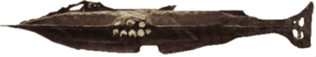 Clearly
following Harper Goff illustrator Steve Butz made some obvious and some
subtle changes to the classic design for the Raintree Publishers and later Steck-Vaughn
Company library-binding adaptation of 20,000 Leagues under the Sea (IBSN
0-8172-1652-9). Most notable is the large salon
window with eight circular sections and apparently two levels. Less
obvious in my simple graphic, the wheelhouse has additional ports on its side
and there are two rows of small ports on the upper and lower hull sides.
The ram has a spiral design, the side and bottom fairings have no rakers,
and Goff's skiff appears to be a narrow fin. The tail is more Goff-like than my
graphic, based on the cover illustration, shows. The cover illustration is the
only one that shows the arch. One of the illustrations within the book
implies a sleeker wheelhouse without an arch and no dorsal fin.
Clearly
following Harper Goff illustrator Steve Butz made some obvious and some
subtle changes to the classic design for the Raintree Publishers and later Steck-Vaughn
Company library-binding adaptation of 20,000 Leagues under the Sea (IBSN
0-8172-1652-9). Most notable is the large salon
window with eight circular sections and apparently two levels. Less
obvious in my simple graphic, the wheelhouse has additional ports on its side
and there are two rows of small ports on the upper and lower hull sides.
The ram has a spiral design, the side and bottom fairings have no rakers,
and Goff's skiff appears to be a narrow fin. The tail is more Goff-like than my
graphic, based on the cover illustration, shows. The cover illustration is the
only one that shows the arch. One of the illustrations within the book
implies a sleeker wheelhouse without an arch and no dorsal fin.

B ob
Farrell found a small picture of this Nautilus version on the City of
Nantes web site. My various attempts to learn more about this image were
unsuccessful, but I found the source serendipitously in a French journal article
I received from Jean-Michel Margot.
Jean Gagneux constructed the detailed model, which has a complete
interior based on the Hetzel edition engravings, and used it to illustrate the
article. In the article Gagneux discusses the features of the Nautilus
and offers a critical engineering evaluation. He criticizes some of the same
features mentioned here, including the diving planes amidships and the location
of ram. He concludes Verne did produce a workable submarine design, but
alas, it could not have achieved the performance described in the novel. The
model itself is simple and true to Verne’s description. The relatively
unadorned, cigar-shaped hull has a small keel projection amidships and some
reinforcement of the bow for a ram. There is a flat,  elevated deck platform. The pilothouse faces forward and, like the lantern, has
four somewhat convex windows. Jean Gagneux heard about this web site and
contacted me. Thanks to his generosity you can see much more of his Nautilus
model here. My illustration and MetaStream
model adhere to Gagneux's plan, which differs slightly from his model. I’ve
placed Gagneux’s Nautilus plan on "The Author’s Desk" at
the top of my 20,000 Leagues page.
elevated deck platform. The pilothouse faces forward and, like the lantern, has
four somewhat convex windows. Jean Gagneux heard about this web site and
contacted me. Thanks to his generosity you can see much more of his Nautilus
model here. My illustration and MetaStream
model adhere to Gagneux's plan, which differs slightly from his model. I’ve
placed Gagneux’s Nautilus plan on "The Author’s Desk" at
the top of my 20,000 Leagues page.
|
 This
Nautilus was featured on the cover of the Radio Shack 'reading-is-fun'
20,000 Leagues under the Sea. The sides of the narrow,
spindle-shaped hull are nearly featureless. There is a hint of an upswept
horizontal fin or dive plane at the stern and possibly a narrow fairing running
the length of the hull. The tail has triangular vertical fins and an
interesting double propeller. There is an oddly shaped structure atop the bow
that may be associated with a ramming attack, perhaps paying homage to Goff's
iconic raker arch, or possibly a wheelhouse. A conning tower-like
structure is set far back on the deck. The mast just aft of this feature
could be a lantern.
This
Nautilus was featured on the cover of the Radio Shack 'reading-is-fun'
20,000 Leagues under the Sea. The sides of the narrow,
spindle-shaped hull are nearly featureless. There is a hint of an upswept
horizontal fin or dive plane at the stern and possibly a narrow fairing running
the length of the hull. The tail has triangular vertical fins and an
interesting double propeller. There is an oddly shaped structure atop the bow
that may be associated with a ramming attack, perhaps paying homage to Goff's
iconic raker arch, or possibly a wheelhouse. A conning tower-like
structure is set far back on the deck. The mast just aft of this feature
could be a lantern.
 In
2011 Stuart Wier posted his 1982 treatise on the design of the Nautilus
including a detailed plan, interpreted in my graphic at left. The design, consistent
with Wier's paper is very true to Jules Verne's text. A relatively small
cast iron ram is affixed to the bow of the spindle hull. There is an oval
salon window positioned to match Nemo's presentation of the dimensions to
Aronnax, relatively small dive planes amidships, and a large four-bladed
prop. Wier shows two possible rudder configurations in his plan and a more
elaborate one in the model, but I've shown the basic one from plan. The
deck includes a retractable wheelhouse at the forward end, a boat under a
protective cover, a large hatch resembling the original illustrations from the
novel, and a tall, narrow retractable lantern. See the plan, images of a
similar scale model, and read the interesting 45-page paper here.
In
2011 Stuart Wier posted his 1982 treatise on the design of the Nautilus
including a detailed plan, interpreted in my graphic at left. The design, consistent
with Wier's paper is very true to Jules Verne's text. A relatively small
cast iron ram is affixed to the bow of the spindle hull. There is an oval
salon window positioned to match Nemo's presentation of the dimensions to
Aronnax, relatively small dive planes amidships, and a large four-bladed
prop. Wier shows two possible rudder configurations in his plan and a more
elaborate one in the model, but I've shown the basic one from plan. The
deck includes a retractable wheelhouse at the forward end, a boat under a
protective cover, a large hatch resembling the original illustrations from the
novel, and a tall, narrow retractable lantern. See the plan, images of a
similar scale model, and read the interesting 45-page paper here.
 This
abstractly fishlike Nautilus was featured on a stamp issued in the
This
abstractly fishlike Nautilus was featured on a stamp issued in the  Central
African Republic in 1985 to commemorate International Youth Year.
A set of large rakers comprise most of the bow, which is also fitted with
two large eye-like ports. From there the hull slopes gently back, to a
large triangular dorsal fin. The hull ends with a similarly angular
tail. There's no indication of a deck, launch, dive planes, or
horizontal fins of any kind. No salon window is visible although it
could be located on the lower hull. Actually this Nautilus
resembles nothing so much as a stealth aircraft. See an image of the
stamp on Zvi Har’El’s Jules
Verne Collection web site.
Central
African Republic in 1985 to commemorate International Youth Year.
A set of large rakers comprise most of the bow, which is also fitted with
two large eye-like ports. From there the hull slopes gently back, to a
large triangular dorsal fin. The hull ends with a similarly angular
tail. There's no indication of a deck, launch, dive planes, or
horizontal fins of any kind. No salon window is visible although it
could be located on the lower hull. Actually this Nautilus
resembles nothing so much as a stealth aircraft. See an image of the
stamp on Zvi Har’El’s Jules
Verne Collection web site.
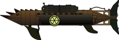 The
1985 Burbank Films Australia made-for-TV animated production of 20,000 Leagues
under the Sea featured a unique Nautilus designed by Michael Lodge.
Angular barbs on the top and sides of the bow and what could be torpedo tubes give it the appearance of a mohawked
fish. (One of the barbs atop the forward hull is replaced by a canon near
the end of the film.) A large articulated dive plane assembly, aft fins, and a similarly
articulated rudder tail contribute to the mechanical fish design motif. Propulsion
is provided by dual propellers near the aft end of the hull.
The large superstructure has a periscope and viewports at the forward end.
A hatch at the aft end opens onto a narrow deck, which has another hatch.
The center section of the superstructure is drawn open by chains to
reveal a dock for the boat. The diving hatch is located on the lower hull
just forward of the aft fins. You can view the animated film in two parts
on YouTube here
and here.
The
1985 Burbank Films Australia made-for-TV animated production of 20,000 Leagues
under the Sea featured a unique Nautilus designed by Michael Lodge.
Angular barbs on the top and sides of the bow and what could be torpedo tubes give it the appearance of a mohawked
fish. (One of the barbs atop the forward hull is replaced by a canon near
the end of the film.) A large articulated dive plane assembly, aft fins, and a similarly
articulated rudder tail contribute to the mechanical fish design motif. Propulsion
is provided by dual propellers near the aft end of the hull.
The large superstructure has a periscope and viewports at the forward end.
A hatch at the aft end opens onto a narrow deck, which has another hatch.
The center section of the superstructure is drawn open by chains to
reveal a dock for the boat. The diving hatch is located on the lower hull
just forward of the aft fins. You can view the animated film in two parts
on YouTube here
and here.
(Thanks to Vincente Nieto Martin
for pointing out this design.)
 Film
producer Dino DiLaurentiis wanted to remake 20,000 Leagues under the Sea
and went to far as to get a script, faithful to the novel, from George
MacDonald Fraser. The movie was never made, but Film
producer Dino DiLaurentiis wanted to remake 20,000 Leagues under the Sea
and went to far as to get a script, faithful to the novel, from George
MacDonald Fraser. The movie was never made, but  Ron Miller
shared some of his production drawings for the Nautilus. The
submarine, conceived rather like an underwater airship, was rather less
faithful, but interesting. The deck had an integral wheelhouse at the
forward end with a hatch just aft. The boat was set just below the center
of the deck but athwartships so that it could be easily launched to the
side. Rather than a single lantern on the deck, lights were set on the
upper and lower hull. All the control surfaces were large. Dive
planes were attached to the after ends of horizontal fins extending from the
spur with a second set mounted on the tail. The ram looked something
like a mace attached to the prow. There were four-bladed props below the
centerline protected by rings on either side keel. Most interesting, the
salon was attached to forward lower hull like an airship air car, with large
windows on either side of the organ. Perhaps the oddest concept was an
enclosed fireplace at the aft end of salon with a brass N on its glass
door. Ron Miller
shared some of his production drawings for the Nautilus. The
submarine, conceived rather like an underwater airship, was rather less
faithful, but interesting. The deck had an integral wheelhouse at the
forward end with a hatch just aft. The boat was set just below the center
of the deck but athwartships so that it could be easily launched to the
side. Rather than a single lantern on the deck, lights were set on the
upper and lower hull. All the control surfaces were large. Dive
planes were attached to the after ends of horizontal fins extending from the
spur with a second set mounted on the tail. The ram looked something
like a mace attached to the prow. There were four-bladed props below the
centerline protected by rings on either side keel. Most interesting, the
salon was attached to forward lower hull like an airship air car, with large
windows on either side of the organ. Perhaps the oddest concept was an
enclosed fireplace at the aft end of salon with a brass N on its glass
door.
|

A bout
the same time Gagneux was building his model, Jean-Pierre Bouvet was
drawing a very detailed set of plans for this Nautilus.
Although it isn't as streamlined as the other designs featured here, it is far
and away the most complete design of any I've seen. It is completely true
to Verne’s description but expands on elements the text only touches, or like
a device for measuring speed, mentioned only indirectly in describing something
else. The simple, cylindrical hull includes exterior sliding panels to
cover the salon windows and a pilot house and lantern that are hydraulically  elevated or withdrawn. Jean-Pierre has generously permitted me to feature
much of detail of his Nautilus
plans here. The illustration and MetaStream
model here omit some detail but depict the major features. You can
also view J-P's many Jules Verne drawings on this Internet Archive capture of
his French-language web
site.
elevated or withdrawn. Jean-Pierre has generously permitted me to feature
much of detail of his Nautilus
plans here. The illustration and MetaStream
model here omit some detail but depict the major features. You can
also view J-P's many Jules Verne drawings on this Internet Archive capture of
his French-language web
site.
|
 This
interesting variation on the iconic Harper Goff design was built as
paper-over-balsawood 1:48 scale model by Niels Wilhelm. In addition
to the look of the hull that results from the construction technique, and subtle
differences in shape, Wilhelm has made some interesting changes. The side
fairing ends just aft of the salon windows, which features six frame struts
instead of Goff's three. In place of the aft fairing there are side fins
on the stern and an additional lateral prop guard strut. There are two four-petal-bladed
propellers inline instead of the single five-shovel-blade prop on the
classic. See photos of this Nautilus at
Nautilus
Submarine.com (free membership required to view).
This
interesting variation on the iconic Harper Goff design was built as
paper-over-balsawood 1:48 scale model by Niels Wilhelm. In addition
to the look of the hull that results from the construction technique, and subtle
differences in shape, Wilhelm has made some interesting changes. The side
fairing ends just aft of the salon windows, which features six frame struts
instead of Goff's three. In place of the aft fairing there are side fins
on the stern and an additional lateral prop guard strut. There are two four-petal-bladed
propellers inline instead of the single five-shovel-blade prop on the
classic. See photos of this Nautilus at
Nautilus
Submarine.com (free membership required to view).
 This
Victorian submarine, "in the manner of Harper Goff's Nautilus"
was featured at the Six Flags Power Plant Entry Hall in Baltimore. Terri
Cardinali built the model based on a drawing by Ed Sotto. (The
image here is based on a sketch by Mike Marquez.) More steampunk than
Captain Nemo, the submarine is smaller than Verne's Nautilus and has a large
glass-enclosed gallery in the bow and a mostly glass wheelhouse. There is
a small ram but all the glass would preclude its use as such. The
submarine has a fish-like form with a large scalloped rudder and a set of three
articulated fins on each side. There's a small conical helical propeller
below the stern. A flat deck extends from the wheelhouse with a large
hatch amidships and a crane aft. The crane gives access to a large hold with
opening doors atop the stern. Read Ed Sotto's reminiscence and see photos
and his original drawing here.
(Thanks to Gen, who discovered this design and posted it at Nautilus
Submarine, beginning an extensive discussion about it.)
This
Victorian submarine, "in the manner of Harper Goff's Nautilus"
was featured at the Six Flags Power Plant Entry Hall in Baltimore. Terri
Cardinali built the model based on a drawing by Ed Sotto. (The
image here is based on a sketch by Mike Marquez.) More steampunk than
Captain Nemo, the submarine is smaller than Verne's Nautilus and has a large
glass-enclosed gallery in the bow and a mostly glass wheelhouse. There is
a small ram but all the glass would preclude its use as such. The
submarine has a fish-like form with a large scalloped rudder and a set of three
articulated fins on each side. There's a small conical helical propeller
below the stern. A flat deck extends from the wheelhouse with a large
hatch amidships and a crane aft. The crane gives access to a large hold with
opening doors atop the stern. Read Ed Sotto's reminiscence and see photos
and his original drawing here.
(Thanks to Gen, who discovered this design and posted it at Nautilus
Submarine, beginning an extensive discussion about it.)

Jim Humphries' design for his rubber-band powered Nautilus model was published in the December 1987 Scale Ship Modeler, but he actually designed it in the early 1980s. Jim used the novel's
engravings as his main source and his lantern and platform are especially faithful to de Neuville's renditions of these structures. The wheelhouse has Verne's four windows and an original organic look. The large front windows facing off at an angle are reminiscent of Goff's, a very reasonable reference to that memorable boat. Jim's is a working model with the two sets of planes needed for proper") operation. He started without a vertical fin, but found lateral stability required it and incorporated the fish-like tail with another nod to Goff. The model lacks a launch and the salon window is too far aft. The propeller is three bladed, an oversight that Jim intends to fix.
operation. He started without a vertical fin, but found lateral stability required it and incorporated the fish-like tail with another nod to Goff. The model lacks a launch and the salon window is too far aft. The propeller is three bladed, an oversight that Jim intends to fix.
For those with a well-equipped woodshop, Jim sells a very detailed set of instructions and plans for constructing this versatile model. It dives and surfaces and can even be made to breach like a whale, just as the Nautilus does in "The Sargasso Sea" chapter, all on rubber-band power.
Contact Jim directly via e-mail
(jfhjr@flash.net) for information. See
Björn Lundberg's construction from Jim's plans here.
 T
T
o
me,
the deceptively simple Nautilus in the Bayard Jeunesse comic Némo Le Capitaine Vengeur,
illustrated by Jean-Marc Rochette, resembles
nothing so much as an old-fashioned can opener. The hull is a long, slim
cylinder with rounded ends and blade-like protuberances at the bow and stern.
There
is a propeller at the stern and the fin aft incorporates a rudder, but there are
no obvious dive planes. The saw-toothed fin forward is part of an intricate configurable ram. The
fin rotates down to become an upturned blade on the lower bow There is also
a narrow spar that can be extended from the bow when the fin is in the low
position, as illustrated in the
animation.. What shine forward as lights in
some of the comic panels, the "eyes" on either side of the
serrated "beak" fin are the salon windows, which can be protected by
"eye-lid" shutters. There is no wheelhouse, but the author,
Jean-Pierre Hugot, includes a "system of mirrors and magnifying
lenses", a sophisticated camera obscura, that projects a large image into
the control room. The hard-cover comic, which cleverly features an
intriguing cast of anthropomorphic animals in the roles of Nemo and and the
other characters, in
French, is available at Amazon.
See some pages from the comic at Mobilis
in Mobile.
simple Nautilus in the Bayard Jeunesse comic Némo Le Capitaine Vengeur,
illustrated by Jean-Marc Rochette, resembles
nothing so much as an old-fashioned can opener. The hull is a long, slim
cylinder with rounded ends and blade-like protuberances at the bow and stern.
There
is a propeller at the stern and the fin aft incorporates a rudder, but there are
no obvious dive planes. The saw-toothed fin forward is part of an intricate configurable ram. The
fin rotates down to become an upturned blade on the lower bow There is also
a narrow spar that can be extended from the bow when the fin is in the low
position, as illustrated in the
animation.. What shine forward as lights in
some of the comic panels, the "eyes" on either side of the
serrated "beak" fin are the salon windows, which can be protected by
"eye-lid" shutters. There is no wheelhouse, but the author,
Jean-Pierre Hugot, includes a "system of mirrors and magnifying
lenses", a sophisticated camera obscura, that projects a large image into
the control room. The hard-cover comic, which cleverly features an
intriguing cast of anthropomorphic animals in the roles of Nemo and and the
other characters, in
French, is available at Amazon.
See some pages from the comic at Mobilis
in Mobile.
(Thanks to Pierre Barraud who pointed this out.)

O
ne
of the most carefully executed depictions of the Nautilus I've seen is Ron
Miller's design in all his Unicorn editions.
The hull has a fully tapered cigar shape and the salon windows are rectangular, which may well have been Verne's intent. The platform is slightly elevated with the longboat in the center and structures placed as Verne described them.
There are a few embellishments, some I think reminiscent of Goff's Nautilus, but none in conflict with the novel.
In general this Nautilus, with its retractable pilothouse, is truer to Verne than mine.


S
ince the publication of
Ron Miller's several Unicorn volumes he's incorporated some
improvements to his design. This version is a little sleeker, the planes
are longer, the salon window repositioned, and notice the placement of the rudder out of the propeller wake.
ECardmodels.com
offers a very nice 1:100 scale paper model kit of the design.
 Illustrator
Robert Bruce Acheson sent Ron Miller a watercolor
Illustrator
Robert Bruce Acheson sent Ron Miller a watercolor  that depicted this Nautilus
back in 1988. The design has a spindle shaped hull but otherwise strays
from Verne's text. The bow is pointed to serve as a ram. The lower
forward hull is subtly ribbed and the upper hull has large rakers resembling
Goof's, although reversed. The superstructure appears to have a wheelhouse
ringed with round ports forward, a similar structure aft and a large one amidships.
A short ladder hints to a deck atop the central structure that probably runs
fore and aft at two levels over the entire superstructure. Instead of a
single salon window this Nautilus has a gallery of large rectangular
windows. The large tapered feature on the side of the forward hull is
likely associated with dive planes as is the similar, smaller feature on the
stern. The design has a large keel and a rudder just aft of the small
propeller. (Thanks
to Ron Miller for passing this design along to me.)
that depicted this Nautilus
back in 1988. The design has a spindle shaped hull but otherwise strays
from Verne's text. The bow is pointed to serve as a ram. The lower
forward hull is subtly ribbed and the upper hull has large rakers resembling
Goof's, although reversed. The superstructure appears to have a wheelhouse
ringed with round ports forward, a similar structure aft and a large one amidships.
A short ladder hints to a deck atop the central structure that probably runs
fore and aft at two levels over the entire superstructure. Instead of a
single salon window this Nautilus has a gallery of large rectangular
windows. The large tapered feature on the side of the forward hull is
likely associated with dive planes as is the similar, smaller feature on the
stern. The design has a large keel and a rudder just aft of the small
propeller. (Thanks
to Ron Miller for passing this design along to me.)
 The
Deutsches Schiffahrtsmuseum (German Maritime Museum) has offered this
Nautilus paper model kit for many years. Drawn by Rainer
Braunschweig, the design is clearly influenced by Goff. Although
narrower than the Disney version, this Nautilus has a similar
cross-section, however the similarities end with the serrated raker arch
The
Deutsches Schiffahrtsmuseum (German Maritime Museum) has offered this
Nautilus paper model kit for many years. Drawn by Rainer
Braunschweig, the design is clearly influenced by Goff. Although
narrower than the Disney version, this Nautilus has a similar
cross-section, however the similarities end with the serrated raker arch  and
fin. Much of the rest of the design follows the novel. The
pilothouse, which may be retractable, has three oval ports. A flat deck
with at least on hatch, in the Goff position aft of the fin, has a recess for
the boat, which is accessed via a hatch in the recess at the top of an interior
ladder. The bottom of the ladder is at the dive hatch in the keel. There's
no obvious ram, but the forward end of the keel might serve this purpose. The
large oval salon windows are positioned according to the text although fins that
might be the dive planes are well aft. The four-bladed propeller is smaller than
in the novel. You can purchase the cutaway paper model kit, which has a
full interior, from the museum about halfway down this page
or from www.papermodelsheet.com.
and
fin. Much of the rest of the design follows the novel. The
pilothouse, which may be retractable, has three oval ports. A flat deck
with at least on hatch, in the Goff position aft of the fin, has a recess for
the boat, which is accessed via a hatch in the recess at the top of an interior
ladder. The bottom of the ladder is at the dive hatch in the keel. There's
no obvious ram, but the forward end of the keel might serve this purpose. The
large oval salon windows are positioned according to the text although fins that
might be the dive planes are well aft. The four-bladed propeller is smaller than
in the novel. You can purchase the cutaway paper model kit, which has a
full interior, from the museum about halfway down this page
or from www.papermodelsheet.com.
~ c. 1990 ~

T
his
spindle-hulled Nautilus with its distinctive barbed spur was created by illustrator
Joseph
Ciardiello for a Reader's Digest Association edition published around
1990. Except for the
relatively small, two-bladed prop, it appears to follow Verne's text well.
The position of the long boat was not obvious in the drawings so I omitted it
from the model.
 Pat
Regan's Nautilus Minisub is a two-place, pressure hull type submarine
boat,
Pat
Regan's Nautilus Minisub is a two-place, pressure hull type submarine
boat,  handcrafted
in steel by one man working alone in a modest backyard shop circa 1985.
Launched in 1991 and acknowledged by Disney in 1992, Regan's minisub proved the
Goff Nautilus design's feasibility as a free-roving manned submersible.
Specifications: 18' LOA, 1.25 tons, double hull construction, electric motor
propulsion, manual guidance controls, and the world's first "hydrobatic"
ballast system. My image, based on early photos,
reflects the original mini-Nautilus. See photos of Pat's construction
here on his
Vulcania
web site.
handcrafted
in steel by one man working alone in a modest backyard shop circa 1985.
Launched in 1991 and acknowledged by Disney in 1992, Regan's minisub proved the
Goff Nautilus design's feasibility as a free-roving manned submersible.
Specifications: 18' LOA, 1.25 tons, double hull construction, electric motor
propulsion, manual guidance controls, and the world's first "hydrobatic"
ballast system. My image, based on early photos,
reflects the original mini-Nautilus. See photos of Pat's construction
here on his
Vulcania
web site.
As of 2016, the Nautilus Minisub was in Hawaii
being refurbished for a video documentary featuring Regan's functional replicas
of the esoteric vintage 20,000 Leagues diving apparatus. For more
info: http://www.vulcaniasubmarine.com
 P
P
eriodici
San Paolo published a hardcover comic book edition of 20.000
Leghe sotto i mari, richly drawn by Renato Polese
and adapted by Roudolph (Raoul Traverso), as a supplement to the Italian
weekly magazine Il Giornalino.
There are multiple later editions of this same book. The design has a relatively
slender central  hull
with a sharp centerline ram on extending from barbed vertical arch-shaped fins
on the bow, surely inspired by Goff. A wide deck begins just aft of the fins and
runs most of the hull's length. There are two circular hatches on the deck
and a large dome-shaped wheelhouse with its own Mohawk-like barbed arch.
The wheelhouse has a large round port on each side. From the front these
look like the large eyes of a beast. A small boat is inset in the aft end
of the deck, very Goff-like. Wide oval extensions on each side of the hull
have the big shuttered salon windows topped with semicircular searchlights at
their forward ends. A large dive hatch is located in the lower central
hull where the side extension end. The narrow stern ends in large
fish-like vertical and horizontal fins that likely incorporate rudders and dive
planes. The fins enclose a large two-bladed propeller.
hull
with a sharp centerline ram on extending from barbed vertical arch-shaped fins
on the bow, surely inspired by Goff. A wide deck begins just aft of the fins and
runs most of the hull's length. There are two circular hatches on the deck
and a large dome-shaped wheelhouse with its own Mohawk-like barbed arch.
The wheelhouse has a large round port on each side. From the front these
look like the large eyes of a beast. A small boat is inset in the aft end
of the deck, very Goff-like. Wide oval extensions on each side of the hull
have the big shuttered salon windows topped with semicircular searchlights at
their forward ends. A large dive hatch is located in the lower central
hull where the side extension end. The narrow stern ends in large
fish-like vertical and horizontal fins that likely incorporate rudders and dive
planes. The fins enclose a large two-bladed propeller.
(Thanks to Davide
Danesin, BlueDD, who found this design and provided images.)

W
hen Greg Sharpe
saw Jim Humphries rubber-band model he had to have one and Jim's design became
the basis for Deep Sea Designs' first Nautilus, published several
times in the early 1990s. This model can be built from detailed plans available
from Deep Sea Designs. It has a non-elevated deck with a hidden launch.
The wheelhouse, taken almost directly from the Humphries boat and like many of
the other designs shown here, has a diamond shape with two large, canted,
forward-facing windows, somewhat reminiscent of Goff’s design. The ram is a
cylindrical cone rather than Verne’s triangular shape and the fish-like stern
is clearly based on Goff's. There is a diving hatch in the keel near the stern
very like Goff's. The round salon window is positioned too far astern for the
novel’s interior description. In appearance the model resembles Goff’s but,
especially with its prominent fin-like diving planes, looks more fishlike and
less reptilian. Greg has a working version of this design.

A
nother Nautilus
design available from Greg Sharpe's Deep Sea Designs is closer to Verne’s
description than the first. The deck is raised slightly to provide some
additional space for retracting the pilothouse and lantern. Two hatches are
recessed into the deck. The launch is also recessed and stowed upside-down. This
permits entry from the Nautilus through a hatch in the launch’s deck
rather than its hull. Of course it must roll over on its trip to the surface,
causing the occupants some discomfit. There is a davit to handle it on the
surface. The salon window is too far astern, although it is consistent with the
interior arrangement on the plan. This is a working design with two sets of
diving planes, one near the stern and the other in the fin structure at the bow.
 This Nautilus,
from the 20,000 Leagues Under the Sea
"Climb aboard the Nautilus" CD-ROM published by Media School
House, was realized by "Heleenie" as a Sketchup 3D model. The
simple design retains Harper Goff's ram but carries the arch the full length of
the hull. The ports of Goff's wheelhouse are kept but the rest is
abbreviated or left out. The large dive planes include small lights on the
forward edge and there is a similarly large fin on the lower hull. The narrow
hull tapers to a small tail with a small rudder and small propeller on each
side.
This Nautilus,
from the 20,000 Leagues Under the Sea
"Climb aboard the Nautilus" CD-ROM published by Media School
House, was realized by "Heleenie" as a Sketchup 3D model. The
simple design retains Harper Goff's ram but carries the arch the full length of
the hull. The ports of Goff's wheelhouse are kept but the rest is
abbreviated or left out. The large dive planes include small lights on the
forward edge and there is a similarly large fin on the lower hull. The narrow
hull tapers to a small tail with a small rudder and small propeller on each
side.
 G
G
raphic
designer Lyle Simoneaux sent me this image of a Nautilus design he
first conceived in the 90s or earlier. He's made it a bit more streamlined
than the original sketches, but the general appearance remains the same.
He changed the classic Harper Goff look for a more cuttlefish-like shape. Also
influencing the shape were his thoughts of kit-bashing a GI Joe helicopter toy
to realize the design as a model. The pilot house, which can be withdrawn
below the protective stylistic nautilus tentacles just forward, provides a panoramic
view through large windows. The ram is purposely drill-like, a theme
continued in the hull side rakers conceived to deflect debris away from the
sub. Two midship arches, a tribute to Harryhausen's Mysterious Island
Nautilus, were not in Lyle's original sketches but serve two practical
purposes. Like the side rakers they protect the hull from ramming debris
and add strength to the structure. There are two lanterns at the aft end
of the arches, shown retracted, can be extended above the deck. The deeply
recessed salon windows are also protected by sliding panels. Lastly, the
tail fins retract when ramming. Overall this Nautilus is designed
to have a sleek nautical creature look with practical considerations to
handle the violence of a ram attack.
See Lyle's 2018 update of this design here.
 The
#1 3-D Color Classics comic that came with a Wendy's Kids Meal was 20,000
Leagues under the Sea. The Art Director and team of illustrators were Neal
Adams, Rodolfo Dmaggio, Andres Klasic and John Nyberg. One of
them conceived this Nautilus. The fishlike hull features a massive
pyramidal ram and a row of thick, saw-tooth rakers extending past the fisheye
control room ports to the wide dorsal-fin-like structure amidships. The
main hatch rises from the deck aft of this structure. There's no large
salon window but a short row of ports on the side of the hull. The short
fins near the bow, the long fairing on the side and the scalloped keel promote
the fish-like appearance, as does the tail that encloses the propulsion mechanism,
probably a propeller, but possibly a water jet. The lower vertical fin is
obviously the rudder and some of the horizontal fins fore and aft may serve as
dive planes.
The
#1 3-D Color Classics comic that came with a Wendy's Kids Meal was 20,000
Leagues under the Sea. The Art Director and team of illustrators were Neal
Adams, Rodolfo Dmaggio, Andres Klasic and John Nyberg. One of
them conceived this Nautilus. The fishlike hull features a massive
pyramidal ram and a row of thick, saw-tooth rakers extending past the fisheye
control room ports to the wide dorsal-fin-like structure amidships. The
main hatch rises from the deck aft of this structure. There's no large
salon window but a short row of ports on the side of the hull. The short
fins near the bow, the long fairing on the side and the scalloped keel promote
the fish-like appearance, as does the tail that encloses the propulsion mechanism,
probably a propeller, but possibly a water jet. The lower vertical fin is
obviously the rudder and some of the horizontal fins fore and aft may serve as
dive planes.
 In
1995 New Zealand Television broadcast an Atlantis Films Ltd and Tasman
Film and Television Ltd Production of Mysterious Island as a 22-epsode
miniseries. This is the Nautilus from that production, which also
aired in Canada. The design has a circular cross-section and is vaguely
shark-like in shape with a symmetrical set of vertical and horizontal
tail fins. The single propeller is protected by a circular shroud.
There is a deck with a boat aft of a long tapered conning tower that has a
recessed open bridge at the forward end. As in a normal submarine, this
could be used only on the surface.
In
1995 New Zealand Television broadcast an Atlantis Films Ltd and Tasman
Film and Television Ltd Production of Mysterious Island as a 22-epsode
miniseries. This is the Nautilus from that production, which also
aired in Canada. The design has a circular cross-section and is vaguely
shark-like in shape with a symmetrical set of vertical and horizontal
tail fins. The single propeller is protected by a circular shroud.
There is a deck with a boat aft of a long tapered conning tower that has a
recessed open bridge at the forward end. As in a normal submarine, this
could be used only on the surface.  There
appear to be a line of small ports on the sides of the hull at the vertical
centerline and a set of rakers forward of these on the same line. These
might support ramming, but the three similar rakers atop the hull aft of the
deck don't appear to have a function. More puzzling is the lattice frame
construction on the forward hull that tapers to the bow. Resembling
fortification breastworks, these seem too fragile to survive a ramming
attack. Nemo's library/control room in the lower hull includes four large
forward-looking windows. Much of the series is viewable on YouTube.
I'm sure there must be other places in the many hours of film, but the Nautilus
is visible about 38 minutes into the last episode.
(Thanks
to Wayne Orlicki for the screenshots used to reconstruct the design and to Lyle
Simoneaux whose interior screenshot led to my corrected understanding of the
hull shape.)
There
appear to be a line of small ports on the sides of the hull at the vertical
centerline and a set of rakers forward of these on the same line. These
might support ramming, but the three similar rakers atop the hull aft of the
deck don't appear to have a function. More puzzling is the lattice frame
construction on the forward hull that tapers to the bow. Resembling
fortification breastworks, these seem too fragile to survive a ramming
attack. Nemo's library/control room in the lower hull includes four large
forward-looking windows. Much of the series is viewable on YouTube.
I'm sure there must be other places in the many hours of film, but the Nautilus
is visible about 38 minutes into the last episode.
(Thanks
to Wayne Orlicki for the screenshots used to reconstruct the design and to Lyle
Simoneaux whose interior screenshot led to my corrected understanding of the
hull shape.)
 T
T
his
Nautilus, from a drawing by Joe Pearson (and possibly Kevin Altieri),
has a tapered spindle hull and a stepped arch, surely inspired by Goff.
The small ram is indistinct in the drawing, partly obscured by searchlights
mounted on its sides. The salon in this Nautilus has a large window
for its ceiling (protected by the arch and and a surrounding framework) and
occupies much of the bow. It appears to have a small, more classical round
window on the lower part of the hull. There is a gill-like structure on
the upper hull just aft of the large window below the wheelhouse. There
are several rows of small portholes on the hull and some indistinct features,
one of which may be a diving hatch. Propulsion is provided by a pair of
structures lined up on the lower hull. These may have small propellers or
they may be water jets, perhaps accounting for the gill structure as an
intake. The wheelhouse, near the forward end of a raised deck and
anchoring the arch, has two large ports. A second structure occupies the
aft end of the deck. Markus Gilman, who rediscovered this artwork, posted
the original image on his Metapunk blog.
(Thanks to Lyle
Simoneaux for pointing this out.)

B
jorn Lundberg sent me an interesting article from a 1996 issue of Model Ship Builder.
Using numerous citations from the novel, the author, Jeff Phillips, discusses details of the Nautilus design, and raises some technical issues also mentioned elsewhere on these pages.
He carefully evaluates some conflicts in the text and describes a particularly true design. Like Ian Williams
(below) and for the same reason, he places the ram above the centerline.
He attempts to solve some of the problems with the lantern by making it taller than the wheelhouse.
That structure still casts a large shadow forward, and Jeff suggests Nemo's design would be improved by several better positioned lights rather than one.
His design has a very large salon window, filling, as he says, "most of the area of the salon".
Although he scrutinized the description of the structure, he neglected the contents.
Nemo's art collection requires a good deal of wall space, limiting the window size.

S
tan Sanders has built a Nautilus model with some noticeable differences. The most significant feature is the stern with its low mounted screw. I originally thought Stan had placed the lantern between the deck and the pilothouse, but closer examination of the pictures revealed a second lantern astern.
The illustration of the Nautilus in the cavern in the Hetzel Mysterious
Island has lanterns rather like these. The lanterns and the pilothouse appear retractable and the launch is at least partially recessed into the deck. There are a couple of features clearly derived from Goff's design. I've reconstructed the design from a set of small black and white pictures so some proportions and details are speculative. The aft diving planes, typical of the working models, are prominent in the pictures, but the location of a forward set is my best guess.
 The
1997 Hallmark TV movie Nautilus by Production Designer Brian
Ackland-Snow is true to Jules Verne in some ways and different in
others. It has a triangular, cookie cutter like ram with an
extendable center. The ram is faired with three saw-tooth fins,
reminiscent of Harper Goff. The main salon windows are set into the hull
and look forward, although there are also side looking ports. The lantern
is set forward on the upper hull and the retractable wheelhouse sits nearly
amidships, just forward of the main hatch. A pair of large downward tilted
dive planes or fins amidships is augmented by apparent planes on the horizontal
tail. The vertical tail ends in a tall fin-shaped rudder aft of the
three-bladed prop. Both tail fins have a serrated edge, again a likely nod
to Goff. The hull is rather bulbous with a squat cross-section, the beam
dimension greater than the height. This Nautilus
is more organic in shape than most and appears to be smaller. See
pictures of the Nautilus in the movie on this
Mobilis
in Mobile
page.
The
1997 Hallmark TV movie Nautilus by Production Designer Brian
Ackland-Snow is true to Jules Verne in some ways and different in
others. It has a triangular, cookie cutter like ram with an
extendable center. The ram is faired with three saw-tooth fins,
reminiscent of Harper Goff. The main salon windows are set into the hull
and look forward, although there are also side looking ports. The lantern
is set forward on the upper hull and the retractable wheelhouse sits nearly
amidships, just forward of the main hatch. A pair of large downward tilted
dive planes or fins amidships is augmented by apparent planes on the horizontal
tail. The vertical tail ends in a tall fin-shaped rudder aft of the
three-bladed prop. Both tail fins have a serrated edge, again a likely nod
to Goff. The hull is rather bulbous with a squat cross-section, the beam
dimension greater than the height. This Nautilus
is more organic in shape than most and appears to be smaller. See
pictures of the Nautilus in the movie on this
Mobilis
in Mobile
page.
 The
shape of the above Hallmark TV Nautilus is strongly influenced by
the Revell model kit. I've had comments, especially from Ishmael, that it is not an
accurate representation of the Nautilus as seen in the movie.
Accordingly, I've
stretched the hull to better match some of the screenshots, giving it a sleeker appearance.
Although the Revell model appears to match some of the miniatures seen in production
photos it may be inaccurate. (I don't know how much of the underwater sequences was computer-generated and
how much was filmed miniatures, but perhaps a technique similar to that used for
some scenes in the 1954 Disney film was employed. For those Disney scenes
a very distorted, shortened miniature was used because a wide-screen Cinemascope
camera was not available. When projected with a Cinemascope lens these
scenes matched the rest of the movie.) I've made a few other less noticeable
changes, particularly adding two rows of lights.
The
shape of the above Hallmark TV Nautilus is strongly influenced by
the Revell model kit. I've had comments, especially from Ishmael, that it is not an
accurate representation of the Nautilus as seen in the movie.
Accordingly, I've
stretched the hull to better match some of the screenshots, giving it a sleeker appearance.
Although the Revell model appears to match some of the miniatures seen in production
photos it may be inaccurate. (I don't know how much of the underwater sequences was computer-generated and
how much was filmed miniatures, but perhaps a technique similar to that used for
some scenes in the 1954 Disney film was employed. For those Disney scenes
a very distorted, shortened miniature was used because a wide-screen Cinemascope
camera was not available. When projected with a Cinemascope lens these
scenes matched the rest of the movie.) I've made a few other less noticeable
changes, particularly adding two rows of lights.
 The
Village Roadshow Pictures production of 20,000 Leagues under the Sea
aired in 1997 on the ABC television network. I liked the Nautilus,
designed by Stewart Burnside and Jim Millett of the Model Smiths,
immediately, but for a long time thought it looked more like a space ship, or
maybe a deep sea exploration platform, than Nemo's weapon of revenge.
However it does in fact resemble a sea creature, the horseshoe crab. The
designers actually had a Balmain bug (butterfly fan lobster) in mind.
Coincidentally or not, it also reminds me of the Nautilus
from Captain Nemo and the Underwater City. There is a reference to
the Disney/Goff design with a row of rakers running up the forward hull.
The wheelhouse is integral with the hull and has three rectangular windows
facing more or less forward. There is a deck set into the aft portion of
the upper hull. The lower part of the hull is more open and spindly than
the top. It has what appears to be a hidden, perhaps extendable ram below
the front of the armored carapace. Just aft, two large circular salon
windows face forward. The aft part of the hull narrows and then flares
into a wide tail with dual propeller mechanisms. All in all this Nautilus
resembles a giant prehistoric crustacean, but also has a Victorian look. See
this ReoCities
page for some photos of the movie model and this Mobilis
in Mobile
page for pictures of the Nautilus from the movie.
The
Village Roadshow Pictures production of 20,000 Leagues under the Sea
aired in 1997 on the ABC television network. I liked the Nautilus,
designed by Stewart Burnside and Jim Millett of the Model Smiths,
immediately, but for a long time thought it looked more like a space ship, or
maybe a deep sea exploration platform, than Nemo's weapon of revenge.
However it does in fact resemble a sea creature, the horseshoe crab. The
designers actually had a Balmain bug (butterfly fan lobster) in mind.
Coincidentally or not, it also reminds me of the Nautilus
from Captain Nemo and the Underwater City. There is a reference to
the Disney/Goff design with a row of rakers running up the forward hull.
The wheelhouse is integral with the hull and has three rectangular windows
facing more or less forward. There is a deck set into the aft portion of
the upper hull. The lower part of the hull is more open and spindly than
the top. It has what appears to be a hidden, perhaps extendable ram below
the front of the armored carapace. Just aft, two large circular salon
windows face forward. The aft part of the hull narrows and then flares
into a wide tail with dual propeller mechanisms. All in all this Nautilus
resembles a giant prehistoric crustacean, but also has a Victorian look. See
this ReoCities
page for some photos of the movie model and this Mobilis
in Mobile
page for pictures of the Nautilus from the movie.
 Screenwriter
and actor Rick Overton designed this
Screenwriter
and actor Rick Overton designed this unique Nautilus for the unrealized second season of the Canadian TV
series The Secret Adventures of Jules Verne.
Rick applied early advice from Harper Goff to explore beyond the author's words,
to move past the expected and go for the visually startling. He
succeeds here. The hull of this Nautilus is articulated so that it moves like a giant
four-flippered sea monster as well as looking like one. The "head"
of the monster contains the pilothouse with four "eye" windows and a
central lantern. The "beak" could serve as a ram, but this Nautilus
has other weapons. Barbed hooks can extend from the back and sides of the
monster's head; spikes and claws are embedded in the flipper fins.
Although the main reference to the novel is its monster-like appearance, the design
doesn't ignore Verne. There is a launch midway along the plated
back. More mobile than Nemo's partly submersible canot, this is a true
mini-sub with six deployable wheels to make it amphibious as well. The launch
has triangular barbs, reminiscent of Goff's Nautilus,
four ports like those of the pilothouse and a row of ports around the lower bow, useful
for undersea exploration. Just below the launch the hull side has large,
not quite Goff-like salon windows, and just below these on the lower hull,
similar large downward looking ports. Of all the Nautilus designs
I've seen, this is the most monster-like, truly a terror of the seas. I
find it easier to think of it as a living creature than a submarine.
unique Nautilus for the unrealized second season of the Canadian TV
series The Secret Adventures of Jules Verne.
Rick applied early advice from Harper Goff to explore beyond the author's words,
to move past the expected and go for the visually startling. He
succeeds here. The hull of this Nautilus is articulated so that it moves like a giant
four-flippered sea monster as well as looking like one. The "head"
of the monster contains the pilothouse with four "eye" windows and a
central lantern. The "beak" could serve as a ram, but this Nautilus
has other weapons. Barbed hooks can extend from the back and sides of the
monster's head; spikes and claws are embedded in the flipper fins.
Although the main reference to the novel is its monster-like appearance, the design
doesn't ignore Verne. There is a launch midway along the plated
back. More mobile than Nemo's partly submersible canot, this is a true
mini-sub with six deployable wheels to make it amphibious as well. The launch
has triangular barbs, reminiscent of Goff's Nautilus,
four ports like those of the pilothouse and a row of ports around the lower bow, useful
for undersea exploration. Just below the launch the hull side has large,
not quite Goff-like salon windows, and just below these on the lower hull,
similar large downward looking ports. Of all the Nautilus designs
I've seen, this is the most monster-like, truly a terror of the seas. I
find it easier to think of it as a living creature than a submarine.

P
aul
Wright's version in the new Eyewitness Classics children's book is based on Miller's but he has taken some liberties inconsistent with the novel. There is a horizontal tail rather like a modern submarine with, apparently, a second set of planes. The triangular ram has been replaced with a cruciform one. The rectangular salon window is now round. The most glaring revision is the raising of the platform into a sort of conning tower, perhaps to better resemble a modern sub. The deck hatch no longer opens on the platform, but on the hull. There are several other cosmetic, non-conflicting embellishments.
 This
Nautilus, drawn by John Benson in 1998, resembles a giant
prehistoric alligator. The basic profile resembles Goff's classic design
but takes it in another extreme direction. The rakers along the top,
bottom
This
Nautilus, drawn by John Benson in 1998, resembles a giant
prehistoric alligator. The basic profile resembles Goff's classic design
but takes it in another extreme direction. The rakers along the top,
bottom and sides of Goff's bow are re-imagined as massive armor plates over the entire
hull. The arch remains but folded down into the hull. Instead of large spherical
ports the wheelhouse has horizontal slits. The salon window remains,
Nemo's one compromise for exploration, but appears almost inset and protected by
the armor. This Nautilus is truly a sea monster and a war
machine. My graphic doesn't do justice to Benson's artwork and I wanted to
include a link to his original pen and ink drawing but the .cs web site is
unsafe, so I've included a very small copy at right.
and sides of Goff's bow are re-imagined as massive armor plates over the entire
hull. The arch remains but folded down into the hull. Instead of large spherical
ports the wheelhouse has horizontal slits. The salon window remains,
Nemo's one compromise for exploration, but appears almost inset and protected by
the armor. This Nautilus is truly a sea monster and a war
machine. My graphic doesn't do justice to Benson's artwork and I wanted to
include a link to his original pen and ink drawing but the .cs web site is
unsafe, so I've included a very small copy at right.

J
ohn Dutton has modified his working Nautilus model sub, originally built from a Deep Sea Designs plan published in R/C Ship Modeling (Vol. 1, No.1).
He's incorporated numerous new ideas, including a feature or two from my design.
The wheelhouse now has a forward-facing window with a headlight mounted on top.
He has retained two sets of diving planes along the side of the hull, a practical consideration for any working model.
Diving planes at the "center of floatation" where Verne positions them, provide less control than the fore and aft planes found on modern subs.
John has told me the circular salon window is stronger and less likely to leak than other shapes.
John's web site has disappeared from the Internet, but with John's permission,
Didier Jaffrédo is now hosting many
of the pictures of the new sub in action .
 Greg
Rico drew this
Nautilus in the mid 1990s. It has more
Greg
Rico drew this
Nautilus in the mid 1990s. It has more classic lines than his later armored, steam punk designs, featured below.
The deck is in a smoothly faired superstructure marked only by the deck scuppers
along the sides and the recessed wheelhouse windows. This gives the boat
an overall clean appearance. The lantern is mounted just aft of the deck
atop the superstructure. There are two sets of horizontal fins, the
forward fins incorporating small diving planes. The salon windows are
recessed in the hull just below the forward fins.
classic lines than his later armored, steam punk designs, featured below.
The deck is in a smoothly faired superstructure marked only by the deck scuppers
along the sides and the recessed wheelhouse windows. This gives the boat
an overall clean appearance. The lantern is mounted just aft of the deck
atop the superstructure. There are two sets of horizontal fins, the
forward fins incorporating small diving planes. The salon windows are
recessed in the hull just below the forward fins.

T
he hole punched in the Scotia's hull is described as two and a half meters below her waterline, but Nemo says he was
traveling two meters below the surface when the collision occurred. This would place the Nautilus's centerline more than six meters deep.
Ian Williams' design, illustrated here, addresses this problem by raising the ram to match the hole.
The ram in this position also addresses a similar issue. During the trip to the South Pole, Aronnax describes the Nautilus using its ram as an icebreaker as it crosses the Antarctic ice shelf on the surface.
Perhaps this could be done with a centerline ram but it seems to me the force would tend to drive the submarine beneath the ice.
Ian has given the salon a much larger window than the other designs and two rudders.
The rudders, meant to evoke Goff's embedded diving planes, may seem strange, but a plan of Nordenfelt's first submarine, built in 1885, shows two rudders in a similar arrangement.
I found a sketch of Ian's Nautilus on his unfortunately now defunct web page. He has since updated
both (see below).

I have talked about my
design elsewhere but here is a little more background and an illustration for
comparison. I used a true cylinder with tapered ends for hull, based in part on
fitting the very large salon within it. Some illustrations of the cigar ships
from the mid-1800s show a more tapered cigar shape. I placed the platform
directly on the hull because the text places it 80 centimeters out of the water.
This corresponds exactly with Nemo's statement that one tenth of the hull is
exposed on the surface.
 Leo
Arnold sent me his plans and a short description of this design. The
most interesting detail is the sideways mounted longboat, facilitating its
launch and retrieval. The wheelhouse and lantern, spaced far apart, have
upper flanges that close the deck openings when retracted. The lantern is
slightly taller than the wheelhouse, partially addressing the problem of the
wheelhouse shadow. The design positions the triangular spur above the
centerline. The hull cross-section includes somewhat flat sides and
bottom, perhaps to improve interior space utilization.
Leo
Arnold sent me his plans and a short description of this design. The
most interesting detail is the sideways mounted longboat, facilitating its
launch and retrieval. The wheelhouse and lantern, spaced far apart, have
upper flanges that close the deck openings when retracted. The lantern is
slightly taller than the wheelhouse, partially addressing the problem of the
wheelhouse shadow. The design positions the triangular spur above the
centerline. The hull cross-section includes somewhat flat sides and
bottom, perhaps to improve interior space utilization.
 3D artist
Jon A. Bell designed this streamlined Nautilus for a Sega CD adventure
game. Unfortunately Sega discontinued the CD platform before production
could be completed. Eric Quakenbush was the primary designer for the
game, but Jon, with Eric's input, designed and built the 3D model. They were
considerably influenced by the Naval Institute Press annotated edition of
20,000
Leagues under the Sea (see more about this excellent version on my Twenty
Thousand Leagues page). Although the actual game design never got past the demo
stage, Jon completed various proof-of-concept animations showing the exterior of
the submarine and the interior rooms. His design, notable for its odd, fan-shaped propeller, includes two
forward lanterns near the pilothouse in addition to the one at the end of the
platform.
You can see renderings and some plans of this Nautilus here.
3D artist
Jon A. Bell designed this streamlined Nautilus for a Sega CD adventure
game. Unfortunately Sega discontinued the CD platform before production
could be completed. Eric Quakenbush was the primary designer for the
game, but Jon, with Eric's input, designed and built the 3D model. They were
considerably influenced by the Naval Institute Press annotated edition of
20,000
Leagues under the Sea (see more about this excellent version on my Twenty
Thousand Leagues page). Although the actual game design never got past the demo
stage, Jon completed various proof-of-concept animations showing the exterior of
the submarine and the interior rooms. His design, notable for its odd, fan-shaped propeller, includes two
forward lanterns near the pilothouse in addition to the one at the end of the
platform.
You can see renderings and some plans of this Nautilus here.
 I
found an image of Jérôme Comblat's Nautilus during a
periodic web search for Nautilus designs. Clearly based on the
novel, it has similarly shaped pilot house and lantern structures at either end
of a subtle deck. There is a dinghy approximately amidships and a hatch
just aft. The hull has no obvious ram but there is an elaborate structure
with a salon window forward of a large trapezoidal dive plane. A gracefully
shaped vertical fin encloses the prop and probably incorporates the
rudder. There may also be a small horizontal fin component, perhaps
serving as a partial prop guard. The image shows a hint of a keel structure on
the forward part of the cylindrical section of the hull. A large bulge on
the lower hull aft might be associated with a diving hatch.
I
found an image of Jérôme Comblat's Nautilus during a
periodic web search for Nautilus designs. Clearly based on the
novel, it has similarly shaped pilot house and lantern structures at either end
of a subtle deck. There is a dinghy approximately amidships and a hatch
just aft. The hull has no obvious ram but there is an elaborate structure
with a salon window forward of a large trapezoidal dive plane. A gracefully
shaped vertical fin encloses the prop and probably incorporates the
rudder. There may also be a small horizontal fin component, perhaps
serving as a partial prop guard. The image shows a hint of a keel structure on
the forward part of the cylindrical section of the hull. A large bulge on
the lower hull aft might be associated with a diving hatch.
 Graphic
designer Gary M Burley has taken on the imposing task of illustrating
every page of 20,000 Leagues under the Sea, changing nothing except the Nautilus
to add his "own stamp to its look". Based on the
remarkable drawings he's completed, he is true to his word and remarkably
consistent in his depictions of the Nautilus. His submarine has a
unique Gothic appearance with perhaps a touch of Giger. From the somewhat
organic ram, following the vicious raker teeth along the upper hull to the
reptilian eyes of the mid-deck pilot house, this is truly a frightening sea
monster. The illustrations show at least two hatches, one on the sloping
back of the pilothouse. Burley also depicts a small "elevated
hydraulic" pilot's cage just forward of the vertical fin (not shown in the
graphic here). There are many view ports including one on the lower hull
with a frame resembling an eye. The design has two three-bladed
propellers. The long structure below the stern may also have a propulsion
function. See many of Burley's drawings and possibly purchase a print at Saatchi
Art.
Graphic
designer Gary M Burley has taken on the imposing task of illustrating
every page of 20,000 Leagues under the Sea, changing nothing except the Nautilus
to add his "own stamp to its look". Based on the
remarkable drawings he's completed, he is true to his word and remarkably
consistent in his depictions of the Nautilus. His submarine has a
unique Gothic appearance with perhaps a touch of Giger. From the somewhat
organic ram, following the vicious raker teeth along the upper hull to the
reptilian eyes of the mid-deck pilot house, this is truly a frightening sea
monster. The illustrations show at least two hatches, one on the sloping
back of the pilothouse. Burley also depicts a small "elevated
hydraulic" pilot's cage just forward of the vertical fin (not shown in the
graphic here). There are many view ports including one on the lower hull
with a frame resembling an eye. The design has two three-bladed
propellers. The long structure below the stern may also have a propulsion
function. See many of Burley's drawings and possibly purchase a print at Saatchi
Art.
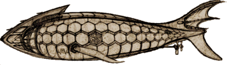 Designer
Ryan Rex realized this Nautilus as a scratch-built model as the
submarine appeared after years in the cavern under the Mysterious Island.
The design has a fish-shaped hull with a massive arch for a ram. A
cylindrical wheelhouse is incorporated within and protected by the arch.
A deck extends aft along the top of the hull almost to the fish tail. The
salon window replaces a hexagonal hull panel amidships, just aft of and above
the whale fin dive plane. A set of small propellers under the tail
provides propulsion.
Designer
Ryan Rex realized this Nautilus as a scratch-built model as the
submarine appeared after years in the cavern under the Mysterious Island.
The design has a fish-shaped hull with a massive arch for a ram. A
cylindrical wheelhouse is incorporated within and protected by the arch.
A deck extends aft along the top of the hull almost to the fish tail. The
salon window replaces a hexagonal hull panel amidships, just aft of and above
the whale fin dive plane. A set of small propellers under the tail
provides propulsion.
The model as built differs slightly from the concept
drawing I've used here. See the drawing and photos of the model on this ArtStation
page.
(Thanks to Lyle Simoneaux for pointing this
out.)
~ c. 2000 ~
 Anthony Testa's
Nautilus uses an
Anthony Testa's
Nautilus uses an  exaggerated version of Goff's rakers to distinguish itself with a vicious and
organic look. The hull is spindle-shaped and the wheelhouse and lantern
appear retractable. Anthony has placed the launch at the end of the
platform and protected the five-bladed propeller within a cylindrical
guard. I produced the image and 3D model from two 3/4
forward views, so my interpretation is missing some details and probably has
some errors.
exaggerated version of Goff's rakers to distinguish itself with a vicious and
organic look. The hull is spindle-shaped and the wheelhouse and lantern
appear retractable. Anthony has placed the launch at the end of the
platform and protected the five-bladed propeller within a cylindrical
guard. I produced the image and 3D model from two 3/4
forward views, so my interpretation is missing some details and probably has
some errors.
 Nobumitsu
Kobayashi's dramatic design has a raised vertical ram, like an axe blade.
The wheelhouse and lantern are at least partially retractable into the
cylindrical hull. The rectangular salon windows, which are placed a little far
aft, are fitted with a protective grid. Nobumitsu has added what may be a set
of forward-facing windows in the hull, although these may
be lights to augment the lantern. The prop appears to have three blades.
Unfortunately, the renderings of this Nautilus appears to be no longer available
on the Internet. Thanks to Mark Dee who told me about this design.
Nobumitsu
Kobayashi's dramatic design has a raised vertical ram, like an axe blade.
The wheelhouse and lantern are at least partially retractable into the
cylindrical hull. The rectangular salon windows, which are placed a little far
aft, are fitted with a protective grid. Nobumitsu has added what may be a set
of forward-facing windows in the hull, although these may
be lights to augment the lantern. The prop appears to have three blades.
Unfortunately, the renderings of this Nautilus appears to be no longer available
on the Internet. Thanks to Mark Dee who told me about this design.
 Michael
Bianco based his design on de Neuville and Riou
Michael
Bianco based his design on de Neuville and Riou  illustrations, with additional inspiration from these pages. The
flattened upper surface of the hull is notable. Most designs add a raised
platform, or leave the deck surface rounded. Michael uses a five-sided
lantern, like Jim Humphries, but turns it around to keep the light from shining
directly into the wheelhouse. Note the window atop the wheelhouse that
provides a sternward view when the structure is rotated into the hull for
streamlining.
illustrations, with additional inspiration from these pages. The
flattened upper surface of the hull is notable. Most designs add a raised
platform, or leave the deck surface rounded. Michael uses a five-sided
lantern, like Jim Humphries, but turns it around to keep the light from shining
directly into the wheelhouse. Note the window atop the wheelhouse that
provides a sternward view when the structure is rotated into the hull for
streamlining.
 Artist
and illustrator Brüno Thielleux created this Nautilus for a
series of comic books based on chapters from 20,000 Leagues under the Sea
and drawn in his distinctive style. The space ship-like cylindrical
design, which only loosely follows Verne's description, is twice the size of
Verne's, but it would work at the standard size. Instead of a ram, this Nautilus
has a pair of blades on the bow, the upper with a saw-tooth edge, that form a
vicious pincer, mimicking the beak of a giant mechanical squid. (There are
also retractable mechanical tentacles that featured unsuccessfully in one
sequence in the fourth comic.) There is a more Verne-like retractable
compartment at the forward end of the deck, just aft of the saw tooth, and a
captain's yacht that can be launched from a mid-deck
recess. Instead of a salon, the submarine has a large library amidships
with very large circular view ports. These appear to be protected by large
panels with the single letter N, visible in some of the illustrations.
Propulsion is by three large conical “reactors” at the stern.
Artist
and illustrator Brüno Thielleux created this Nautilus for a
series of comic books based on chapters from 20,000 Leagues under the Sea
and drawn in his distinctive style. The space ship-like cylindrical
design, which only loosely follows Verne's description, is twice the size of
Verne's, but it would work at the standard size. Instead of a ram, this Nautilus
has a pair of blades on the bow, the upper with a saw-tooth edge, that form a
vicious pincer, mimicking the beak of a giant mechanical squid. (There are
also retractable mechanical tentacles that featured unsuccessfully in one
sequence in the fourth comic.) There is a more Verne-like retractable
compartment at the forward end of the deck, just aft of the saw tooth, and a
captain's yacht that can be launched from a mid-deck
recess. Instead of a salon, the submarine has a large library amidships
with very large circular view ports. These appear to be protected by large
panels with the single letter N, visible in some of the illustrations.
Propulsion is by three large conical “reactors” at the stern.
 Illustrator
Didier Graffet's Nautilus is showcased in the richly
illustrated Gründ full French text Vingt Mille Lieues sous les mers,
published in 2003. Although not strictly following the text, his design is
reasonably true to Verne while incorporating elements from Goff and many other
sources. Notable features are a partially retractable control room forward
of the small wheelhouse, a folding exterior ladder in the aft keel below the
dive hatch, a downward looking window at the bottom of the main, spiral
stairway, and additional lights fore and aft on the lower hull. The very
large fins are distinctly fishlike. One of the more interesting details of
the design is his overlapping the hull plates top-to-bottom, rather than
bow-to-stern as others have done. The images here are of my model based on
the plan and drawings in the book. Now you can see Didier's plans, other
images, and photos of the electrified wood and cardboard model of his Nautilus
on his official Mondes &
Voyages website.
Illustrator
Didier Graffet's Nautilus is showcased in the richly
illustrated Gründ full French text Vingt Mille Lieues sous les mers,
published in 2003. Although not strictly following the text, his design is
reasonably true to Verne while incorporating elements from Goff and many other
sources. Notable features are a partially retractable control room forward
of the small wheelhouse, a folding exterior ladder in the aft keel below the
dive hatch, a downward looking window at the bottom of the main, spiral
stairway, and additional lights fore and aft on the lower hull. The very
large fins are distinctly fishlike. One of the more interesting details of
the design is his overlapping the hull plates top-to-bottom, rather than
bow-to-stern as others have done. The images here are of my model based on
the plan and drawings in the book. Now you can see Didier's plans, other
images, and photos of the electrified wood and cardboard model of his Nautilus
on his official Mondes &
Voyages website.
 This
is Jesper Kurt-Nielsen's original spindle-hulled Nautilus concept.
The deck details reflect the Hetzel edition illustrations, like many of
the designs. The stern features an asymmetric
rudder. His original art included Aronnax standing on the deck in the
classic Riou drawing that, according to Walter James Miller in The Annotated
20,000 Leagues, Verne posed for himself.
This
is Jesper Kurt-Nielsen's original spindle-hulled Nautilus concept.
The deck details reflect the Hetzel edition illustrations, like many of
the designs. The stern features an asymmetric
rudder. His original art included Aronnax standing on the deck in the
classic Riou drawing that, according to Walter James Miller in The Annotated
20,000 Leagues, Verne posed for himself.
 Jesper
Kurt-Nielsen added ornamentation to his second Nautilus and changed
to a symmetrical stern. Unfortunately his color renditions of both
designs including the Aronnax figure are no longer available on the Internet. (See Riou’s Aronnax on Zvi Har’El’s Illustrated
Jules Verne pages.)
Jesper
Kurt-Nielsen added ornamentation to his second Nautilus and changed
to a symmetrical stern. Unfortunately his color renditions of both
designs including the Aronnax figure are no longer available on the Internet. (See Riou’s Aronnax on Zvi Har’El’s Illustrated
Jules Verne pages.)
 H.R.
SantaColoma created this Nautilus for Virtual Sailor. He says he
"based my version of the Nautilus on the
Disney Studios interpretation, Campbell Grant's adaptation for the 1963 Golden
Press book, and my own ideas about what Verne intended. For instance, I
did not create a spike strip on the underside of the craft, feeling it would not
make sense in practice." Except for the
missing lower rakers and main deck, the forward part of the design follows the classic Goff
look. The rest of the hull narrows to be more fishlike, so that the deck
slopes downward. The salon window is farther forward and the tail is
enlarged to better resemble a fish tail. You can download this Nautilus
from the submarine page at Virtual
Sailor. (The download is a zip archive in exe from that can be opened by any
archive program like 7z or WinZip. The submarine components are in Direct
X format, which can be imported by many 3D modeling programs.)
H.R.
SantaColoma created this Nautilus for Virtual Sailor. He says he
"based my version of the Nautilus on the
Disney Studios interpretation, Campbell Grant's adaptation for the 1963 Golden
Press book, and my own ideas about what Verne intended. For instance, I
did not create a spike strip on the underside of the craft, feeling it would not
make sense in practice." Except for the
missing lower rakers and main deck, the forward part of the design follows the classic Goff
look. The rest of the hull narrows to be more fishlike, so that the deck
slopes downward. The salon window is farther forward and the tail is
enlarged to better resemble a fish tail. You can download this Nautilus
from the submarine page at Virtual
Sailor. (The download is a zip archive in exe from that can be opened by any
archive program like 7z or WinZip. The submarine components are in Direct
X format, which can be imported by many 3D modeling programs.)
 This
Nautilus appears in the introductory title sequence of a series of
animated films called "Jules Verne's Amazing Journeys" from Tele
Images International. The design has a modified spindle hull and a
somewhat fishlike appearance. There is a simple spar ram on the prow, and very large observation windows on the upper bow with smaller oblong ports just
aft. A large arch, a nod to Harper Goff's iconic Nautilus, rises on the upper hull,
protecting the superstructure amidships that has many round ports. The
animation image is not clear, but there may be a propeller or rudder just aft of the
lower fin on
the stern. A cruciform tail is located at the very stern. You can see this Nautilus
at the very beginning of this Mysterious Island animated film, La
Isla Misteriosa de Julio Verne (the Nautilus in the film itself
is very different). (The video is no longer available on the Internet.)
This
Nautilus appears in the introductory title sequence of a series of
animated films called "Jules Verne's Amazing Journeys" from Tele
Images International. The design has a modified spindle hull and a
somewhat fishlike appearance. There is a simple spar ram on the prow, and very large observation windows on the upper bow with smaller oblong ports just
aft. A large arch, a nod to Harper Goff's iconic Nautilus, rises on the upper hull,
protecting the superstructure amidships that has many round ports. The
animation image is not clear, but there may be a propeller or rudder just aft of the
lower fin on
the stern. A cruciform tail is located at the very stern. You can see this Nautilus
at the very beginning of this Mysterious Island animated film, La
Isla Misteriosa de Julio Verne (the Nautilus in the film itself
is very different). (The video is no longer available on the Internet.)
(Thanks to Vincente Nieto Martin
for pointing out this design.)
 The
Nautilus in the animated film La
Isla Misteriosa de Julio Verne from Tele
Images International has a rather odd design. Reasonably organic
I'm afraid it looks like a bloated fish, perhaps appropriate for the Nautilus
that has been dormant in a cave for years. (Lyle Simoneaux suggests
resemblance to the humpback anglerfish.) There is a small pointed ram on
the lower bow below an enormous observation window. The upper hull has a
row of pointed barbs running up to an open bridge at the very top. The
balloon-like hull tapers to a narrow waist and then expands to a second smaller
section that finishes with a set of small, backward-facing barbs before
transitioning to a fish-like tail. The hull has three upward-shining lights
on each side and another atop the aft section. Recall the original illustration in Verne's novel showing
two light beams lighting up the cavern. Just aft of the salon window there
is an intake on the side of the hull that might be associated with the power
system but this Nautilus has a standard propeller. The bottom of the
forward hull
appears flat but the after section is never shown.
The
Nautilus in the animated film La
Isla Misteriosa de Julio Verne from Tele
Images International has a rather odd design. Reasonably organic
I'm afraid it looks like a bloated fish, perhaps appropriate for the Nautilus
that has been dormant in a cave for years. (Lyle Simoneaux suggests
resemblance to the humpback anglerfish.) There is a small pointed ram on
the lower bow below an enormous observation window. The upper hull has a
row of pointed barbs running up to an open bridge at the very top. The
balloon-like hull tapers to a narrow waist and then expands to a second smaller
section that finishes with a set of small, backward-facing barbs before
transitioning to a fish-like tail. The hull has three upward-shining lights
on each side and another atop the aft section. Recall the original illustration in Verne's novel showing
two light beams lighting up the cavern. Just aft of the salon window there
is an intake on the side of the hull that might be associated with the power
system but this Nautilus has a standard propeller. The bottom of the
forward hull
appears flat but the after section is never shown.
You can see this Nautilus
in the main Mysterious Island animated film, La
Isla Misteriosa de Julio Verne (the Nautilus in the introduction,
above, is very different).
(Thanks to Vincente Nieto Martin
for pointing out this design.)
 This
Nautilus by Nick Porcino reminds me of an armored crustacean that
might move along the bottom of the sea. The overlapping plates fit one of
the descriptions that Aronnax records in the novel. The sawtooth rakers
atop the forward hull, the shape of the wheelhouse and the salon window almost
call to mind Goff's design (although the window is located far aft), but I'm inclined
to consider any resemblance an unconscious coincidence. The design
features a massive armored ram with smaller barbs. The wheelhouse has
large ports on the sides and a periscope and possible snorkel, both likely
retractable for ram attacks. What may be a boat is set into the short deck
just aft of the wheelhouse and short deck rail. The superstructure has a
port just below the boat. A narrow fairing runs almost the full length of
the lower hull, ending forward of large dive planes. The stern has a small
four-bladed prop and a large rudder.
This
Nautilus by Nick Porcino reminds me of an armored crustacean that
might move along the bottom of the sea. The overlapping plates fit one of
the descriptions that Aronnax records in the novel. The sawtooth rakers
atop the forward hull, the shape of the wheelhouse and the salon window almost
call to mind Goff's design (although the window is located far aft), but I'm inclined
to consider any resemblance an unconscious coincidence. The design
features a massive armored ram with smaller barbs. The wheelhouse has
large ports on the sides and a periscope and possible snorkel, both likely
retractable for ram attacks. What may be a boat is set into the short deck
just aft of the wheelhouse and short deck rail. The superstructure has a
port just below the boat. A narrow fairing runs almost the full length of
the lower hull, ending forward of large dive planes. The stern has a small
four-bladed prop and a large rudder.
 Clive
Cussler's umpteenth novel Valhalla Rising included the rediscovery
of the Nautilus in the Hudson Valley. The cover artist was Lawrence
Ratzkin, but I have not been able to identify the illustrator responsible
for the drawings in the book. The design features a spindle hull offset
toward the bow. A set of relatively small dive planes is located just
below the center line and about halfway from the bow to midships. A large
round port is placed on the centerline amidships. The hull tapers back to
a fair-sized four-bladed propeller protected by vertical and horizontal
fins. The horizontal fins appear to function as dive planes and the
vertical fins hold a large rudder. A good-sized, hexagonal wheelhouse with
six round windows is set forward of a simple deck at about the widest part of
the hull. There's no indication of a launch or lantern.
Clive
Cussler's umpteenth novel Valhalla Rising included the rediscovery
of the Nautilus in the Hudson Valley. The cover artist was Lawrence
Ratzkin, but I have not been able to identify the illustrator responsible
for the drawings in the book. The design features a spindle hull offset
toward the bow. A set of relatively small dive planes is located just
below the center line and about halfway from the bow to midships. A large
round port is placed on the centerline amidships. The hull tapers back to
a fair-sized four-bladed propeller protected by vertical and horizontal
fins. The horizontal fins appear to function as dive planes and the
vertical fins hold a large rudder. A good-sized, hexagonal wheelhouse with
six round windows is set forward of a simple deck at about the widest part of
the hull. There's no indication of a launch or lantern.

Frank
Chase has conceived a
Nautilus that calls Goff's design to mind but is very different.
Frank began from Verne's text but has taken a few liberties. The result is
a graceful but powerful appearance. His 3D model has a full interior laid
out very much as Verne described. I find the appointments and machinery
somewhat modern, but the detail is incredible and the result impressive.
 Frank
Chase's
web site also features interior views of his second Nautilus.
Although
resembling his original design, Frank went back to the text for this
version. The Goff influence is gone. The deck
is clearly Verne but the ram is set high like Ian Williams. The salon
window is rectangular like Ron Miller's. See Frank's third Nautilus
below.
Frank
Chase's
web site also features interior views of his second Nautilus.
Although
resembling his original design, Frank went back to the text for this
version. The Goff influence is gone. The deck
is clearly Verne but the ram is set high like Ian Williams. The salon
window is rectangular like Ron Miller's. See Frank's third Nautilus
below.
 Design
Wheel, a company that designs film, television, and interior spaces created
this Nautilus concept as a study for a 2002 film of 20,000 Leagues
under the Sea. To quote their website, "The 'Nautalis'
is reborn in this new version of the famous Jules Verne novel"
Design
Wheel, a company that designs film, television, and interior spaces created
this Nautilus concept as a study for a 2002 film of 20,000 Leagues
under the Sea. To quote their website, "The 'Nautalis'
is reborn in this new version of the famous Jules Verne novel"
. The
concept draws on the classic Harper
Goff design but reverses some elements for a very different appearance and
includes the movie scene of the Nautilus held by the giant squid by adding a
tentacle motif to the hull. A concept drawing and some interior sketches
were posted on the non-defunct Design
Wheel website, near the end of the page. The link now goes to an
Internet Archive capture of the page that unfortunately does not include the
images.
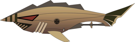 The
DiC Entertainment 2002 animated 20,000 Leagues Under the
Sea featured this fishlike Nautilus. There's not much of
Jules Verne in the design, but the propeller shaft mounted below the tail is
interesting. I'm sure it's only a coincidence but it reminds me of some of
the experimental propellers tried out on the Walter S. Winans cigar
boat. The movie, which I have not seen, is available at amazon as a DVD
and also on iTunes.
The
DiC Entertainment 2002 animated 20,000 Leagues Under the
Sea featured this fishlike Nautilus. There's not much of
Jules Verne in the design, but the propeller shaft mounted below the tail is
interesting. I'm sure it's only a coincidence but it reminds me of some of
the experimental propellers tried out on the Walter S. Winans cigar
boat. The movie, which I have not seen, is available at amazon as a DVD
and also on iTunes.
(Thanks to Mark Young, who
pointed out this design.)
 Another
animated film was released in 2002. This one, 20000 leghe sotto i mari,
produced by the Italian company Officine Pixel features a very different Nautilus
design. Although less industrial looking,
Another
animated film was released in 2002. This one, 20000 leghe sotto i mari,
produced by the Italian company Officine Pixel features a very different Nautilus
design. Although less industrial looking,  it resembles the 1969 Captain
Nemo and the Underwater City design. There's also a resemblance to the
1997 Village Roadshow Nautilus, although the Officine Pixel
design is more organic. Viewed from above, the forward, main part of the hull
flairs outward before gracefully narrowing and then widening slightly at the tail.
From the front this design presents the appearance of the shell of a sea turtle. A
sharp ram is mounted on the bow. Two large and two smaller lights on the edges
of the carapace give this Nautilus the aspect of a large, frightening
sea creature as it comes toward you. The semicircular pilot house atop the
forward hull is ringed with seven round Goff salon window-like ports providing
views forward and to the sides. There are similar, larger ports atop
the pilot house. When the structure pivots down into the hull for attacks,
these upper ports provide a view forward. There are hatches on the aft
part of the main hull and opening two large plates atop the hull reveals a small
boat that appears to operate as Nemo describes in the novel. Not visible in my slightly tilted elevation render, a narrow deck with retractable railings runs along the hull
from the highest point on main hull to the tail. The large salon, located
in the bow below the pilot house, has a wall of ports facing forward. The
video, in Italian, is available on YouTube here.
it resembles the 1969 Captain
Nemo and the Underwater City design. There's also a resemblance to the
1997 Village Roadshow Nautilus, although the Officine Pixel
design is more organic. Viewed from above, the forward, main part of the hull
flairs outward before gracefully narrowing and then widening slightly at the tail.
From the front this design presents the appearance of the shell of a sea turtle. A
sharp ram is mounted on the bow. Two large and two smaller lights on the edges
of the carapace give this Nautilus the aspect of a large, frightening
sea creature as it comes toward you. The semicircular pilot house atop the
forward hull is ringed with seven round Goff salon window-like ports providing
views forward and to the sides. There are similar, larger ports atop
the pilot house. When the structure pivots down into the hull for attacks,
these upper ports provide a view forward. There are hatches on the aft
part of the main hull and opening two large plates atop the hull reveals a small
boat that appears to operate as Nemo describes in the novel. Not visible in my slightly tilted elevation render, a narrow deck with retractable railings runs along the hull
from the highest point on main hull to the tail. The large salon, located
in the bow below the pilot house, has a wall of ports facing forward. The
video, in Italian, is available on YouTube here.
(Thanks to Davide Danesin, BlueDD who found this design.)
 Corsican
artist Serge Micheli created this Nautilus for Voyage
sous les eaux, a graphic novel about Jules Verne and Captain Nemo, published
in 2002. The design has an organic, but also jerry-rigged
appearance. The only part that might be traced to Harper Goff is the
Corsican
artist Serge Micheli created this Nautilus for Voyage
sous les eaux, a graphic novel about Jules Verne and Captain Nemo, published
in 2002. The design has an organic, but also jerry-rigged
appearance. The only part that might be traced to Harper Goff is the  large
and vicious saw-tooth affixed to the forward hull. The pilothouse, with
two large, irregular windows, just aft of saw, is otherwise the highest point on
the hull. There are small lanterns mounted atop the forward hull on each
side of the saw, and possibly two more atop the hull just aft of the pilothouse,
although these may be portholes. Two large, roughly rectangular view ports
extend from each side, the forward pair from the library, and a slightly larger
set from the salon. Just aft of these the hull is adorned with some
complex structures that merge into curling tentacles. The book has an
epilogue in which the author, François Rivière, discusses Jules Verne, and
which includes what is perhaps Micheli's concept art of the Nautilus.
It has most of the features of the version described here, but is flatter and
more elongated, with a more prehistoric sea creature appearance.
large
and vicious saw-tooth affixed to the forward hull. The pilothouse, with
two large, irregular windows, just aft of saw, is otherwise the highest point on
the hull. There are small lanterns mounted atop the forward hull on each
side of the saw, and possibly two more atop the hull just aft of the pilothouse,
although these may be portholes. Two large, roughly rectangular view ports
extend from each side, the forward pair from the library, and a slightly larger
set from the salon. Just aft of these the hull is adorned with some
complex structures that merge into curling tentacles. The book has an
epilogue in which the author, François Rivière, discusses Jules Verne, and
which includes what is perhaps Micheli's concept art of the Nautilus.
It has most of the features of the version described here, but is flatter and
more elongated, with a more prehistoric sea creature appearance.
You can buy the English version of this richly illustrated
book, Voyage Into the Deep, at amazon.com.
 Robert
Kelley misses a few details of Verne's description in this version
Robert
Kelley misses a few details of Verne's description in this version of
the Nautilus, but I like the rough and tough look. The
sinister wheelhouse and light, shown in their retracted positions, remind me of
pill box gun emplacements. Kelley's lethal blade-shaped ram, inspired in
part by Ron Miller's design, might have caused Nemo to say "like a
knife through butter" instead of "a needle through
sailcloth". The renderings I’ve seen, now available on Kelley’s
web site, give an impression of toughness and violence. This sub could
have easily terrorized 19th century seas. See Robert's images here
and here.
of
the Nautilus, but I like the rough and tough look. The
sinister wheelhouse and light, shown in their retracted positions, remind me of
pill box gun emplacements. Kelley's lethal blade-shaped ram, inspired in
part by Ron Miller's design, might have caused Nemo to say "like a
knife through butter" instead of "a needle through
sailcloth". The renderings I’ve seen, now available on Kelley’s
web site, give an impression of toughness and violence. This sub could
have easily terrorized 19th century seas. See Robert's images here
and here.
 Sculptor
Bruce Bowman has designed a simple, clean looking Nautilus, based
on Jules Verne's text. In his description Bruce acknowledges the only
obvious error - five blades on the prop instead of four. My graphic
doesn't do justice to the classic appearance of the spindle hull and almost
stiletto-like triangular cross-section, three-bladed ram. The small
wheelhouse has five or six sides with one facing forward. The lantern is a
little taller than the wheelhouse with two lights facing forward. The deck
between the wheelhouse and the lantern is integral with the hull - there is no
platform - and protected by a low railing, part of which appears to be a chain
that can be lowered to launch the boat, located mid-deck. The oval salon
window is sized to match the interior view of some of the original engravings. The dive planes, located amidships, are short fore and aft
but project noticeably to the sides to provide a large
Sculptor
Bruce Bowman has designed a simple, clean looking Nautilus, based
on Jules Verne's text. In his description Bruce acknowledges the only
obvious error - five blades on the prop instead of four. My graphic
doesn't do justice to the classic appearance of the spindle hull and almost
stiletto-like triangular cross-section, three-bladed ram. The small
wheelhouse has five or six sides with one facing forward. The lantern is a
little taller than the wheelhouse with two lights facing forward. The deck
between the wheelhouse and the lantern is integral with the hull - there is no
platform - and protected by a low railing, part of which appears to be a chain
that can be lowered to launch the boat, located mid-deck. The oval salon
window is sized to match the interior view of some of the original engravings. The dive planes, located amidships, are short fore and aft
but project noticeably to the sides to provide a large  control surface. The rudder, mounted on the hull bottom forward of the
prop, is similarly large. You can see some nice graphics of this Nautilus
on the Bowman Arts
website.
control surface. The rudder, mounted on the hull bottom forward of the
prop, is similarly large. You can see some nice graphics of this Nautilus
on the Bowman Arts
website.
 The
Adventure Company game Return
to Mysterious Island features a Nautilus
surprisingly true to the novel. The design is clearly inspired by
an illustration in the original Hetzel edition with details suggested by other
sources. The image at right, produced from a published screenshot,
The
Adventure Company game Return
to Mysterious Island features a Nautilus
surprisingly true to the novel. The design is clearly inspired by
an illustration in the original Hetzel edition with details suggested by other
sources. The image at right, produced from a published screenshot, shows two searchlights imbedded in the deck, matching the Hetzel illustration
shown as an inset. (Close examination of the original drawing shows the
lights are imbedded in the superstructure, but no matter.) The design has
two dinghies, one on each side of the deck, a nice improvement on my own
original Nautilus. The pilot house and a pilot house and lantern
are similar to several designs in the catalog. The nicely detailed hull
uses overlapping plates just like those of my new Nautilus, except that
they are much smaller. My recreation image of this design at left
speculates on parts such as the salon window and dive plane not visible in the
published screenshot graphics. The published interior screenshots show a
recurring chambered nautilus design motif similar to the raised emblem on the
bow. Such decoration might extend to the outside portion of the window.
shows two searchlights imbedded in the deck, matching the Hetzel illustration
shown as an inset. (Close examination of the original drawing shows the
lights are imbedded in the superstructure, but no matter.) The design has
two dinghies, one on each side of the deck, a nice improvement on my own
original Nautilus. The pilot house and a pilot house and lantern
are similar to several designs in the catalog. The nicely detailed hull
uses overlapping plates just like those of my new Nautilus, except that
they are much smaller. My recreation image of this design at left
speculates on parts such as the salon window and dive plane not visible in the
published screenshot graphics. The published interior screenshots show a
recurring chambered nautilus design motif similar to the raised emblem on the
bow. Such decoration might extend to the outside portion of the window.
Additional information and screen shots can be found at
this game web site
or by a web search of the game title. You can buy the game at amazon.com
but check out some reviews first to know what you are getting. The
submarine does have passages from the deck to the complete salon but
unfortunately no other interior rooms to explore.
 I
I
an Williams
refined his original design (above). Most noticeable,
the salon window is smaller, more oval, and recessed, and the four-bladed prop
is larger. The wheelhouse is smaller, more in keeping with some of the
engravings is the original Hetzel edition of 20K. Linkages are included
for the double rudder and there are other subtle differences, otherwise the design
remains essentially the same. Visit this archived copy of his now
defunct web site for a sketch and a
detailed plan.
 According
to a capsule history provided by John McEwan, his Victorian Science
Fiction Submarine Narwal was built by the French in 1889 using
information that Aronnax,
According
to a capsule history provided by John McEwan, his Victorian Science
Fiction Submarine Narwal was built by the French in 1889 using
information that Aronnax,  actually
a French secret agent, collected during his sojourn aboard the Nautilus.
It has many of the features described in the novel and improvements similar to
other designs featured in the Catalog. John acknowledges Ian William's Nautilus
as an inspiration. The lantern is mounted atop the wheel house. In
addition to the helmsman's windows, the extended wheelhouse includes a set of
portholes on the sides of what might be a full control room. A launch is
located in the center of the deck forward of the main hatch. There are aft
dive planes in a set of horizontal fins and the expected hull-mounted planes
planes are moved forward of the large salon windows. A double rudder is
set in the vertical fins very similar to the Williams Nautilus and the
triangular cross-section ram is set high. The four bladed prop is
protected by an annular shroud attached to aft fins. McEwan's Reviresco
war gaming company features some other images and a paper card model
of the Narwal
on its web site.
actually
a French secret agent, collected during his sojourn aboard the Nautilus.
It has many of the features described in the novel and improvements similar to
other designs featured in the Catalog. John acknowledges Ian William's Nautilus
as an inspiration. The lantern is mounted atop the wheel house. In
addition to the helmsman's windows, the extended wheelhouse includes a set of
portholes on the sides of what might be a full control room. A launch is
located in the center of the deck forward of the main hatch. There are aft
dive planes in a set of horizontal fins and the expected hull-mounted planes
planes are moved forward of the large salon windows. A double rudder is
set in the vertical fins very similar to the Williams Nautilus and the
triangular cross-section ram is set high. The four bladed prop is
protected by an annular shroud attached to aft fins. McEwan's Reviresco
war gaming company features some other images and a paper card model
of the Narwal
on its web site.
 Jean-Marc
Deschamps’ Nautilus includes all the details described in the
novel. The hull is asymmetrically cigar-shaped with a rounded stern and a
pointed bow. The ram has two fins that, combined with the extended
keel, would make a triangular cut in the hull of an attacked ship.
The pilothouse and lantern have the same shape and appearance. You
can see photos of Deschamps’ model and a detailed
plan on the
NemoTechnik
web site.
Jean-Marc
Deschamps’ Nautilus includes all the details described in the
novel. The hull is asymmetrically cigar-shaped with a rounded stern and a
pointed bow. The ram has two fins that, combined with the extended
keel, would make a triangular cut in the hull of an attacked ship.
The pilothouse and lantern have the same shape and appearance. You
can see photos of Deschamps’ model and a detailed
plan on the
NemoTechnik
web site.
 The
Nautilus - 1st version - of Hugues Rouleux
("BatNemo") has many influences, including the novel. The
profile is reminiscent of Harper Goff's but there are two side-by-side raker
arches, like Ray Harryhausen's Mysterious Island Nautilus.
Only part of the railing is visible in my
graphic, but the top of the wheelhouse somewhat resembles a fleet boat submarine
conning tower. There is a rather beak-like triangular ram and an eye-like
salon window. This RC design has four dive
planes, two small ones just forward of the salon window and two aft in a set of
large horizontal fins. The deck includes a boat amidships and a large
forward-facing lantern at the aft end. You can see photos of this nicely
finished model here
(slow loading).
See his newer in-work Nautilus
version below.
The
Nautilus - 1st version - of Hugues Rouleux
("BatNemo") has many influences, including the novel. The
profile is reminiscent of Harper Goff's but there are two side-by-side raker
arches, like Ray Harryhausen's Mysterious Island Nautilus.
Only part of the railing is visible in my
graphic, but the top of the wheelhouse somewhat resembles a fleet boat submarine
conning tower. There is a rather beak-like triangular ram and an eye-like
salon window. This RC design has four dive
planes, two small ones just forward of the salon window and two aft in a set of
large horizontal fins. The deck includes a boat amidships and a large
forward-facing lantern at the aft end. You can see photos of this nicely
finished model here
(slow loading).
See his newer in-work Nautilus
version below.
 The
Nautilus seen in the 2005 Hallmark Channel production of Mysterious
Island with Patrick Stewart as Captain Nemo, has a clockwork look. We
only see the submarine at its cavern dock with a row of bright ports or lights
just below the surface, so I've rendered a view with the part below the
waterline ghosted out except for those lights. The views we do get however
are memorable. The clockwork arch, with its intricate oriental look, might
even be articulated,
The
Nautilus seen in the 2005 Hallmark Channel production of Mysterious
Island with Patrick Stewart as Captain Nemo, has a clockwork look. We
only see the submarine at its cavern dock with a row of bright ports or lights
just below the surface, so I've rendered a view with the part below the
waterline ghosted out except for those lights. The views we do get however
are memorable. The clockwork arch, with its intricate oriental look, might
even be articulated,  moving
during an attack to inflict maximum damage. The wheelhouse, below the aft
base of the arch, has two eyelike ports, enhancing a Chinese dragon look.
There are two hatches, one just aft of the arch and one aft of the triangular
fin atop the mid-deck structure. The designer might have had a purpose for
the simpler reverse arch aft of that but it's a mystery to me. A seemingly
separate structure in the water further after must be part of the Nautilus,
a tail fin or possibly another dorsal fin farther astern. (There are not
many scenes with the Nautilus.) See Mark Corderoy's take on
this Nautilus below.
moving
during an attack to inflict maximum damage. The wheelhouse, below the aft
base of the arch, has two eyelike ports, enhancing a Chinese dragon look.
There are two hatches, one just aft of the arch and one aft of the triangular
fin atop the mid-deck structure. The designer might have had a purpose for
the simpler reverse arch aft of that but it's a mystery to me. A seemingly
separate structure in the water further after must be part of the Nautilus,
a tail fin or possibly another dorsal fin farther astern. (There are not
many scenes with the Nautilus.) See Mark Corderoy's take on
this Nautilus below.
 Christian
Zaber’s Nautilus has a sinister, organic look. It's not
only Victorian era seamen who might mistake this lethal ramming machine for a
sea monster. The design is less true to the novel than most in the
catalog. It has a long boat set in the hull a little aft of
amidships. The hull, composed of several intersecting and cut-off
ellipsoids, is not topped with a deck, but there is a small promenade just
forward of the wheel house and a larger one aft of the long boat. Both are
reached by hatches. Instead of a lantern there are a pair of searchlights
on the lower forward hull. The salon window amidships, the raker arch, and
the two large wheel house windows are reminiscent of Goff, but there is no real
resemblance. See many images of both the exterior and interior of this Nautilus
on Christian's Ultra Mondes web site.
Christian
Zaber’s Nautilus has a sinister, organic look. It's not
only Victorian era seamen who might mistake this lethal ramming machine for a
sea monster. The design is less true to the novel than most in the
catalog. It has a long boat set in the hull a little aft of
amidships. The hull, composed of several intersecting and cut-off
ellipsoids, is not topped with a deck, but there is a small promenade just
forward of the wheel house and a larger one aft of the long boat. Both are
reached by hatches. Instead of a lantern there are a pair of searchlights
on the lower forward hull. The salon window amidships, the raker arch, and
the two large wheel house windows are reminiscent of Goff, but there is no real
resemblance. See many images of both the exterior and interior of this Nautilus
on Christian's Ultra Mondes web site.
 Illustrator
Max Hierro created this Nautilus for the Anaya illustrated
juvenile edition Veinte mil leguas de viaje submarino (Twenty Thousand
Leagues Under the Sea).
Illustrator
Max Hierro created this Nautilus for the Anaya illustrated
juvenile edition Veinte mil leguas de viaje submarino (Twenty Thousand
Leagues Under the Sea).  Its
most striking features are the large barbed and rakered ram and the unusual
keel, resembling an inverted arch. A four-sided wheelhouse is located atop
the hull where the forward taper ends. There is no obvious deck, just a
clean hull extending almost to the large perforated vertical tail fin where
there is a small lantern structure. A large, oddly canted centerline
propeller is located at the stern and a fair-sized rudder in the lower tail
fin. No dive planes are evident. The sweeping window arrangement on
the hull side (including an element like a nautilus shell) lends to the organic
appearance. See Max's illustration at DeviantArt. You can purchase the illustrated Anya edition (in Spanish)
at amazon.
Its
most striking features are the large barbed and rakered ram and the unusual
keel, resembling an inverted arch. A four-sided wheelhouse is located atop
the hull where the forward taper ends. There is no obvious deck, just a
clean hull extending almost to the large perforated vertical tail fin where
there is a small lantern structure. A large, oddly canted centerline
propeller is located at the stern and a fair-sized rudder in the lower tail
fin. No dive planes are evident. The sweeping window arrangement on
the hull side (including an element like a nautilus shell) lends to the organic
appearance. See Max's illustration at DeviantArt. You can purchase the illustrated Anya edition (in Spanish)
at amazon.
 In
2005 the German printing firm Lingoli published a combined children's
edition of
In
2005 the German printing firm Lingoli published a combined children's
edition of 80 Tagen um die Welt
and 20.000 Meilen unter dem Meer in their Entdecker
(Discovery) series, cleverly illustrated by Tony Wolf. The
design has a triangular ram composed of a full-width horizontal plate with a
half-height vertical plate placed atop it. The vertical component
transitions to two large raker fins atop the forward hull. The deck and
superstructure are unique. A large, but not unusual wheel house at the
forward end has two canted circular windows. There is a similarly large
lantern hosing at the aft end with four circular windows. But in the
center, the boat is not set into the deck but enclosed in a boat house between
these two elements. Hinged panels are raised like a garage door to launch
the boat. Large circular salon windows are approximately where expected,
but Wolf has placed the dive planes at the aft end of horizontal fins that
protrude slightly from a fairing running almost the full length of the
hull. Two similar vertical fins extend from the aft hull with the rudder
set at the end of the lower one. The aft hull terminates in a cone with a
large, free-standing, four-bladed prop. The book, available internationally
(in German) from booksellers in Germany, includes a cutaway view of the Nautilus,
more or less true to Verne's description. Verne's characters are all
there, but are animals in this children's version. See some illustrations
from the book at Mobilis
in Mobile.
80 Tagen um die Welt
and 20.000 Meilen unter dem Meer in their Entdecker
(Discovery) series, cleverly illustrated by Tony Wolf. The
design has a triangular ram composed of a full-width horizontal plate with a
half-height vertical plate placed atop it. The vertical component
transitions to two large raker fins atop the forward hull. The deck and
superstructure are unique. A large, but not unusual wheel house at the
forward end has two canted circular windows. There is a similarly large
lantern hosing at the aft end with four circular windows. But in the
center, the boat is not set into the deck but enclosed in a boat house between
these two elements. Hinged panels are raised like a garage door to launch
the boat. Large circular salon windows are approximately where expected,
but Wolf has placed the dive planes at the aft end of horizontal fins that
protrude slightly from a fairing running almost the full length of the
hull. Two similar vertical fins extend from the aft hull with the rudder
set at the end of the lower one. The aft hull terminates in a cone with a
large, free-standing, four-bladed prop. The book, available internationally
(in German) from booksellers in Germany, includes a cutaway view of the Nautilus,
more or less true to Verne's description. Verne's characters are all
there, but are animals in this children's version. See some illustrations
from the book at Mobilis
in Mobile.
Thanks again to Jürgen Guerrero
Kommritz for bringing this Nautilus to my attention.
 This
Nautilus was created by digital painter "Tauceti" as a
commissioned piece. He did research to make the design true to Verne and
it shows. The hull is spindle shaped. Both the wheelhouse, far
forward on the hull, and lantern housing are retractable. There is a deck
area with a rectangular hatch a little forward of amidships. The boat is
mounted at the aft end of the deck. The ram is integral with the hull at
the bow. The oval salon window is set on the hull side forward of
wheelhouse. They aren't easy to see in my graphic, but there are three
sets of dive planes, the first pair just aft of the wheelhouse and the other two
pairs about a third of the way aft. The large four-bladed prop is at the
stern end of the hull. It isn't clear in the original art, but the rudder
may be on the hull bottom just forward of the prop. See the
original image at DeviantArt.
This
Nautilus was created by digital painter "Tauceti" as a
commissioned piece. He did research to make the design true to Verne and
it shows. The hull is spindle shaped. Both the wheelhouse, far
forward on the hull, and lantern housing are retractable. There is a deck
area with a rectangular hatch a little forward of amidships. The boat is
mounted at the aft end of the deck. The ram is integral with the hull at
the bow. The oval salon window is set on the hull side forward of
wheelhouse. They aren't easy to see in my graphic, but there are three
sets of dive planes, the first pair just aft of the wheelhouse and the other two
pairs about a third of the way aft. The large four-bladed prop is at the
stern end of the hull. It isn't clear in the original art, but the rudder
may be on the hull bottom just forward of the prop. See the
original image at DeviantArt.
 Mike
McGregor created this Nautilus for a CGSociety challenge.
Mike
McGregor created this Nautilus for a CGSociety challenge.  The shape is organic with a roughly spindle-shaped hull, but the bow is unlike
anything else. The lower hull, like the undershot jaw of some sea creature
serves as a ram. We might find some reference to Goff's classic wheelhouse
in the rest of the bow. The raker arch has be flattened into the upper
hull, which then appears to be notched out. The space under the arch is
now a hole completed through the hull, with the two globe windows set into
opening. The salon window is bigger with a more elaborate grill than the
classic. There are four small ports running along the hull and another
looking up near the wheelhouse. A low conning tower sail mounts small dive
plans. None of Mike's images, no longer on the Internet, show a prop but a small cruciform tail is
visible. The image here doesn't do justice to McGregor's detail.
The shape is organic with a roughly spindle-shaped hull, but the bow is unlike
anything else. The lower hull, like the undershot jaw of some sea creature
serves as a ram. We might find some reference to Goff's classic wheelhouse
in the rest of the bow. The raker arch has be flattened into the upper
hull, which then appears to be notched out. The space under the arch is
now a hole completed through the hull, with the two globe windows set into
opening. The salon window is bigger with a more elaborate grill than the
classic. There are four small ports running along the hull and another
looking up near the wheelhouse. A low conning tower sail mounts small dive
plans. None of Mike's images, no longer on the Internet, show a prop but a small cruciform tail is
visible. The image here doesn't do justice to McGregor's detail.
 This is Philip Heinrich's interesting
fishlike Nautilus. Inspired
This is Philip Heinrich's interesting
fishlike Nautilus. Inspired  some
by Dave Warren's design, but based largely on calculations from the novel,
Philip's Nautilus has the look of
some prehistoric fish with overlapping scales. He admits his
unique positioning of the propeller forward of the large, flat tail, while
looking very good, might not work. It calls the original cigar steamer's
midships propeller to my mind. That boat had a frame that held the forward
and aft hulls together. Missing that, Philip's design requires a hollow
propeller shaft surrounding a central, non-rotating structural shaft to keep the
tail stationary, as well as rudder controls. It would be complex and
difficult engineering, but perhaps not beyond Nemo's genius. Philip
created his Nautilus
in Carrara and kindly provided the images that appear here.
some
by Dave Warren's design, but based largely on calculations from the novel,
Philip's Nautilus has the look of
some prehistoric fish with overlapping scales. He admits his
unique positioning of the propeller forward of the large, flat tail, while
looking very good, might not work. It calls the original cigar steamer's
midships propeller to my mind. That boat had a frame that held the forward
and aft hulls together. Missing that, Philip's design requires a hollow
propeller shaft surrounding a central, non-rotating structural shaft to keep the
tail stationary, as well as rudder controls. It would be complex and
difficult engineering, but perhaps not beyond Nemo's genius. Philip
created his Nautilus
in Carrara and kindly provided the images that appear here.
 Leelan
Lampkins’ Nautilus combines features of Greg Sharpe’s first
design with Ian Williams’ ram. He’s added a cutwater forward of the
pilothouse and incorporated a tall lantern in a dorsal fin for protection during
ramming. He's moved the salon windows forward in keeping with the internal
dimensions of the novel.
Leelan
Lampkins’ Nautilus combines features of Greg Sharpe’s first
design with Ian Williams’ ram. He’s added a cutwater forward of the
pilothouse and incorporated a tall lantern in a dorsal fin for protection during
ramming. He's moved the salon windows forward in keeping with the internal
dimensions of the novel.
 William
Burningham's Nautilus echoes many of the designs shown here
but particularly resembles Jim Humphries' boat. His design includes
rotating davits that operate like those I've planned for my new Nautilus
and animated on my dinghy page, with the dinghy stored inverted, but flipped
during launch. These look very much like those on the Return to
Mysterious Island Nautilus but those are not positioned to operate
the same way. Burningham markets 3D models under his KuroKuma professional
name. Unfortunately, the Nautilus is no longer available. (My Carrara animation was
made after importing the Poser model with TransPoser.)
William
Burningham's Nautilus echoes many of the designs shown here
but particularly resembles Jim Humphries' boat. His design includes
rotating davits that operate like those I've planned for my new Nautilus
and animated on my dinghy page, with the dinghy stored inverted, but flipped
during launch. These look very much like those on the Return to
Mysterious Island Nautilus but those are not positioned to operate
the same way. Burningham markets 3D models under his KuroKuma professional
name. Unfortunately, the Nautilus is no longer available. (My Carrara animation was
made after importing the Poser model with TransPoser.)
 Greg
deSantis started with the idea of recreating Nemo’s Nautilus
but decided he didn't want to be limited by the novel, opting for the freedom
to create his own ultimate Nautilus. The result, an imposing
Victorian submarine, includes large, ornate salon windows, a deck-mounted
launch, and an elevated cable-braced spar.
Greg
deSantis started with the idea of recreating Nemo’s Nautilus
but decided he didn't want to be limited by the novel, opting for the freedom
to create his own ultimate Nautilus. The result, an imposing
Victorian submarine, includes large, ornate salon windows, a deck-mounted
launch, and an elevated cable-braced spar.  The
two-sided pilot house with center lantern is unique, but an interesting
frog-head extension of Goff's big windows. The design owes more to
Goff as well, with its flat-plate, polygonal cross-sectioned hull, fish-like
tail and horizontal hull extensions, but in the end it is all
Greg's. Perhaps most interesting is the attention to detail he's put
into the model. It looks as good close up as from a distance. See a
some images of Greg's "Improbable" Nautilus at this “Wayback
Machine” capture of his Museum of the
Improbable website (the original site is lamentably gone). Except for
the standard side view here, which Greg provided, the images were shaded and
rendered in Carrara. A very nice plastic 1:144 scale model of this Nautilus
is now available. I got my kit from CultTVman's
Hobby Shop.
The
two-sided pilot house with center lantern is unique, but an interesting
frog-head extension of Goff's big windows. The design owes more to
Goff as well, with its flat-plate, polygonal cross-sectioned hull, fish-like
tail and horizontal hull extensions, but in the end it is all
Greg's. Perhaps most interesting is the attention to detail he's put
into the model. It looks as good close up as from a distance. See a
some images of Greg's "Improbable" Nautilus at this “Wayback
Machine” capture of his Museum of the
Improbable website (the original site is lamentably gone). Except for
the standard side view here, which Greg provided, the images were shaded and
rendered in Carrara. A very nice plastic 1:144 scale model of this Nautilus
is now available. I got my kit from CultTVman's
Hobby Shop.
 Lee
Krystek built this Nautilus for an on-line graphic novel version of 20,000
Leagues under the Sea. The design is unique, with a deck that runs nearly
the full length of the hull and a cigar shaped hull with a truncated
stern. A cruciform vertical and horizontal fin structure is attached to
the stern and the long spar appears to have a diamond cross-section for most of
its length. The two diving planes are mounted somewhat forward forward of
the hull center. There are three windows on each side of the hull
although only one appears to be in the salon. (Actually, the salon
apparently combines the salon, library, and dining room.) The retractable
wheelhouse with a searchlight lantern mounted on either side and a large hatch
amidships are the only noticeable features on the deck. The boat is stored
in a deck compartment forward of the wheelhouse, and doesn't appear to be
lauchable underwater. The blunt end of the hull combined with the fin
structure that encloses the prop neatly protects it during a ram attack.
You can see more of this Nautilus in the 20,000 Leagues graphic
novel (made using figures from an earlier version of Poser) on Lee's "Museum
of Unnatural History" web site.
Lee
Krystek built this Nautilus for an on-line graphic novel version of 20,000
Leagues under the Sea. The design is unique, with a deck that runs nearly
the full length of the hull and a cigar shaped hull with a truncated
stern. A cruciform vertical and horizontal fin structure is attached to
the stern and the long spar appears to have a diamond cross-section for most of
its length. The two diving planes are mounted somewhat forward forward of
the hull center. There are three windows on each side of the hull
although only one appears to be in the salon. (Actually, the salon
apparently combines the salon, library, and dining room.) The retractable
wheelhouse with a searchlight lantern mounted on either side and a large hatch
amidships are the only noticeable features on the deck. The boat is stored
in a deck compartment forward of the wheelhouse, and doesn't appear to be
lauchable underwater. The blunt end of the hull combined with the fin
structure that encloses the prop neatly protects it during a ram attack.
You can see more of this Nautilus in the 20,000 Leagues graphic
novel (made using figures from an earlier version of Poser) on Lee's "Museum
of Unnatural History" web site.
 When
I first saw this BCI Nautilus model I found it interesting, but
certainly not based on the novel as described in the advertising. I
assume this description was actually to account for the fact that it had no
resemblance to Harper Goff's Disney version. The design is clearly fish-
or even shark-like, although the shape, except for the sturdy ram, set above the
centerline, the hull reminds me of a salmon in spawning season. There are
a number of sharp fins that migrate into a unique pair of counter-rotating
annular propellers. There's no specific salon window but a number of
similar portholes on the upper hull, and no obvious wheelhouse or lantern.
The upper hull forms into what might be a very squat conning tower with perhaps
periscopes and other submarine equipment not mentioned by Verne. Two pairs
of side fins are pre probably dive planes. The feature amidships where
Verne places the dive controls is a bulkier structure that appears to be
immobile. Also unique to this model are the four pairs of pipes on the
upper hull, possibly to account for the jets of water described in the
novel.
When
I first saw this BCI Nautilus model I found it interesting, but
certainly not based on the novel as described in the advertising. I
assume this description was actually to account for the fact that it had no
resemblance to Harper Goff's Disney version. The design is clearly fish-
or even shark-like, although the shape, except for the sturdy ram, set above the
centerline, the hull reminds me of a salmon in spawning season. There are
a number of sharp fins that migrate into a unique pair of counter-rotating
annular propellers. There's no specific salon window but a number of
similar portholes on the upper hull, and no obvious wheelhouse or lantern.
The upper hull forms into what might be a very squat conning tower with perhaps
periscopes and other submarine equipment not mentioned by Verne. Two pairs
of side fins are pre probably dive planes. The feature amidships where
Verne places the dive controls is a bulkier structure that appears to be
immobile. Also unique to this model are the four pairs of pipes on the
upper hull, possibly to account for the jets of water described in the
novel.
 Jiri
Chytil sent me images of his Nautilus. He has been very
Jiri
Chytil sent me images of his Nautilus. He has been very  faithful
to the text. His design features guards in front of the dive planes,
rather like the Hunley, to protect them during a ram attack.
The salon windows have external covers, again for protection and his
ram is the most massive of those pictured here. The boat is designed as a
weapon. Jiri didn't include a description, but the dinghy appears to be
mounted to the side similar to my original design and probably for the same
reason.
faithful
to the text. His design features guards in front of the dive planes,
rather like the Hunley, to protect them during a ram attack.
The salon windows have external covers, again for protection and his
ram is the most massive of those pictured here. The boat is designed as a
weapon. Jiri didn't include a description, but the dinghy appears to be
mounted to the side similar to my original design and probably for the same
reason.
 Didier
Jaffrédo sent me a copy of the April 2005 issue of the French
Didier
Jaffrédo sent me a copy of the April 2005 issue of the French boat modeling magazine
MRB that features André Laisney's article "Le vrai Nautilus
de Jules Verne". The two-part article, inspired by Jean Gagneux's earlier
work,
includes a comprehensive
analysis of the text of 20,000 Leagues not unlike that on these pages and detailed illustrations of a powered
model built by the author. It includes a full plan
(including interior) that I used to create the 3D model for the images shown
here. Laisney began with
Gagneux's design and added salon window covers, diving plane guards, and a
longer keel. He modified the ram and the rudder, and used a slightly
elevated wood deck to account for the curvature of the hull. Other small
differences are apparent on examination, but the Gagneux pedigree is clear.
boat modeling magazine
MRB that features André Laisney's article "Le vrai Nautilus
de Jules Verne". The two-part article, inspired by Jean Gagneux's earlier
work,
includes a comprehensive
analysis of the text of 20,000 Leagues not unlike that on these pages and detailed illustrations of a powered
model built by the author. It includes a full plan
(including interior) that I used to create the 3D model for the images shown
here. Laisney began with
Gagneux's design and added salon window covers, diving plane guards, and a
longer keel. He modified the ram and the rudder, and used a slightly
elevated wood deck to account for the curvature of the hull. Other small
differences are apparent on examination, but the Gagneux pedigree is clear.
 Didier
also sent me a page from the February/March 2005 issue of Bateau modèle showing
this Nautilus. M. Claude Martinet built his
model based on Michel Métivier's "Monographie du Nautilus". The
design used the the shape of the 1863 French submarine Le
Plongeur, often cited as an inspiration the Nautilus, for the
hull. Martinet added the features described by Verne in the novel,
including the salon window, wheelhouse, lantern, and deck. Le
Plongeur had a torpedo spar
but this Nautilus has a ram that is integral to the somewhat triangular
bow. I have unfortunately not seen Métivier's monograph,
but the magazine article indicates the large number of port holes in this design
are true to it. Read about Le
Plongeur and see some images for
comparison on Wikipedia.org.
Didier
also sent me a page from the February/March 2005 issue of Bateau modèle showing
this Nautilus. M. Claude Martinet built his
model based on Michel Métivier's "Monographie du Nautilus". The
design used the the shape of the 1863 French submarine Le
Plongeur, often cited as an inspiration the Nautilus, for the
hull. Martinet added the features described by Verne in the novel,
including the salon window, wheelhouse, lantern, and deck. Le
Plongeur had a torpedo spar
but this Nautilus has a ram that is integral to the somewhat triangular
bow. I have unfortunately not seen Métivier's monograph,
but the magazine article indicates the large number of port holes in this design
are true to it. Read about Le
Plongeur and see some images for
comparison on Wikipedia.org.
 John
Whitesel says of his Nautilus that he tried to keep away from Jules Verne's
design, but staying in the technology of that time period it's hard to come
up with anything that doesn't look like the Nautilus. With
Whitesel's disclaimer I won't comment on the design, which I like. It
looks like it could sit on the bottom as Verne's often does in the novel.
I do see elements of real and proposed 19th century submarines.
Note the keel construction resemblance to the Zédé
model below. John has created 3D models and animations for various
projects and historical documentaries (no longer available).
John
Whitesel says of his Nautilus that he tried to keep away from Jules Verne's
design, but staying in the technology of that time period it's hard to come
up with anything that doesn't look like the Nautilus. With
Whitesel's disclaimer I won't comment on the design, which I like. It
looks like it could sit on the bottom as Verne's often does in the novel.
I do see elements of real and proposed 19th century submarines.
Note the keel construction resemblance to the Zédé
model below. John has created 3D models and animations for various
projects and historical documentaries (no longer available).
 John
Ott sent me his impressive Nautilus. Sacrificing
some authenticity, he designed it for "looks". The bow,
with a lethal ram and massive rakers reminiscent of Goff, makes this clearly a
"ship killer". Ott cites real 19th century submarines
Gymote, Peral's Spanish boat, and others as inspiration for details of
the stern. The slightly raised deck casing accommodates retraction of the
wheel house and the lantern without penetrating the inner hull and provides room
for an 8-meter catboat that could serve as a lifeboat for the entire crew.
The design includes a full interior with a cigar-shaped inner hull and more
cylindrical out hull.
John
Ott sent me his impressive Nautilus. Sacrificing
some authenticity, he designed it for "looks". The bow,
with a lethal ram and massive rakers reminiscent of Goff, makes this clearly a
"ship killer". Ott cites real 19th century submarines
Gymote, Peral's Spanish boat, and others as inspiration for details of
the stern. The slightly raised deck casing accommodates retraction of the
wheel house and the lantern without penetrating the inner hull and provides room
for an 8-meter catboat that could serve as a lifeboat for the entire crew.
The design includes a full interior with a cigar-shaped inner hull and more
cylindrical out hull.
 Adam
Eli Clem took the deep sea Goblin Shark (Mitsukurina
owstoni) as inspiration for his Nautilus. The hull is more
or less spindle shaped with the salon window, with a possible sliding cover,
approximately amidships. The ram is elevated well above the centerline and
more complex than it appears in my graphic (it is diamond-shaped when viewed
from above), looking very much like the inspiration's rostrum or snout.
The pilot house is set into the forward end of the deck, at the end of the
ram. There are two forward-looking, canted rectangular windows, hidden by
the deck sides in my graphic. The wheel house may be retractable.
There is another structure further aft on the deck that may be a possibly
retractable lantern, or perhaps a boat. The deck extends well beyond the
aft end of the hull in emulation of the goblin shark's very long tail.
Clem's sketches show a propeller at the end of the hull proper and a complex fin
structure probably intended to emulate the shark's fins. If this shark
were Nemo's inspiration, this might combine the functions of dive planes and
rudder. Sightings of this "sea monster" would have surely amazed
and puzzled 19th century naturalists. This entry is
based on Clem's original
2006 sketch posted on his blog (no longer available).
Adam
Eli Clem took the deep sea Goblin Shark (Mitsukurina
owstoni) as inspiration for his Nautilus. The hull is more
or less spindle shaped with the salon window, with a possible sliding cover,
approximately amidships. The ram is elevated well above the centerline and
more complex than it appears in my graphic (it is diamond-shaped when viewed
from above), looking very much like the inspiration's rostrum or snout.
The pilot house is set into the forward end of the deck, at the end of the
ram. There are two forward-looking, canted rectangular windows, hidden by
the deck sides in my graphic. The wheel house may be retractable.
There is another structure further aft on the deck that may be a possibly
retractable lantern, or perhaps a boat. The deck extends well beyond the
aft end of the hull in emulation of the goblin shark's very long tail.
Clem's sketches show a propeller at the end of the hull proper and a complex fin
structure probably intended to emulate the shark's fins. If this shark
were Nemo's inspiration, this might combine the functions of dive planes and
rudder. Sightings of this "sea monster" would have surely amazed
and puzzled 19th century naturalists. This entry is
based on Clem's original
2006 sketch posted on his blog (no longer available).
 Looking
for a Victorianesque appearance while matching Verne's description, Randolph
Hess created this Nautilus. The wheelhouse and tall lantern are
completely retractable and in attack configuration the salon windows are
protected by sliding external panels. The large and lethal blade-like ram
is triangular in that it widens from a knife-sharp leading edge to the width of
the wheelhouse where it fairs into the deck. The lantern top is pentagonal
with three lights facing forward and two aft. There is a large hatch in
the deck forward of the lantern tower and the canot is set into the deck
just aft. A large rudder is mounted in the keel extension mirroring the
ram profile. Randolph positioned the large dive planes forward of the
salon window in his original desing. The interlocking hull plates were
purposefully designed with a far-eastern motif consistent the “Indian”
ethnicity given to Nemo in Mysterious Island but also lend a reptilian
appearance. This is further emphasized by vertical frame elements in
the salon window "eye". See Randolph's updated design below.
Looking
for a Victorianesque appearance while matching Verne's description, Randolph
Hess created this Nautilus. The wheelhouse and tall lantern are
completely retractable and in attack configuration the salon windows are
protected by sliding external panels. The large and lethal blade-like ram
is triangular in that it widens from a knife-sharp leading edge to the width of
the wheelhouse where it fairs into the deck. The lantern top is pentagonal
with three lights facing forward and two aft. There is a large hatch in
the deck forward of the lantern tower and the canot is set into the deck
just aft. A large rudder is mounted in the keel extension mirroring the
ram profile. Randolph positioned the large dive planes forward of the
salon window in his original desing. The interlocking hull plates were
purposefully designed with a far-eastern motif consistent the “Indian”
ethnicity given to Nemo in Mysterious Island but also lend a reptilian
appearance. This is further emphasized by vertical frame elements in
the salon window "eye". See Randolph's updated design below.
 This
Nautilus - the 2nd version - of Hugues Rouleux ("BatNemo")
is still in-work, so some of the details illustrated here may change. The
beak-like ram of the first version has grown much more elaborate while the hull
has assumed a more rounded, organic shape. BatNemo's rough line drawing
shows a barbed raker arch similar to the first, but it is not yet on the
model. Hugues informs me this will be a double arch, as with his first
boat, above. I've ghosted it in my graphic. There is a two level
deck. The upper level, built into a rounded structure atop the hull, has a classic four-sided
wheel house near the
forward end and a large boat aft. The lower deck has a small dorsal fin
forward and a lantern with forward facing light aft. Again, Hugues tells
me that the wheelhouse and the lantern will withdraw into the hull, as in the
novel, giving a clean profile for ram attacks. The tail is similar to the
first version and still somewhat Goff-like. The hull is flared at the
center line extending into what may be dive planes amidships and then again into
horizontal tail fins aft. The hull plates overlap bow to stern. The salon windows are set in recesses
in the lower hull and face
partly forward. The hull includes a smoothly fared keel.
This
Nautilus - the 2nd version - of Hugues Rouleux ("BatNemo")
is still in-work, so some of the details illustrated here may change. The
beak-like ram of the first version has grown much more elaborate while the hull
has assumed a more rounded, organic shape. BatNemo's rough line drawing
shows a barbed raker arch similar to the first, but it is not yet on the
model. Hugues informs me this will be a double arch, as with his first
boat, above. I've ghosted it in my graphic. There is a two level
deck. The upper level, built into a rounded structure atop the hull, has a classic four-sided
wheel house near the
forward end and a large boat aft. The lower deck has a small dorsal fin
forward and a lantern with forward facing light aft. Again, Hugues tells
me that the wheelhouse and the lantern will withdraw into the hull, as in the
novel, giving a clean profile for ram attacks. The tail is similar to the
first version and still somewhat Goff-like. The hull is flared at the
center line extending into what may be dive planes amidships and then again into
horizontal tail fins aft. The hull plates overlap bow to stern. The salon windows are set in recesses
in the lower hull and face
partly forward. The hull includes a smoothly fared keel.
 Greg
Rico began from the perspective of Civil War ironclads
Greg
Rico began from the perspective of Civil War ironclads  when
he conceived his Nautilus. The ironclads were built to take a
pounding and give it back. That succinctly describes this very "steam
punk" design. Greg has designed an upper attack deck as a
superstructure set on top of a normally submerged secondary, utility deck.
Both the pilothouse and lantern housing are retractable more for the practical
purpose of protecting them during an attack then to streamline the
submarine. The ram is more brutal and functional then in most
designs. The large, round salon window is positioned just forward of the
nearly amidships dive plane. The dive hatch is placed in the keel, rather
Goff-style. The prop and rudder are well protected by a beefy set of
guards. Click
here to see more of Greg's Nautilus drawings.
when
he conceived his Nautilus. The ironclads were built to take a
pounding and give it back. That succinctly describes this very "steam
punk" design. Greg has designed an upper attack deck as a
superstructure set on top of a normally submerged secondary, utility deck.
Both the pilothouse and lantern housing are retractable more for the practical
purpose of protecting them during an attack then to streamline the
submarine. The ram is more brutal and functional then in most
designs. The large, round salon window is positioned just forward of the
nearly amidships dive plane. The dive hatch is placed in the keel, rather
Goff-style. The prop and rudder are well protected by a beefy set of
guards. Click
here to see more of Greg's Nautilus drawings.
 Pierre-Yves
Garcin conceived the design of this Nautilus, extrapolated from the original
Pierre-Yves
Garcin conceived the design of this Nautilus, extrapolated from the original
 Hetzel
illustrations, evident in the wheelhouse, lamp, and deck details, but with some deliberate differences. His version has a
six-bladed propeller, several small portholes, and no
spur. Pierre's intent was to bring Verne's vision closer to the reality of
such early submarines as Zédé's. Pierre had his vision realized in a
one-of-a-kind 60-cm model, built for him by Bernard Brimeur, who works for
Disney, MGM, and various other film companies. (The photo
of the model at right is © 2007-P.Fautrat/Envie d'Image.) See more photos
of this model on the Mobilis in Mobile museum
website.
Hetzel
illustrations, evident in the wheelhouse, lamp, and deck details, but with some deliberate differences. His version has a
six-bladed propeller, several small portholes, and no
spur. Pierre's intent was to bring Verne's vision closer to the reality of
such early submarines as Zédé's. Pierre had his vision realized in a
one-of-a-kind 60-cm model, built for him by Bernard Brimeur, who works for
Disney, MGM, and various other film companies. (The photo
of the model at right is © 2007-P.Fautrat/Envie d'Image.) See more photos
of this model on the Mobilis in Mobile museum
website.
 Leelan
Lampkins is in the process of refining his Nautilus. The
obvious difference is the redesigned tail. Noting that Aronnax thought the
monster might be a giant narwhale, Leelan was looking for a surface profile more
like a whale than a shark. The new tail fin is normally below the
waterline and in any case not obvious even when rolling seas expose the
propeller.
Leelan
Lampkins is in the process of refining his Nautilus. The
obvious difference is the redesigned tail. Noting that Aronnax thought the
monster might be a giant narwhale, Leelan was looking for a surface profile more
like a whale than a shark. The new tail fin is normally below the
waterline and in any case not obvious even when rolling seas expose the
propeller.
 Feature
film Concept artist and Digital Matte Painter Meinert Hansen sent me his
interesting, somewhat organic Nautilus design. The spiral screw propeller isn't from Verne
but was in fact conceived and patented as a propulsion device for vessels in the
late 18th century. It is technology that Nemo might have
considered when he designed the Nautilus. This propeller is
consistent with the flowing, fluid, fishlike appearance of the forward part of
this design. The shape of the hull and the propeller call to mind a
Paleozoic nautiloid ancestor of the modern chambered nautilus, the namesake of
Nemo's submarine. Nautiloids, predators like the Nautilus, propel
themselves backwards, their tentacles trailing. The fin-like
ventral rudder and dive planes evoke the body of a squid, and the spiral
prop might be its fins. The giant squid attack is Disney, not Verne, but
the association is fixed in popular perception, and Meinert captures it
nicely. See Meinert's images of this Nautilus on his Concept
Art Blog. See another Hansen design below.
Feature
film Concept artist and Digital Matte Painter Meinert Hansen sent me his
interesting, somewhat organic Nautilus design. The spiral screw propeller isn't from Verne
but was in fact conceived and patented as a propulsion device for vessels in the
late 18th century. It is technology that Nemo might have
considered when he designed the Nautilus. This propeller is
consistent with the flowing, fluid, fishlike appearance of the forward part of
this design. The shape of the hull and the propeller call to mind a
Paleozoic nautiloid ancestor of the modern chambered nautilus, the namesake of
Nemo's submarine. Nautiloids, predators like the Nautilus, propel
themselves backwards, their tentacles trailing. The fin-like
ventral rudder and dive planes evoke the body of a squid, and the spiral
prop might be its fins. The giant squid attack is Disney, not Verne, but
the association is fixed in popular perception, and Meinert captures it
nicely. See Meinert's images of this Nautilus on his Concept
Art Blog. See another Hansen design below.
 3D
modeler Helmut Schaub's Nautilus calls to mind a number of other
designs.
3D
modeler Helmut Schaub's Nautilus calls to mind a number of other
designs.  The basic hull shape and appearance remind me of the Greg
deSantis Improbable Nautilus. It shares external anchor chains, a
three-part salon window, and the basic deck structure with that Nautilus.
The tall conning tower wheelhouse, which resembles Gino d'Achille's illustrations
for the 1983 Random House Step into Classics edition of 20,000 Leagues,
the signature ornate tail (characteristic of other Schaub creations), and
tiered centerline ram give it a distinct appearance. Upper and lower rakers
on the bow continue the ram tiers but also recall the classic Goff design.
My facsimile drawing doesn't do justice to the details of the original, hinted
in the render at right. Gabriel Garcia has built a powered scale
model Nautilus based on this design. See his construction notes (in
Spanish) and photos here.
The basic hull shape and appearance remind me of the Greg
deSantis Improbable Nautilus. It shares external anchor chains, a
three-part salon window, and the basic deck structure with that Nautilus.
The tall conning tower wheelhouse, which resembles Gino d'Achille's illustrations
for the 1983 Random House Step into Classics edition of 20,000 Leagues,
the signature ornate tail (characteristic of other Schaub creations), and
tiered centerline ram give it a distinct appearance. Upper and lower rakers
on the bow continue the ram tiers but also recall the classic Goff design.
My facsimile drawing doesn't do justice to the details of the original, hinted
in the render at right. Gabriel Garcia has built a powered scale
model Nautilus based on this design. See his construction notes (in
Spanish) and photos here.
 Starting
with the hull of a
Starting
with the hull of a  Japanese
model and adding bits and pieces of designs found on this page, Jim Smith
created a simple, but recognizable Nautilus consistent with a story he
conceived. Jim features his Nautilus in the diorama pictured
here. He provided this narrative to explain it: "On June 25,
1961 while on a routine test dive at 900 feet near an exploded volcano in the
Pacific, the USS
Nautilus finds what the crew thought was something that was only from the
pages of a book. Chills went up their spines, yet there she lay, still intact,
and stranger still, fully operational: Captain Nemo's Nautilus!"
Japanese
model and adding bits and pieces of designs found on this page, Jim Smith
created a simple, but recognizable Nautilus consistent with a story he
conceived. Jim features his Nautilus in the diorama pictured
here. He provided this narrative to explain it: "On June 25,
1961 while on a routine test dive at 900 feet near an exploded volcano in the
Pacific, the USS
Nautilus finds what the crew thought was something that was only from the
pages of a book. Chills went up their spines, yet there she lay, still intact,
and stranger still, fully operational: Captain Nemo's Nautilus!"
 Every
once in while a strikingly different Nautilus appears.
Every
once in while a strikingly different Nautilus appears.  Film
Production Designer Hugh Marchant has created such a design. Jules
Verne described a nearly featureless vessel that appeared suddenly, attacked,
and disappeared as quickly. Its monstrosity was in the impression it left
behind. So different from ships of the time, it could only have been a sea
monster. Most of the designs on this page are simple interpretations of
the novel's text, imaginative elaborations on Victorian Age motifs, variations
on a sea creature of great size, or some combination of these. Although
there are hints of all these in Marchant's Nautilus, it is unique.
To me this design is skeletal, sinister, a very different kind of monster
Film
Production Designer Hugh Marchant has created such a design. Jules
Verne described a nearly featureless vessel that appeared suddenly, attacked,
and disappeared as quickly. Its monstrosity was in the impression it left
behind. So different from ships of the time, it could only have been a sea
monster. Most of the designs on this page are simple interpretations of
the novel's text, imaginative elaborations on Victorian Age motifs, variations
on a sea creature of great size, or some combination of these. Although
there are hints of all these in Marchant's Nautilus, it is unique.
To me this design is skeletal, sinister, a very different kind of monster
 Greg
Rico sent me a second version of his Nautilus. Although
similar to his first this one has cleaner lines - a little less steam punk and,
I think, a little more art deco. The attack deck is much less
pronounced and the deck housings have more of what I'll call the Jim Humphries
form. The ram is unchanged from Greg's first but the design of the forward
hull, with fewer rakers, is much less brutal. This Nautilus is
less a warship and more a luxury yacht.
Greg
Rico sent me a second version of his Nautilus. Although
similar to his first this one has cleaner lines - a little less steam punk and,
I think, a little more art deco. The attack deck is much less
pronounced and the deck housings have more of what I'll call the Jim Humphries
form. The ram is unchanged from Greg's first but the design of the forward
hull, with fewer rakers, is much less brutal. This Nautilus is
less a warship and more a luxury yacht.
 “zak”'s
Nautilus is a classic spindle-hulled design,
“zak”'s
Nautilus is a classic spindle-hulled design,  modeled
in SketchUp. The short, centerline ram has a cruciform
cross-section. A small forward-shining lantern that appears to be
retractable is located low on the forward end of the deck. The retractable,
circular cross-section wheelhouse is just aft of the lantern. It has
one-forward looking port and one on each side. The long, flat deck has a
large hatch amidships and a launch is mounted at the aft end, inset as in Harper
Goff's Nautilus. Circular salon windows are situated below the
centerline on the forward part of the hull. There appears to be a circular
diving hatch on the hull bottom beneath the salon. A fairly small,
centerline, four-bladed propeller is mounted at the aft end of the hull.
There are small vertical and horizontal fins just forward of the prop, but there
are no obvious diving planes or rudder.
modeled
in SketchUp. The short, centerline ram has a cruciform
cross-section. A small forward-shining lantern that appears to be
retractable is located low on the forward end of the deck. The retractable,
circular cross-section wheelhouse is just aft of the lantern. It has
one-forward looking port and one on each side. The long, flat deck has a
large hatch amidships and a launch is mounted at the aft end, inset as in Harper
Goff's Nautilus. Circular salon windows are situated below the
centerline on the forward part of the hull. There appears to be a circular
diving hatch on the hull bottom beneath the salon. A fairly small,
centerline, four-bladed propeller is mounted at the aft end of the hull.
There are small vertical and horizontal fins just forward of the prop, but there
are no obvious diving planes or rudder.
 Artist
Malin Hedström created pencil drawings of
the Nautilus under construction in a cave as a an art class
exercise. The drawings show only the upper hull so my graphic may be inaccurate.
The design is a straightforward tapered cylinder with a small spar but a strong
fairing on the forward hull, providing protection for the two-windowed
wheelhouse that strikes me as looking alive in one drawing. There is a
smaller lantern housing set far aft on the hull. Most noticeable is the
open frame vertical fin. I've duplicated the form below, but the lower fin
might incorporate the rudder. A large centerline seven-bladed propeller is
fitted to the stern. See Malin's drawings at DeviantArt here
and here.
Artist
Malin Hedström created pencil drawings of
the Nautilus under construction in a cave as a an art class
exercise. The drawings show only the upper hull so my graphic may be inaccurate.
The design is a straightforward tapered cylinder with a small spar but a strong
fairing on the forward hull, providing protection for the two-windowed
wheelhouse that strikes me as looking alive in one drawing. There is a
smaller lantern housing set far aft on the hull. Most noticeable is the
open frame vertical fin. I've duplicated the form below, but the lower fin
might incorporate the rudder. A large centerline seven-bladed propeller is
fitted to the stern. See Malin's drawings at DeviantArt here
and here.
 I
found this interesting Nautilus in paintings by artist "PixeeDust"
on DeviantArt. The design features a long, deck-level spar. It's not
apparent in my graphic, but the spar fairs into the wide deck that then tapers
into a mirrored structure aft that supports the rudder. There is a
five-windowed wheelhouse at the deck's forward end and a similarly sized and
shaped lantern near the aft end. The spindle-shaped hull has a very large
oval salon window, large trapozoidal, batwing-like dive planes and a unique
centrifugal impeller/propeller. See PixeeDust's original images here
and here.
I
found this interesting Nautilus in paintings by artist "PixeeDust"
on DeviantArt. The design features a long, deck-level spar. It's not
apparent in my graphic, but the spar fairs into the wide deck that then tapers
into a mirrored structure aft that supports the rudder. There is a
five-windowed wheelhouse at the deck's forward end and a similarly sized and
shaped lantern near the aft end. The spindle-shaped hull has a very large
oval salon window, large trapozoidal, batwing-like dive planes and a unique
centrifugal impeller/propeller. See PixeeDust's original images here
and here.
 This Nautilus
appeared on the public blog of
La Legion Fantastique, a theater group whose shows bring the
worlds of Jules Verne to life. You can read the posting and see photos of
the Nautilus model o the No.7
Saville Road blog. I created my image from those photos so it is
somewhat distorted. The submarine has a lethal-looking ram, backed up by
four large fins with rakers, slightly reminiscent of the Harper Goff
Nautilus. There is no doubt that this Nautilus is a
warship. The only other element that might be traced to Goff is the long
wheel house with its goggle-eye windows. There is a rectangular salon
window with what may be a smaller circular window just forward and what appears
to be a hull-mounted light just aft. There is no deck-mounted lantern and
no obvious boat. The tale has a ventral fin and two horizontal fins and an
elaborate fin-mounted rudder. Like the bow fins, the upper part of the
tail is fitted with rakers.
This Nautilus
appeared on the public blog of
La Legion Fantastique, a theater group whose shows bring the
worlds of Jules Verne to life. You can read the posting and see photos of
the Nautilus model o the No.7
Saville Road blog. I created my image from those photos so it is
somewhat distorted. The submarine has a lethal-looking ram, backed up by
four large fins with rakers, slightly reminiscent of the Harper Goff
Nautilus. There is no doubt that this Nautilus is a
warship. The only other element that might be traced to Goff is the long
wheel house with its goggle-eye windows. There is a rectangular salon
window with what may be a smaller circular window just forward and what appears
to be a hull-mounted light just aft. There is no deck-mounted lantern and
no obvious boat. The tale has a ventral fin and two horizontal fins and an
elaborate fin-mounted rudder. Like the bow fins, the upper part of the
tail is fitted with rakers.
 Phil
Benson based his design on late 19th century submarines in
Phil
Benson based his design on late 19th century submarines in  addition
to the text from the novel. He began with an approximately square
cross-section hull that tapers to rounded ends. Protrusions on each side
give it an almost conventional submarine appearance. Phil placed the
lantern on the hull forward of the deck and mounted four additional lamps below
the centerline on each side of the hull for underwater illumination. He's
placed a second deck house aft, defining a narrow promenade deck between the
houses. The boat is recessed in the deck extension aft of the second
house. Covered by panels, it is launched and retrieved on extendable
rails. The tall structure near the middle of the deck is a telescoping air
vent. The ram, inspired by the narwhale's horn, is mounted just a bit
above the centerline. Phil supplied the photo of his small prototype
model at right. He's planning a larger scale version.
addition
to the text from the novel. He began with an approximately square
cross-section hull that tapers to rounded ends. Protrusions on each side
give it an almost conventional submarine appearance. Phil placed the
lantern on the hull forward of the deck and mounted four additional lamps below
the centerline on each side of the hull for underwater illumination. He's
placed a second deck house aft, defining a narrow promenade deck between the
houses. The boat is recessed in the deck extension aft of the second
house. Covered by panels, it is launched and retrieved on extendable
rails. The tall structure near the middle of the deck is a telescoping air
vent. The ram, inspired by the narwhale's horn, is mounted just a bit
above the centerline. Phil supplied the photo of his small prototype
model at right. He's planning a larger scale version.
 The
Nautilus in the 1954 Disney film was realized as miniatures of different
sizes as well as a number of life size sets. It shouldn't be a surprise to
find that these did not match up. The sets would not fit in a full-sized
version of the 11-foot "hero" prop seen in many of the underwater
sequences. Artist David McCamant found that if he lengthened the
hull from a nominal 178 feet to 200 feet and made
The
Nautilus in the 1954 Disney film was realized as miniatures of different
sizes as well as a number of life size sets. It shouldn't be a surprise to
find that these did not match up. The sets would not fit in a full-sized
version of the 11-foot "hero" prop seen in many of the underwater
sequences. Artist David McCamant found that if he lengthened the
hull from a nominal 178 feet to 200 feet and made adjustments here and there, he could fit all the interior rooms used in the film
in a 200-foot hull. The beauty of his design is you can only notice the
differences by a side-by-side comparison (recognizing the the various scale
models available vary in accuracy to the movie hero Nautilus) yet it
could be built full scale and would match interior sets. You can see
some of Dave's Nautilus artwork or purchase some of his beautiful plans
at Vulcania
Volunteers (this is an Internet Archive capture of the now defunct website). (Click the ART WORK and PLANS
widgets on the welcome page.)
adjustments here and there, he could fit all the interior rooms used in the film
in a 200-foot hull. The beauty of his design is you can only notice the
differences by a side-by-side comparison (recognizing the the various scale
models available vary in accuracy to the movie hero Nautilus) yet it
could be built full scale and would match interior sets. You can see
some of Dave's Nautilus artwork or purchase some of his beautiful plans
at Vulcania
Volunteers (this is an Internet Archive capture of the now defunct website). (Click the ART WORK and PLANS
widgets on the welcome page.)
 William
Wardrop also drew his inspiration from early submarines as well as Verne's
text. Except for the distinctive Confederate Pioneer hull shape,
most everything in this design traces to Aronnax's description and other
information in the novel, down to the undersea excursion hatch and ladder in the
lower aft hull. See a photo of William's Nautilus
model and take a look at some of his other creations on his Steam
Noir
web site. His work, modeled in cardboard and the result of years of
research, presents innovative and eccentric vehicles of the 18th, 19th
and early 20th centuries.
William
Wardrop also drew his inspiration from early submarines as well as Verne's
text. Except for the distinctive Confederate Pioneer hull shape,
most everything in this design traces to Aronnax's description and other
information in the novel, down to the undersea excursion hatch and ladder in the
lower aft hull. See a photo of William's Nautilus
model and take a look at some of his other creations on his Steam
Noir
web site. His work, modeled in cardboard and the result of years of
research, presents innovative and eccentric vehicles of the 18th, 19th
and early 20th centuries.
 Alan
Moore's graphic
novel, The League of Extraordinary Gentlemen, features a giant,
double-hulled Nautilus. This original concept, with one hull in the
form of a giant squid attached to a second whale-shaped hull, has little to do
with Verne, but the sequel,
The Black Dossier, includes a small image of the first Nautilus
with illustrator Kevin O'Neill's cut-away drawing of the
second. O'Neill's spindle-hulled design has a massive ram backed up
by large raker fins. It appears he has moved the lantern just forward of
the wheelhouse and placed a large porthole in the lower aft hull, but most
everything else matches the description in the novel.
Alan
Moore's graphic
novel, The League of Extraordinary Gentlemen, features a giant,
double-hulled Nautilus. This original concept, with one hull in the
form of a giant squid attached to a second whale-shaped hull, has little to do
with Verne, but the sequel,
The Black Dossier, includes a small image of the first Nautilus
with illustrator Kevin O'Neill's cut-away drawing of the
second. O'Neill's spindle-hulled design has a massive ram backed up
by large raker fins. It appears he has moved the lantern just forward of
the wheelhouse and placed a large porthole in the lower aft hull, but most
everything else matches the description in the novel.
JIHS has realized O'Neill's Nautilus as a 3D model and made
it available at TurboSquid.
The page has many 3D renderings of the design.
 Didier
Jaffrédo has completed his N. ANNULATUS Radio-Controlled
submarine. As described on his web site, in addition to carefully reading
the text of novel, Didier began with Ian Williams' design and modified it some
per John McEwan’s Victorian Science Fiction
Didier
Jaffrédo has completed his N. ANNULATUS Radio-Controlled
submarine. As described on his web site, in addition to carefully reading
the text of novel, Didier began with Ian Williams' design and modified it some
per John McEwan’s Victorian Science Fiction  Submarine Narwal and other sources. Jaffrédo's design differs
from Williams' in a number of particulars. He re-envisioned the ram to
resemble the Whitemargin Unicorn Fish (naso annulatus) "nose"
and named his submarine accordingly. To improve control, he moved the dive
planes far forward and added a second set aft within the horizontal fins,
similar to the rudders in the vertical fins. He replaced the single
propeller with two smaller shrouded props at the aft end of the fins to improve
stability. The deck details differ, especially with the addition of two large
ventilators to facilitate Nemo's replenishment of air when on the surface.
Lastly, Didier has eliminated the salon windows. He justifies the changes
with speculation that Nemo continued to improve the Nautilus in the
years after the events of 20,000 Leagues under the Sea. See much
more about the ANNULATUS
at Didier's Reve de
Sous-Marin site. Click the small button labeled ANNULATUS on
the upper left. The pages are in French but with many pictures most things
are readily understandable. Click around a little because the links to
some sub-pages, such as the details of construction (including many photos), are
not obvious.
Submarine Narwal and other sources. Jaffrédo's design differs
from Williams' in a number of particulars. He re-envisioned the ram to
resemble the Whitemargin Unicorn Fish (naso annulatus) "nose"
and named his submarine accordingly. To improve control, he moved the dive
planes far forward and added a second set aft within the horizontal fins,
similar to the rudders in the vertical fins. He replaced the single
propeller with two smaller shrouded props at the aft end of the fins to improve
stability. The deck details differ, especially with the addition of two large
ventilators to facilitate Nemo's replenishment of air when on the surface.
Lastly, Didier has eliminated the salon windows. He justifies the changes
with speculation that Nemo continued to improve the Nautilus in the
years after the events of 20,000 Leagues under the Sea. See much
more about the ANNULATUS
at Didier's Reve de
Sous-Marin site. Click the small button labeled ANNULATUS on
the upper left. The pages are in French but with many pictures most things
are readily understandable. Click around a little because the links to
some sub-pages, such as the details of construction (including many photos), are
not obvious.
 This
Nautilus is documented in a set of images, each labeled geocities.jp/z301gousitu/.
Geocities
This
Nautilus is documented in a set of images, each labeled geocities.jp/z301gousitu/.
Geocities  no
longer exists on the Internet and I could not find the labeled subfolder in any
archive, so I have no other provenance information to provide. The design,
which is highly detailed in the images, has a somewhat spade shaped hull with a
heavy pointed-blade ram fixed to the bow. The forward part of the hull,
more or less semi-cylindrical in cross-section, tapers slightly larger to its
aft end where it transitions abruptly to the elongated oval stern section.
I'd guess that the forward section contains the living quarters and the aft
section, most of the engineering and propulsion components. A short deck
amidships atop the forward hull includes a conning tower with masts and small
globular ports on the sides and facing aft. This port overlooks the most
interesting feature of this Nautilus, a mini-submarine launch recessed
into the top of the aft hull section. The launch has its own large
globular observation port on its lower bow. The aft hull of the Nautilus
has a large rudder on the stern and cylindrical turbine propulsion units on its
lower side. Long dive planes are attached to the turbines. The
forward hull has retractable diving planes at the bow and large recessed globular
salon windows protected by guards amidships. There is a hemispherical
diving chamber directly below these windows.
no
longer exists on the Internet and I could not find the labeled subfolder in any
archive, so I have no other provenance information to provide. The design,
which is highly detailed in the images, has a somewhat spade shaped hull with a
heavy pointed-blade ram fixed to the bow. The forward part of the hull,
more or less semi-cylindrical in cross-section, tapers slightly larger to its
aft end where it transitions abruptly to the elongated oval stern section.
I'd guess that the forward section contains the living quarters and the aft
section, most of the engineering and propulsion components. A short deck
amidships atop the forward hull includes a conning tower with masts and small
globular ports on the sides and facing aft. This port overlooks the most
interesting feature of this Nautilus, a mini-submarine launch recessed
into the top of the aft hull section. The launch has its own large
globular observation port on its lower bow. The aft hull of the Nautilus
has a large rudder on the stern and cylindrical turbine propulsion units on its
lower side. Long dive planes are attached to the turbines. The
forward hull has retractable diving planes at the bow and large recessed globular
salon windows protected by guards amidships. There is a hemispherical
diving chamber directly below these windows.
 I
found an image of this Second Life Nautilus posted by "radiolake",
during a periodic sweep. I know nothing about radiolake, and there were only two
images, one of which is a mostly obscured, very distant view, but the
design is interesting. It bears a superficial resemblance to Goff's, as so
may do, especially with the double arches. The forward part of the
wheelhouse is glass paneled and there is a glass dome on top. The highest
section of the multi-tiered deck has a large rectangular hatch. There is
no indication of a boat, but the aft-most tier mounts a cannon. The design
appears to include a Goff-like fishtail, but it's out of the image, so I haven't
depicted i
I
found an image of this Second Life Nautilus posted by "radiolake",
during a periodic sweep. I know nothing about radiolake, and there were only two
images, one of which is a mostly obscured, very distant view, but the
design is interesting. It bears a superficial resemblance to Goff's, as so
may do, especially with the double arches. The forward part of the
wheelhouse is glass paneled and there is a glass dome on top. The highest
section of the multi-tiered deck has a large rectangular hatch. There is
no indication of a boat, but the aft-most tier mounts a cannon. The design
appears to include a Goff-like fishtail, but it's out of the image, so I haven't
depicted i
t here. There is a large
circular salon window in upper forward hull and a mid-hull horizontal fairing
interrupted by dive plane amidships and running the length of the hull.
The image hints at what might be a diving hatch bulge on the hull bottom.
My rendering is an approximation; see the original image on flickr.
 Fascinated
with steam power, human-computer interaction researcher Nathan Prestopnik
conceived this steam-powered Nautilus in early 2008. The design
features a relatively small spar mounted high on the bow. The cutwater
ends in a protective arch for a large steamship-like bridge. The small
structure on top, just forward of a railed upper deck, is probably a lantern but
could be a flying bridge/wheelhouse. Aft of the bridge
Fascinated
with steam power, human-computer interaction researcher Nathan Prestopnik
conceived this steam-powered Nautilus in early 2008. The design
features a relatively small spar mounted high on the bow. The cutwater
ends in a protective arch for a large steamship-like bridge. The small
structure on top, just forward of a railed upper deck, is probably a lantern but
could be a flying bridge/wheelhouse. Aft of the bridge
there is a large, recessed deck
with an elevated bulwark. The two stacks and several ventilators on this
deck are clearly surface ship features. Although Prestopnik expresses some
doubt, we can assume Nemo would have been technically astute enough to equip
these for submerged running. A narrow deck with railing extends aft above
the hull to a lantern housing The hull has a rounded spindle shape (the
classic cigar), with two sets of large dive planes, one forward and one
aft. There are Goff-like salon windows located fore and aft of the forward
planes. This Nautilus features a long, elaborate tail culminating
in a large rudder. The interesting arrangement of two four-bladed props on
a single shaft reminds me of the experimental propellers tested on the modified Walter
S. Winans cigar ship.
 The
International Maritime Museum - Hamburg features Felix Lühning's
large Nautilus
model representing "The Fabulous" on its Deck 7 exhibit floor.
The hull is spindle shaped with a beefy conical ram forming the bow. The
wheelhouse, with three round ports, is recessed into the hull so that only the
pyramidal port structure projects above hull lines. The deck begins
immediately aft with
The
International Maritime Museum - Hamburg features Felix Lühning's
large Nautilus
model representing "The Fabulous" on its Deck 7 exhibit floor.
The hull is spindle shaped with a beefy conical ram forming the bow. The
wheelhouse, with three round ports, is recessed into the hull so that only the
pyramidal port structure projects above hull lines. The deck begins
immediately aft with a circular hatch at its forward end. The boat is set into the deck and the
hull amidships. The lantern, with six round lenses, is located just aft of
the deck. The wheelhouse is not retractable but the lantern might
be. The stern features a vertical tail that protects a large six-bladed
propeller and ends in a large rudder. The rudder is operated with a rather
vulnerable looking external chain drive. The hull is constructed with
almost full length longitudinal plates in two layers, one overlapping the the
other. The construction is obvious; the model features a cutout to show
part of the interior. A small rounded-end, rectangular salon window is
situated on the lower forward hull. Small dive planes are located just
forward of amidships. See some photos taken by Kai Brüninghaus here.
a circular hatch at its forward end. The boat is set into the deck and the
hull amidships. The lantern, with six round lenses, is located just aft of
the deck. The wheelhouse is not retractable but the lantern might
be. The stern features a vertical tail that protects a large six-bladed
propeller and ends in a large rudder. The rudder is operated with a rather
vulnerable looking external chain drive. The hull is constructed with
almost full length longitudinal plates in two layers, one overlapping the the
other. The construction is obvious; the model features a cutout to show
part of the interior. A small rounded-end, rectangular salon window is
situated on the lower forward hull. Small dive planes are located just
forward of amidships. See some photos taken by Kai Brüninghaus here.
 Clyde
Childress sent me a photo of this scratch-built Nautilus
model. The design demonstrates how you might take elements of Goff's Nautilus
and finish with something that looks nothing like it. The hill is more
angular with flat sides. There is no separate ram, but the bow appears
reinforced to provide a ram. Several triangular fins, large rakers, on the
upper hull serve to protect the super structure during an attack. The
wheelhouse, with perhaps a forward-mounted lamp, resembles no other. There
are two deck hatches and a dorsal fin that might be a nod to Goff or maybe just
a counter-point to the fins at the bow. There are horizontal fins high on
the hull and on a line with the plate-covered salon window that probably include
dive planes. There is a single prop in a somewhat stylized vertical tail
fin. The only part of the design that resembles Goff's in any way is the
keel structure. The dive hatch aft of the salon window is very like Goff's
but the corkscrew mechanism is a dead giveaway.
Clyde
Childress sent me a photo of this scratch-built Nautilus
model. The design demonstrates how you might take elements of Goff's Nautilus
and finish with something that looks nothing like it. The hill is more
angular with flat sides. There is no separate ram, but the bow appears
reinforced to provide a ram. Several triangular fins, large rakers, on the
upper hull serve to protect the super structure during an attack. The
wheelhouse, with perhaps a forward-mounted lamp, resembles no other. There
are two deck hatches and a dorsal fin that might be a nod to Goff or maybe just
a counter-point to the fins at the bow. There are horizontal fins high on
the hull and on a line with the plate-covered salon window that probably include
dive planes. There is a single prop in a somewhat stylized vertical tail
fin. The only part of the design that resembles Goff's in any way is the
keel structure. The dive hatch aft of the salon window is very like Goff's
but the corkscrew mechanism is a dead giveaway.
 Mechanical
engineer James Mahaffey sketched two
Mechanical
engineer James Mahaffey sketched two  Nautilus
designs in 2008. This is his "Boomer" design, which has a
heftier bow but is otherwise identical to his more cigar-shaped design. There's
no externally visible ram, but there are structural elements in the bow to
absorb and transfer the force of a ramming attack to the Nautilus
frame. The oval salon window is located consistent with the novel's text,
as are the wheelhouse with four globular ports, the partly recessed boat, the main hatch, and the
lantern. Both the wheelhouse and the lantern can be withdrawn into the
hull for an attack. The design has a heavy propeller and a large
rudder. Verne's dive planes are situated amidships and there's a second,
larger set on the stern. The diving hatch, located on the lower hull, starboard
side about at the lantern's position, isn't visible in the view here. A unique
feature of Mahaffey's design is the attack wheelhouse in the bow, shown in the
inset. The slot that gives the helmsman visibility is normally covered
over to keep the hull streamlined.
Nautilus
designs in 2008. This is his "Boomer" design, which has a
heftier bow but is otherwise identical to his more cigar-shaped design. There's
no externally visible ram, but there are structural elements in the bow to
absorb and transfer the force of a ramming attack to the Nautilus
frame. The oval salon window is located consistent with the novel's text,
as are the wheelhouse with four globular ports, the partly recessed boat, the main hatch, and the
lantern. Both the wheelhouse and the lantern can be withdrawn into the
hull for an attack. The design has a heavy propeller and a large
rudder. Verne's dive planes are situated amidships and there's a second,
larger set on the stern. The diving hatch, located on the lower hull, starboard
side about at the lantern's position, isn't visible in the view here. A unique
feature of Mahaffey's design is the attack wheelhouse in the bow, shown in the
inset. The slot that gives the helmsman visibility is normally covered
over to keep the hull streamlined.
 Mathieu
Frossard ("matic") posted this Nautilus on the 3DVF Le
Magazine Online de la 3d Francophone web site for a "Jules Verne's
Universe" challenge. The hull is spindle-shaped, with a somewhat
heavy superstructure that seems inconsistent with the lattice-like centerline
ram. There is a huge circular salon window, no obvious dive planes or
rudder and a frail looking propeller. The long wheelhouse located
amidships, is shaped vaguely like Goff's and tapers into the deck as his
does.
Mathieu
Frossard ("matic") posted this Nautilus on the 3DVF Le
Magazine Online de la 3d Francophone web site for a "Jules Verne's
Universe" challenge. The hull is spindle-shaped, with a somewhat
heavy superstructure that seems inconsistent with the lattice-like centerline
ram. There is a huge circular salon window, no obvious dive planes or
rudder and a frail looking propeller. The long wheelhouse located
amidships, is shaped vaguely like Goff's and tapers into the deck as his
does.
 Artist
and illustrator Gary Gianni designed this Nautilus for
his 2009 full color graphic
Artist
and illustrator Gary Gianni designed this Nautilus for
his 2009 full color graphic  novel version of Twenty-Thousand Leagues Under the Sea
published by Flex. This Nautilus has a more or less spindle shaped hull
embedded in an oval cross-section cylinder that forms the deck. Most noticeable
are the large shell-like fins on the bow and stern. The bow fin narrows
into a corkscrew ram. There's no noticeable wheelhouse but the deck
features a raised platform at the aft end. The platform includes a large circular hatch,
an elaborate railing, and a short stairway down to the main deck. There
are fin-like dive planes resembling the vertical fins on the forward hull and
three large windows spaced along the upper hull. The example
illustrations that include the Nautilus are no longer on Gary's website
but you can view them via the Internet
Archive. You can read about the book and purchase it at amazon.
(Note that the amazon "Look inside" brings up a generic 20,000
Leagues and not this beautiful graphic novel.)
novel version of Twenty-Thousand Leagues Under the Sea
published by Flex. This Nautilus has a more or less spindle shaped hull
embedded in an oval cross-section cylinder that forms the deck. Most noticeable
are the large shell-like fins on the bow and stern. The bow fin narrows
into a corkscrew ram. There's no noticeable wheelhouse but the deck
features a raised platform at the aft end. The platform includes a large circular hatch,
an elaborate railing, and a short stairway down to the main deck. There
are fin-like dive planes resembling the vertical fins on the forward hull and
three large windows spaced along the upper hull. The example
illustrations that include the Nautilus are no longer on Gary's website
but you can view them via the Internet
Archive. You can read about the book and purchase it at amazon.
(Note that the amazon "Look inside" brings up a generic 20,000
Leagues and not this beautiful graphic novel.)
(A black & white version of this graphic novel with this Nautilus
appeared as the Dark Horse Classics 20,000 Leagues Under the Sea in
1992. You can view this earlier version on-line at Professor
H's Wayback Machine.)
 On
his blog, "bricolosolo" states his wish
for a bronze colored Nautilus with big rivets, with an "art deco-art
nouveau" look of Verne's century (for example, the Eiffel Tower). He
realized his design as a scratch-built model made of paper, cardboard and found
odds and ends. The designer followed Verne's text but took a few liberties
for creativity's sake. The hull is more or less cylindrical with complexly
detailed, tapered end. A long, narrow spar is affixed to a lattice frame
that surrounds the slightly narrower bow. The central part of the
hull has a polygonal cross-section with regular riveted beams. There's a circular
salon window on the lower hull amidships and two pairs of fins that might serve
as dive planes. The dive hatch is on the bottom, lined up with the second
set of fins. The aft hull and stern is intricate in a different way from
the bow. The rudder isn't obvious but a set of fins supports a polygonal
propeller ring. The wheelhouse, set near the forward end of the
deck, has flat trapezoidal sides and is sloped fore and aft, with a
circular port on each side. The boat is set into the center of the deck
and a triangular lantern with a single forward facing lens is set near the aft
end. See photos of the model and a description of its construction (in
French) here.
(Thanks
to Lyle Simoneaux who brought this Nautilus to my attention.)
On
his blog, "bricolosolo" states his wish
for a bronze colored Nautilus with big rivets, with an "art deco-art
nouveau" look of Verne's century (for example, the Eiffel Tower). He
realized his design as a scratch-built model made of paper, cardboard and found
odds and ends. The designer followed Verne's text but took a few liberties
for creativity's sake. The hull is more or less cylindrical with complexly
detailed, tapered end. A long, narrow spar is affixed to a lattice frame
that surrounds the slightly narrower bow. The central part of the
hull has a polygonal cross-section with regular riveted beams. There's a circular
salon window on the lower hull amidships and two pairs of fins that might serve
as dive planes. The dive hatch is on the bottom, lined up with the second
set of fins. The aft hull and stern is intricate in a different way from
the bow. The rudder isn't obvious but a set of fins supports a polygonal
propeller ring. The wheelhouse, set near the forward end of the
deck, has flat trapezoidal sides and is sloped fore and aft, with a
circular port on each side. The boat is set into the center of the deck
and a triangular lantern with a single forward facing lens is set near the aft
end. See photos of the model and a description of its construction (in
French) here.
(Thanks
to Lyle Simoneaux who brought this Nautilus to my attention.)
 I
found this design in one of my regular sweeps. I'm not sure of the
designer's name, possibly Ancel Alexandre or Alexandre Ancel. His Nautilus
was created to participate in the "Jules Verne's Universe" challenge
on www.3dvf.com,
for which he reread the novel. He chose the cigar-form hull because
he felt it was the only way to achieve the great speed Nemo claims and made it
sturdy to absorb the shock of ram attacks and the escape from beneath the
Antarctic ice described in the novel. The design closely follows the text.
There is a sharp, triangular spar, an oval window for the salon, and large dive
planes amidships. The deck is very much as Verne described it with a
rectangular structure at each end with a rather novel rail. The launch is
visible near the aft end of the deck. Alexandre has placed a number of
small lights along the top and bottom of the hull and a ventral fin aft.
There appears to be a large rudder and possibly a horizontal propeller
guard. If you follow the 3dvf link above, you'll find Alexandre's comments
in French, and links to some large images of his Nautilus.
I
found this design in one of my regular sweeps. I'm not sure of the
designer's name, possibly Ancel Alexandre or Alexandre Ancel. His Nautilus
was created to participate in the "Jules Verne's Universe" challenge
on www.3dvf.com,
for which he reread the novel. He chose the cigar-form hull because
he felt it was the only way to achieve the great speed Nemo claims and made it
sturdy to absorb the shock of ram attacks and the escape from beneath the
Antarctic ice described in the novel. The design closely follows the text.
There is a sharp, triangular spar, an oval window for the salon, and large dive
planes amidships. The deck is very much as Verne described it with a
rectangular structure at each end with a rather novel rail. The launch is
visible near the aft end of the deck. Alexandre has placed a number of
small lights along the top and bottom of the hull and a ventral fin aft.
There appears to be a large rudder and possibly a horizontal propeller
guard. If you follow the 3dvf link above, you'll find Alexandre's comments
in French, and links to some large images of his Nautilus.
 Eric Gasper
took inspiration from Confederate ironclad rams, especially the Virginia,
in designing his Nautilus. The upper part of the hull is configured
for attack, with a unique pike-ram, nearly as long as the hull, mounted above
the deck on tall blades. In an attack with the deck awash, only the pike
and the dorsal blade aft would be visible on the surface. The large
propeller is protected by a long cylindrical shroud and the rudder includes a
lock to prevent damage from attack debris. There is a full bridge forward
beneath the conical observation wheelhouse, the top of which would just clear
the surface when attacking. The lower part of this Nautilus is
configured for undersea exploration and treasure hunting, the source of Nemo's
wealth. There is a large oval window with a cluster of smaller observation
ports amidships. Eight hull-mounted rectangular searchlights illuminate
the sea below the boat. Eric has included a racing-sailboat-like keel
ballast tank extension to the hull. This structure protects the rest of
the lower hull when the Nautilus
rests on the bottom for seafloor excursions. The keel mount provides an
observation deck with portholes all around that look out on the sea bottom.
Eric Gasper
took inspiration from Confederate ironclad rams, especially the Virginia,
in designing his Nautilus. The upper part of the hull is configured
for attack, with a unique pike-ram, nearly as long as the hull, mounted above
the deck on tall blades. In an attack with the deck awash, only the pike
and the dorsal blade aft would be visible on the surface. The large
propeller is protected by a long cylindrical shroud and the rudder includes a
lock to prevent damage from attack debris. There is a full bridge forward
beneath the conical observation wheelhouse, the top of which would just clear
the surface when attacking. The lower part of this Nautilus is
configured for undersea exploration and treasure hunting, the source of Nemo's
wealth. There is a large oval window with a cluster of smaller observation
ports amidships. Eight hull-mounted rectangular searchlights illuminate
the sea below the boat. Eric has included a racing-sailboat-like keel
ballast tank extension to the hull. This structure protects the rest of
the lower hull when the Nautilus
rests on the bottom for seafloor excursions. The keel mount provides an
observation deck with portholes all around that look out on the sea bottom.
 In
2008, when the Czech publisher Albatros put out a new edition of Dvacet tisíc
mil pod mořem featuring the beautiful illustrations of Zdeněk
Burian, they had Ladislav Badalec create a set of Nautilus
interior plans for the back cover end papers. (Badalec had earlier done a
similar set of plans for Jules Verne a jeho svět, Jules Verne and his
World, with Ondřej Neff, who rewrote the text for the Albatros
edition.) Badalec kept some features of Burian's 1937 Nautilus,
featured above, for the end papers but did make the overall design his own.
This Nautilus retains Burina's triple dive plane arrangement on the
stern hull, and the rest of the stern is similar, although the spiral propeller
is very different. There is a large, vicious-looking ram. A detail
on the drawing shows a Mecedes-emblem-like triangular cross-section, but the
plans have the cruciform shape I've reproduced in my graphic. The forward
hull features short rakers top and bottom and on the sides, a feature found on
so many designs. Badalec returns to the standard single window at the
salon location instead of Burian's set of three and places a set of wide dive
planes amidships. He shows a diving hatch on the lower hull. There
is a long deck between the wheelhouse forward and the similar lantern housing
aft. These structures are fixed. The boat is recessed into the hull
and deck just forward of the hatch. Finally, he retains and exaggerates
the cylindrical humps on Burian's upper hull, using them as ballast tanks.
In
2008, when the Czech publisher Albatros put out a new edition of Dvacet tisíc
mil pod mořem featuring the beautiful illustrations of Zdeněk
Burian, they had Ladislav Badalec create a set of Nautilus
interior plans for the back cover end papers. (Badalec had earlier done a
similar set of plans for Jules Verne a jeho svět, Jules Verne and his
World, with Ondřej Neff, who rewrote the text for the Albatros
edition.) Badalec kept some features of Burian's 1937 Nautilus,
featured above, for the end papers but did make the overall design his own.
This Nautilus retains Burina's triple dive plane arrangement on the
stern hull, and the rest of the stern is similar, although the spiral propeller
is very different. There is a large, vicious-looking ram. A detail
on the drawing shows a Mecedes-emblem-like triangular cross-section, but the
plans have the cruciform shape I've reproduced in my graphic. The forward
hull features short rakers top and bottom and on the sides, a feature found on
so many designs. Badalec returns to the standard single window at the
salon location instead of Burian's set of three and places a set of wide dive
planes amidships. He shows a diving hatch on the lower hull. There
is a long deck between the wheelhouse forward and the similar lantern housing
aft. These structures are fixed. The boat is recessed into the hull
and deck just forward of the hatch. Finally, he retains and exaggerates
the cylindrical humps on Burian's upper hull, using them as ballast tanks.
 Artist
Myke Amend created this Nautilus for an engraving that depicts
giant squid, actually in Myke's words "a rather Lovecraftian creature of
the deep embracing" the submarine. This fishlike Nautilus
might well be considered prey but I suspect all but the very largest predators
would regret an attack. Sharp rakers run along the entire length of the
upper hull and on the sides of the fish tail. With this design I think
Nemo's submarine is primarily for exploration - notice the many large windows -
and not for exacting revenge. The barbed fins look more defensive than
aggressive. There is a set of horizontal control fins on the conning tower
and pectoral fins on the lower hull. The lower fins each have a small
four-bladed propeller, with a third propeller on on the stern. Instead of
a rudder, there is a helicopter-like fan in the vertical tail. I suspect
this Nautilus
is extremely maneuverable, an advantage in exploring and defense.
Artist
Myke Amend created this Nautilus for an engraving that depicts
giant squid, actually in Myke's words "a rather Lovecraftian creature of
the deep embracing" the submarine. This fishlike Nautilus
might well be considered prey but I suspect all but the very largest predators
would regret an attack. Sharp rakers run along the entire length of the
upper hull and on the sides of the fish tail. With this design I think
Nemo's submarine is primarily for exploration - notice the many large windows -
and not for exacting revenge. The barbed fins look more defensive than
aggressive. There is a set of horizontal control fins on the conning tower
and pectoral fins on the lower hull. The lower fins each have a small
four-bladed propeller, with a third propeller on on the stern. Instead of
a rudder, there is a helicopter-like fan in the vertical tail. I suspect
this Nautilus
is extremely maneuverable, an advantage in exploring and defense.
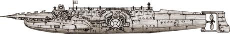 Ishmael,
a student at Anshun University, sent me this Nautilus he drew while
in middle school. The design, with its nicely decorated hull, has a lethal
looking, barbed, raised ram and features a retractable wheelhouse and
lantern. There is a large central viewport, more elaborate than Goff's,
with adjoining ports for the library and dining room, plus arrays of ports in
other rooms, including Nemo's cabin. The dive planes are just forward of
the large viewport and Ishmael has added torpedo tubes on the lower hull just
forward of the planes. Ishmael drew
on many sources when designing this Nautilus: "The deck was from the
book but the general shape, especially the bow, came from the Nautilus
from the Japanese classic anime Nadia, the Secret of Blue Water. The
layout was somewhat from Goff and the large junk-like rudder was from The
League of Extraordinary Gentlemen movie version Sword of the Ocean."
The shape of the main deck lanterns was from a mistaken impression that
the statues on the LXG Nautilus "aft castle" were lanterns like
those on sailing ships. Note the art
deco chambered nautilus just below wheelhouse and the ship name and
"Captain Nemo 1865" can be seen a little further aft. Ishmael
sized this Nautilus 90 meters long, twenty more than the novel.
Ishmael,
a student at Anshun University, sent me this Nautilus he drew while
in middle school. The design, with its nicely decorated hull, has a lethal
looking, barbed, raised ram and features a retractable wheelhouse and
lantern. There is a large central viewport, more elaborate than Goff's,
with adjoining ports for the library and dining room, plus arrays of ports in
other rooms, including Nemo's cabin. The dive planes are just forward of
the large viewport and Ishmael has added torpedo tubes on the lower hull just
forward of the planes. Ishmael drew
on many sources when designing this Nautilus: "The deck was from the
book but the general shape, especially the bow, came from the Nautilus
from the Japanese classic anime Nadia, the Secret of Blue Water. The
layout was somewhat from Goff and the large junk-like rudder was from The
League of Extraordinary Gentlemen movie version Sword of the Ocean."
The shape of the main deck lanterns was from a mistaken impression that
the statues on the LXG Nautilus "aft castle" were lanterns like
those on sailing ships. Note the art
deco chambered nautilus just below wheelhouse and the ship name and
"Captain Nemo 1865" can be seen a little further aft. Ishmael
sized this Nautilus 90 meters long, twenty more than the novel.
 Meinert
Hansen has updated his original design (seen above).
This version, although very much like the first, has a few obvious
differences. The old semi-spherical wheelhouse and its protective arch set
forward has been replaced by a spire-topped cylindrical structure near the aft
end of the deck. The deck itself is longer, starting further forward, and
more obvious than before. Although especially from some vantage points,
the design is still very organic and even shark-like, I think it has a nice
retro-mechanical look, not unlike something from a space opera serial in the
1930s and 40s. See Meinert's images of this Nautilus on Utamo's
Blog.
Meinert
Hansen has updated his original design (seen above).
This version, although very much like the first, has a few obvious
differences. The old semi-spherical wheelhouse and its protective arch set
forward has been replaced by a spire-topped cylindrical structure near the aft
end of the deck. The deck itself is longer, starting further forward, and
more obvious than before. Although especially from some vantage points,
the design is still very organic and even shark-like, I think it has a nice
retro-mechanical look, not unlike something from a space opera serial in the
1930s and 40s. See Meinert's images of this Nautilus on Utamo's
Blog.
 Illustrator
and designer David Herfel, walking the line between Jules Verne's text
and his own artistic vision, has produced this wonderfully detailed Nautilus.
The spindle-shaped hull flares slightly on the sides to smoothly accommodate the
amidships dive planes and horizontal tail fins, which together with the vertical
fins, support a shroud to protect the large, five-bladed propeller. The
narrow but deep keel is similarly faired to the hull. A ladder on the keel
provides access to the airlock hatch on the lower hull, aft. A streamlined
superstructure permits a raised deck so that no part of the hull is visible
during surface running. A boat, inspired by Robert Fulton's Nautilus is
mounted in the deck just aft of midships. The submarine is fitted with
anchors, one forward, port side and one aft and starboard. In addition to
the lantern housing that mimics the wheelhouse at the other end of the deck,
David's design includes lights around the salon windows and the diver hatch,
four lights each around the hull at the bow and stern, and a small lantern on
the superstructure just forward of the deck. This lantern and the two
housings withdraw into the deck for attack, panels close over the salon
windows, and the classically positioned ram is extended forward. The bow
is fitted with serrated rakers for lethality. David has dated his drawing 2000,
but I've placed it here because he has constantly tweaked it over the years and
this represents today's design.
Illustrator
and designer David Herfel, walking the line between Jules Verne's text
and his own artistic vision, has produced this wonderfully detailed Nautilus.
The spindle-shaped hull flares slightly on the sides to smoothly accommodate the
amidships dive planes and horizontal tail fins, which together with the vertical
fins, support a shroud to protect the large, five-bladed propeller. The
narrow but deep keel is similarly faired to the hull. A ladder on the keel
provides access to the airlock hatch on the lower hull, aft. A streamlined
superstructure permits a raised deck so that no part of the hull is visible
during surface running. A boat, inspired by Robert Fulton's Nautilus is
mounted in the deck just aft of midships. The submarine is fitted with
anchors, one forward, port side and one aft and starboard. In addition to
the lantern housing that mimics the wheelhouse at the other end of the deck,
David's design includes lights around the salon windows and the diver hatch,
four lights each around the hull at the bow and stern, and a small lantern on
the superstructure just forward of the deck. This lantern and the two
housings withdraw into the deck for attack, panels close over the salon
windows, and the classically positioned ram is extended forward. The bow
is fitted with serrated rakers for lethality. David has dated his drawing 2000,
but I've placed it here because he has constantly tweaked it over the years and
this represents today's design.
 Richard Svensson built his Nautilus
model from parts from an old Revell Hindenburg
zepellin and other kits. He wanted a submarine that resembled the
original illustrations in the novel and not something fish or monster
like. The three-piece saw-tooth ram almost dominates the forward part
of the hull, but is overwhelmed by the large, bulbous view ports in the same
area. A row of smaller port holes run along the upper aft hull that
terminates in a relatively small centerline propeller. There is a small,
complex deck area amidships. A single ventral fin aft mounts the
rudder. The only other major hull feature is a large, keel-mounted
searchlight. Read Richard's account of the construction, "The
Sword of the Oceans", and see some nice photos and other illustrations
on his blog, "The Lone Animator".
Richard Svensson built his Nautilus
model from parts from an old Revell Hindenburg
zepellin and other kits. He wanted a submarine that resembled the
original illustrations in the novel and not something fish or monster
like. The three-piece saw-tooth ram almost dominates the forward part
of the hull, but is overwhelmed by the large, bulbous view ports in the same
area. A row of smaller port holes run along the upper aft hull that
terminates in a relatively small centerline propeller. There is a small,
complex deck area amidships. A single ventral fin aft mounts the
rudder. The only other major hull feature is a large, keel-mounted
searchlight. Read Richard's account of the construction, "The
Sword of the Oceans", and see some nice photos and other illustrations
on his blog, "The Lone Animator".
 Ron Strickler's Nautilus
has some of Goff's design with its large arched raker but the overall
appearance is more like a retro-style rocket. The arch structure
incorporates the wheelhouse, whose windows create the open arch
impression. A deck extends aft from the wheelhouse structure to a small
hatch aft. There is a short ram on the bow and the hull terminates with a
small rudder. A set of searchlights is mounted in the bow just aft of the
ram and the large view port is circled with lights just aft of amidships.
Ron Strickler's Nautilus
has some of Goff's design with its large arched raker but the overall
appearance is more like a retro-style rocket. The arch structure
incorporates the wheelhouse, whose windows create the open arch
impression. A deck extends aft from the wheelhouse structure to a small
hatch aft. There is a short ram on the bow and the hull terminates with a
small rudder. A set of searchlights is mounted in the bow just aft of the
ram and the large view port is circled with lights just aft of amidships.
 "Techromancer" makes no claim to
Nemo's Nautilus in his short description, but his Victorian Submarine
surely could be. His angular design has a polygon-cross-section hull with
the forward section re-inforced for ramming (making the long spar seem almost
fragile by comparison). The pilot house reminds me of an armored train
that, further protected by a hefty wedge just forward, appears strong enough to
support ram attacks. It has two large ports on its sides and a small one
forward. The small roundhouse that tops it might even be
retractable. The fair-sized, wedge-shaped dive planes are forward of a set
of four circular ports positioned just forward of amidships. The two vertical
fins aft end in a large double rudder. The propulsion mechanism isn't
clear but could be a small prop protected by a polygonal shroud.
"Techromancer" makes no claim to
Nemo's Nautilus in his short description, but his Victorian Submarine
surely could be. His angular design has a polygon-cross-section hull with
the forward section re-inforced for ramming (making the long spar seem almost
fragile by comparison). The pilot house reminds me of an armored train
that, further protected by a hefty wedge just forward, appears strong enough to
support ram attacks. It has two large ports on its sides and a small one
forward. The small roundhouse that tops it might even be
retractable. The fair-sized, wedge-shaped dive planes are forward of a set
of four circular ports positioned just forward of amidships. The two vertical
fins aft end in a large double rudder. The propulsion mechanism isn't
clear but could be a small prop protected by a polygonal shroud.
 C.J.
Leigh's Nautilus, modeled in SketchUp, has a long, somewhat
Victorian-looking spar, mounted at deck height. A narrow web stretching to
the hull supports the spar over most of its length and extends protectively over
the wheelhouse. The hexagonal wheelhouse located at the forward end of the
deck has a round window on five sides, oriented so that one looks forward.
There is a small set of lights atop the structure and the aft side has a hatch
with some stairs ascending to the deck. Squat cylinders on either side
just aft of the wheelhouse may account for the water jets associated with the
“sea monster” in the novel. The deck itself is inset in the hull and has a
solid bulwark over much of its length. There is another hatch slight to
the side at the aft end next to a stair that ascends to a scuppered platform at
the very end. The lantern, similar to but smaller than the wheelhouse, is
located on the platform. The launch is inset in the very aft end,
Goff-style. The Victorian appearance of the hull is enhanced by low
fairings on the sides of the hull that increase in height to accommodate large
oval salon windows, situated at the wheelhouse position, and then narrow again
but transform into horizontal fins near the stern. Large, rectangular dive
planes with an airfoil cross-section are located on the fairings
amidships. There are diving hatches low on the hull sides approximately
amidships. A small four-bladed propeller is mounted below the stern at the
end of a vertical fairing extended from the keel. A semicircular rudder is
situated just aft of the prop.
C.J.
Leigh's Nautilus, modeled in SketchUp, has a long, somewhat
Victorian-looking spar, mounted at deck height. A narrow web stretching to
the hull supports the spar over most of its length and extends protectively over
the wheelhouse. The hexagonal wheelhouse located at the forward end of the
deck has a round window on five sides, oriented so that one looks forward.
There is a small set of lights atop the structure and the aft side has a hatch
with some stairs ascending to the deck. Squat cylinders on either side
just aft of the wheelhouse may account for the water jets associated with the
“sea monster” in the novel. The deck itself is inset in the hull and has a
solid bulwark over much of its length. There is another hatch slight to
the side at the aft end next to a stair that ascends to a scuppered platform at
the very end. The lantern, similar to but smaller than the wheelhouse, is
located on the platform. The launch is inset in the very aft end,
Goff-style. The Victorian appearance of the hull is enhanced by low
fairings on the sides of the hull that increase in height to accommodate large
oval salon windows, situated at the wheelhouse position, and then narrow again
but transform into horizontal fins near the stern. Large, rectangular dive
planes with an airfoil cross-section are located on the fairings
amidships. There are diving hatches low on the hull sides approximately
amidships. A small four-bladed propeller is mounted below the stern at the
end of a vertical fairing extended from the keel. A semicircular rudder is
situated just aft of the prop.
 VFX
Art Director/Designer Mark Dubeau created this Goff-echoing Nautilus
in 2009. The raker arch is flared into a simpler but larger saw-tooth
flange that
is more-or-less mirrored on the lower hull with the combination incorporating the ram.
The saw-tooth and hull are vertically asymmetric with the upper hull taller than
the lower and the side fins set below the centerline. There is a large
salon port and three smaller ports aft. The main hull is somewhat spindle-shaped
but the stern, nearly a quarter of the length, is a narrow grooved cylinder,
with saw-tooth fins and openings similar to the bow structure. The tail
and rudder are very Goff-like but more symmetrical. The wheelhouse is
dwarfed by the towering saw-tooth arch and extends aft with a long beam over the
deck that merges into the smooth stern liens of the superstructure. Of the
present Catalog designs, only Eric Gasper's has a similar structure, although
Tom Martin's second design extends upper raker aft as a solid structure. While retaining
a Goof look, the lower hull evokes the upper superstructure. Ishmael at
Anshun University
thinks that
features like the tall overhanging saw-tooth are inspired by the 1961 Mysterious Island film
Harryhausen Nautilus. He speculates that the small structures in
saw-tooth fin holes might be lights to instill fear during a ramming run.
VFX
Art Director/Designer Mark Dubeau created this Goff-echoing Nautilus
in 2009. The raker arch is flared into a simpler but larger saw-tooth
flange that
is more-or-less mirrored on the lower hull with the combination incorporating the ram.
The saw-tooth and hull are vertically asymmetric with the upper hull taller than
the lower and the side fins set below the centerline. There is a large
salon port and three smaller ports aft. The main hull is somewhat spindle-shaped
but the stern, nearly a quarter of the length, is a narrow grooved cylinder,
with saw-tooth fins and openings similar to the bow structure. The tail
and rudder are very Goff-like but more symmetrical. The wheelhouse is
dwarfed by the towering saw-tooth arch and extends aft with a long beam over the
deck that merges into the smooth stern liens of the superstructure. Of the
present Catalog designs, only Eric Gasper's has a similar structure, although
Tom Martin's second design extends upper raker aft as a solid structure. While retaining
a Goof look, the lower hull evokes the upper superstructure. Ishmael at
Anshun University
thinks that
features like the tall overhanging saw-tooth are inspired by the 1961 Mysterious Island film
Harryhausen Nautilus. He speculates that the small structures in
saw-tooth fin holes might be lights to instill fear during a ramming run.
You can see the full size Nautilus image on Mark Dubeua's web
site. Take a look at some of his other art while you're there.
(Thanks to Ishmael for pointing out this design.)
 After
reading 20,000 Leagues under the
Sea in 2009 a young Alec Griffiths created this Nautilus.
Although it departs from Verne's text in many ways, it remains recognizable and
provides a distinct alternative among the non-Goff designs. The
hull, inspired by one of de Neuville's illustrations, transitions smoothly
from the large ram to a cylindrical middle section. There are no ports or
windows in the hull. The platform atop the hull has two hatches, the center
one serving as the dive hatch. The small boat is set in the hull just aft
of the platform. There are two small lanterns on the hull just forward of
the glass-domed wheelhouse. From there the hull tapers quickly to a small
two-bladed propeller at the stern. Large dive planes are located on either
side of the aft hull and a small rudder is situated just forward of the
prop.
After
reading 20,000 Leagues under the
Sea in 2009 a young Alec Griffiths created this Nautilus.
Although it departs from Verne's text in many ways, it remains recognizable and
provides a distinct alternative among the non-Goff designs. The
hull, inspired by one of de Neuville's illustrations, transitions smoothly
from the large ram to a cylindrical middle section. There are no ports or
windows in the hull. The platform atop the hull has two hatches, the center
one serving as the dive hatch. The small boat is set in the hull just aft
of the platform. There are two small lanterns on the hull just forward of
the glass-domed wheelhouse. From there the hull tapers quickly to a small
two-bladed propeller at the stern. Large dive planes are located on either
side of the aft hull and a small rudder is situated just forward of the
prop.
 Shueisha
Bunko published a paperback Japanese translation of 20,000 Leagues under the
Sea with this Nautilus on the cover.
Shueisha
Bunko published a paperback Japanese translation of 20,000 Leagues under the
Sea with this Nautilus on the cover. Probably a little longer than my rendition here, the design is clearly inspired
by Harper Goff's classic. The ram is very similar with a longer
base. The rakers on the side fairings point backward instead of forward
and continue past the salon window all the way to the tail. Those on the
keel and arch have a more rectangular profile, looking more like razors.
On the keel they extend to the break where Goff placed the dive
hatch. Sets of three blades are set on the upper and lower stern of the
Shueisha Nautilus. The wheelhouse is set farther aft and looks more
like a conning tower with an array of masts. There are two large,
identical hatches under the arch. The salon window is somewhat simplified
from Goff's and there's a smaller, more oval port on the upper hull near the bow
above a small feature that looks like Goff's anchor. I think it's an interesting
take on the Nautilus.
Probably a little longer than my rendition here, the design is clearly inspired
by Harper Goff's classic. The ram is very similar with a longer
base. The rakers on the side fairings point backward instead of forward
and continue past the salon window all the way to the tail. Those on the
keel and arch have a more rectangular profile, looking more like razors.
On the keel they extend to the break where Goff placed the dive
hatch. Sets of three blades are set on the upper and lower stern of the
Shueisha Nautilus. The wheelhouse is set farther aft and looks more
like a conning tower with an array of masts. There are two large,
identical hatches under the arch. The salon window is somewhat simplified
from Goff's and there's a smaller, more oval port on the upper hull near the bow
above a small feature that looks like Goff's anchor. I think it's an interesting
take on the Nautilus.
(Thanks to Lyle Simoneuax for pointing out this design.)
 The clean
lines of Elías Enmanuel Castillo Rivera's spindle-hulled Nautilus
make me think of it as a more Jules Verne-like "Sword of the Sea" than
that in the Extraordinary Gentlemen film. His raised, dagger-like
ram extends to fairing running to the forward end of the deck. A narrow
vertical fin extends the length of the hull aft of the deck. The keel
begins just aft
The clean
lines of Elías Enmanuel Castillo Rivera's spindle-hulled Nautilus
make me think of it as a more Jules Verne-like "Sword of the Sea" than
that in the Extraordinary Gentlemen film. His raised, dagger-like
ram extends to fairing running to the forward end of the deck. A narrow
vertical fin extends the length of the hull aft of the deck. The keel
begins just aft  of the salon window and extends into a similar lower fin.
The vertical fins culminate in a large rudder aft of the prop. These
planes make the Nautilus resemble a prehistoric marine reptile from a top
view. There are
four large diving planes centered amidships, two just aft of the salon window
and two a corresponding distance aft of mid-hull. The small deck is very much as
Verne described it with a low wheelhouse forward, a boat amidships and a lantern
aft. The lantern is mounted on a high tower as the only exception to the
text. Both deck structures can be withdrawn into the hull
for a streamlined attack configuration. With the tall ventral fin Elías has placed just aft of
the deck, his Nautilus the appearance of a monstrous killer whale
when running rigged for attack.
of the salon window and extends into a similar lower fin.
The vertical fins culminate in a large rudder aft of the prop. These
planes make the Nautilus resemble a prehistoric marine reptile from a top
view. There are
four large diving planes centered amidships, two just aft of the salon window
and two a corresponding distance aft of mid-hull. The small deck is very much as
Verne described it with a low wheelhouse forward, a boat amidships and a lantern
aft. The lantern is mounted on a high tower as the only exception to the
text. Both deck structures can be withdrawn into the hull
for a streamlined attack configuration. With the tall ventral fin Elías has placed just aft of
the deck, his Nautilus the appearance of a monstrous killer whale
when running rigged for attack.
 Elías Enmanuel Castillo Rivera
continued to refine his Nautilus and provided me this update. Truer
to the novel, this version replaces the quad diving planes and ventral fin with
a pair of midship-mounted planes. The hull is very much the same
although he's added a scale-like plating. The salon window is now
rectangular and protected by a sliding exterior cover. The ram is
unchanged but the keel and fins have been refined for a more fishlike
silhouette, and
Elías
reduced the rudder height while extending it aft. With smaller pilot house
and lantern and the new railing all retracted into the hull for attacks and the
cleaner fins structure aft, this Nautilus has a more natural sea creature
appearance. This new effort is much more classic in appearance but at the
cost of the quad planes.
Elías Enmanuel Castillo Rivera
continued to refine his Nautilus and provided me this update. Truer
to the novel, this version replaces the quad diving planes and ventral fin with
a pair of midship-mounted planes. The hull is very much the same
although he's added a scale-like plating. The salon window is now
rectangular and protected by a sliding exterior cover. The ram is
unchanged but the keel and fins have been refined for a more fishlike
silhouette, and
Elías
reduced the rudder height while extending it aft. With smaller pilot house
and lantern and the new railing all retracted into the hull for attacks and the
cleaner fins structure aft, this Nautilus has a more natural sea creature
appearance. This new effort is much more classic in appearance but at the
cost of the quad planes.
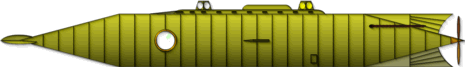 Illustrator
Emilio Amade features this Nautilus in the poster
El Submarino del Futuro from his Jules Verne cutaway series. The
design closely follows Jules Verne's text. There is a three-bladed
center-line ram at the stem of the cylindrical hull. The deck is only a
little more elevated than other novel-consistent designs and has three low
fairing blades at the forward end, perhaps to protect the deck during a ram
attack. My image of the poster is too small to read, but the pilot house
and lantern appear retractable. The large fin-like rudder is controlled by
a chain running from the aft hull. The poster itself appears quite
interesting with considerable background information on period submarine
technology, features of the Nautilus and on the novel. See an image
of the poster here.
Illustrator
Emilio Amade features this Nautilus in the poster
El Submarino del Futuro from his Jules Verne cutaway series. The
design closely follows Jules Verne's text. There is a three-bladed
center-line ram at the stem of the cylindrical hull. The deck is only a
little more elevated than other novel-consistent designs and has three low
fairing blades at the forward end, perhaps to protect the deck during a ram
attack. My image of the poster is too small to read, but the pilot house
and lantern appear retractable. The large fin-like rudder is controlled by
a chain running from the aft hull. The poster itself appears quite
interesting with considerable background information on period submarine
technology, features of the Nautilus and on the novel. See an image
of the poster here.
See more artwork featuring this Nautilus here,
illustrating the creative process.
 Artists
are faced with the problem of presenting something different when doing
covers for new editions of 20,000 Leagues under the Sea. Freelance
illustrator Nitzan Klamer (kipizki) created this Nautilus for a
art project cover. Klamer has retained his own distinctive style while
evoking Verne in a way that doesn't repeat elements of the well-known Goff
version, and doesn't look too much like a modern submarine. The simplified
image here is missing the artist's details and the context of the cover
art. See the full cover illustration here.
Artists
are faced with the problem of presenting something different when doing
covers for new editions of 20,000 Leagues under the Sea. Freelance
illustrator Nitzan Klamer (kipizki) created this Nautilus for a
art project cover. Klamer has retained his own distinctive style while
evoking Verne in a way that doesn't repeat elements of the well-known Goff
version, and doesn't look too much like a modern submarine. The simplified
image here is missing the artist's details and the context of the cover
art. See the full cover illustration here.
 This
Nautilus by Eddi Haskell wasn't shown as a submarine at all but as the
oversized gondola of an airship in an image titled "Steampunk Airship over
Caledon Rothesay". Still the image looked to me enough like a
submarine being transferred by airship that I've included it in the
catalog. There is a definite ram at the bow and overlapping arches leading
up to an unprotected glass bridge (wheelhouse). A railed deck extends over
the center hull with a pair of what may be mortars at the aft end. The
tail or stern is certainly airship-like but still not outlandish compared to
some Nautilus designs here. There appear to be glassed-in
observation platforms on either side of the lower hull.
This
Nautilus by Eddi Haskell wasn't shown as a submarine at all but as the
oversized gondola of an airship in an image titled "Steampunk Airship over
Caledon Rothesay". Still the image looked to me enough like a
submarine being transferred by airship that I've included it in the
catalog. There is a definite ram at the bow and overlapping arches leading
up to an unprotected glass bridge (wheelhouse). A railed deck extends over
the center hull with a pair of what may be mortars at the aft end. The
tail or stern is certainly airship-like but still not outlandish compared to
some Nautilus designs here. There appear to be glassed-in
observation platforms on either side of the lower hull.
 Justin
Oaksford's Nautilus has an industrial look and a streamlined shape
unlike any of the others featured here. Per his words, Justin "tried
to make it cool, but still within the descriptions of the book". His Nautilus
has a flat, possibly two-level upper hull and a gracefully tapered lower hull,
narrower at the bow and thicker at the stern. There is more a sloping
raker structure a short distance further aft on top of the hull. As Wayne
O. pointed out to me, the raker appears to slide forward and down to form a
beaklike ram. The upper hull sweeps straight back more than half the
boat's length to the second level section that starts with a large hemispherical
globe on each side. These are likely pilothouse windows. Further aft
a small superstructure rises from the deck and then slopes back to the hull that
curves down to the
Justin
Oaksford's Nautilus has an industrial look and a streamlined shape
unlike any of the others featured here. Per his words, Justin "tried
to make it cool, but still within the descriptions of the book". His Nautilus
has a flat, possibly two-level upper hull and a gracefully tapered lower hull,
narrower at the bow and thicker at the stern. There is more a sloping
raker structure a short distance further aft on top of the hull. As Wayne
O. pointed out to me, the raker appears to slide forward and down to form a
beaklike ram. The upper hull sweeps straight back more than half the
boat's length to the second level section that starts with a large hemispherical
globe on each side. These are likely pilothouse windows. Further aft
a small superstructure rises from the deck and then slopes back to the hull that
curves down to the stern. On the lower hull there is a small lantern attached to the hull
bottom a short distance back from the bow. About a third of the way
sternward several large cylindrical structures are attached to the hull bottom
and what may be a large rectangular window or perhaps just a lighted panel is
situated higher up. There is a more conventional circular port low on the
hull about two thirds of the way back. A large scoop is apparent on the
hull side just forward of the unconventional propulsion section. A rudder
is mounted on the bottom of the upper hull near the stern. See Justin Oaksford's
finely detailed illustration of his Nautilus at DeviantArt.
stern. On the lower hull there is a small lantern attached to the hull
bottom a short distance back from the bow. About a third of the way
sternward several large cylindrical structures are attached to the hull bottom
and what may be a large rectangular window or perhaps just a lighted panel is
situated higher up. There is a more conventional circular port low on the
hull about two thirds of the way back. A large scoop is apparent on the
hull side just forward of the unconventional propulsion section. A rudder
is mounted on the bottom of the upper hull near the stern. See Justin Oaksford's
finely detailed illustration of his Nautilus at DeviantArt.
 This
sleek, modern Nautilus by senior digital modeler Michael Meyers
pays homage to Harper Goff, but is clearly designed as a giant shark.
Goff's ram has been smoothed down to a spike and the long, sweeping raker arch
is now almost half the
This
sleek, modern Nautilus by senior digital modeler Michael Meyers
pays homage to Harper Goff, but is clearly designed as a giant shark.
Goff's ram has been smoothed down to a spike and the long, sweeping raker arch
is now almost half the  length of the boat and studded with shark's teeth. The Victorian
wheelhouse is faired into the shark's body hull, with organically shaped windows
forward. The circular side windows recall the original wheelhouse but also
Goff's salon windows. The dorsal and tail fins are there, perhaps a little
less streamlined than Goff's. Meyers has opened up the bow with a set of
monster-eye windows. Is this Nemo's salon? Further aft, the large gills
must be intakes for some advanced propulsion system, evidenced by the
un-shark-like cylinders on the tail. Otherwise the giant shark appearance
is enhanced by three pairs of fins from the largest, well forward of amidships,
to the tail. The dorsal fin is complemented by a smaller ventral fin
below. There are three relatively small circular windows on the hull where
one might expect the salon and a larger one slightly farther aft on the lower
hull. Overall, the appearance is less threatening than graceful but
powerful, a beautiful sea monster. See Meyers' original concept art here.
length of the boat and studded with shark's teeth. The Victorian
wheelhouse is faired into the shark's body hull, with organically shaped windows
forward. The circular side windows recall the original wheelhouse but also
Goff's salon windows. The dorsal and tail fins are there, perhaps a little
less streamlined than Goff's. Meyers has opened up the bow with a set of
monster-eye windows. Is this Nemo's salon? Further aft, the large gills
must be intakes for some advanced propulsion system, evidenced by the
un-shark-like cylinders on the tail. Otherwise the giant shark appearance
is enhanced by three pairs of fins from the largest, well forward of amidships,
to the tail. The dorsal fin is complemented by a smaller ventral fin
below. There are three relatively small circular windows on the hull where
one might expect the salon and a larger one slightly farther aft on the lower
hull. Overall, the appearance is less threatening than graceful but
powerful, a beautiful sea monster. See Meyers' original concept art here.
 Here's
another Nautilus design by Michael Meyers. Clearly in the
form of a shark, this Nautilus might be the lower-tech predecessor of his
sleek design above. It has three eight-bladed propellers, a large one in
the tail and a smaller side-by-side pair below the aft hull. There appears
to be a circular window (not visible in the graphic) at the forward end of the
superstructure where we'd expect the wheelhouse. I'm not sure of my interpretation
but there may be a round port in the hull above the pectoral fins and three
smaller ports farther aft. There's not much of Verne in this design, but
it is surely a monster of the deep.
Here's
another Nautilus design by Michael Meyers. Clearly in the
form of a shark, this Nautilus might be the lower-tech predecessor of his
sleek design above. It has three eight-bladed propellers, a large one in
the tail and a smaller side-by-side pair below the aft hull. There appears
to be a circular window (not visible in the graphic) at the forward end of the
superstructure where we'd expect the wheelhouse. I'm not sure of my interpretation
but there may be a round port in the hull above the pectoral fins and three
smaller ports farther aft. There's not much of Verne in this design, but
it is surely a monster of the deep.
 I
found Ruby White's partial Nautilus during a periodic sweep for
new designs. Ruby White Enterprises produced the image, which can be seen
on their web
site, as an example
I
found Ruby White's partial Nautilus during a periodic sweep for
new designs. Ruby White Enterprises produced the image, which can be seen
on their web
site, as an example  illustration for
20,000 Leagues under the Sea, hoping to interest a publisher. The
image doesn't show the bow, nor is the salon window area visible, but what is
there is interesting. The hull is more or less spindle shaped and
constructed of overlapping plates, not unlike my design. Large dive planes
appear to be mounted a little aft of amidships. The rudder isn't visible
but the large propeller breaks the surface, as described in the novel. The
deck details are most interesting. Instead of a wheelhouse there are four
small observation domes set in a line fore and aft. These appear to be
retractable, the openings covered by half shell sliding plates on either
side. There is a small deck and hatch amidships. The launch is set
into the hull nearby, on the port side.
illustration for
20,000 Leagues under the Sea, hoping to interest a publisher. The
image doesn't show the bow, nor is the salon window area visible, but what is
there is interesting. The hull is more or less spindle shaped and
constructed of overlapping plates, not unlike my design. Large dive planes
appear to be mounted a little aft of amidships. The rudder isn't visible
but the large propeller breaks the surface, as described in the novel. The
deck details are most interesting. Instead of a wheelhouse there are four
small observation domes set in a line fore and aft. These appear to be
retractable, the openings covered by half shell sliding plates on either
side. There is a small deck and hatch amidships. The launch is set
into the hull nearby, on the port side.
 Oceanology:
The True Account of the Voyage of the Nautilus includes this
unique design. Some elements are reminiscent of Harper Goff's but the
overall impression is very different.
Oceanology:
The True Account of the Voyage of the Nautilus includes this
unique design. Some elements are reminiscent of Harper Goff's but the
overall impression is very different.  The
large perforated raker arch extends will past the midpoint to the large
hexagonal wheelhouse. The external platform atop the wheelhouse has
several rail-mounted searchlights and a periscope. The deck extends all
the way aft and includes a hatch and launch. The hull has a large salon
window amidships but also several smaller portholes. An interior drawing
included in the book shows four in the library, two in Nemo's cabin and one in
his study, and six in the diving chamber. That chamber is not for divers
but for a spherical miniature submarine called the Nautosphere. The
divers exit via the deck hatch, which has its own airlock. There appear to
be two small lights on the bottom forward hull in addition to large forward
looking searchlights faired into the hull alongside the massive and intricate
ram. Incidentally, in this account Nemo tells the main character, a young
boy, that the ram is intended for defense. The lethal silhouette of this Nautilus
belies that statement. The submarine is equipped with a single propeller
mounted under the hull and a set of large dive planes mounted well aft of
amidships.
The
large perforated raker arch extends will past the midpoint to the large
hexagonal wheelhouse. The external platform atop the wheelhouse has
several rail-mounted searchlights and a periscope. The deck extends all
the way aft and includes a hatch and launch. The hull has a large salon
window amidships but also several smaller portholes. An interior drawing
included in the book shows four in the library, two in Nemo's cabin and one in
his study, and six in the diving chamber. That chamber is not for divers
but for a spherical miniature submarine called the Nautosphere. The
divers exit via the deck hatch, which has its own airlock. There appear to
be two small lights on the bottom forward hull in addition to large forward
looking searchlights faired into the hull alongside the massive and intricate
ram. Incidentally, in this account Nemo tells the main character, a young
boy, that the ram is intended for defense. The lethal silhouette of this Nautilus
belies that statement. The submarine is equipped with a single propeller
mounted under the hull and a set of large dive planes mounted well aft of
amidships.
 Peter
Findley, a television production designer who understands that a sleek,
simple submarine will look dull on screen, created this Nautilus that is
anything but dull. His organic design has many flat planes, unexpected
curves, and odd geometric shapes. The long sharp and strong nose (let's
think of this as a monster) but complex, detailed stern give the impression of a
vessel with a purpose. It's brutish and lethal in some ways, but, noticing
the large windows on its bottom, capable of benign observation and research as
well, not unlike Captain Nemo himself. The spar has a spiral form that
looks like razor wire and merges cleanly into an amorphous hull. There is
no wheelhouse,
Peter
Findley, a television production designer who understands that a sleek,
simple submarine will look dull on screen, created this Nautilus that is
anything but dull. His organic design has many flat planes, unexpected
curves, and odd geometric shapes. The long sharp and strong nose (let's
think of this as a monster) but complex, detailed stern give the impression of a
vessel with a purpose. It's brutish and lethal in some ways, but, noticing
the large windows on its bottom, capable of benign observation and research as
well, not unlike Captain Nemo himself. The spar has a spiral form that
looks like razor wire and merges cleanly into an amorphous hull. There is
no wheelhouse,  but large forward-looking windows at the waterline - the eyes of the
beast. There is a small circular deck near amidships, forward of a large
unexplained superstructure. Much of this submarine defies
explanation. The propulsion mechanism isn't clear, but the large vertical
and horizontal fins imply its motion is controlled with strength. The
large observation windows on the lower forward hull - the grinning mouth of the
beast - provide a panoramic view. Further aft, there are three small dome
ports on the side and a large downward-looking dome on the bottom. See
more of Peter's creation here.
but large forward-looking windows at the waterline - the eyes of the
beast. There is a small circular deck near amidships, forward of a large
unexplained superstructure. Much of this submarine defies
explanation. The propulsion mechanism isn't clear, but the large vertical
and horizontal fins imply its motion is controlled with strength. The
large observation windows on the lower forward hull - the grinning mouth of the
beast - provide a panoramic view. Further aft, there are three small dome
ports on the side and a large downward-looking dome on the bottom. See
more of Peter's creation here.
 "Reitsuki
Kojima" has created this faithful Nautilus in the Vernian Sea
of Second Life. His design has a long, barbed, triangular ram.
Except for the slightly angled bow, the hull is spindle-shaped. The salon
windows are inset behind protective sliding exterior panels. There a a
pair of airfoil shaped diving planes amidships. The tail consists of thick
vertical and horizontal fins that support a protective ring around the large
four-bladed propeller and a large rudder aft of the prop. The deck has
identical retractable four-sided structures for the wheelhouse and
lantern. Each has a larger plate at the top to compensate for the tapered
shape and a circular glass on each side. There is a launch in the deck
just forward of amidships. Reitsuki has included an interior that
resembles that of my original design, with slanting upper
walls covered with classical paintings. Thanks very much to Hajime
Nishimura who brought this Nautilus to my attention.
"Reitsuki
Kojima" has created this faithful Nautilus in the Vernian Sea
of Second Life. His design has a long, barbed, triangular ram.
Except for the slightly angled bow, the hull is spindle-shaped. The salon
windows are inset behind protective sliding exterior panels. There a a
pair of airfoil shaped diving planes amidships. The tail consists of thick
vertical and horizontal fins that support a protective ring around the large
four-bladed propeller and a large rudder aft of the prop. The deck has
identical retractable four-sided structures for the wheelhouse and
lantern. Each has a larger plate at the top to compensate for the tapered
shape and a circular glass on each side. There is a launch in the deck
just forward of amidships. Reitsuki has included an interior that
resembles that of my original design, with slanting upper
walls covered with classical paintings. Thanks very much to Hajime
Nishimura who brought this Nautilus to my attention.
 3D
modeler, illustrator and artist Peter Pohle created this design. Although not
explicitly identified as the Nautilus, I include it here because it looks
like
3D
modeler, illustrator and artist Peter Pohle created this design. Although not
explicitly identified as the Nautilus, I include it here because it looks
like  the Nautilus. The design has only a small pointed ram, but a
large, Goff-like raker arch extends from the bow to the forward edge of the
raised deck. The hull has a long dive plane on the side of the bow and a
large circular window amidships, flanked by two large but narrow ports. Small vertical and horizontal fins frame a five-bladed propeller and support a
large rudder at the stern. A fairly large keel is visible on the bottom of the
hull. The deck includes a low conning tower aft of what are probably a
non-Vernian periscope and snorkel. There appears to be a small boat at the
aft end, very like Goff's.
the Nautilus. The design has only a small pointed ram, but a
large, Goff-like raker arch extends from the bow to the forward edge of the
raised deck. The hull has a long dive plane on the side of the bow and a
large circular window amidships, flanked by two large but narrow ports. Small vertical and horizontal fins frame a five-bladed propeller and support a
large rudder at the stern. A fairly large keel is visible on the bottom of the
hull. The deck includes a low conning tower aft of what are probably a
non-Vernian periscope and snorkel. There appears to be a small boat at the
aft end, very like Goff's.
The original
Flash animation is no longer on Peter Pohle's web
site so I've included a small capture from it.
 The
2009 Library of Wonder edition of Jules Verne Extraordinary Voyages,
published by Falls Press includes Nate Pride's illustrations of the Nautilus.
This design has a sleek spindle hull with double salon windows. The ram is
set high on the bow, and faired into a forward fin. This fairing extends
at the stern into streamlined vertical and horizontal fins. The low
wheelhouse sits just forward of a retractable lantern.
The
2009 Library of Wonder edition of Jules Verne Extraordinary Voyages,
published by Falls Press includes Nate Pride's illustrations of the Nautilus.
This design has a sleek spindle hull with double salon windows. The ram is
set high on the bow, and faired into a forward fin. This fairing extends
at the stern into streamlined vertical and horizontal fins. The low
wheelhouse sits just forward of a retractable lantern.
 John
Martinez
created this classic Nautilus. The hull is a cylinder, tapered
John
Martinez
created this classic Nautilus. The hull is a cylinder, tapered  at
the ends, with a brutal and massive triangular ram positioned above the
centerline. A rectangular window is set into the lower hull in the
approximate salon location per the novel's text and dive planes at the
centerline amidships. There are horizontal fins on the after part of the
hull and a large four-bladed prop at the end of the hull. A rudder is set
below the hull aft, although its details are not visible in Martinez'
image. A long, low deck atop the hull amidships has a modest pilothouse
with a large circular port forward and two smaller ports on the sides. In
one image its profile is triangular but in another appears trapezoidal.
The launch is located at the center and a forward shining lantern at the aft
end. See a complete
image of this Nautilus and another on
the surface in John's gallery (as dragonpyper) at DeviantArt.
at
the ends, with a brutal and massive triangular ram positioned above the
centerline. A rectangular window is set into the lower hull in the
approximate salon location per the novel's text and dive planes at the
centerline amidships. There are horizontal fins on the after part of the
hull and a large four-bladed prop at the end of the hull. A rudder is set
below the hull aft, although its details are not visible in Martinez'
image. A long, low deck atop the hull amidships has a modest pilothouse
with a large circular port forward and two smaller ports on the sides. In
one image its profile is triangular but in another appears trapezoidal.
The launch is located at the center and a forward shining lantern at the aft
end. See a complete
image of this Nautilus and another on
the surface in John's gallery (as dragonpyper) at DeviantArt.
 I
don't know who designed this somewhat whimsical Nautilus,
exhibited as a working, steam-powered, surface-running, radio-controlled model
at the Cabin Fever
Expo in York, Pennsylvania in January 2010. The fishlike design
features a spindle hull with fins galore. There is a small organic,
possibly spiral ram at the bow. A small wheelhouse with two windows is set
on the upper hull a good ways forward of the recessed deck. The deck
features a beefy periscope (actually the model's smokestack), railings on each
side, and a circular hatch. The tail fin terminates in the rudder, and
there are two pairs of dive planes, one well forward of the circular salon
window and the other pair well aft. A small prop is mounted on the
trailing edge of the aft-most ventral fin. You can see several photos of
the model at Vilseskogen's Cabin Fever Expo photo set
on
I
don't know who designed this somewhat whimsical Nautilus,
exhibited as a working, steam-powered, surface-running, radio-controlled model
at the Cabin Fever
Expo in York, Pennsylvania in January 2010. The fishlike design
features a spindle hull with fins galore. There is a small organic,
possibly spiral ram at the bow. A small wheelhouse with two windows is set
on the upper hull a good ways forward of the recessed deck. The deck
features a beefy periscope (actually the model's smokestack), railings on each
side, and a circular hatch. The tail fin terminates in the rudder, and
there are two pairs of dive planes, one well forward of the circular salon
window and the other pair well aft. A small prop is mounted on the
trailing edge of the aft-most ventral fin. You can see several photos of
the model at Vilseskogen's Cabin Fever Expo photo set
on
 .
.
 This
is William Wardrop's interpretation of the Nautilus from The
Secret Sea by Thomas F. Monteleon. Wardrop says his design is based on
Goff's with some features of Harryhausen's Mysterious Island Nautilus
and a WW I U-Boat. The submarine is richly riveted, much more heavily than
the Goff classic, and the dual serrated arches on each side of the wedge-shaped
wheelhouse are more impressive than Harryhausen's. The hull is a cylinder
with tapered ends with a large oval salon window amidships. There are two
lights extending from the hull below the window. A smaller porthole is set
in the upper side of the aft hull. The stern has a symmetrical fishtail
with a two-part rudder above and below the centerline prop. There are
"pectoral fin" dive planes and likely a second set on the trailing
edge of the horizontal fins just forward of the tail. A scuppered
superstructure atop the hull includes a sloped deck forward and a large flat
deck with two hatches aft, a serrated Goff dorsal fin and a 70mm U-Boat deck
gun. Wardrop's back story on the addition of the gun is that Impey Barbican,
president of the Baltimore Gun Club in Jules Verne's From the Earth to the
Moon, made it for Nemo. The wheelhouse has two large ports on its sharply
angled forward sides. A large lantern is mounted just forward of the
ports. Different from Goff's anchor arangement, there is an anchor high on
the upper forward hull with a track below to guide it away from the hull.
A diving hatch on the lower hull is protected by an guard frame.
This
is William Wardrop's interpretation of the Nautilus from The
Secret Sea by Thomas F. Monteleon. Wardrop says his design is based on
Goff's with some features of Harryhausen's Mysterious Island Nautilus
and a WW I U-Boat. The submarine is richly riveted, much more heavily than
the Goff classic, and the dual serrated arches on each side of the wedge-shaped
wheelhouse are more impressive than Harryhausen's. The hull is a cylinder
with tapered ends with a large oval salon window amidships. There are two
lights extending from the hull below the window. A smaller porthole is set
in the upper side of the aft hull. The stern has a symmetrical fishtail
with a two-part rudder above and below the centerline prop. There are
"pectoral fin" dive planes and likely a second set on the trailing
edge of the horizontal fins just forward of the tail. A scuppered
superstructure atop the hull includes a sloped deck forward and a large flat
deck with two hatches aft, a serrated Goff dorsal fin and a 70mm U-Boat deck
gun. Wardrop's back story on the addition of the gun is that Impey Barbican,
president of the Baltimore Gun Club in Jules Verne's From the Earth to the
Moon, made it for Nemo. The wheelhouse has two large ports on its sharply
angled forward sides. A large lantern is mounted just forward of the
ports. Different from Goff's anchor arangement, there is an anchor high on
the upper forward hull with a track below to guide it away from the hull.
A diving hatch on the lower hull is protected by an guard frame.
See photos of this blue Nautilus on
Wardrop's Steam
Noir web site.
 Mike
Gonzales (AlphaRed6) posted his concept Nemo's second
Nautilus at NautilusSubmarine.com. He thinks it would have been a
research vessel rather than a war machine, for as "Nemo aged his temper
cooled, his thirst for revenge was sated". Mike says the new Nautilus
would be several times larger, but I've rendered his image at Verne's
length. The design is clearly recognizable as Harper Goff's classic
concept even with the significant changes. The ram is gone with a light
mounted at the prow in its place. The characteristic arch and rakers are
all gone. this Nautilus would suffer damage in a collision. the original
alligator eyes atop the wheel house now comprise Verne's lantern. The
barbed dorsal fin is gone from the longer deck, now adorned with railings.
the submarine now has two anchors to handle the longer hull, and finally the
salon is much larger, with two pairs of windows. Or perhaps the reformed
Nemo has provided a lounge for his crew with the same outside view.
Mike
Gonzales (AlphaRed6) posted his concept Nemo's second
Nautilus at NautilusSubmarine.com. He thinks it would have been a
research vessel rather than a war machine, for as "Nemo aged his temper
cooled, his thirst for revenge was sated". Mike says the new Nautilus
would be several times larger, but I've rendered his image at Verne's
length. The design is clearly recognizable as Harper Goff's classic
concept even with the significant changes. The ram is gone with a light
mounted at the prow in its place. The characteristic arch and rakers are
all gone. this Nautilus would suffer damage in a collision. the original
alligator eyes atop the wheel house now comprise Verne's lantern. The
barbed dorsal fin is gone from the longer deck, now adorned with railings.
the submarine now has two anchors to handle the longer hull, and finally the
salon is much larger, with two pairs of windows. Or perhaps the reformed
Nemo has provided a lounge for his crew with the same outside view.
~ c. 2010 ~
 Chuck
Messer sent me photos of his Nautilus model "inspired by the
Verne novel and the look of several 19th century submarines, including the Hunley
and the USS Alligator". Chuck's design has a spindle hull
with a long tapered ram strengthened by three ribs to form a triangular
cross-section. There are large dive planes mounted a little forward of
amidships, a circular salon window just aft, and long, narrow vertical and
horizontal tail fins that end in a double rudder and additional planes. A
large four-bladed propeller is set at the very end of the hull. The large
wheelhouse has four small ports, the forward one between a double cutwater not
unlike some of the early, inaccurate depictions of the Hunley. The
lantern structure is smaller, with two forward facing lights on each side of a
single, more accurately Hunley-like cutwater. The Hunley cutwaters
were intended to prevent the hatch towers form hanging up on defensive
cables. here they provide protection in a ram attack. The low deck
between these structures has a launch set deep into the center.
Chuck
Messer sent me photos of his Nautilus model "inspired by the
Verne novel and the look of several 19th century submarines, including the Hunley
and the USS Alligator". Chuck's design has a spindle hull
with a long tapered ram strengthened by three ribs to form a triangular
cross-section. There are large dive planes mounted a little forward of
amidships, a circular salon window just aft, and long, narrow vertical and
horizontal tail fins that end in a double rudder and additional planes. A
large four-bladed propeller is set at the very end of the hull. The large
wheelhouse has four small ports, the forward one between a double cutwater not
unlike some of the early, inaccurate depictions of the Hunley. The
lantern structure is smaller, with two forward facing lights on each side of a
single, more accurately Hunley-like cutwater. The Hunley cutwaters
were intended to prevent the hatch towers form hanging up on defensive
cables. here they provide protection in a ram attack. The low deck
between these structures has a launch set deep into the center.
 This
is graphic designer Tarek Shamas' impression of the Nautilus,
drawing after reading the novel. I think he let his imagination run free because
there's little of Verne's description apparent. He has started with a
conventional submarine form, adding considerable ornamentation. There is a
large observation window on the lower bow and what may be spiral-iris-protected
ports higher on the forward hull. The wheelhouse is realized as a conning
tower with an observation deck, ports on each side, and possibly a
forward-facing searchlight. Either a rounded bump on the forward deck or
another on the upper aft hull might be the canot. There is a tall tail fin
but no obvious dive planes. This Nautilus has a large spiral screw
propeller and large scoops on the sides of the lower hull, hinting at an
innovative propulsion system. See Tarek's original art on his web site here.
This
is graphic designer Tarek Shamas' impression of the Nautilus,
drawing after reading the novel. I think he let his imagination run free because
there's little of Verne's description apparent. He has started with a
conventional submarine form, adding considerable ornamentation. There is a
large observation window on the lower bow and what may be spiral-iris-protected
ports higher on the forward hull. The wheelhouse is realized as a conning
tower with an observation deck, ports on each side, and possibly a
forward-facing searchlight. Either a rounded bump on the forward deck or
another on the upper aft hull might be the canot. There is a tall tail fin
but no obvious dive planes. This Nautilus has a large spiral screw
propeller and large scoops on the sides of the lower hull, hinting at an
innovative propulsion system. See Tarek's original art on his web site here.
 Designer
Tim Delaney of Walt Disney Imagineering created this updated version of
Harper Goff's original Nautilus. It appears to be closer in length
to Verne and otherwise moves the Nautilus technology into the
next century. Tim has retained the spar and raker arches almost unchanged
but added vents to the lower forward hull. The wheelhouse is much more
streamlined and faired to a much larger dorsal fin giving a more organic
appearance than the original. The aft hatch may still be there but if so
its construction is very different. The lower diving hatch, if retained,
is also very different. The salon window frame is elongated and the tail
fins longer and more streamlined. The biggest change is in the propulsion
technology. Tim has replaced the prop with a jet system, including a
smaller version on the keel and there may be maneuvering fans in the keel and
lower fin. (Thanks to Wade
Watson on NautilusSubmarine.com.)
Designer
Tim Delaney of Walt Disney Imagineering created this updated version of
Harper Goff's original Nautilus. It appears to be closer in length
to Verne and otherwise moves the Nautilus technology into the
next century. Tim has retained the spar and raker arches almost unchanged
but added vents to the lower forward hull. The wheelhouse is much more
streamlined and faired to a much larger dorsal fin giving a more organic
appearance than the original. The aft hatch may still be there but if so
its construction is very different. The lower diving hatch, if retained,
is also very different. The salon window frame is elongated and the tail
fins longer and more streamlined. The biggest change is in the propulsion
technology. Tim has replaced the prop with a jet system, including a
smaller version on the keel and there may be maneuvering fans in the keel and
lower fin. (Thanks to Wade
Watson on NautilusSubmarine.com.)
 Jaime
Campbell based this Nautilus design on some early drawings and his
own ideas. He sees the pilothouse as an integral part of the deck,
sticking up just 4 or 5 feet above the actual deck level. He locates the
lantern and the boat on the deck as a single platform; the boat simply
launches from the structure while submerged. He places an additional
4-foot porthole in Nemo’s cabin. Jaime keeps much of the the look of
Harper Goff's bow except for the fore-mentioned changes and more barbing on the
spar. The salon window is closer to Verne's description, there is a single
dive plane amidships, and the hull is longer, but otherwise retains a number of
Goff's features.
Jaime
Campbell based this Nautilus design on some early drawings and his
own ideas. He sees the pilothouse as an integral part of the deck,
sticking up just 4 or 5 feet above the actual deck level. He locates the
lantern and the boat on the deck as a single platform; the boat simply
launches from the structure while submerged. He places an additional
4-foot porthole in Nemo’s cabin. Jaime keeps much of the the look of
Harper Goff's bow except for the fore-mentioned changes and more barbing on the
spar. The salon window is closer to Verne's description, there is a single
dive plane amidships, and the hull is longer, but otherwise retains a number of
Goff's features.
 If
Nemo had used steam power, Peter
Pohle's steam-powered Steampunk Submarine could have been the Nautilus.
The spindle hull, made of distinctly non-Vernian wood, is very like Monturiol's Ictineo II.
It is reinforced with a steel frame and has a blunt but heavy-looking metal ram
on the forward end. There are dive planes located in the side frame a
short distance aft of the prow and a second set is set in horizontal fins at the
stern. The large centerline nine-bladed propeller is protected by these
fins and a vertical set that supports a large rudder. In addition to the a
large salon window approximately amidships, there are small observation domes
near the bow and two rows of ports along the hull side. The forward end of the
deck is decorated with an ornate Hippocampus figurehead. A graceful raker
arch, perhaps a nod to Harper Goff, protects the figurehead and a small
observation dome. The deck extends to an elaborate conning tower that
incorporates a ship's-bridge-like wheelhouse at deck level and the steam plant
with three capped smoke stacks, tall enough that the submarine could run
submerged near the surface with operating boilers. The stacks would be
vulnerable in a full ram attack (as would be much of the superstructure) but
could perhaps be retracted into the hull. Peter's conception of the launch
as a mini-submarine set into the deck aft of the power plant is only a minor
extension of Verne's. Peter has realized it as a small explorer submarine
that very much reminds me of the excursion pods of 2001A Space Odyssey's Discovery.
Like Nemo's canot, it can be entered from within the main submarine via a hatch
in its lower hull.
If
Nemo had used steam power, Peter
Pohle's steam-powered Steampunk Submarine could have been the Nautilus.
The spindle hull, made of distinctly non-Vernian wood, is very like Monturiol's Ictineo II.
It is reinforced with a steel frame and has a blunt but heavy-looking metal ram
on the forward end. There are dive planes located in the side frame a
short distance aft of the prow and a second set is set in horizontal fins at the
stern. The large centerline nine-bladed propeller is protected by these
fins and a vertical set that supports a large rudder. In addition to the a
large salon window approximately amidships, there are small observation domes
near the bow and two rows of ports along the hull side. The forward end of the
deck is decorated with an ornate Hippocampus figurehead. A graceful raker
arch, perhaps a nod to Harper Goff, protects the figurehead and a small
observation dome. The deck extends to an elaborate conning tower that
incorporates a ship's-bridge-like wheelhouse at deck level and the steam plant
with three capped smoke stacks, tall enough that the submarine could run
submerged near the surface with operating boilers. The stacks would be
vulnerable in a full ram attack (as would be much of the superstructure) but
could perhaps be retracted into the hull. Peter's conception of the launch
as a mini-submarine set into the deck aft of the power plant is only a minor
extension of Verne's. Peter has realized it as a small explorer submarine
that very much reminds me of the excursion pods of 2001A Space Odyssey's Discovery.
Like Nemo's canot, it can be entered from within the main submarine via a hatch
in its lower hull.
This Nautilus is available as a 3D model at TurboSquid.
The TurboSquid page illustrates many features of the design.
 "Balsavor"
(Aaron Godwin) posted this organic Nautilus at DeviantArt
as a work-in-progress. I see superficial similarity to Christian Zaber's above,
but at the next level it is very different. Rather than Goff's legacy
sawtooth rakers, it has rows of small dorsal fins (although there may be rakers
along the side), slightly reminiscent of the Michael Caine TV film
version. At least two large windows are visible. The lower one
surely is in the salon for underwater viewing. If the upper one is for
surface running it would be dramatically near the waterline and would place the
lethal ram far above it. The conical ribbon impeller screw, a little like
Hansen's much larger versions, nicely complements the
lines and interruptions of the design. Overall the impression is dangerous
but graceful. See Godwin's full size image at DeviantArt.
"Balsavor"
(Aaron Godwin) posted this organic Nautilus at DeviantArt
as a work-in-progress. I see superficial similarity to Christian Zaber's above,
but at the next level it is very different. Rather than Goff's legacy
sawtooth rakers, it has rows of small dorsal fins (although there may be rakers
along the side), slightly reminiscent of the Michael Caine TV film
version. At least two large windows are visible. The lower one
surely is in the salon for underwater viewing. If the upper one is for
surface running it would be dramatically near the waterline and would place the
lethal ram far above it. The conical ribbon impeller screw, a little like
Hansen's much larger versions, nicely complements the
lines and interruptions of the design. Overall the impression is dangerous
but graceful. See Godwin's full size image at DeviantArt.
 This
is another design from Leelan Lampkins. Like his other versions
this Nautilus is adapted from Greg Sharpe's plan.
As before Leelan has raised the ram. The wheelhouse and dive planes are
like Greg's but the lantern is different. He's added an anchor, moved the salon
window forward and added a ring of lights. The stern has noticeable
changes, particularly the symmetrical vertical fins. See a detailed plan
of this Nautilus at DeviantArt
and see Leelan's earlier versions here and here.
This
is another design from Leelan Lampkins. Like his other versions
this Nautilus is adapted from Greg Sharpe's plan.
As before Leelan has raised the ram. The wheelhouse and dive planes are
like Greg's but the lantern is different. He's added an anchor, moved the salon
window forward and added a ring of lights. The stern has noticeable
changes, particularly the symmetrical vertical fins. See a detailed plan
of this Nautilus at DeviantArt
and see Leelan's earlier versions here and here.
 Stinson
L., who has his own design in the Catalog, modeled this
variation on Ron Miller's Nautilus based on Ron's
cutaway drawing. Stinson started with his own design and changed the
proportions and a few of the features to match Ron's. The ram and prop are
Stinson's and the salon window and wheelhouse retain his unique design.
The lantern is Miller's but larger. You might be able to download this Nautilus
from the 3D
Warehouse.
Stinson
L., who has his own design in the Catalog, modeled this
variation on Ron Miller's Nautilus based on Ron's
cutaway drawing. Stinson started with his own design and changed the
proportions and a few of the features to match Ron's. The ram and prop are
Stinson's and the salon window and wheelhouse retain his unique design.
The lantern is Miller's but larger. You might be able to download this Nautilus
from the 3D
Warehouse.
 This
Nautilus by "Chrisz3D" is available as a 3D model at TurboSquid.
Described as "the old book version of Jules Verne's Nautilus",
the design is mostly true to the novel with a few embellishments for visual
interest. The flat deck sits atop the hull amidships. A four-sided
wheelhouse with a viewport on each side is set at a 45-degree angle at the
forward end. The boat is set into the deck amidships with a circular hatch
just aft. The lantern housing at the aft end of the deck is slightly
larger than the wheelhouse and has a large lens facing forward. Large oval
salon ports are placed slightly above the centerline just forward of rounded
dive planes amidships. There appears to be a diving hatch on the hull
bottom. The four-bladed prop is mounted at the afted end of the hull with
the rudder affixed to a vertical ventral fin extending from the keel. The
hull appears to be a modified spindle with constant cross-section in the middle
section and tapering end sections. The cross-section is not circular, but
has flattened sides. The pointed ram slightly larger than and affixed to
the prow, looks strong enough for a ram attack. See some nice images of
this Nautilus at TurboSquid.
This
Nautilus by "Chrisz3D" is available as a 3D model at TurboSquid.
Described as "the old book version of Jules Verne's Nautilus",
the design is mostly true to the novel with a few embellishments for visual
interest. The flat deck sits atop the hull amidships. A four-sided
wheelhouse with a viewport on each side is set at a 45-degree angle at the
forward end. The boat is set into the deck amidships with a circular hatch
just aft. The lantern housing at the aft end of the deck is slightly
larger than the wheelhouse and has a large lens facing forward. Large oval
salon ports are placed slightly above the centerline just forward of rounded
dive planes amidships. There appears to be a diving hatch on the hull
bottom. The four-bladed prop is mounted at the afted end of the hull with
the rudder affixed to a vertical ventral fin extending from the keel. The
hull appears to be a modified spindle with constant cross-section in the middle
section and tapering end sections. The cross-section is not circular, but
has flattened sides. The pointed ram slightly larger than and affixed to
the prow, looks strong enough for a ram attack. See some nice images of
this Nautilus at TurboSquid.
 Concept
Artist John Eaves conceived this Nautilus for the 2012 movie Journey
2: The Mysterious Island. The design is similar to but differs from
that used in the movie. It has a manta ray shape with graceful
wings. A single arch extends from a large forward-facing window in the bow
to a supporting buttress amidships. The arch, which resembles the pair in
Harryhausen's design in the 1961 film, has Goff-like rakers.
There are rakers on the the fins on each wink, on the upper fin over the prop,
and along the top of the salon window housings. There is a deck amidships
under the arch and a circular hatch aft of the arch. Control is provided
by a large rudder at the stern and a pair of dive planes extending forward from
the bow. See John Eaves' artwork on his web site here
and here.
Concept
Artist John Eaves conceived this Nautilus for the 2012 movie Journey
2: The Mysterious Island. The design is similar to but differs from
that used in the movie. It has a manta ray shape with graceful
wings. A single arch extends from a large forward-facing window in the bow
to a supporting buttress amidships. The arch, which resembles the pair in
Harryhausen's design in the 1961 film, has Goff-like rakers.
There are rakers on the the fins on each wink, on the upper fin over the prop,
and along the top of the salon window housings. There is a deck amidships
under the arch and a circular hatch aft of the arch. Control is provided
by a large rudder at the stern and a pair of dive planes extending forward from
the bow. See John Eaves' artwork on his web site here
and here.
 The
Nautilus in the film Journey
2: The Mysterious Island was closer
The
Nautilus in the film Journey
2: The Mysterious Island was closer  to
this concept by Miles Teves. The design is similar Eaves' just above, but
has a very different bow and lacks the large side windows. Among many
other smaller differences are the tail shape and the propeller's protective
ring. The actual miniature (pictured here)
had further differences, including a glassed-in gallery on the deck, a flatter
bow window, other bow features, and much small fins atop the manta wings. (This
item dates to 2012. I've placed it here for easy comparison with the Eaves design.)
to
this concept by Miles Teves. The design is similar Eaves' just above, but
has a very different bow and lacks the large side windows. Among many
other smaller differences are the tail shape and the propeller's protective
ring. The actual miniature (pictured here)
had further differences, including a glassed-in gallery on the deck, a flatter
bow window, other bow features, and much small fins atop the manta wings. (This
item dates to 2012. I've placed it here for easy comparison with the Eaves design.)
 The
7th Voyage Productions Nautilus doesn't actually appear in the
amazon.com downloadable movie, Nautilus: The Next Generation, but only in
the publicity material. The interesting hull has a possibly dolphin- or
whale-like shape, with the salon window as the eye. A row of smaller ports
along the hull side is just noticeable. A heavy cogged arch extends from a
very low-mounted ram up over the bow to join an elevated bridge-like deck.
This much of the design looks robust enough to handle
The
7th Voyage Productions Nautilus doesn't actually appear in the
amazon.com downloadable movie, Nautilus: The Next Generation, but only in
the publicity material. The interesting hull has a possibly dolphin- or
whale-like shape, with the salon window as the eye. A row of smaller ports
along the hull side is just noticeable. A heavy cogged arch extends from a
very low-mounted ram up over the bow to join an elevated bridge-like deck.
This much of the design looks robust enough to handle  a
ramming attack, but the deck railing and antenna mast likely wouldn't
survive. Rather than a wheelhouse, this Nautilus has a conning
tower/sail topped with another tower. The sail sweeps down to an odd
stern. A heavy horizontal fin appears to extend from the hull top far to the
sides. About a third of the way from the end of this fin, a lighter vertical
component sweeps down and then inward to connect with a large vertical fin
extending from the keel. You can see the design image (displayed at half size)
at IMDb.
(Note that this Nautilus doesn't appear in the film. Read the
reviews before purchasing the download.)
a
ramming attack, but the deck railing and antenna mast likely wouldn't
survive. Rather than a wheelhouse, this Nautilus has a conning
tower/sail topped with another tower. The sail sweeps down to an odd
stern. A heavy horizontal fin appears to extend from the hull top far to the
sides. About a third of the way from the end of this fin, a lighter vertical
component sweeps down and then inward to connect with a large vertical fin
extending from the keel. You can see the design image (displayed at half size)
at IMDb.
(Note that this Nautilus doesn't appear in the film. Read the
reviews before purchasing the download.)
 Chuck
Pfaff created a drawing of this true-to-the-novel Nautilus
design. There is a sturdy ram at the bow of the spindle hull and a large
four-bladed propeller at the stern. A double rudder is set in vertical
tail fins. The dive plane amidships is somewhat smaller than most. A
flat deck is centered atop the hull with a rectangular pilothouse with four
large ports forward and a similar lantern structure aft. Both are
retractable. The boat is set into the deck amidships. There's an odd
feature on lower hull that may be a dive hatch. Chuck places two large
oval windows in the forward hull. One is shown with protective shutters
closed. See the original drawing on DeviantArt.
Chuck
Pfaff created a drawing of this true-to-the-novel Nautilus
design. There is a sturdy ram at the bow of the spindle hull and a large
four-bladed propeller at the stern. A double rudder is set in vertical
tail fins. The dive plane amidships is somewhat smaller than most. A
flat deck is centered atop the hull with a rectangular pilothouse with four
large ports forward and a similar lantern structure aft. Both are
retractable. The boat is set into the deck amidships. There's an odd
feature on lower hull that may be a dive hatch. Chuck places two large
oval windows in the forward hull. One is shown with protective shutters
closed. See the original drawing on DeviantArt.
 Video
game concept artist and illustrator Roberto Robert posted this
Nautilus on his Robots blog. It's a pleasingly sleek
design. Some details such as propulsion or steering are unclear or perhaps
missing, but only noticeable on analysis. There is no ram but the lower
hull has a snaggle-tooth array of rakers. The archless wheelhouse is reminiscent
of Goff's as is the salon window set high on the side. Another snaggled
construction farther astern on the upper hull recall Goff's dorsal fin.
The lower hull has an interesting large opening amidships, clearly associated
with diving. See Roberto's original artwork here.
Video
game concept artist and illustrator Roberto Robert posted this
Nautilus on his Robots blog. It's a pleasingly sleek
design. Some details such as propulsion or steering are unclear or perhaps
missing, but only noticeable on analysis. There is no ram but the lower
hull has a snaggle-tooth array of rakers. The archless wheelhouse is reminiscent
of Goff's as is the salon window set high on the side. Another snaggled
construction farther astern on the upper hull recall Goff's dorsal fin.
The lower hull has an interesting large opening amidships, clearly associated
with diving. See Roberto's original artwork here.
 The
graphic novel 20 000 siècles sous les mers (20,000 Centuries beneath
the Sea), by Richard Nolane and Patrick Dumas, tells the
story of Nemo battling an ancient undersea horror in a new, larger version of
the Nautilus.
Part 1 includes images of the original Nautilus in a flashback
sequence.
The original design has a cylindrical cigar-shaped hull with a deck
running the full length of the cylindrical section.
There is a pilothouse with a very large circular port on each side and an
outside platform in the top, such as on a typical submarine’s conning tower,
at the forward end of the deck.
A second, identical, unexplained structure is located at the aft end.
There are two large round ports in the side of the hull.
The larger aft window has a four-leaf diaphragm protective shutter.
This Nautilus has a three-bladed prop in a simple fishtail.
The
graphic novel 20 000 siècles sous les mers (20,000 Centuries beneath
the Sea), by Richard Nolane and Patrick Dumas, tells the
story of Nemo battling an ancient undersea horror in a new, larger version of
the Nautilus.
Part 1 includes images of the original Nautilus in a flashback
sequence.
The original design has a cylindrical cigar-shaped hull with a deck
running the full length of the cylindrical section.
There is a pilothouse with a very large circular port on each side and an
outside platform in the top, such as on a typical submarine’s conning tower,
at the forward end of the deck.
A second, identical, unexplained structure is located at the aft end.
There are two large round ports in the side of the hull.
The larger aft window has a four-leaf diaphragm protective shutter.
This Nautilus has a three-bladed prop in a simple fishtail.
 Commercial
artist, designer, and illustrator Brandon
Steele includes this Nautilus design in his online portfolio.
The hull has two parts. The larger diameter forward part has a cruciform
flange of which the vertical set is larger and extends over the smaller diameter
aft hull, the upper portion becoming an arch. There are four large
forward-facing lamps at the bow. Steele's artwork hints at a wheelhouse
where I've guessed at it, but the perspective of the graphic hides any
detail. The aft hull has two large windows on either side that open on the
salon, which Steel calls the lounge. (His separate Lounge illustration
indicates a double hull construction with a flattened oval inner hull.)
There are four smaller ports along the lower hull. The design has a large
tail with a large rudder in the lower part. A prop isn't visible and bubbles
coming from the conical stern as well as the three circular features possibly
hint at an exotic propulsion system. See the original
artwork in the portfolio. (Clicking the graphic opens a
high-resolution version.)
Commercial
artist, designer, and illustrator Brandon
Steele includes this Nautilus design in his online portfolio.
The hull has two parts. The larger diameter forward part has a cruciform
flange of which the vertical set is larger and extends over the smaller diameter
aft hull, the upper portion becoming an arch. There are four large
forward-facing lamps at the bow. Steele's artwork hints at a wheelhouse
where I've guessed at it, but the perspective of the graphic hides any
detail. The aft hull has two large windows on either side that open on the
salon, which Steel calls the lounge. (His separate Lounge illustration
indicates a double hull construction with a flattened oval inner hull.)
There are four smaller ports along the lower hull. The design has a large
tail with a large rudder in the lower part. A prop isn't visible and bubbles
coming from the conical stern as well as the three circular features possibly
hint at an exotic propulsion system. See the original
artwork in the portfolio. (Clicking the graphic opens a
high-resolution version.)
 Deniz
Mutlu ("stabbedwithacarrot) designed this and the next Nautilus
for a school project. Both are part of the same multi-view drawing; this one is
not colored in on the same drawing and I've
interpreted it as a preliminary design. The fish-shaped, oval
cross-section hull has a small
ram and a row of raker teeth along the upper forward hull culminating in a tall
fin just forward of a small deck. There's what appears to be a very large window
under the center part of the rakers. Large side fins flare out at the
section that resembles gills. I included this preliminary version because
instead of dive planes these fins carry possibly movable cylindrical ducts with
four-bladed fans, a feature used on deep-sea submersibles and, in slightly
different form, on the 1886 Ottoman submarine Abdül Hamid. The hull ends with a cruciform tail with
double rudder
and four-bladed propeller.
Deniz
Mutlu ("stabbedwithacarrot) designed this and the next Nautilus
for a school project. Both are part of the same multi-view drawing; this one is
not colored in on the same drawing and I've
interpreted it as a preliminary design. The fish-shaped, oval
cross-section hull has a small
ram and a row of raker teeth along the upper forward hull culminating in a tall
fin just forward of a small deck. There's what appears to be a very large window
under the center part of the rakers. Large side fins flare out at the
section that resembles gills. I included this preliminary version because
instead of dive planes these fins carry possibly movable cylindrical ducts with
four-bladed fans, a feature used on deep-sea submersibles and, in slightly
different form, on the 1886 Ottoman submarine Abdül Hamid. The hull ends with a cruciform tail with
double rudder
and four-bladed propeller.
 The
Nautilus that is the focus of Deniz Mutlu's ("stabbedwithacarrot)
drawing is less organic, more mechanical than the previous design. The
ram has been enlarged and integrated into a sharpened fin system protecting the forward
hull. The line of rakers is more stylized and now a full arch over the
reverse tapered bow. There is a two-level deck just aft of the tall
forward leaning fin that completes the row of rakers. The large windows of
the preliminary version now have a more procatical multi-paned frame. The
"gills" remain but dive/surface fans are gone, replaced by horizontal
cylinders that may be some sort of intakes, possibly associated with the gills. The more or less triangular
cross-section hull is stepped to resemble a sort of prehistoric armored and
segmented sea creature, especially in the top and bottom views. This look is carried to the tail, which
incorporates dive planes and rudder around a four-bladed propeller. See Mutlu's drawing with multiple views of both
this and the previous design at DeviantArt.
The
Nautilus that is the focus of Deniz Mutlu's ("stabbedwithacarrot)
drawing is less organic, more mechanical than the previous design. The
ram has been enlarged and integrated into a sharpened fin system protecting the forward
hull. The line of rakers is more stylized and now a full arch over the
reverse tapered bow. There is a two-level deck just aft of the tall
forward leaning fin that completes the row of rakers. The large windows of
the preliminary version now have a more procatical multi-paned frame. The
"gills" remain but dive/surface fans are gone, replaced by horizontal
cylinders that may be some sort of intakes, possibly associated with the gills. The more or less triangular
cross-section hull is stepped to resemble a sort of prehistoric armored and
segmented sea creature, especially in the top and bottom views. This look is carried to the tail, which
incorporates dive planes and rudder around a four-bladed propeller. See Mutlu's drawing with multiple views of both
this and the previous design at DeviantArt.
 This
Nautilus, called "The Streamliner" by UK modeler Alan Taylor
("unbuiltnautilus") is what I'd call a quick-&-dirty design,
based on the hull of an Akula-class submarine. It has the classic Goff silhouette
with a much cleaner - streamlined - appearance. There are no rakers on the
arch or keel, and the side fins flare gracefully up to and away from the
accurately positioned salon window. The deck is designed from the novel
with an angle-sided pilothouse somewhat aft of the arch, the boat set in the
deck about halfway aft to to the forward-looking lantern housing. There's
a hatch just forward of the lantern. The oval cutout in the keel is a
style element shared with other Taylor designs. The position
of the dive control surfaces isn't obvious from the drawing, but because this
was conceived as a working model, they would be functional. See a drawing
of this Nautilus beside the original Akula in this post by Alan on the Model
Boat Mayhem web site (1st post).
This
Nautilus, called "The Streamliner" by UK modeler Alan Taylor
("unbuiltnautilus") is what I'd call a quick-&-dirty design,
based on the hull of an Akula-class submarine. It has the classic Goff silhouette
with a much cleaner - streamlined - appearance. There are no rakers on the
arch or keel, and the side fins flare gracefully up to and away from the
accurately positioned salon window. The deck is designed from the novel
with an angle-sided pilothouse somewhat aft of the arch, the boat set in the
deck about halfway aft to to the forward-looking lantern housing. There's
a hatch just forward of the lantern. The oval cutout in the keel is a
style element shared with other Taylor designs. The position
of the dive control surfaces isn't obvious from the drawing, but because this
was conceived as a working model, they would be functional. See a drawing
of this Nautilus beside the original Akula in this post by Alan on the Model
Boat Mayhem web site (1st post).
~ 2011 ~
 Randolph
Hess updated his original Nautilus
Randolph
Hess updated his original Nautilus  (above)
to better conform to the novel. There are some minor changes, but the only
significant one is the repositioning of the dive planes amidships. As
before, the wheelhouse and lantern retract for attack configuration as
illustrated in the animation.
(above)
to better conform to the novel. There are some minor changes, but the only
significant one is the repositioning of the dive planes amidships. As
before, the wheelhouse and lantern retract for attack configuration as
illustrated in the animation.
 Described
by "JIHS" as a steampunk Nautilus, the design is
conceived as a
Described
by "JIHS" as a steampunk Nautilus, the design is
conceived as a  giant
squid, with the squid's tail to the left forming the bow, and the tentacles,
eight tubes that appear to be part of the propulsion system, to the right, so
that it actually sails "backwards", as a squid does when using its
jet. The tip of the tail forms a massive ram. The tail fins just aft
on the body appear to be for show only as control is achieved by several sets of
fans set both horizontally in the body and and vertically as visible in the
illustration. There is a long, conning tower-like pilothouse on the deck,
and large circular ports in the hull side. This Nautilus
is not so true to Verne's text, but I think true to its spirit. You can
no longer download JIHS's SketchUp model at Google
3D Warehouse but there are images and a version for sale in several formats at TurboSquid.
giant
squid, with the squid's tail to the left forming the bow, and the tentacles,
eight tubes that appear to be part of the propulsion system, to the right, so
that it actually sails "backwards", as a squid does when using its
jet. The tip of the tail forms a massive ram. The tail fins just aft
on the body appear to be for show only as control is achieved by several sets of
fans set both horizontally in the body and and vertically as visible in the
illustration. There is a long, conning tower-like pilothouse on the deck,
and large circular ports in the hull side. This Nautilus
is not so true to Verne's text, but I think true to its spirit. You can
no longer download JIHS's SketchUp model at Google
3D Warehouse but there are images and a version for sale in several formats at TurboSquid.
 K2
Pictures designed this Nautilus for their television production of The
Mysterious Island. The overall design is like no other, resembling
perhaps some prehistoric undersea creature. The snout, if that's what it
is, of this creature translates into overlapping serrated rams. These
together with a massive set of angled fins below and just forward of the
pilothouse, protect the rest of the hull, which is only slightly less armored
and much more detailed than illustrated in my rendering.
K2
Pictures designed this Nautilus for their television production of The
Mysterious Island. The overall design is like no other, resembling
perhaps some prehistoric undersea creature. The snout, if that's what it
is, of this creature translates into overlapping serrated rams. These
together with a massive set of angled fins below and just forward of the
pilothouse, protect the rest of the hull, which is only slightly less armored
and much more detailed than illustrated in my rendering.  The
pilothouse itself has an angled round port on each side and one, protected by a
triangular hood, facing straight ahead. The top of the pilothouse supports
a deck. The finlike object aft of the deck is actually a wide structure
with a circular cross-section. The hull sides feature a large round port
and three slightly smaller ones. The triangular tail has a horizontal
element that may include dive planes. The five-bladed propeller is
enclosed in a protective cage.
The
pilothouse itself has an angled round port on each side and one, protected by a
triangular hood, facing straight ahead. The top of the pilothouse supports
a deck. The finlike object aft of the deck is actually a wide structure
with a circular cross-section. The hull sides feature a large round port
and three slightly smaller ones. The triangular tail has a horizontal
element that may include dive planes. The five-bladed propeller is
enclosed in a protective cage.
 This
Nautilus by Georgi Grigorov is available as a small resin model
kit. The design is essentially the classic version. The hull is a modified
spindle with cylindrical midsection. The four-sided wheelhouse is aligned
so the ports face forward and back and to the sides. The shape is slightly
more complex than the standard pyramidal form. The flat deck immediately
aft of the wheelhouse has a rectangular hatchway followed by the boat.
There are several unexplained features probably added for interest. The
prism-shaped lantern is set in the hull just aft of the deck. The images
I've seen don't show a propeller but it would be situated at the very end of the
hull, aft of the double triangle rudder. The rudder is mounted at the end
of a pair of vertical fins. Trapezoidal dive planes are mounted amidships
and there is a small circular salon window. Grigorov
has added a number of smaller portholes along the hull side. See more
about the kit, including some images here.
This
Nautilus by Georgi Grigorov is available as a small resin model
kit. The design is essentially the classic version. The hull is a modified
spindle with cylindrical midsection. The four-sided wheelhouse is aligned
so the ports face forward and back and to the sides. The shape is slightly
more complex than the standard pyramidal form. The flat deck immediately
aft of the wheelhouse has a rectangular hatchway followed by the boat.
There are several unexplained features probably added for interest. The
prism-shaped lantern is set in the hull just aft of the deck. The images
I've seen don't show a propeller but it would be situated at the very end of the
hull, aft of the double triangle rudder. The rudder is mounted at the end
of a pair of vertical fins. Trapezoidal dive planes are mounted amidships
and there is a small circular salon window. Grigorov
has added a number of smaller portholes along the hull side. See more
about the kit, including some images here.
 "Youngblood88"
created this Nautilus as a school project. It owns more to
modern submarine design and recent science fiction than Jules Verne, but it does
stand out as a unique design. The final drawing has annotation but it isn't
legible and is likely written in Turkish, so all my comments are my own
interpretation. The bow of this Nautilus is unlike any other,
featuring what appears to be a dropped ram. There is an intricate
structure just aft of the ram that appears to be duplicated on each side.
The hull itself looks to be semi-cylindrical, rounded on top and flat on the
bottom. I won't speculate on the finlike structure below the conning
tower, but I'd guess that the large structure on the stern, which may be rounded
is also duplicated port and starboard. The screw or other propulsion
system might be between these and the tabs top and bottom may be rudders. There
is a fair-sized porthole forward of amidships, a very large, armored port
corresponding to the salon, and a row of small ports aft. The
superstructure is almost a conventional conning tower with periscope, but there
are two ports on the side, which are more Verne/sci-fi. Lastly there's an
interesting structure at the base of the tower that I might interpret as part of
a recessed boat. See youngblood88's original image at
DeviantArt.
"Youngblood88"
created this Nautilus as a school project. It owns more to
modern submarine design and recent science fiction than Jules Verne, but it does
stand out as a unique design. The final drawing has annotation but it isn't
legible and is likely written in Turkish, so all my comments are my own
interpretation. The bow of this Nautilus is unlike any other,
featuring what appears to be a dropped ram. There is an intricate
structure just aft of the ram that appears to be duplicated on each side.
The hull itself looks to be semi-cylindrical, rounded on top and flat on the
bottom. I won't speculate on the finlike structure below the conning
tower, but I'd guess that the large structure on the stern, which may be rounded
is also duplicated port and starboard. The screw or other propulsion
system might be between these and the tabs top and bottom may be rudders. There
is a fair-sized porthole forward of amidships, a very large, armored port
corresponding to the salon, and a row of small ports aft. The
superstructure is almost a conventional conning tower with periscope, but there
are two ports on the side, which are more Verne/sci-fi. Lastly there's an
interesting structure at the base of the tower that I might interpret as part of
a recessed boat. See youngblood88's original image at
DeviantArt.
 Artist
Walter Plitt Quintin posted several very nice illustrations of Jules
Verne's Nautilus
on his Illustrated Man blog. Each of these is a little different
so I've selected features from several for my graphic here. The hull is
more or less spindle-shaped although one version is more of a cylinder with
tapered ends. The elevated deck extends all the way to the bow and
includes a set of saw-tooth rakers at the prow. There is no spur or ram but the bow
looks beefy enough for ramming. Most versions include a cylindrical
wheelhouse. Two versions have the salon window located amidships but two
place it further forward. There is no sign of dive planes either amidships
or forward, so they must be in the stern horizontal fins. Finally, the
propeller has Verne's four blades. None of the illustrations shows a clear
rudder. The blog is gone now but you can view some of Quintin's original Nautilus
art at Deviant Art here,
here,
and here.
In 2012 he posted a new image showing side, top, and bottom views that is
viewable via the Wayback
Machine. This, again slightly different, design has a spindle-shaped
hull and shows the rudder in the vertical tail fins and dive planes in the
horizontal fins.
Artist
Walter Plitt Quintin posted several very nice illustrations of Jules
Verne's Nautilus
on his Illustrated Man blog. Each of these is a little different
so I've selected features from several for my graphic here. The hull is
more or less spindle-shaped although one version is more of a cylinder with
tapered ends. The elevated deck extends all the way to the bow and
includes a set of saw-tooth rakers at the prow. There is no spur or ram but the bow
looks beefy enough for ramming. Most versions include a cylindrical
wheelhouse. Two versions have the salon window located amidships but two
place it further forward. There is no sign of dive planes either amidships
or forward, so they must be in the stern horizontal fins. Finally, the
propeller has Verne's four blades. None of the illustrations shows a clear
rudder. The blog is gone now but you can view some of Quintin's original Nautilus
art at Deviant Art here,
here,
and here.
In 2012 he posted a new image showing side, top, and bottom views that is
viewable via the Wayback
Machine. This, again slightly different, design has a spindle-shaped
hull and shows the rudder in the vertical tail fins and dive planes in the
horizontal fins.
 You
can find
You
can find  several
images of Tomasz Niedzinski's classic Nautilus on DeviantArt.
The design, which is highly faithful to the novel, has a tapered spindle hull
with a narrow spar. There are large offset dive planes just forward of
amidships and a gracefully sculptured fishtail fin. The small spherical
pilot house with three circular windows is set into the hull at the forward end
of a raised deck. A small lantern is located on the deck just aft of the
pilothouse. The boat is in the center of the deck forward of
amidships. The circular salon window is located on the lower hull just a
bit forward of the pilothouse and there is a diving hatch in the keel about a
third way aft of amidships. The rudder, set in the tail aft of the
five-bladed prop, resembles Goff's. See images of this Nautilus
on DeviantArt here,
here,
here,
and here.
several
images of Tomasz Niedzinski's classic Nautilus on DeviantArt.
The design, which is highly faithful to the novel, has a tapered spindle hull
with a narrow spar. There are large offset dive planes just forward of
amidships and a gracefully sculptured fishtail fin. The small spherical
pilot house with three circular windows is set into the hull at the forward end
of a raised deck. A small lantern is located on the deck just aft of the
pilothouse. The boat is in the center of the deck forward of
amidships. The circular salon window is located on the lower hull just a
bit forward of the pilothouse and there is a diving hatch in the keel about a
third way aft of amidships. The rudder, set in the tail aft of the
five-bladed prop, resembles Goff's. See images of this Nautilus
on DeviantArt here,
here,
here,
and here.
 Digital
artist Zacharias Vaught began with the View-Master Nautilus
above but his own design is very different. The hull
shape is similar, but the raker configuration is very different. The
sawtooth set atop the hull is interrupted by a deck as in the novel with a low
wheelhouse forward, a lantern aft, and a boat and hatch between them. The
rectangular, panel-covered salon window is accurately placed. Vaught has
located diving hatches on the hull bottom between the exaggerated fins and
hidden lights in the fins. I like this fishlike design better than the View-Master
original.
Digital
artist Zacharias Vaught began with the View-Master Nautilus
above but his own design is very different. The hull
shape is similar, but the raker configuration is very different. The
sawtooth set atop the hull is interrupted by a deck as in the novel with a low
wheelhouse forward, a lantern aft, and a boat and hatch between them. The
rectangular, panel-covered salon window is accurately placed. Vaught has
located diving hatches on the hull bottom between the exaggerated fins and
hidden lights in the fins. I like this fishlike design better than the View-Master
original.
 Papercrafter
"RocketmanTan" created this paper model version of the Nautilus.
He based his design on the original Hetzel-edition illustrations and Verne's
text. In his words, "the hull retains the 4:35 ratio as described,
the ram is in the shape of an isosceles triangle, the salon window is towards
the bow, the diving plane is amidships, and the pilothouse and light retract
into the hull during ramming attacks. ... The hull proportions refer to the hull
only" so that the ram and rudder are extra. The rudder assembly is
from the French submarine Plongeur, often mentioned as Verne's
inspiration. You can download the paper model at Deviant
Art.
Papercrafter
"RocketmanTan" created this paper model version of the Nautilus.
He based his design on the original Hetzel-edition illustrations and Verne's
text. In his words, "the hull retains the 4:35 ratio as described,
the ram is in the shape of an isosceles triangle, the salon window is towards
the bow, the diving plane is amidships, and the pilothouse and light retract
into the hull during ramming attacks. ... The hull proportions refer to the hull
only" so that the ram and rudder are extra. The rudder assembly is
from the French submarine Plongeur, often mentioned as Verne's
inspiration. You can download the paper model at Deviant
Art.
 UK
modeler Alan Taylor ("unbuiltnautilus") has been
tinkering with a working model Nautilus he calls "The
Beast". This is one version of that steampunky design. The
basic spindle hull is richly adorned with functional and perhaps decorative
elements. Starting with the narrow centerline ram we move aft to a
nicely-conceived reversed raker arch linked to the keel. The keel is
fitted with a row of large rakers. The bow structure has a double
row that continues along the upper hull to the slant-sided bridge. It's
not obvious from the drawing here, but the appearance of this Nautilus
just awash on the surface would very much resemble the head of a monstrous
crocodile - The Beast! Just aft of the bridge is a more standard raker
arch, intended to protect the open deck platform atop the aft
superstructure. Another arch protects the vertical tail. Armor
plates along the side of the hull protect the large salon window and a row of
lights along the hull. The three "tentacles" are exhaust pipes,
the source of the spray streams described in the novel. There are dive
planes forward and aft of the armor structure. Aft of the Taylor signature
oval notch in the keel is a practical reversed lantern tower for under water
viewing. See drawings of this and other Nautilus designs by Alan,
and a photo of a prototype model, posted on the Model
Boat Mayhem web site (posts 40 & 43 toward the bottom of the
page).
UK
modeler Alan Taylor ("unbuiltnautilus") has been
tinkering with a working model Nautilus he calls "The
Beast". This is one version of that steampunky design. The
basic spindle hull is richly adorned with functional and perhaps decorative
elements. Starting with the narrow centerline ram we move aft to a
nicely-conceived reversed raker arch linked to the keel. The keel is
fitted with a row of large rakers. The bow structure has a double
row that continues along the upper hull to the slant-sided bridge. It's
not obvious from the drawing here, but the appearance of this Nautilus
just awash on the surface would very much resemble the head of a monstrous
crocodile - The Beast! Just aft of the bridge is a more standard raker
arch, intended to protect the open deck platform atop the aft
superstructure. Another arch protects the vertical tail. Armor
plates along the side of the hull protect the large salon window and a row of
lights along the hull. The three "tentacles" are exhaust pipes,
the source of the spray streams described in the novel. There are dive
planes forward and aft of the armor structure. Aft of the Taylor signature
oval notch in the keel is a practical reversed lantern tower for under water
viewing. See drawings of this and other Nautilus designs by Alan,
and a photo of a prototype model, posted on the Model
Boat Mayhem web site (posts 40 & 43 toward the bottom of the
page).
 "stince"
(Stinson L.) modeled this
"stince"
(Stinson L.) modeled this  somewhat
elongated spindle-hulled Nautilus in SketchUp. The ram
appears to be an integral part of the hull. A raised deck is located
forward of amidships, with a complex wheelhouse at the forward end and a tall
tower-mounted lantern at the aft end. Neither appears to be
retractable. There is a large rectangular hatch near the center, but no
sign of a boat. Large dive planes are set on the hull just aft of the
wheelhouse. The rudder is located below the stern, supported by a narrow
fin on the hull bottom. A four-bladed propeller is attached to the very
stern. There is a diving hatch on the bottom below the center of the
deck. The design includes angled, elaborately grilled rectangular windows,
shown in the detail at right. The detail also shows the round, layered
(possibly fresnel) glass ports and the paned window arrangement on the sides and
top.
somewhat
elongated spindle-hulled Nautilus in SketchUp. The ram
appears to be an integral part of the hull. A raised deck is located
forward of amidships, with a complex wheelhouse at the forward end and a tall
tower-mounted lantern at the aft end. Neither appears to be
retractable. There is a large rectangular hatch near the center, but no
sign of a boat. Large dive planes are set on the hull just aft of the
wheelhouse. The rudder is located below the stern, supported by a narrow
fin on the hull bottom. A four-bladed propeller is attached to the very
stern. There is a diving hatch on the bottom below the center of the
deck. The design includes angled, elaborately grilled rectangular windows,
shown in the detail at right. The detail also shows the round, layered
(possibly fresnel) glass ports and the paned window arrangement on the sides and
top.
 Game
designer and illustrator "Omega2064" created this
spindle-shaped Nautilus based some old notes on the novel. The
design follows the the text with a large oval salon window, diving plane
amidships, and large four-bladed propeller. The wheelhouse and lantern are
stationary, with the lantern tower tall enough to illuminate the area ahead of
the submarine. The captain's boat is recessed into the hull between
them. Omega264 used a Giger-like pattern to simulate a monster's
skin. My graphic tones the skin pattern down; see the original artwork and
read Omega2064's explanation on DeviantArt.
Game
designer and illustrator "Omega2064" created this
spindle-shaped Nautilus based some old notes on the novel. The
design follows the the text with a large oval salon window, diving plane
amidships, and large four-bladed propeller. The wheelhouse and lantern are
stationary, with the lantern tower tall enough to illuminate the area ahead of
the submarine. The captain's boat is recessed into the hull between
them. Omega264 used a Giger-like pattern to simulate a monster's
skin. My graphic tones the skin pattern down; see the original artwork and
read Omega2064's explanation on DeviantArt.
 This
Nautilus by Chris3D more standard submarine-like than most but
does have Vernian elements. It mounts a sturdy spar mounted high on the
bow, with a nod to Harper Goff in the raker ridge immediately aft. There
is a hatch in the deck just aft of the ridge. The almost full-length deck
is fitted atop the hull with large scupper vents fore and aft. The
wheelhouse is placed amidships, rather like a conning tower. The stern has
a centerline four-bladed propeller and vertical and horizontal fins with a split
rudder on the former and dive planes on the latter. The large salon window
is located high on the hull amidships. See images of this Nautilus
at TurboSquid,
where it is for sale.
This
Nautilus by Chris3D more standard submarine-like than most but
does have Vernian elements. It mounts a sturdy spar mounted high on the
bow, with a nod to Harper Goff in the raker ridge immediately aft. There
is a hatch in the deck just aft of the ridge. The almost full-length deck
is fitted atop the hull with large scupper vents fore and aft. The
wheelhouse is placed amidships, rather like a conning tower. The stern has
a centerline four-bladed propeller and vertical and horizontal fins with a split
rudder on the former and dive planes on the latter. The large salon window
is located high on the hull amidships. See images of this Nautilus
at TurboSquid,
where it is for sale.
 Alexander
Sokornov (MsToft) has a very nice video of his Nautilus that you
can view on here
on
Alexander
Sokornov (MsToft) has a very nice video of his Nautilus that you
can view on here
on  .
His spindle-shaped design is true to Verne's text, although he has added a few
embellishments. The spar is similar to Humphries' or Dutton's and others
but more graceful. The circular, slightly recessed salon window is correctly
placed. There are large diving planes placed amidships and horizontal fins
at the stern that appear to be control surfaces. They are mounted in an
identical frame to that used for the double rudder. The large,
four-bladed propeller is set at the very end of the hull. There is a large
diving hatch on the hull bottom directly below the wheelhouse. Most of the
embellishments are to the
.
His spindle-shaped design is true to Verne's text, although he has added a few
embellishments. The spar is similar to Humphries' or Dutton's and others
but more graceful. The circular, slightly recessed salon window is correctly
placed. There are large diving planes placed amidships and horizontal fins
at the stern that appear to be control surfaces. They are mounted in an
identical frame to that used for the double rudder. The large,
four-bladed propeller is set at the very end of the hull. There is a large
diving hatch on the hull bottom directly below the wheelhouse. Most of the
embellishments are to the details of the centrally located deck. The deck arrangement is
basically as described in the novel, with the wheelhouse forward, the boat
in the center, and the lantern aft, with a rail running most of the
length. Sokornov has constructed the lantern tower similarly to the
wheelhouse, with view ports and placed the actual lantern atop the tower.
A second, larger lantern is mounted atop the wheelhouse. A row of what
might be ports or deadlights runs along each side of the hull along the edge of
the deck. The boat has a very interesting construction, looking almost
like a small submarine and consistent with Nemo's description of its use.
MsToft has kindly allowed me to post some of his images here.
details of the centrally located deck. The deck arrangement is
basically as described in the novel, with the wheelhouse forward, the boat
in the center, and the lantern aft, with a rail running most of the
length. Sokornov has constructed the lantern tower similarly to the
wheelhouse, with view ports and placed the actual lantern atop the tower.
A second, larger lantern is mounted atop the wheelhouse. A row of what
might be ports or deadlights runs along each side of the hull along the edge of
the deck. The boat has a very interesting construction, looking almost
like a small submarine and consistent with Nemo's description of its use.
MsToft has kindly allowed me to post some of his images here.
 CG
arts and animation student Daniel Rolph posted his Nautilus
design on his DR Designs blog. The bow of this Nautilus with its
keel mounted ram reminds me some of a Roman galley. There's not much of
Jules Verne here but hints of Goff in the raker arch, anchor, and large
wheelhouse window that resembles the 1956 salon window. There are large
rectangular ports in the forward hull that probably place the salon there.
Otherwise the design draws on more modern submarines. There are forward
and aft dive planes, two propellers low on the hull and tandem rudders at the
stern. The midships wheelhouse is more of a conning tower. It even
appears to have a periscope. Not visible in my graphic, the large deck has
a hatch at its aft end. The forward end extends under the arch and
includes a hatch there as well, another reference to Goff. See Daniel's
original art on his blog.
CG
arts and animation student Daniel Rolph posted his Nautilus
design on his DR Designs blog. The bow of this Nautilus with its
keel mounted ram reminds me some of a Roman galley. There's not much of
Jules Verne here but hints of Goff in the raker arch, anchor, and large
wheelhouse window that resembles the 1956 salon window. There are large
rectangular ports in the forward hull that probably place the salon there.
Otherwise the design draws on more modern submarines. There are forward
and aft dive planes, two propellers low on the hull and tandem rudders at the
stern. The midships wheelhouse is more of a conning tower. It even
appears to have a periscope. Not visible in my graphic, the large deck has
a hatch at its aft end. The forward end extends under the arch and
includes a hatch there as well, another reference to Goff. See Daniel's
original art on his blog.
 Prolific
artist Walter Pitt Quintin has drawn a number of variations of the Nautilus.
This one, more fishlike that his earlier set, features a crest-like
barbed fin at the bow. There are hatches in the deck forward and aft of
the organic wheelhouse with three large viewports. The eye-like salon
window is placed well forward. There is a dive plane just aft of the
window, still well forward of amidships and a cruciform tail that may include additional
planes and a double rudder. The design has a large, four-bladed prop at
the stern.
Prolific
artist Walter Pitt Quintin has drawn a number of variations of the Nautilus.
This one, more fishlike that his earlier set, features a crest-like
barbed fin at the bow. There are hatches in the deck forward and aft of
the organic wheelhouse with three large viewports. The eye-like salon
window is placed well forward. There is a dive plane just aft of the
window, still well forward of amidships and a cruciform tail that may include additional
planes and a double rudder. The design has a large, four-bladed prop at
the stern.
 Although
not conceived as the Nautilus, Mara Aum's Argo, a vehicle
from her C.O.G. Chronicles
graphic novel, fits comfortably in the catalog. While designed using
motifs that reappear in many of the Chronicles' graphics, we can see elements that
evoke the Nautilus of Verne. The Argo has a fishlike shape
with a narwhal spar. There are two observation dome/wheelhouse possibilities,
one on the upper bow with smaller flat ports just aft, and one atop the
hull. Two sets of semicircular ports located on the hull side might
indicate large rooms, either of which could be serve as the Nautilus' salon. Rows of
smaller ports indicate at least three decks in the Argo. The hull has
overlapping, backward facing barbs, pointed along the sides and on the tail
mount, rounded at the top. The lower hull features a very large forward facing
hook introducing a design element continued farther aft and in the ornate tail.
There's a slot in the hull for a complex set of large cogs, the motif that
recurs appropriately throughout the Cog Chronicles. See Mara Aum's
original artwork here.
Although
not conceived as the Nautilus, Mara Aum's Argo, a vehicle
from her C.O.G. Chronicles
graphic novel, fits comfortably in the catalog. While designed using
motifs that reappear in many of the Chronicles' graphics, we can see elements that
evoke the Nautilus of Verne. The Argo has a fishlike shape
with a narwhal spar. There are two observation dome/wheelhouse possibilities,
one on the upper bow with smaller flat ports just aft, and one atop the
hull. Two sets of semicircular ports located on the hull side might
indicate large rooms, either of which could be serve as the Nautilus' salon. Rows of
smaller ports indicate at least three decks in the Argo. The hull has
overlapping, backward facing barbs, pointed along the sides and on the tail
mount, rounded at the top. The lower hull features a very large forward facing
hook introducing a design element continued farther aft and in the ornate tail.
There's a slot in the hull for a complex set of large cogs, the motif that
recurs appropriately throughout the Cog Chronicles. See Mara Aum's
original artwork here.
~ 2012 ~
 Artist
Miles Teves has created more than half a dozen interesting Nautilus
designs. I especially like this one for its cross-references.
The shape is very much like Meinert Hansen's spiral screw designs (above)
but Teves has reversed the concept, making the screw a rotating ram. The
flying raker arch emulates Ray Harryhausen's Mysterious Island Nautilus
but with the wheelhouse integrated with the arch. The salon window on the
hull side is very large, but there is also a gondola on the hull bottom for
underwater viewing. The raker motif begins as a saw-tooth edge on the ram,
continues along the arch, runs along the top and sides of the aft hull, the
bottom of the gondola, and ends on the trailing edge of the extra large
rudder.
Artist
Miles Teves has created more than half a dozen interesting Nautilus
designs. I especially like this one for its cross-references.
The shape is very much like Meinert Hansen's spiral screw designs (above)
but Teves has reversed the concept, making the screw a rotating ram. The
flying raker arch emulates Ray Harryhausen's Mysterious Island Nautilus
but with the wheelhouse integrated with the arch. The salon window on the
hull side is very large, but there is also a gondola on the hull bottom for
underwater viewing. The raker motif begins as a saw-tooth edge on the ram,
continues along the arch, runs along the top and sides of the aft hull, the
bottom of the gondola, and ends on the trailing edge of the extra large
rudder.
The particular design pictured here is one of a closely
related set of four. One of these has a clearly separate spiral ram, leading me to believe it is
intended to rotate. It lacks the flying arch but has a graceful, almost
filigreed framework on the hull. Another is sturdier looking than the
first two and the spiral ram is obviously fixed to
the hull. The flying arch is more subdued than that featured here and is
partly mirrored by a barbed keel extension. There are two or even four
propellers. The last of the four has reshaped the ram, integrating it more
closely with the hull. The deck is located farther aft and may include a
boat. The salon window of each is sized, positioned and configured
differently. None show obvious dive planes. See Teves' original drawing of this
set and other Nautilus
designs (and his other art) on his web
site (this is an archive copy - the actual link doesn't load).
One of these has a clearly separate spiral ram, leading me to believe it is
intended to rotate. It lacks the flying arch but has a graceful, almost
filigreed framework on the hull. Another is sturdier looking than the
first two and the spiral ram is obviously fixed to
the hull. The flying arch is more subdued than that featured here and is
partly mirrored by a barbed keel extension. There are two or even four
propellers. The last of the four has reshaped the ram, integrating it more
closely with the hull. The deck is located farther aft and may include a
boat. The salon window of each is sized, positioned and configured
differently. None show obvious dive planes. See Teves' original drawing of this
set and other Nautilus
designs (and his other art) on his web
site (this is an archive copy - the actual link doesn't load).
 Perhaps
before
her armored fish Nautilus just below, freelance illustrator Cindy de Andrade Avelino
conceived this similar, if simpler, design. It has narwhal tusk ram, but
in this case the tooth is still within the fish's mouth. The large salon
window serves as the creature's eye, and there are three smaller arched windows
along the side of the hull, the peaked arches perhaps meant to suggest Captain
Nemo's Indian heritage, revealed in The Mysterious Island. The smaller window high on the hull
appears to be a light. The overlapping armor plates are less spiky than the
later Nautilus but still
obvious, especially covering the forward section. There are no noticeable dive planes, but this Nautilus does have a fairing along the side of the
hull running from the salon window all the way to the intricately shaped
tail. The artwork doesn't show a propeller, but a bubble vortex hints at
one. A simple, streamlined wheelhouse sits atop the hull. See
the original image at DeviantArt.
In her comments Cindy indicates the idea for the illustration, which shows a
giant octopus coming up behind the comparatively small fish-like Nautilus,
was a group effort, although she was the illustrator.
Perhaps
before
her armored fish Nautilus just below, freelance illustrator Cindy de Andrade Avelino
conceived this similar, if simpler, design. It has narwhal tusk ram, but
in this case the tooth is still within the fish's mouth. The large salon
window serves as the creature's eye, and there are three smaller arched windows
along the side of the hull, the peaked arches perhaps meant to suggest Captain
Nemo's Indian heritage, revealed in The Mysterious Island. The smaller window high on the hull
appears to be a light. The overlapping armor plates are less spiky than the
later Nautilus but still
obvious, especially covering the forward section. There are no noticeable dive planes, but this Nautilus does have a fairing along the side of the
hull running from the salon window all the way to the intricately shaped
tail. The artwork doesn't show a propeller, but a bubble vortex hints at
one. A simple, streamlined wheelhouse sits atop the hull. See
the original image at DeviantArt.
In her comments Cindy indicates the idea for the illustration, which shows a
giant octopus coming up behind the comparatively small fish-like Nautilus,
was a group effort, although she was the illustrator.
 This
Nautilus is imagined by freelance illustrator Cindy de Andrade Avelino
as a heavily armored fish. The ram is the curved tusk of a narwhal, suggested by
Professor Aronnax in the novel as a possible explanation for the
"monster". (Not visible in the much reduced graphic here but
detailed in her original art, the artist has placed an asymmetrically tusked
creature as a figurehead, appropriate because the narwhal's tusk is actually one
of its canine teeth, grown enormous.) The entire hull is covered with
overlapping spiny plates. The large, near spherical salon windows serve as
eyes of the beast. There is a searchlight embedded in a plate atop the
hull, just forward of the wheelhouse, and two arched windows, smaller than the
salon window, amidships. Several smaller ports are set into the sides of
the hull aft. A small boat, approximately the same size as the wheelhouse,
is set atop the hull about two-thirds of the way aft. Two structures of
uncertain purpose, possibly associated with the propulsion system, are located
atop the hull just forward of the spiky tail. There are two propellers in
the tail, one on the hull centerline and a smaller one mounted in the crook of
the upper tail. There are no obvious dive planes, but some of the side
plates may function of these. See the intricate original artwork at DeviantArt.
Although posted to DeviantArt in 2013, the commentary dates the image
2012.
This
Nautilus is imagined by freelance illustrator Cindy de Andrade Avelino
as a heavily armored fish. The ram is the curved tusk of a narwhal, suggested by
Professor Aronnax in the novel as a possible explanation for the
"monster". (Not visible in the much reduced graphic here but
detailed in her original art, the artist has placed an asymmetrically tusked
creature as a figurehead, appropriate because the narwhal's tusk is actually one
of its canine teeth, grown enormous.) The entire hull is covered with
overlapping spiny plates. The large, near spherical salon windows serve as
eyes of the beast. There is a searchlight embedded in a plate atop the
hull, just forward of the wheelhouse, and two arched windows, smaller than the
salon window, amidships. Several smaller ports are set into the sides of
the hull aft. A small boat, approximately the same size as the wheelhouse,
is set atop the hull about two-thirds of the way aft. Two structures of
uncertain purpose, possibly associated with the propulsion system, are located
atop the hull just forward of the spiky tail. There are two propellers in
the tail, one on the hull centerline and a smaller one mounted in the crook of
the upper tail. There are no obvious dive planes, but some of the side
plates may function of these. See the intricate original artwork at DeviantArt.
Although posted to DeviantArt in 2013, the commentary dates the image
2012.
 Before
he elaborated on the design of his submarine Rendezvous, below, Ricardo
Garcia tried what he called an "old illustration" similar to the
engravings found in 19th century magazines and newspapers, maybe done by an
artist based on first and second hand reports. It retains characteristics
of the more detailed version below, but if it's the same submarine, the artist
got lots wrong. The design has an overall fishlike appearance with a long
barbed ram at the bow, above the centerline. The bow slopes up to the
wheelhouse more or less consistent with the diorama mentioned below, but much
smaller. The structure has a large "Mohawk" fin with rakers.
There's a deck aft of the wheelhouse extending to the observation chamber just
forward of a small rakered dorsal fin. Aft of the bow the hull slopes down
to the fish's belly. Large ventral fins likely serve as dive planes and,
instead of a large salon window, there's a round structure with a central port
and additional ports, or possibly lights, fore and aft. The hull then
slopes up to an elaborate tail with rakered fins protecting the propeller.
Those on the sides are angled down. The vertical fins have a two-part
rudder on the trailing edges and the angled fins appear to have control surfaces
as well. See the original artwork at DeviantArt.
Before
he elaborated on the design of his submarine Rendezvous, below, Ricardo
Garcia tried what he called an "old illustration" similar to the
engravings found in 19th century magazines and newspapers, maybe done by an
artist based on first and second hand reports. It retains characteristics
of the more detailed version below, but if it's the same submarine, the artist
got lots wrong. The design has an overall fishlike appearance with a long
barbed ram at the bow, above the centerline. The bow slopes up to the
wheelhouse more or less consistent with the diorama mentioned below, but much
smaller. The structure has a large "Mohawk" fin with rakers.
There's a deck aft of the wheelhouse extending to the observation chamber just
forward of a small rakered dorsal fin. Aft of the bow the hull slopes down
to the fish's belly. Large ventral fins likely serve as dive planes and,
instead of a large salon window, there's a round structure with a central port
and additional ports, or possibly lights, fore and aft. The hull then
slopes up to an elaborate tail with rakered fins protecting the propeller.
Those on the sides are angled down. The vertical fins have a two-part
rudder on the trailing edges and the angled fins appear to have control surfaces
as well. See the original artwork at DeviantArt.
 Ricardo
Garcia ("Coscomomo") based his submarine Rendezvous on
Goff's iconic design, first enlarging the the wheelhouse to match a diorama he
made of its interior and then removing, adding, and changing elements to create
this new version. Although slightly longer, the spar remains but the arch
and rakers are gone, replaced by a set of fins. The enlarged wheelhouse has
a forward-facing port, a smaller one on each side of the helm and two more
at the aft end. Two other additions are observation chambers with several
ports, one on the aft deck, and one on the lower hull. The lower tail fin
is greatly lengthened and something that looks like a hatch is added to the hull
side in the fairing just below the wheelhouse ports. Overall this is a
robust, steampunky version of the classic Nautilus. See Garcia's
original art, which includes a cutaway, here
and examine his wheelhouse diorama at here
and here
at DeviantArt.
Ricardo
Garcia ("Coscomomo") based his submarine Rendezvous on
Goff's iconic design, first enlarging the the wheelhouse to match a diorama he
made of its interior and then removing, adding, and changing elements to create
this new version. Although slightly longer, the spar remains but the arch
and rakers are gone, replaced by a set of fins. The enlarged wheelhouse has
a forward-facing port, a smaller one on each side of the helm and two more
at the aft end. Two other additions are observation chambers with several
ports, one on the aft deck, and one on the lower hull. The lower tail fin
is greatly lengthened and something that looks like a hatch is added to the hull
side in the fairing just below the wheelhouse ports. Overall this is a
robust, steampunky version of the classic Nautilus. See Garcia's
original art, which includes a cutaway, here
and examine his wheelhouse diorama at here
and here
at DeviantArt.
 The
MM Nautilus by "Mausel" and "Mike2010"
starts with the classic Goff design and morphs it into something new. The arch,
the rakers, dorsal fin, the salon window bulge are all there, but
different. The spar is heavier and incorporates its own rakers. In
fact the entire hull is wider and heavier looking. The wheelhouse, now
more like a ship's bridge, is incorporated into the hull rather than attached to
the deck. The deck itself is divided into three parts, the main deck
aft of the wheelhouse hatch and a lower level on each side. The salon
window is very like Goff's but the ring of lights is replaced by three lights
that are miniatures of the window. M & M have moved the dive hatch
from the center of the keel to the lower hull starboard side. The stern
itself has its own look, with a large rudder aft of a Verne-true, four-bladed
prop. I don't see any dive planes (this is not the only design without
them). This is a Poser
3-D model with a complete interior. You can see some images of this Nautilus
and purchase the model at Renderosity.
The
MM Nautilus by "Mausel" and "Mike2010"
starts with the classic Goff design and morphs it into something new. The arch,
the rakers, dorsal fin, the salon window bulge are all there, but
different. The spar is heavier and incorporates its own rakers. In
fact the entire hull is wider and heavier looking. The wheelhouse, now
more like a ship's bridge, is incorporated into the hull rather than attached to
the deck. The deck itself is divided into three parts, the main deck
aft of the wheelhouse hatch and a lower level on each side. The salon
window is very like Goff's but the ring of lights is replaced by three lights
that are miniatures of the window. M & M have moved the dive hatch
from the center of the keel to the lower hull starboard side. The stern
itself has its own look, with a large rudder aft of a Verne-true, four-bladed
prop. I don't see any dive planes (this is not the only design without
them). This is a Poser
3-D model with a complete interior. You can see some images of this Nautilus
and purchase the model at Renderosity.
 My
rendition doesn't do justice to artist Martin Reimann's unique Nautilus.
Granted, the design owes little to Verne, but even less to any other
designer. This submarine is brand new from the half-swallowed modern
cathedral in the bow to the graceful hill of a conning tower - identified as the
bridge - that dominates the deck. The tall church windows in the bow and
an array of smaller round windows in the prow itself look out from a large room
he calls the observatory. A chamber on the lower hull with smaller windows
must serve some less formal purpose. Reimann's experimental development
drawings indicate that the clamshell structure on the forward lower hull is
designed to open to reveal a futuristic weapon. The lower hull has diving
lights, one below the prow and one on each side amidships. This Nautilus
is more massive than most, more like a second generation boat, and has a large
rudder and large dive planes, angled downward, but a surprisingly small
prop. See Martin's original drawing here.
My
rendition doesn't do justice to artist Martin Reimann's unique Nautilus.
Granted, the design owes little to Verne, but even less to any other
designer. This submarine is brand new from the half-swallowed modern
cathedral in the bow to the graceful hill of a conning tower - identified as the
bridge - that dominates the deck. The tall church windows in the bow and
an array of smaller round windows in the prow itself look out from a large room
he calls the observatory. A chamber on the lower hull with smaller windows
must serve some less formal purpose. Reimann's experimental development
drawings indicate that the clamshell structure on the forward lower hull is
designed to open to reveal a futuristic weapon. The lower hull has diving
lights, one below the prow and one on each side amidships. This Nautilus
is more massive than most, more like a second generation boat, and has a large
rudder and large dive planes, angled downward, but a surprisingly small
prop. See Martin's original drawing here.
 This
is Jean-Paul Denis's design for the Nautilus that Nemo
first built. After his escape he wished to live a peaceful, isolated life,
exploring the sea. The spindle-hull design features a cutwater at the bow,
to ease travel on the surface through ice or other impediments. There is a
low wheelhouse at the forward end of the deck with the lantern mounted atop it
just aft of the windows. There is a hatch aft of the wheelhouse with the
boat in the deck approximately amidships. A large eight-bladed propeller
is located at the stern. The rudder is mounted on the hull bottom just
forward of the prop. The dive hatch is on the hull bottom about half way
to amidships. Triangular dive planes located just aft of amidships are
small, but there are much larger surfaces on each side of the stern. The
large circular salon windows are protected by a light framework. There is
a covered anchor port and cooling water intakes for the electric equipment
forward of the window.
This
is Jean-Paul Denis's design for the Nautilus that Nemo
first built. After his escape he wished to live a peaceful, isolated life,
exploring the sea. The spindle-hull design features a cutwater at the bow,
to ease travel on the surface through ice or other impediments. There is a
low wheelhouse at the forward end of the deck with the lantern mounted atop it
just aft of the windows. There is a hatch aft of the wheelhouse with the
boat in the deck approximately amidships. A large eight-bladed propeller
is located at the stern. The rudder is mounted on the hull bottom just
forward of the prop. The dive hatch is on the hull bottom about half way
to amidships. Triangular dive planes located just aft of amidships are
small, but there are much larger surfaces on each side of the stern. The
large circular salon windows are protected by a light framework. There is
a covered anchor port and cooling water intakes for the electric equipment
forward of the window.
 Jean-Paul
Denis suggests that Nemo, now being hunted by the "hated nation",
modified the Nautilus while making repairs for damage suffered in the
Maelstrom. The basic functional design is unchanged, but he reinforced and
armored the cutwater to make it a much more effective ram. Dorsal and
ventral "barbs" were added to the hull to protect fittings and to
cause more target damage during a ramming attack. The salon window guards
are now heavy-duty and the stern has been significantly modified both to protect
the propeller and to provide better stabilization. The result is a much
more aggressive, warlike appearance.
Jean-Paul
Denis suggests that Nemo, now being hunted by the "hated nation",
modified the Nautilus while making repairs for damage suffered in the
Maelstrom. The basic functional design is unchanged, but he reinforced and
armored the cutwater to make it a much more effective ram. Dorsal and
ventral "barbs" were added to the hull to protect fittings and to
cause more target damage during a ramming attack. The salon window guards
are now heavy-duty and the stern has been significantly modified both to protect
the propeller and to provide better stabilization. The result is a much
more aggressive, warlike appearance.
 French
illustrator Gwendal Lemercier's drawing of what might be the underwater
city of Oceanopolis features this Nautilus. The basic hull
more or less follows the text of the novel, but there are many, many
enhancements and additions. The Goff-inspired arch spans almost the entire
length with a backswept fin near the tail. There appear to be two
galleries below the arch, one of which might contain the wheelhouse. The
side of the hull has an enormous salon window near amidships and a row of
smaller ports fore and aft. The keel has a sweptback fin just forward of a
bump I'd like to think is a small submarine launch for entering the city.
The tail includes a shroud protecting what Lemercier describes as a series of
propellers, but considering the artist's interest, there may be some other form
of hydro-propulsion. See this page,
with the artist's explanation (in French).
French
illustrator Gwendal Lemercier's drawing of what might be the underwater
city of Oceanopolis features this Nautilus. The basic hull
more or less follows the text of the novel, but there are many, many
enhancements and additions. The Goff-inspired arch spans almost the entire
length with a backswept fin near the tail. There appear to be two
galleries below the arch, one of which might contain the wheelhouse. The
side of the hull has an enormous salon window near amidships and a row of
smaller ports fore and aft. The keel has a sweptback fin just forward of a
bump I'd like to think is a small submarine launch for entering the city.
The tail includes a shroud protecting what Lemercier describes as a series of
propellers, but considering the artist's interest, there may be some other form
of hydro-propulsion. See this page,
with the artist's explanation (in French).
 This
is an earlier design concept of Dr.
Grymm's Nautilus for 5 Wits
Attractions, depicted just below. There is a clear relationship to the
final version. It has an organic, fishlike hull with fins that have a more
steampunk, mechanical appearance than the final design. Likewise the forward
and aft observation domes are larger and the propeller indicates a more
conventional propulsion system. The larger portholes running along the
side of the hull almost bring Goff's design to mind. The large dome on the
hull bottom might have a diver's hatch. See the rough sketch on Flickr
and a slightly different design here.
This
is an earlier design concept of Dr.
Grymm's Nautilus for 5 Wits
Attractions, depicted just below. There is a clear relationship to the
final version. It has an organic, fishlike hull with fins that have a more
steampunk, mechanical appearance than the final design. Likewise the forward
and aft observation domes are larger and the propeller indicates a more
conventional propulsion system. The larger portholes running along the
side of the hull almost bring Goff's design to mind. The large dome on the
hull bottom might have a diver's hatch. See the rough sketch on Flickr
and a slightly different design here.
 Dr.
Grymm (Joey Marsocci) built this fish-like Nautilus for 5 Wits
Attractions. In his own words, "I wanted to
keep with a more organic and streamlined shape though with a bit more grounded
in reality design for a submarine. In the original story Verne's description of
the sub was more like a Narwhal whale, as such I had always envisioned it to be
more like a whale shark. I believed this design would be able to better
camouflage into the ocean, while being a perfect design for ramming ships with
it's dorsal fin". The bow, rather than a
ram, has a glowing grill where the shark's mouth would be. This
might be a wide window or might be associated with the unusual propulsion
system. There is a dome at each end of superstructure with the tall fin
amidships. Three rows of port holes run along the hull, those on the
bottom looking down. There are three downward-pointing lights along the
keel and what appears to be an observation gondola with small ports about a
third of the way aft. Control is provided by pivot-mounted ventral fins
and a shark-like tail, all scaled to match the dorsal fin. The propulsion
system has components mounted on each side at the shark's pelvic fin location
and one in the tail. See photos of this interesting Nautilus on Flickr.
Dr.
Grymm (Joey Marsocci) built this fish-like Nautilus for 5 Wits
Attractions. In his own words, "I wanted to
keep with a more organic and streamlined shape though with a bit more grounded
in reality design for a submarine. In the original story Verne's description of
the sub was more like a Narwhal whale, as such I had always envisioned it to be
more like a whale shark. I believed this design would be able to better
camouflage into the ocean, while being a perfect design for ramming ships with
it's dorsal fin". The bow, rather than a
ram, has a glowing grill where the shark's mouth would be. This
might be a wide window or might be associated with the unusual propulsion
system. There is a dome at each end of superstructure with the tall fin
amidships. Three rows of port holes run along the hull, those on the
bottom looking down. There are three downward-pointing lights along the
keel and what appears to be an observation gondola with small ports about a
third of the way aft. Control is provided by pivot-mounted ventral fins
and a shark-like tail, all scaled to match the dorsal fin. The propulsion
system has components mounted on each side at the shark's pelvic fin location
and one in the tail. See photos of this interesting Nautilus on Flickr.
 Gerard
Duffy (Taranis) more or less followed the novel, retaining a version of
the arch and much of the wheelhouse from Harper Goff's classic design. As
for so many of us, the Disney film was his introduction to Jules Verne.
Duffy's Nautilus is near-cylindrical - the cross-section is a polygon,
similar to Goff's - with tapered ends. Although an early
version lacked one, the final sub has a cruciform spar. The vertical and
horizontal fairings of Goff's design are retained, minus the rakers, and further
modified. The horizontal fairing flairs out forward of the salon window to
contain large dive planes. The window has external panels that slide
together for protection, as described in the novel. A narrow fairing
resumes after the window and then flairs out again near the stern to accommodate
a second set of planes. The large four-bladed propeller is protected by a
short cylindrical shroud with a large rudder astern. The notch in the keel
fairing, like Goff's, contains the diving hatch. The forward arch is
cantilevered over the wheelhouse, rather than attached, and Goff's alligator-eye
lights are relocated to the deck well forward of the wheelhouse. The deck
runs straight back from the main hatch just aft of the wheelhouse, but flairs
out to a circular platform amidships, resuming its narrow shape along the stern
and ending at what appears to be a small lantern located on the forward edge of
the blunt vertical fin. The boat is set in the aft part of the flared-out
deck. See some very nice renderings of Duffy's Nautilus on
his blog here.
(And see his second Nautilus below.)
Gerard
Duffy (Taranis) more or less followed the novel, retaining a version of
the arch and much of the wheelhouse from Harper Goff's classic design. As
for so many of us, the Disney film was his introduction to Jules Verne.
Duffy's Nautilus is near-cylindrical - the cross-section is a polygon,
similar to Goff's - with tapered ends. Although an early
version lacked one, the final sub has a cruciform spar. The vertical and
horizontal fairings of Goff's design are retained, minus the rakers, and further
modified. The horizontal fairing flairs out forward of the salon window to
contain large dive planes. The window has external panels that slide
together for protection, as described in the novel. A narrow fairing
resumes after the window and then flairs out again near the stern to accommodate
a second set of planes. The large four-bladed propeller is protected by a
short cylindrical shroud with a large rudder astern. The notch in the keel
fairing, like Goff's, contains the diving hatch. The forward arch is
cantilevered over the wheelhouse, rather than attached, and Goff's alligator-eye
lights are relocated to the deck well forward of the wheelhouse. The deck
runs straight back from the main hatch just aft of the wheelhouse, but flairs
out to a circular platform amidships, resuming its narrow shape along the stern
and ending at what appears to be a small lantern located on the forward edge of
the blunt vertical fin. The boat is set in the aft part of the flared-out
deck. See some very nice renderings of Duffy's Nautilus on
his blog here.
(And see his second Nautilus below.)
 Andy
Catling created this somewhat whimsical fish-like Nautilus for 20,000 Leagues
Under the Sea Illustrated Classics published by Sandy Creek in
2013. There are large viewports on the forward hull partially shielded by
a protective flange just aft of the pointed ram. A row of differently
sized ports runs along the side of the hull. A cutaway diagram shows an
intricate power plant occupying the after portion of the hull, but it's not
clear from the other illustrations how this translates to motion or depth
control. The pectoral fins may serve as dive planes. The diagram also
shows a small boat but doesn't indicate where it is stowed or how it's
launched. The design however does have the look of an armored sea monster.
Andy
Catling created this somewhat whimsical fish-like Nautilus for 20,000 Leagues
Under the Sea Illustrated Classics published by Sandy Creek in
2013. There are large viewports on the forward hull partially shielded by
a protective flange just aft of the pointed ram. A row of differently
sized ports runs along the side of the hull. A cutaway diagram shows an
intricate power plant occupying the after portion of the hull, but it's not
clear from the other illustrations how this translates to motion or depth
control. The pectoral fins may serve as dive planes. The diagram also
shows a small boat but doesn't indicate where it is stowed or how it's
launched. The design however does have the look of an armored sea monster.
 Professional
comic creator J.S. Earls created this Nautilus for a possible
comic about Nemo's activities between those told in 20,000 Leagues and Mysterious
Island. The design is somewhat stylized with a large notched ram high
on the bow. There appears to be a circular salon window about a quarter of
the way back on the hull and possibly numerous small ports, widely
distributed. No dive planes are apparent but there is a structure on the
aft hull that might be part of a control or auxiliary propulsive system.
The hull tapers down to the stern with vertical fins, a low-mounted rudder, and
a large propeller. The deck has a nearly standard submarine conning tower
with masts and several forward-facing ports. What appear to be guns fore
and aft of the tower may be the steam or hot-water jets as mentioned in the
novel. See Earls' original artwork at Deviant Art here
and here.
Professional
comic creator J.S. Earls created this Nautilus for a possible
comic about Nemo's activities between those told in 20,000 Leagues and Mysterious
Island. The design is somewhat stylized with a large notched ram high
on the bow. There appears to be a circular salon window about a quarter of
the way back on the hull and possibly numerous small ports, widely
distributed. No dive planes are apparent but there is a structure on the
aft hull that might be part of a control or auxiliary propulsive system.
The hull tapers down to the stern with vertical fins, a low-mounted rudder, and
a large propeller. The deck has a nearly standard submarine conning tower
with masts and several forward-facing ports. What appear to be guns fore
and aft of the tower may be the steam or hot-water jets as mentioned in the
novel. See Earls' original artwork at Deviant Art here
and here.
 This
unique design is by illustrator/cartoonist Alan McIntyre, posted on
his blog "The Board of Decisiveness". From above, this Nautilus
is very roughly whale shaped, with a slim, flukeless tail, very large flippers
and a narrow nose.
This
unique design is by illustrator/cartoonist Alan McIntyre, posted on
his blog "The Board of Decisiveness". From above, this Nautilus
is very roughly whale shaped, with a slim, flukeless tail, very large flippers
and a narrow nose.  Although the hull retains is odd shape, the organic
resemblance vanishes other views. ,From the side it looks like some prosaic
utility vessel, emphasizing its hefty construction. The design has a large
serrated ram that at its root spreads out to blend into the wide-beamed hull.
The flat, diamond-shaped deck is huge, with a small railed-off area around the
main hatch at its center. There is a mast and other superstructure elements
including at least one periscope in this area and mid forward and far aft.
A low
rail surrounds the whole deck. There is no wheelhouse on the deck but a large
bridge with many windows is situated just at or below the waterline on the forward hull.
The salon is uniquely unconventional. A large circular structure with
surrounding windows located on the lower hull amidships can be lowered like a
diving bell. The heavy diving planes so commanding in top and side views are
evident even in the side view. The design has a large trapezoidal rudder and
appears to use a set of thrusters for propulsion. See McIntyre's Nautilus
drawings here
and here
on his visual blog.
Although the hull retains is odd shape, the organic
resemblance vanishes other views. ,From the side it looks like some prosaic
utility vessel, emphasizing its hefty construction. The design has a large
serrated ram that at its root spreads out to blend into the wide-beamed hull.
The flat, diamond-shaped deck is huge, with a small railed-off area around the
main hatch at its center. There is a mast and other superstructure elements
including at least one periscope in this area and mid forward and far aft.
A low
rail surrounds the whole deck. There is no wheelhouse on the deck but a large
bridge with many windows is situated just at or below the waterline on the forward hull.
The salon is uniquely unconventional. A large circular structure with
surrounding windows located on the lower hull amidships can be lowered like a
diving bell. The heavy diving planes so commanding in top and side views are
evident even in the side view. The design has a large trapezoidal rudder and
appears to use a set of thrusters for propulsion. See McIntyre's Nautilus
drawings here
and here
on his visual blog.
~ 2013 ~
 Robert
Blanda (Cybertenko) conceived this Nautilus from the inside
out. The complete submarine appears only as an orientation drawing for
richly detailed interior models of the salon and the library, and as a whimsical
inkwell on Nemo's desk. I've rendered it here using these
examples. The hull is a tapered cylinder with large oval salon windows
approximately amidships. A multi-bladed propeller is mounted on the
centerline in a cruciform finned tail protected by a large propeller
guard. There is a large D-shaped rudder at the stern and likely dive
planes in the horizontal fins. Both the wheelhouse and lamp are realized
as large frame-protected domes at either end of a narrow deck. No other
details are visible, but I'm sure Robert will add them as appropriate if he
extends the interior. You can see, and if you are a Poser user,
purchase Cybertenkos's very detailed Nautilus
Salon
and Library
at Renderosity.
Robert
Blanda (Cybertenko) conceived this Nautilus from the inside
out. The complete submarine appears only as an orientation drawing for
richly detailed interior models of the salon and the library, and as a whimsical
inkwell on Nemo's desk. I've rendered it here using these
examples. The hull is a tapered cylinder with large oval salon windows
approximately amidships. A multi-bladed propeller is mounted on the
centerline in a cruciform finned tail protected by a large propeller
guard. There is a large D-shaped rudder at the stern and likely dive
planes in the horizontal fins. Both the wheelhouse and lamp are realized
as large frame-protected domes at either end of a narrow deck. No other
details are visible, but I'm sure Robert will add them as appropriate if he
extends the interior. You can see, and if you are a Poser user,
purchase Cybertenkos's very detailed Nautilus
Salon
and Library
at Renderosity.
 This Nautilus appears
in a blog titled "Nautilus - Sumergido en la lectura" about reading
Jules Verne, especially 20,000 Leagues, but unfortunately without
attribution or signature. The fish-shaped design has large forward
hull, the head, and a much smaller aft hull, the tail. A row of large fins
adorns the top of the "head" and a set of pelvic fins serve as dive
planes. The large somewhat irregular salon window seems to represent the
the fish's mouth while a small port on the upper bow represents the eye.
There's a double row of small ports amidships as well as several other
ports. A set of masts like those found atop the conning tower on modern
submarines is located at the aft end of forward hull and there is a short deck
atop the forward end of the aft hull. See the original image here
(about halfway down the page).
This Nautilus appears
in a blog titled "Nautilus - Sumergido en la lectura" about reading
Jules Verne, especially 20,000 Leagues, but unfortunately without
attribution or signature. The fish-shaped design has large forward
hull, the head, and a much smaller aft hull, the tail. A row of large fins
adorns the top of the "head" and a set of pelvic fins serve as dive
planes. The large somewhat irregular salon window seems to represent the
the fish's mouth while a small port on the upper bow represents the eye.
There's a double row of small ports amidships as well as several other
ports. A set of masts like those found atop the conning tower on modern
submarines is located at the aft end of forward hull and there is a short deck
atop the forward end of the aft hull. See the original image here
(about halfway down the page).
(Thanks to Lyle Simoneaux for telling me about this design.)
 Le
Regard Sonore Productions designed this fish-like Nautilus for
their app and eBook edition of 20,000 Leagues under the Sea. The
shark-like prow lacks a toothy mouth, but uses shark's teeth for a chainsaw line
of rakers along the top of the bow. The salon window serves as the shark's
eye and the dive planes are set forward as rather small ventral fins. The
small portholes aft of the salon window call to mind a shark's gills. The
fish imagery extends to the tailfin shape of the stern and rudder. There
is a relatively small propeller located below the hull. The wheelhouse and
lantern rise very little from the hull top and are likely depicted
withdrawn. (Thanks to MsToft
for telling me about this design.)
Le
Regard Sonore Productions designed this fish-like Nautilus for
their app and eBook edition of 20,000 Leagues under the Sea. The
shark-like prow lacks a toothy mouth, but uses shark's teeth for a chainsaw line
of rakers along the top of the bow. The salon window serves as the shark's
eye and the dive planes are set forward as rather small ventral fins. The
small portholes aft of the salon window call to mind a shark's gills. The
fish imagery extends to the tailfin shape of the stern and rudder. There
is a relatively small propeller located below the hull. The wheelhouse and
lantern rise very little from the hull top and are likely depicted
withdrawn. (Thanks to MsToft
for telling me about this design.)
 The
0one Games Nautilus, designed by Guido Barbati, is
described as very different from Verne's description, being small, more modern,
and armed. Fifty meters long, the hull has an aquatic animal appearance
with a fishlike stern, not very different from Harper Goff's, a dorsal fin aft,
and what may be ventral fins forward. A nautilus shell motif amidships provides
a frame for the pilothouse control room. The dive planes are incorporated
in horizontal fins on the aft hull forward of the tail and aft of the dorsal
fin. Although armed with missiles and torpedoes, this design retains a ram
below the bow, and rows of hooked rakers on the hull top and bottom and
The
0one Games Nautilus, designed by Guido Barbati, is
described as very different from Verne's description, being small, more modern,
and armed. Fifty meters long, the hull has an aquatic animal appearance
with a fishlike stern, not very different from Harper Goff's, a dorsal fin aft,
and what may be ventral fins forward. A nautilus shell motif amidships provides
a frame for the pilothouse control room. The dive planes are incorporated
in horizontal fins on the aft hull forward of the tail and aft of the dorsal
fin. Although armed with missiles and torpedoes, this design retains a ram
below the bow, and rows of hooked rakers on the hull top and bottom and  along
the sides. There are very large round windows on each side of the dining room.
In this Nautilus the captain and crew appear to have near equal status,
using the same dining room. Each of the ten crew cabins has a large
porthole while the captain's and guest cabins do not. The control room in
the hull-top pilothouse has a very large triple view port forward and the design
includes a second manual piloting room in the bow with its own bulbous view
port. There may also be large rectangular windows in the lower aft hull
below the crew cabins.
along
the sides. There are very large round windows on each side of the dining room.
In this Nautilus the captain and crew appear to have near equal status,
using the same dining room. Each of the ten crew cabins has a large
porthole while the captain's and guest cabins do not. The control room in
the hull-top pilothouse has a very large triple view port forward and the design
includes a second manual piloting room in the bow with its own bulbous view
port. There may also be large rectangular windows in the lower aft hull
below the crew cabins.
This
Nautilus is depicted in detail, including interior plans, in a booklet
intended for use in role playing games. A bonus PDF file has a very nice,
large printable poster of the design. The downloadable files are available at a
very modest price on the 0one
Games-Deep Blues website.
 Once
more reworking his Nautilus, Frank Chase has added a 19th century
look. He's returned the ram to the hull centerline and restored the small
saw-tooth rakers of his original design, above. A
small Goff-honoring arch protects the wheelhouse, enlarged from the previous
design. Frank has moved the lantern forward of the boat. The boat
itself is set inverted into the deck slightly to port, and mounted to a frame
that rotates it to the water, similarly to the arrangement at the bottom of my Dinghy
page. The deck hatches are next to the boat on the starboard side of
the deck. Frank has completely reworked the stern, making it more graceful
and fish-like. This design is available as a printable STL model. See it at
The Nautilus
Drydocks.
Once
more reworking his Nautilus, Frank Chase has added a 19th century
look. He's returned the ram to the hull centerline and restored the small
saw-tooth rakers of his original design, above. A
small Goff-honoring arch protects the wheelhouse, enlarged from the previous
design. Frank has moved the lantern forward of the boat. The boat
itself is set inverted into the deck slightly to port, and mounted to a frame
that rotates it to the water, similarly to the arrangement at the bottom of my Dinghy
page. The deck hatches are next to the boat on the starboard side of
the deck. Frank has completely reworked the stern, making it more graceful
and fish-like. This design is available as a printable STL model. See it at
The Nautilus
Drydocks.
 This
is Alan James' concept of of the Nautilus, as described in the
novel. The hull is spindle-shaped and and the mechanical elements are placed
more or less per the text. There is a clear reference to Harper Goff in
the saw-tooth rakers atop the forward hull. The wheelhouse appears also
inspired by Goff in its shape, the hint of alligator eyes and the step vents
just aft. The lantern looks very much like the wheelhouse and might
include ports as well as a light. The structure aft of the lantern is likely
the boat, placed as Goff did. The small structure on lower aft hull is
probably the diving hatch. See the original drawing at Etsy.
This
is Alan James' concept of of the Nautilus, as described in the
novel. The hull is spindle-shaped and and the mechanical elements are placed
more or less per the text. There is a clear reference to Harper Goff in
the saw-tooth rakers atop the forward hull. The wheelhouse appears also
inspired by Goff in its shape, the hint of alligator eyes and the step vents
just aft. The lantern looks very much like the wheelhouse and might
include ports as well as a light. The structure aft of the lantern is likely
the boat, placed as Goff did. The small structure on lower aft hull is
probably the diving hatch. See the original drawing at Etsy.
 Illustrator
Aleksa Gajic conceived this Nautilus for the Makondo 2013 Serbian
edition of 20 000 миља
под морем.
The Nautilus appears with slight variations in half of the dozen
Illustrator
Aleksa Gajic conceived this Nautilus for the Makondo 2013 Serbian
edition of 20 000 миља
под морем.
The Nautilus appears with slight variations in half of the dozen illustrations. I based my graphic on parts of an interior plan in one
illustration but incorporated features from others. The design has an
interesting double arch ram that extends in front of the hull. One
illustration appears to show a wheelhouse but most show an empty deck.
There is a large salon window approximately amidships and some bulges and
fairings on the aft hull one of which looks like an intake. There appear
to be two small ventral fins on the forward lower hull and a large fin
aft. The plan shows a system of at least five propellers in one view and a
single prop in another. Perhaps the others are located in ducts. The
drawing show an oval cross-section wider than it is high. Click the cover
graphic at right to go to the publisher's page, which includes a gallery (galerija)
of high-resolution illustrations, or click here
for Aleksa Gajic's blog
entry that features additional illustrations.
illustrations. I based my graphic on parts of an interior plan in one
illustration but incorporated features from others. The design has an
interesting double arch ram that extends in front of the hull. One
illustration appears to show a wheelhouse but most show an empty deck.
There is a large salon window approximately amidships and some bulges and
fairings on the aft hull one of which looks like an intake. There appear
to be two small ventral fins on the forward lower hull and a large fin
aft. The plan shows a system of at least five propellers in one view and a
single prop in another. Perhaps the others are located in ducts. The
drawing show an oval cross-section wider than it is high. Click the cover
graphic at right to go to the publisher's page, which includes a gallery (galerija)
of high-resolution illustrations, or click here
for Aleksa Gajic's blog
entry that features additional illustrations.
 Imagining
how Nemo might have changed the Nautilus if he and it had survived the
destruction of his Vulcania base at the end of the 1954 movie, Tom Martin
(vismus) came up with this variation on Harper Goff's iconic design. Tom
has lowered the profile of the wheelhouse and continued the raker arch over its
top. He's moved the "alligator eye" lights from the top of the
wheelhouse to the deck aft of the forward hatch and just forward of the large
ports. The dorsal fin just forward of the deck hatch is gone and a new set
of deck rails, not unlike those in Goff's original concept model is added. He's
replaced the bulb-nosed ram with a simple triangular cross-section spar as Verne
described it in the novel. Tom also made a few less obvious changes such as
adding dive lights to the lower hull. I think Harper would like it. Tommie
has kindly allowed me to post some of his images here.
See a some more Martin re-thought designs just below and here.
Imagining
how Nemo might have changed the Nautilus if he and it had survived the
destruction of his Vulcania base at the end of the 1954 movie, Tom Martin
(vismus) came up with this variation on Harper Goff's iconic design. Tom
has lowered the profile of the wheelhouse and continued the raker arch over its
top. He's moved the "alligator eye" lights from the top of the
wheelhouse to the deck aft of the forward hatch and just forward of the large
ports. The dorsal fin just forward of the deck hatch is gone and a new set
of deck rails, not unlike those in Goff's original concept model is added. He's
replaced the bulb-nosed ram with a simple triangular cross-section spar as Verne
described it in the novel. Tom also made a few less obvious changes such as
adding dive lights to the lower hull. I think Harper would like it. Tommie
has kindly allowed me to post some of his images here.
See a some more Martin re-thought designs just below and here.
 Here
is a second reimagining of the Nautilus by
Tom Martin. Following the
same rationale as his design above, he made a few small
changes, perhaps only noticeable by comparing the two images. The extended
raker arch is different and the wheelhouse is smaller, with a different
shape. The "alligator eye" lights are repositioned farther
aft. He's placed a dome viewport just aft of the wheelhouse on a lowered
and lengthened breather structure and removed some of the railing to accommodate
this. The ram is more like Goff's but slimmer. Less visible at this
scale is a ring of diving lights around the lower hatch, but the larger prop
guard is easy to see. See a larger image of this design here.
Here
is a second reimagining of the Nautilus by
Tom Martin. Following the
same rationale as his design above, he made a few small
changes, perhaps only noticeable by comparing the two images. The extended
raker arch is different and the wheelhouse is smaller, with a different
shape. The "alligator eye" lights are repositioned farther
aft. He's placed a dome viewport just aft of the wheelhouse on a lowered
and lengthened breather structure and removed some of the railing to accommodate
this. The ram is more like Goff's but slimmer. Less visible at this
scale is a ring of diving lights around the lower hatch, but the larger prop
guard is easy to see. See a larger image of this design here.
 "diasparys"
has given this Nautilus a wide, graceful ray shape. The design
features a very long barbed spar. A nod to Goff incorporates an arch with
sharp rakers protecting the large wheelhouse. These continue as a barbed
spine running the length of the hull, reminding me a little of ABC Nautilus.
A sparser set of spines are set in the edges of the ray wing sides of the hull,
a little like Goff's. The bulbous wheelhouse windows are very large,
as compared to the single hatch and ladder just aft on the side of the
structure. There are no other features on the hull top and the three
images available show only part of one of at least two propeller housings.
There are no views from below, so except for the propeller, the lower hull in my
render is purely speculative. See images of this very nice design at
DeviantArt here,
here,
and here.
"diasparys"
has given this Nautilus a wide, graceful ray shape. The design
features a very long barbed spar. A nod to Goff incorporates an arch with
sharp rakers protecting the large wheelhouse. These continue as a barbed
spine running the length of the hull, reminding me a little of ABC Nautilus.
A sparser set of spines are set in the edges of the ray wing sides of the hull,
a little like Goff's. The bulbous wheelhouse windows are very large,
as compared to the single hatch and ladder just aft on the side of the
structure. There are no other features on the hull top and the three
images available show only part of one of at least two propeller housings.
There are no views from below, so except for the propeller, the lower hull in my
render is purely speculative. See images of this very nice design at
DeviantArt here,
here,
and here.
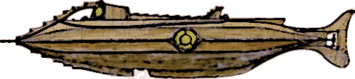 This
Nautilus by Joseph Bennecelli is clearly derived from Goff's
classic but not as graceful in appearnce. The upper hull is similar but
the diving hatch is located well forward and the lower hull appears
bloated. His print (available here)
includes a matching interior view that may explain some of the distortion as
needed to accommodate the interior as it is featured in the Disney movie. (Thanks
to Mikel Sauve for finding this Nautilus.)
This
Nautilus by Joseph Bennecelli is clearly derived from Goff's
classic but not as graceful in appearnce. The upper hull is similar but
the diving hatch is located well forward and the lower hull appears
bloated. His print (available here)
includes a matching interior view that may explain some of the distortion as
needed to accommodate the interior as it is featured in the Disney movie. (Thanks
to Mikel Sauve for finding this Nautilus.)
 JC
Carbonel built this Nautilus by kit-bashing a Glencoe Mars
Liner model (the Glencoe kit is a reproduction of an earlier Strombecker Disneyland
TWA
Moonliner kit). Carbonel used the fuselage to create a sleek hull, filling
in three of the landing leg recesses and extending the stern with part of a
different Glencoe rocket kit. The cockpit canopy was modified to become a
low wheelhouse with a single port forward. The salon observation window is
far forward and the small port just above it perhaps a window in Nemo's
cabin. The large organic dive planes (not obvious in my graphic) are set
low on the hull just aft of the salon windows. Carbonel intended the fins
and the windows to call to mind an ichthyosaur. Rather than a deck-mounted
lantern this design has a ring of lights on the hull amidships. There is a
long deck atop the hull. Again not visible, the aft part of the deck has
two doors covering a large recess for the boat. The simple tail includes
chains on top to operate the rudder, a large propeller, and the rudder at the
very stern. See detailed photos of the construction at Model
Stories. (Thanks
to Ishmael for bringing this Nautilus to my attention.)
JC
Carbonel built this Nautilus by kit-bashing a Glencoe Mars
Liner model (the Glencoe kit is a reproduction of an earlier Strombecker Disneyland
TWA
Moonliner kit). Carbonel used the fuselage to create a sleek hull, filling
in three of the landing leg recesses and extending the stern with part of a
different Glencoe rocket kit. The cockpit canopy was modified to become a
low wheelhouse with a single port forward. The salon observation window is
far forward and the small port just above it perhaps a window in Nemo's
cabin. The large organic dive planes (not obvious in my graphic) are set
low on the hull just aft of the salon windows. Carbonel intended the fins
and the windows to call to mind an ichthyosaur. Rather than a deck-mounted
lantern this design has a ring of lights on the hull amidships. There is a
long deck atop the hull. Again not visible, the aft part of the deck has
two doors covering a large recess for the boat. The simple tail includes
chains on top to operate the rudder, a large propeller, and the rudder at the
very stern. See detailed photos of the construction at Model
Stories. (Thanks
to Ishmael for bringing this Nautilus to my attention.)
 Here's
another design by artist Walter Pitt Quintin , in this case to illustrate
the Nautilus beneath the Antarctic ice. This robust-looking version
has a hefty ram integrated with the bow and topped with a row of raker
barbs. There are two rows of additional barbs along the side of the hull
forward and aft of the salon window positioned amidships. The dive planes
are placed well forward. The cruciform tail is smaller and much less
fishlike than Quintin's last design. This Nautilus
looks like it could easily smash an enemy ship.
Here's
another design by artist Walter Pitt Quintin , in this case to illustrate
the Nautilus beneath the Antarctic ice. This robust-looking version
has a hefty ram integrated with the bow and topped with a row of raker
barbs. There are two rows of additional barbs along the side of the hull
forward and aft of the salon window positioned amidships. The dive planes
are placed well forward. The cruciform tail is smaller and much less
fishlike than Quintin's last design. This Nautilus
looks like it could easily smash an enemy ship.
 Prolific
Sketchup modeler “JAZ” describes this as his own, “non-canon”,
Great White Shark-like version of the Nautilus. Evaluating it on those
criteria, the appearance is definitely shark-like, although the dorsal fine is a
bit too big and would be better positioned a little farther toward the tail. The
salon windows serve well as overlarge eyes and the pivoting dive hatch/ramp is a
fair shark jaw. Evaluating it in general as a Nautilus submarine
design, there is a large deck atop the hull but no wheelhouse. The control room
located under the dorsal fin has a large screen in front of the wheel. The
smaller windows on the upper hull look out from a corridor on one side and the
galley on the other. There are forward-facing lamps in the very thick pectoral
fins that have control surfaces on the trailing edge. The design has a
ring-protected main prop in the tail and two smaller props mounted at the base
of the pelvic fins. There is no obvious ram. Figures include
Prolific
Sketchup modeler “JAZ” describes this as his own, “non-canon”,
Great White Shark-like version of the Nautilus. Evaluating it on those
criteria, the appearance is definitely shark-like, although the dorsal fine is a
bit too big and would be better positioned a little farther toward the tail. The
salon windows serve well as overlarge eyes and the pivoting dive hatch/ramp is a
fair shark jaw. Evaluating it in general as a Nautilus submarine
design, there is a large deck atop the hull but no wheelhouse. The control room
located under the dorsal fin has a large screen in front of the wheel. The
smaller windows on the upper hull look out from a corridor on one side and the
galley on the other. There are forward-facing lamps in the very thick pectoral
fins that have control surfaces on the trailing edge. The design has a
ring-protected main prop in the tail and two smaller props mounted at the base
of the pelvic fins. There is no obvious ram. Figures include d
in JAZ's 3D model indicate this Nautilus is about 135 feet long compared
to Verne's 230 feet.
d
in JAZ's 3D model indicate this Nautilus is about 135 feet long compared
to Verne's 230 feet.
My only criticism of the design is the overly large dorsal
fin and hatch, lifted almost directly from Goff. The image at right shows these
components reduced to better match the overall scale of the submarine. The human
figure provides a reference.
 Illustrator
Andrea Pucci designed this elaborate Nautilus for the 2013
LuxVide animated
Italian TV series Le straordinarie avventure di Jules Verne. The various concepts he considered in arriving at this design
(shown on his blog), feature
characteristics of a
squid, fish, nautilus, or other marine life motif. The final design
combines elements from these, retaining the nautilus form just discernable in the central hull
around the salon window. Thanks very much to Ishmael who offered that the
overall shape of this Nautilus is that of a magic lamp. Even more
insightful is his suggestion that the barbed spar represents the trident
of Shiva, an appropriate weapon considering Nemo's Indian origin as revealed in Mysterious
Island. The large barbed claw-like spar and the large
N-emblem tail stand out, but it's easy to get lost in the extensive
detail. An interior plan shows a second salon/observation room in the lowest part of the hull.
This room has a
planetarium and orrery, and a platform for Nemo's organ in the
center. There are bays for mini-subs of
two sizes. See a trailer for the Nautilus episode (Ventimila
leghe sotto i mari) here.
(Thanks
to Lyle Simoneaux for bringing this Nautilus to my attention.)
Illustrator
Andrea Pucci designed this elaborate Nautilus for the 2013
LuxVide animated
Italian TV series Le straordinarie avventure di Jules Verne. The various concepts he considered in arriving at this design
(shown on his blog), feature
characteristics of a
squid, fish, nautilus, or other marine life motif. The final design
combines elements from these, retaining the nautilus form just discernable in the central hull
around the salon window. Thanks very much to Ishmael who offered that the
overall shape of this Nautilus is that of a magic lamp. Even more
insightful is his suggestion that the barbed spar represents the trident
of Shiva, an appropriate weapon considering Nemo's Indian origin as revealed in Mysterious
Island. The large barbed claw-like spar and the large
N-emblem tail stand out, but it's easy to get lost in the extensive
detail. An interior plan shows a second salon/observation room in the lowest part of the hull.
This room has a
planetarium and orrery, and a platform for Nemo's organ in the
center. There are bays for mini-subs of
two sizes. See a trailer for the Nautilus episode (Ventimila
leghe sotto i mari) here.
(Thanks
to Lyle Simoneaux for bringing this Nautilus to my attention.)
 Tom
Martin went even farther re-imagining Harper Goff's classic design with this
version of Nemo's rebuild of the Nautilus. The raised deck
and wheelhouse are completely gone, replaced by a mirror replication of the keel
profile incorporating the forward deck hatch in the first opening and a new
wheelhouse under a rail-protected dome, mimicking the salon window, in the
gap. The mirror keel then continues aft, replacing the Goff's dorsal fin,
ending at the aft deck hatch. From here aft the deck with the pinnace and
tail are very like Goff's original. Tom has made less obvious changes to
the forward hull, placing the "alligator eye" lights from the old
wheelhouse here, adding breather vents and, with a touch of whimsy, Nemo's
crest. This sinister looking beast is by far my favorite variation on
Goff. See more images of this intriguing Nautilus here.
Tom's earlier reconception is above.
Tom
Martin went even farther re-imagining Harper Goff's classic design with this
version of Nemo's rebuild of the Nautilus. The raised deck
and wheelhouse are completely gone, replaced by a mirror replication of the keel
profile incorporating the forward deck hatch in the first opening and a new
wheelhouse under a rail-protected dome, mimicking the salon window, in the
gap. The mirror keel then continues aft, replacing the Goff's dorsal fin,
ending at the aft deck hatch. From here aft the deck with the pinnace and
tail are very like Goff's original. Tom has made less obvious changes to
the forward hull, placing the "alligator eye" lights from the old
wheelhouse here, adding breather vents and, with a touch of whimsy, Nemo's
crest. This sinister looking beast is by far my favorite variation on
Goff. See more images of this intriguing Nautilus here.
Tom's earlier reconception is above.
 An
announcement in late 2013 about the scheduled opening of the Museum of
Science Fiction in 2017 included an illustration, attributed to Phil Smith,
of Jules Verne's Nautilus, 1:10 replica, planned for the Vehicles
Gallery. Except for the spar-mounted ram, the design is true to the
text. The cigar-shaped hull has rectangular salon windows and a set of
large trapezoidal dive planes amidships. The four-bladed propeller is protected by a
ring. In addition to the ring, the stern supports a large rudder and
horizontal fins that may also serve as dive planes. The wheelhouse has a
large oval port forward, two smaller ports one-quarter forward and slightly
larger ports on the sides. A ghosted-in elevation plan shows a boat, not
shown in the featured 3/4 cutaway drawing, on the wide deck that extends almost
to the lantern, which has at least three lights. The illustration can be
found on several sites, including this
one.
An
announcement in late 2013 about the scheduled opening of the Museum of
Science Fiction in 2017 included an illustration, attributed to Phil Smith,
of Jules Verne's Nautilus, 1:10 replica, planned for the Vehicles
Gallery. Except for the spar-mounted ram, the design is true to the
text. The cigar-shaped hull has rectangular salon windows and a set of
large trapezoidal dive planes amidships. The four-bladed propeller is protected by a
ring. In addition to the ring, the stern supports a large rudder and
horizontal fins that may also serve as dive planes. The wheelhouse has a
large oval port forward, two smaller ports one-quarter forward and slightly
larger ports on the sides. A ghosted-in elevation plan shows a boat, not
shown in the featured 3/4 cutaway drawing, on the wide deck that extends almost
to the lantern, which has at least three lights. The illustration can be
found on several sites, including this
one.
~ 2014 ~
 This
elaborate Nautilus from the Campeones de Verne game, drawn by
professional illustrator José David Lanza definitely owes something to
Harper Goff and probably to a few others but the design is unique. The
upper rakers on the bow are straight from the Goff version, but here the arch is
integrated with the bug-eye pilothouse. The design has a raised deck
amidships, under a possible dual, scary looking, cantilevered, reversed raker
arch that merges into the aft bridge superstructure. The rakers transform
from Goff's shape to sharp insectile barbs that run along the extension that
overhangs the stern. The lower rakers on the bow just aft of the barbed ram are
more ragged than those above and also insectile. They end forward of amidships
where there is an unusual transition in the hull, almost as if the bow can
separate from the stern. There are three small portholes on the lower hull
and several odd black circular structures. There is a complex mechanical structure here but I can only imagine its function. The aft hull has a
large Goff-like salon window with two smaller ports just aft. Other
mechanicals
are attached to the lower hull and a version of the reverse arch is affixed to
the keel, but continuing the sharp insect barb motif. The only clearly
recognizable features are a large anchor and the propeller, although some of the
rods might be controls for the large batwing shaped rudder
at the stern. Overall this is a distinct, recognizable design. See the full
size artwork here
and the game on this web site
(both in Spanish).
This
elaborate Nautilus from the Campeones de Verne game, drawn by
professional illustrator José David Lanza definitely owes something to
Harper Goff and probably to a few others but the design is unique. The
upper rakers on the bow are straight from the Goff version, but here the arch is
integrated with the bug-eye pilothouse. The design has a raised deck
amidships, under a possible dual, scary looking, cantilevered, reversed raker
arch that merges into the aft bridge superstructure. The rakers transform
from Goff's shape to sharp insectile barbs that run along the extension that
overhangs the stern. The lower rakers on the bow just aft of the barbed ram are
more ragged than those above and also insectile. They end forward of amidships
where there is an unusual transition in the hull, almost as if the bow can
separate from the stern. There are three small portholes on the lower hull
and several odd black circular structures. There is a complex mechanical structure here but I can only imagine its function. The aft hull has a
large Goff-like salon window with two smaller ports just aft. Other
mechanicals
are attached to the lower hull and a version of the reverse arch is affixed to
the keel, but continuing the sharp insect barb motif. The only clearly
recognizable features are a large anchor and the propeller, although some of the
rods might be controls for the large batwing shaped rudder
at the stern. Overall this is a distinct, recognizable design. See the full
size artwork here
and the game on this web site
(both in Spanish).
 Not
obvious in my standard side
Not
obvious in my standard side  view,
"Atesta" used a stylized squid shape for this Nautilus.
The tapered hull ends in a flared horizontal tail and giving the design a
clearly squid-like appearance from a top or bottom view. We might consider
the vertically symmetrical lattice structure extending from the narrow ram and
blended into the hull as representing the squid's arms. The circular salon
window is located far aft as the squid's eye. There appears to be a short
deck atop the hull here with a round lantern just aft. Farther aft, the
design has a complex vaned propeller system forward of the wide tail.
Atesta has posted renders of this Nautilus at nautilussubmarine.com
(membership is necessary to view these).
view,
"Atesta" used a stylized squid shape for this Nautilus.
The tapered hull ends in a flared horizontal tail and giving the design a
clearly squid-like appearance from a top or bottom view. We might consider
the vertically symmetrical lattice structure extending from the narrow ram and
blended into the hull as representing the squid's arms. The circular salon
window is located far aft as the squid's eye. There appears to be a short
deck atop the hull here with a round lantern just aft. Farther aft, the
design has a complex vaned propeller system forward of the wide tail.
Atesta has posted renders of this Nautilus at nautilussubmarine.com
(membership is necessary to view these).
 This
Nautilus by "D-Sun7" looks more like a prehistoric
bottom-feeding creature than a free swimmer, but certainly fits the "sea
monster" description. It evokes some 19th century illustrations of sea
creatures, and especially Victorian Era dolphin sculpture. The bow, with
its sharp, upturned, beak-like ram and two large globular salon windows serves
as the face of the beast. The design's ornamental fins on the lower bow
and stern complete the look and may have some propulsive or control function as
there are no dive planes, rudder, or propeller visible. A four-sided
wheelhouse with a circular port on each side sits atop the hull forward of the
long deck. There is a large, unusual structure with a hatch on its side in
the middle of the deck. This may be a conning tower and may include a
forward-facing lantern. The hull shows two rows of portholes, indicating
at lease two internal levels. A large hatch on the belly of the beast may
be a diving hatch large enough to bring in supplies from the sea floor.
This
Nautilus by "D-Sun7" looks more like a prehistoric
bottom-feeding creature than a free swimmer, but certainly fits the "sea
monster" description. It evokes some 19th century illustrations of sea
creatures, and especially Victorian Era dolphin sculpture. The bow, with
its sharp, upturned, beak-like ram and two large globular salon windows serves
as the face of the beast. The design's ornamental fins on the lower bow
and stern complete the look and may have some propulsive or control function as
there are no dive planes, rudder, or propeller visible. A four-sided
wheelhouse with a circular port on each side sits atop the hull forward of the
long deck. There is a large, unusual structure with a hatch on its side in
the middle of the deck. This may be a conning tower and may include a
forward-facing lantern. The hull shows two rows of portholes, indicating
at lease two internal levels. A large hatch on the belly of the beast may
be a diving hatch large enough to bring in supplies from the sea floor.
 Gerard
Duffy (Taranis) has
created a second, I think more graceful Nautilus version. As he
says, "I wanted to move away from the Harper Goff look as much as I could,
and stay as close as I can to most of the descriptions from the
book." This new design has a circular cross-section, smoothly
tapered-end, cylindrical hull. He's retained the raker arch ("I
debated for a while about ... the 'Raker', but I feel that it would be useful
for protecting the pilot house a little when ramming ships"), but this
version is finer than his early design and slopes back smoothly into the
wheelhouse structure. Duffy's moved the launch back a little to the end of
the deck. The vertical and horizontal fins at the stern that support the
propeller guard are smaller, complimenting the hull taper. Compared to the
earlier version, the entire design is more unified.
The tapered ram has an octagonal cross-section that transforms naturally into
the forward hull fairings. The upper one joins the raker arch, the next
lower pair end at the hull-mounted lamps, the middle pair run along the hull all
the way to the recessed salon window wells, the set below this mirror those
running to the lamps, and the lower one merges with the keel. Except for
the arch, the fairings have a horizontal saw-tooth design, less brutal than
Goff's vertical raker teeth, but still subtly lethal. See some very nice
renderings of this Nautilus on Gerard's blog.
(See Gerard's earlier design above in the Catalog.)
Gerard
Duffy (Taranis) has
created a second, I think more graceful Nautilus version. As he
says, "I wanted to move away from the Harper Goff look as much as I could,
and stay as close as I can to most of the descriptions from the
book." This new design has a circular cross-section, smoothly
tapered-end, cylindrical hull. He's retained the raker arch ("I
debated for a while about ... the 'Raker', but I feel that it would be useful
for protecting the pilot house a little when ramming ships"), but this
version is finer than his early design and slopes back smoothly into the
wheelhouse structure. Duffy's moved the launch back a little to the end of
the deck. The vertical and horizontal fins at the stern that support the
propeller guard are smaller, complimenting the hull taper. Compared to the
earlier version, the entire design is more unified.
The tapered ram has an octagonal cross-section that transforms naturally into
the forward hull fairings. The upper one joins the raker arch, the next
lower pair end at the hull-mounted lamps, the middle pair run along the hull all
the way to the recessed salon window wells, the set below this mirror those
running to the lamps, and the lower one merges with the keel. Except for
the arch, the fairings have a horizontal saw-tooth design, less brutal than
Goff's vertical raker teeth, but still subtly lethal. See some very nice
renderings of this Nautilus on Gerard's blog.
(See Gerard's earlier design above in the Catalog.)
 Artist
Josef Keller realized this Nautilus by kit-bashing a model of the USS Abraham Lincoln
nuclear submarine and adding elements true to the novel. The
slim cigar-shaped hull has a formidable four-bladed ram and oval salon
windows positioned per Nemo's description in the text. The design has large trapezoidal
dive planes amidships and a diving hatch on the lower hull. It features a
unique propeller with four T-shaped blades. The wheelhouse at the forward end
of the deck has a large port forward and smaller ports on each side. The boat is set
into the deck amidships with a hatch just aft. The lantern housing, with
is large forward-facing lens, is
located at the aft end of the deck. See a photo of Josef's scratch-built model at nautilussubmarine
(membership required). See many of his Nautilus model photos here.
Artist
Josef Keller realized this Nautilus by kit-bashing a model of the USS Abraham Lincoln
nuclear submarine and adding elements true to the novel. The
slim cigar-shaped hull has a formidable four-bladed ram and oval salon
windows positioned per Nemo's description in the text. The design has large trapezoidal
dive planes amidships and a diving hatch on the lower hull. It features a
unique propeller with four T-shaped blades. The wheelhouse at the forward end
of the deck has a large port forward and smaller ports on each side. The boat is set
into the deck amidships with a hatch just aft. The lantern housing, with
is large forward-facing lens, is
located at the aft end of the deck. See a photo of Josef's scratch-built model at nautilussubmarine
(membership required). See many of his Nautilus model photos here.
 Mogadore
J. Bivouac sketched this "vintage submarine" while waiting in a
car repair shop. The somewhat fish-shaped
design looks to have been around a while
and undergone quite a bit of repairs itself. Aside from the toothed rakers
atop the beak of a bow and the oval salon window, there's little that can be
attributed to Goff. The sub has a more or less traditional conning tower with
masts and periscope but no visible dive planes. A vertical fin on the keel
offsets the tower. The large scalloped rudder contributes to the fish-like
look. The design is likely smaller than the usual Nautilus as
indicated by the size of the deck and diving hatches. See the original
artwork at DeviantArt.
Mogadore
J. Bivouac sketched this "vintage submarine" while waiting in a
car repair shop. The somewhat fish-shaped
design looks to have been around a while
and undergone quite a bit of repairs itself. Aside from the toothed rakers
atop the beak of a bow and the oval salon window, there's little that can be
attributed to Goff. The sub has a more or less traditional conning tower with
masts and periscope but no visible dive planes. A vertical fin on the keel
offsets the tower. The large scalloped rudder contributes to the fish-like
look. The design is likely smaller than the usual Nautilus as
indicated by the size of the deck and diving hatches. See the original
artwork at DeviantArt.
 Bob
Farrell and I
exchanged lots of ideas about the Nautilus when I began my Nautilus
pages. Now I'm happy to include Bob's own design.
Although more cylindrical, the hull shape has the rounded stern of Deschamp's design
above, and the rectangular salon windows or Ron
Miller's. Both the pilothouse and lantern can be withdrawn into the
hull. Bob has recessed both the main deck between the pilothouse and the
lantern, and the fishing deck aft of the lantern, into the hull, to provide
level surfaces without protruding from the hull. The forward deck includes
the main hatch and boat. There are two hatches and lots of space for
handling and stowing the catch described in the novel. The dive planes are
configured to fold up into a recess in the hull side for surface running. See much more and
read Bob's thoughts on this Nautilus on his Design
Perspective web site. (This
link is to an Internet Archive capture. Use the black menu par to navigate
to the subpages.)
Bob
Farrell and I
exchanged lots of ideas about the Nautilus when I began my Nautilus
pages. Now I'm happy to include Bob's own design.
Although more cylindrical, the hull shape has the rounded stern of Deschamp's design
above, and the rectangular salon windows or Ron
Miller's. Both the pilothouse and lantern can be withdrawn into the
hull. Bob has recessed both the main deck between the pilothouse and the
lantern, and the fishing deck aft of the lantern, into the hull, to provide
level surfaces without protruding from the hull. The forward deck includes
the main hatch and boat. There are two hatches and lots of space for
handling and stowing the catch described in the novel. The dive planes are
configured to fold up into a recess in the hull side for surface running. See much more and
read Bob's thoughts on this Nautilus on his Design
Perspective web site. (This
link is to an Internet Archive capture. Use the black menu par to navigate
to the subpages.)
 This
sleek Nautilus design is by Daniel Amaral. The graceful
spindle-shaped hull has an armored bow to serve as a ram and a large circular
salon window in the forward hull. The dive planes are not where Verne
described them, but located on the stern at the ends of graceful horizontal
fins. Similar vertical fins end in a two part rudder. The
four-bladed prop is on the centerline. The wheelhouse at the forward end
of the deck has a large viewport forward, a smaller port on either side and two
yet smaller ports facing aft. Unlike the wheelhouse, the forward-facing lantern,
located midway along the deck, appears to be retractable. The
configuration aft of the lantern is a little unclear, but I believe the boat is
nested the hull just aft with a large hatch aft of that. See the original artwork
at ArtStation here
and here.
This
sleek Nautilus design is by Daniel Amaral. The graceful
spindle-shaped hull has an armored bow to serve as a ram and a large circular
salon window in the forward hull. The dive planes are not where Verne
described them, but located on the stern at the ends of graceful horizontal
fins. Similar vertical fins end in a two part rudder. The
four-bladed prop is on the centerline. The wheelhouse at the forward end
of the deck has a large viewport forward, a smaller port on either side and two
yet smaller ports facing aft. Unlike the wheelhouse, the forward-facing lantern,
located midway along the deck, appears to be retractable. The
configuration aft of the lantern is a little unclear, but I believe the boat is
nested the hull just aft with a large hatch aft of that. See the original artwork
at ArtStation here
and here.
 Ian
O'Toole's Nautilus is realized in the second edition of the
solitaire board game Nemo's War, by Chris Taylor. Its only obvious design
reference is the second generation Nautilus as drawn by Kevin O'Neill in
the League of Extraordinary Gentlemen graphic novel series, although the
overhead arch resembles a number of other designs. This Nautilus
has an intricately stepped pyramidal ram. The side tentacle structures
wrap around and possibly protect dual salon windows positioned at different levels,
suggesting an interesting interior layout. There's no apparent wheelhouse
but the portholes in the superstructure below the raised deck hint at a possible
surface control purpose. There are dive planes on the aft hull and a
vertical tail that may serve as a rudder. The design uses a
"hydro drive" rather than a propeller. The game, which is
expected to include a small sculpted game piece of the Nautilus, was scheduled
for release by Victory Point Games in December 2015.
Ian
O'Toole's Nautilus is realized in the second edition of the
solitaire board game Nemo's War, by Chris Taylor. Its only obvious design
reference is the second generation Nautilus as drawn by Kevin O'Neill in
the League of Extraordinary Gentlemen graphic novel series, although the
overhead arch resembles a number of other designs. This Nautilus
has an intricately stepped pyramidal ram. The side tentacle structures
wrap around and possibly protect dual salon windows positioned at different levels,
suggesting an interesting interior layout. There's no apparent wheelhouse
but the portholes in the superstructure below the raised deck hint at a possible
surface control purpose. There are dive planes on the aft hull and a
vertical tail that may serve as a rudder. The design uses a
"hydro drive" rather than a propeller. The game, which is
expected to include a small sculpted game piece of the Nautilus, was scheduled
for release by Victory Point Games in December 2015.
 This
design by artist Walter Pitt Quintin is a little more fishlike than his
earlier design featured above. There is a large window
on the upper bow just aft of a hefty ram. This may be a forward salon or
an underwater bridge. Dive planes are located just below this
window. There's a large dorsal fin at the forward end of the deck and a
slope-sided wheelhouse with large oval ports at mid-deck. The windows on
the hull side amidships, the usual position of the salon are smaller than the
forward ports and no larger than those on the wheelhouse. The hull tapers
to a cruciform tail with a fishlike appearance from the side. The
horizontal fins probably incorporate aft dive planes.
This
design by artist Walter Pitt Quintin is a little more fishlike than his
earlier design featured above. There is a large window
on the upper bow just aft of a hefty ram. This may be a forward salon or
an underwater bridge. Dive planes are located just below this
window. There's a large dorsal fin at the forward end of the deck and a
slope-sided wheelhouse with large oval ports at mid-deck. The windows on
the hull side amidships, the usual position of the salon are smaller than the
forward ports and no larger than those on the wheelhouse. The hull tapers
to a cruciform tail with a fishlike appearance from the side. The
horizontal fins probably incorporate aft dive planes.
~ 2015 ~
 Grigory
Smirnov's Nautilus seems small and lacks the proportions described in
the novel but is easily recognizable as Verne's classic submarine. The
main characteristic of the design is the extent of elaborate decoration, only
some of which I've mimicked in my graphic. This Nautilus has a
simple cigar-shaped hull with a small ram at the bow and a small propeller at
the stern. The very large salon window, the focus of the design, contrasts
with three smaller ports located along the side trim nearer the stern.
There are three much smaller ports on the lower hull. When compared to the
deck railing these small ports are seen to be proportionally large and the salon
window becomes enormous. The large wheelhouse has large canted ports
facing forward and one on each side. There is a large hatch amidships in
the deck that stretches far aft over the rudder. Two-thirds of the way
along the deck another structure, with aft-facing ports, appears to be something
other than a lantern housing. See Smirnov's Nautilus stock image at
Dreamstime.
Grigory
Smirnov's Nautilus seems small and lacks the proportions described in
the novel but is easily recognizable as Verne's classic submarine. The
main characteristic of the design is the extent of elaborate decoration, only
some of which I've mimicked in my graphic. This Nautilus has a
simple cigar-shaped hull with a small ram at the bow and a small propeller at
the stern. The very large salon window, the focus of the design, contrasts
with three smaller ports located along the side trim nearer the stern.
There are three much smaller ports on the lower hull. When compared to the
deck railing these small ports are seen to be proportionally large and the salon
window becomes enormous. The large wheelhouse has large canted ports
facing forward and one on each side. There is a large hatch amidships in
the deck that stretches far aft over the rudder. Two-thirds of the way
along the deck another structure, with aft-facing ports, appears to be something
other than a lantern housing. See Smirnov's Nautilus stock image at
Dreamstime.
 Ocram62
conceived this Nautilus in the form of a fish. It has some
shark-like elements but to me it seems more tropical fish-like. It has a
long, rather fragile-looking spar, but a row of punishing saw-tooth rakers along
the top of the bow. What might be torpedo tubes or perhaps on the water
canons mentioned in the novel on either side of the rakers. A pair of forward-facing
searchlights are positioned just aft of these. The wheelhouse, shaped a
little like Goff's, with large round ports on the angled sides is located at the
forward end of a deck that runs along the hull almost to the very long tail that
ends in a graceful fin. There are two pairs of windows on sides of the
hull. The larger pair is just forward of the wheelhouse and the smaller,
angled forward are approximately amidships, forward of a large diving hatch on
the hull bottom. The design has dual four-bladed props under the tail and
a large rudder. This Nautilus is smaller than the size Verne
described but has very large fins for control. The forward pair appear to
be articulated so they might be flapped to aid in propulsion. You can
examine and download this model at Sketchfab.
Ocram62
conceived this Nautilus in the form of a fish. It has some
shark-like elements but to me it seems more tropical fish-like. It has a
long, rather fragile-looking spar, but a row of punishing saw-tooth rakers along
the top of the bow. What might be torpedo tubes or perhaps on the water
canons mentioned in the novel on either side of the rakers. A pair of forward-facing
searchlights are positioned just aft of these. The wheelhouse, shaped a
little like Goff's, with large round ports on the angled sides is located at the
forward end of a deck that runs along the hull almost to the very long tail that
ends in a graceful fin. There are two pairs of windows on sides of the
hull. The larger pair is just forward of the wheelhouse and the smaller,
angled forward are approximately amidships, forward of a large diving hatch on
the hull bottom. The design has dual four-bladed props under the tail and
a large rudder. This Nautilus is smaller than the size Verne
described but has very large fins for control. The forward pair appear to
be articulated so they might be flapped to aid in propulsion. You can
examine and download this model at Sketchfab.
 Wayne
Orlicki designed this Nautilus with the intention of staying true to
Nemo's killer ramming submarine concept while avoiding copying Goff's classic
elements. Well, there's still a little Goff there, especially in the
reverse arch at the stern, but it's camouflage mimicry. The Nautilus
admirer sees a sleeker, cleaner version of the Nautilus with a beefy
arch, but wait a minute ... it's going the other way! "He didn't miss
me; he's attacking!" The lethal ram on this boat is not at the
bow, but above the extended wheelhouse near the stern in the form of a massive
keel-breaking hook. The entire submarine is a weapon, from the reinforced
bow to the shielding arch that runs nearly the whole length of the submarine,
designed to bring the target's keel to that murderous hook. There is a
small boat, identical to Goff's, mounted in the aft end of the deck, on the port
side of the arch. The salon windows, located almost amidships, are
recessed into the hull side for protection. The diving hatch, below the
wheelhouse on the lower port-side hull, has sliding doors (shown open in the
graphic). The dive planes are combined with the rudders in a V-tail "ruddervator"
arrangement just aft of the twin propellers. See larger images of Wayne's Nautilus
and read his commentary at nautilussubmarine.com
(registration required for access).
Wayne
Orlicki designed this Nautilus with the intention of staying true to
Nemo's killer ramming submarine concept while avoiding copying Goff's classic
elements. Well, there's still a little Goff there, especially in the
reverse arch at the stern, but it's camouflage mimicry. The Nautilus
admirer sees a sleeker, cleaner version of the Nautilus with a beefy
arch, but wait a minute ... it's going the other way! "He didn't miss
me; he's attacking!" The lethal ram on this boat is not at the
bow, but above the extended wheelhouse near the stern in the form of a massive
keel-breaking hook. The entire submarine is a weapon, from the reinforced
bow to the shielding arch that runs nearly the whole length of the submarine,
designed to bring the target's keel to that murderous hook. There is a
small boat, identical to Goff's, mounted in the aft end of the deck, on the port
side of the arch. The salon windows, located almost amidships, are
recessed into the hull side for protection. The diving hatch, below the
wheelhouse on the lower port-side hull, has sliding doors (shown open in the
graphic). The dive planes are combined with the rudders in a V-tail "ruddervator"
arrangement just aft of the twin propellers. See larger images of Wayne's Nautilus
and read his commentary at nautilussubmarine.com
(registration required for access).
 The
fourth reimagining of Goff's classic by master Nautilus kit basher Tom Martin
resembles his previous version (here) but extends Nemo's arsenal
with high-powered armor-piercing harpoon launchers. The bow of this design
resembles the last. The ram is still there as are the rakers, augmented by a second
larger set on the aft end of arch, inspired by Wayne O's vicious hook, above. The harpoon launch tubes, two on the
port side, one starboard, are mounted on the upper hull. The forward hatch
under the arch and the aft hatch at the end of the hatch are retained from the
previous version but the
glass helmsman's dome amidships is gone. This Nautilus has periscopes, a fixed one used on the surface by the helmsman and a second
raisable one for Nemo's scouting use submerged. Tom has relocated
Goff's breather vents to the aft deck, just forward of the skiff. The
stern is unchanged. See larger images of this Nautilus here.
The
fourth reimagining of Goff's classic by master Nautilus kit basher Tom Martin
resembles his previous version (here) but extends Nemo's arsenal
with high-powered armor-piercing harpoon launchers. The bow of this design
resembles the last. The ram is still there as are the rakers, augmented by a second
larger set on the aft end of arch, inspired by Wayne O's vicious hook, above. The harpoon launch tubes, two on the
port side, one starboard, are mounted on the upper hull. The forward hatch
under the arch and the aft hatch at the end of the hatch are retained from the
previous version but the
glass helmsman's dome amidships is gone. This Nautilus has periscopes, a fixed one used on the surface by the helmsman and a second
raisable one for Nemo's scouting use submerged. Tom has relocated
Goff's breather vents to the aft deck, just forward of the skiff. The
stern is unchanged. See larger images of this Nautilus here.
 Artist
Bin Li designed this Nautilus as part of a sculpture depicting a
giant squid attacking the submarine. His concept drawings show he tried
various more-or-less fishlike shapes for the Nautilus reaching this
armored, less-organic design. There is a slight resemblance to Goff's
classic in the spar, the lower raker barbs, the salon window, and the
superstructure, although this is moved farther aft and has no viewports.
Instead the the pilothouse is in the bow with three round ports on each
side. The salon window mount is more angular, with fewer lights.
There appears to be a row of three smaller ports on the side of the upper hull
aft of the superstructure. There are two fin-like control or stabilization
surfaces on the side of the hull forward of the salon window. The less
fishlike tail with its dual in-line propellers bears little resemblance to
Goff. See images of the concept art, the sculpture, and even download a
file to print it yourself at the Thingiverse.
Artist
Bin Li designed this Nautilus as part of a sculpture depicting a
giant squid attacking the submarine. His concept drawings show he tried
various more-or-less fishlike shapes for the Nautilus reaching this
armored, less-organic design. There is a slight resemblance to Goff's
classic in the spar, the lower raker barbs, the salon window, and the
superstructure, although this is moved farther aft and has no viewports.
Instead the the pilothouse is in the bow with three round ports on each
side. The salon window mount is more angular, with fewer lights.
There appears to be a row of three smaller ports on the side of the upper hull
aft of the superstructure. There are two fin-like control or stabilization
surfaces on the side of the hull forward of the salon window. The less
fishlike tail with its dual in-line propellers bears little resemblance to
Goff. See images of the concept art, the sculpture, and even download a
file to print it yourself at the Thingiverse.
 Australian
artist
Wild Bill Flowers (Snake-Artist) uses this Nautilus in several of
his 20,000 Leagues under the Sea illustrations. His fish-shaped design
owes a little to Goff in the saw tooth vertical fins but is mostly
original. It has a long sharp spar, sharper than I've shown, that smoothly
transitions into the finned keel and upper fairing. The pilot house, with
large circular ports on its front and sides, resembles the conning tower of a 20th
century submarine, including masts. There's a deck area just aft of this
structure with a saw-tooth finned bulwark on either side. The hull sides
have an organic ornamentation motif from bow to stern, resembling a tentacled
sea creature. The ornamentation incorporates the large free-form salon
window. The propeller, if that's the propulsion mechanism, is hidden in a cylindrical
duct at the stern. No dive planes are evident, but dual ventral fins
probably provide control. See one of Snake-Artist's illustrations at DeviantArt.
Australian
artist
Wild Bill Flowers (Snake-Artist) uses this Nautilus in several of
his 20,000 Leagues under the Sea illustrations. His fish-shaped design
owes a little to Goff in the saw tooth vertical fins but is mostly
original. It has a long sharp spar, sharper than I've shown, that smoothly
transitions into the finned keel and upper fairing. The pilot house, with
large circular ports on its front and sides, resembles the conning tower of a 20th
century submarine, including masts. There's a deck area just aft of this
structure with a saw-tooth finned bulwark on either side. The hull sides
have an organic ornamentation motif from bow to stern, resembling a tentacled
sea creature. The ornamentation incorporates the large free-form salon
window. The propeller, if that's the propulsion mechanism, is hidden in a cylindrical
duct at the stern. No dive planes are evident, but dual ventral fins
probably provide control. See one of Snake-Artist's illustrations at DeviantArt.
 Author/illustrator
William O'Connor created this Nautilus for the Sterling
Illustrated Classics 2015 edition of 20,000 Leagues under the Sea. The
design has a cylindrical hull with conical ends and an internal layout that
follows Verne's description in the novel. The sturdy, harpoon point-like
ram is backed by fluted cone structure to carry the force of a ram attack into
the hull structure. This and other details give this Nautilus a
steampunk appearance. The forward deck is protected by a bulwark
that becomes a railing about a third of the way aft. The cylindrical
wheelhouse with four ports is retractable so that its cap is flush with the deck
behind the bulwark. The boat is set into the deck just aft of the circular
main hatch. The lantern, with a structure similar to wheelhouse, is also
partly retractable. The lantern cylinder is capped with a tapered
extension so that the light itself, which may be rotatable, is raised to project
above the wheelhouse. Circular salon windows are located fairly forward on
the hull at the forward conic transition and the large dive planes are mounted
forward of amidships. There are smaller stabilizing fins on the aft hull
conic section. The dive hatch is recessed in the hull bottom, and not
visible in my
Author/illustrator
William O'Connor created this Nautilus for the Sterling
Illustrated Classics 2015 edition of 20,000 Leagues under the Sea. The
design has a cylindrical hull with conical ends and an internal layout that
follows Verne's description in the novel. The sturdy, harpoon point-like
ram is backed by fluted cone structure to carry the force of a ram attack into
the hull structure. This and other details give this Nautilus a
steampunk appearance. The forward deck is protected by a bulwark
that becomes a railing about a third of the way aft. The cylindrical
wheelhouse with four ports is retractable so that its cap is flush with the deck
behind the bulwark. The boat is set into the deck just aft of the circular
main hatch. The lantern, with a structure similar to wheelhouse, is also
partly retractable. The lantern cylinder is capped with a tapered
extension so that the light itself, which may be rotatable, is raised to project
above the wheelhouse. Circular salon windows are located fairly forward on
the hull at the forward conic transition and the large dive planes are mounted
forward of amidships. There are smaller stabilizing fins on the aft hull
conic section. The dive hatch is recessed in the hull bottom, and not
visible in my  side
view. The aft hull ends with symmetric vertical fins with a large two-part
rudder. The medium-sized four-bladed propeller is located at the very
stern. O'Connor has embellished this Nautilus with many details
such as ballast and steam vents, as well as the waterspout vents mentioned in
the novel.
side
view. The aft hull ends with symmetric vertical fins with a large two-part
rudder. The medium-sized four-bladed propeller is located at the very
stern. O'Connor has embellished this Nautilus with many details
such as ballast and steam vents, as well as the waterspout vents mentioned in
the novel.
The richly
illustrated and beautifully printed book has only one unfortunate flaw: the text
is Lewis Mercier's incomplete and error-filled public
domain translation. If the publisher had stepped up to one of the vastly
superior modern translations it would be perfect, if a
bit more expensive. But as it is I still heartily recommend it for
O'Connor's beautiful illustrations, which are true to Jules Verne's novel.
My simple side view doesn't do justice to this Nautilus. You can preview
some of the pages and purchase the book on amazon.com.
(Thanks
to Dean Peteet for bringing this Nautilus to my attention.)
 This
elegant Nautilus by H I Sutton modifies or replaces some of the
features but retains the basic concept described by Nemo in the novel. The
design features double-hull construction not obvious in this side view but apparent
in the cutaway on Sutton's Nautilus web
page. There is a sharp ramming spar on the conical bow. The
circular salon windows are inset in the outer hull and further protected by
triangular fins. A curved arch protects the cylindrical pilothouse that is
mounted atop the hull. Two large pilothouse ports are projected by grid work.
Decking is attached to the hull beginning just forward of the pilothouse and extending
to a conning tower-like structure that serves as a station for the surface watch
crew. This structure has a rather fragile looking filigree arch, that if
wide enough might protect the air intake and extendable searchlight. The
boat is set in the deck forward of this arch and the main hatch is located in
the center of the deck. There is a diving hatch on the side of the lower
hull below the main hatch. The dive planes are located at about the
pilothouse position below the centerline and protected by fairings. There
are small twin propellers and a large double rudder that forms a fish-like
tail. Read about more about this Nautilus and see some beautiful
high-resolution images of both the exterior and interior design on Sutton's Nautilus
page.
This
elegant Nautilus by H I Sutton modifies or replaces some of the
features but retains the basic concept described by Nemo in the novel. The
design features double-hull construction not obvious in this side view but apparent
in the cutaway on Sutton's Nautilus web
page. There is a sharp ramming spar on the conical bow. The
circular salon windows are inset in the outer hull and further protected by
triangular fins. A curved arch protects the cylindrical pilothouse that is
mounted atop the hull. Two large pilothouse ports are projected by grid work.
Decking is attached to the hull beginning just forward of the pilothouse and extending
to a conning tower-like structure that serves as a station for the surface watch
crew. This structure has a rather fragile looking filigree arch, that if
wide enough might protect the air intake and extendable searchlight. The
boat is set in the deck forward of this arch and the main hatch is located in
the center of the deck. There is a diving hatch on the side of the lower
hull below the main hatch. The dive planes are located at about the
pilothouse position below the centerline and protected by fairings. There
are small twin propellers and a large double rudder that forms a fish-like
tail. Read about more about this Nautilus and see some beautiful
high-resolution images of both the exterior and interior design on Sutton's Nautilus
page.
 The
Craig Francis and Rick Miller environmentally-aware stage production of Twenty
Thousand Leagues under the Sea features this
Nautilus, attributed to Craig Francis and Irina Litvinenko of
Kidoons in its associated multimedia material. The design has a large
conical ram and a cylindrical hull with organic characteristics. The
closed-iris salon window could be a creature's eye, the large dive planes,
fins, and the stern steps down like the layers of a carapace to a finned tail
with a large four-bladed prop. What might have been a wheelhouse on the
bow is more likely a large lantern to augment the downward-tilted lights on the lower
bow. The helmsman may use a periscope, shown withdrawn, for
navigation. There's an oval window below the salon and a row of large
ports amidships on the upper hull. A very small dorsal fin is just forward of the
deck that includes a hatch. The row of circular structures on the lower
hull aft of the dive plane may be associated with the engine room. This
(slow-loading) resource
guide from the 2016 New Victory Theater production includes an image of this
Nautilus. (Thanks to Lyle Simoneaux for pointing out this design.)
The
Craig Francis and Rick Miller environmentally-aware stage production of Twenty
Thousand Leagues under the Sea features this
Nautilus, attributed to Craig Francis and Irina Litvinenko of
Kidoons in its associated multimedia material. The design has a large
conical ram and a cylindrical hull with organic characteristics. The
closed-iris salon window could be a creature's eye, the large dive planes,
fins, and the stern steps down like the layers of a carapace to a finned tail
with a large four-bladed prop. What might have been a wheelhouse on the
bow is more likely a large lantern to augment the downward-tilted lights on the lower
bow. The helmsman may use a periscope, shown withdrawn, for
navigation. There's an oval window below the salon and a row of large
ports amidships on the upper hull. A very small dorsal fin is just forward of the
deck that includes a hatch. The row of circular structures on the lower
hull aft of the dive plane may be associated with the engine room. This
(slow-loading) resource
guide from the 2016 New Victory Theater production includes an image of this
Nautilus. (Thanks to Lyle Simoneaux for pointing out this design.)
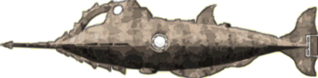 "Plush
Hyena of Doom" (PHoD) created Nautilus for a content
challenge on the BioWare game forum. It derives from Goff's Disney design
as so many do, but diverges in a more organic direction. The ram is very
long but the hull itself is foreshortened. The dive hatch is located
farther forward and the aft keel like the dorsal fin is more fish fin-like.
Similarly, the tail is more symmetrical, enclosing a relatively small two-bladed
propeller.
"Plush
Hyena of Doom" (PHoD) created Nautilus for a content
challenge on the BioWare game forum. It derives from Goff's Disney design
as so many do, but diverges in a more organic direction. The ram is very
long but the hull itself is foreshortened. The dive hatch is located
farther forward and the aft keel like the dorsal fin is more fish fin-like.
Similarly, the tail is more symmetrical, enclosing a relatively small two-bladed
propeller.
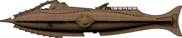 Rather
than imitate or reference Goff's iconic design several folk have modified it so
it's still recognizable as Goff's but different. This is
Chris Holtorf (Chris2009)'s
Rather
than imitate or reference Goff's iconic design several folk have modified it so
it's still recognizable as Goff's but different. This is
Chris Holtorf (Chris2009)'s  reimagining of Goff's Nautilus. Most obvious in the small elevation view
here is the triangular dart-like ram. There is a deck rail and a new hatch
atop the wheelhouse. The tail looks different from the original, but less obvious
in the side view, the hull has a circular cross-section and, more importantly,
this design has dual propellers. The image at right shows the propellers,
which Chris based on a period patent, and the articulated rudder. See high-resolution images
of Chris's Rhino model work-in-progress and read some commentary in this Nautilus
Submarine.com thread (free membership required).
reimagining of Goff's Nautilus. Most obvious in the small elevation view
here is the triangular dart-like ram. There is a deck rail and a new hatch
atop the wheelhouse. The tail looks different from the original, but less obvious
in the side view, the hull has a circular cross-section and, more importantly,
this design has dual propellers. The image at right shows the propellers,
which Chris based on a period patent, and the articulated rudder. See high-resolution images
of Chris's Rhino model work-in-progress and read some commentary in this Nautilus
Submarine.com thread (free membership required).
 "TheCeladon"
has subtly re-imagined Harper Goff's classic Nautilus. At first
look it's a faithful reproduction, but as you examine the details, most of which
aren't visible in my small image, differences emerge. Most noticeable, Go
"TheCeladon"
has subtly re-imagined Harper Goff's classic Nautilus. At first
look it's a faithful reproduction, but as you examine the details, most of which
aren't visible in my small image, differences emerge. Most noticeable, Go ff's
bulb-ended spur has been replaced by a longer, chisel-like spike
that emulates the polygonal cross-section of the hull. The wheelhouse
windows now resemble the faceted salon window frames, which also differ from
Goff's. These and the matching light assemblies are inspired by the
International Space Station Cupola module. Not so obvious in the side view, the
tail differs significantly. This Nautilus has a more conventional
four-bladed propeller enclosed in a nicely integrated cylindrical shroud
assembly. Goff's simple if functional prop guard looks like an afterthought
by comparison. The rudder is the entire vertical tail and TheCeladon has replaced
the small side-strake-mounted dive planes with large fin-like planes just
forward of the tail, visible in the image at right. The images here don't
do justice to the the intricate details of this Nautilus, modeled in Sketchup.
You can see high-res images and read some of the designer's thoughts in this Nautilus
Submarine.com thread (free membership required). The nameplate is a nice
touch, and look for the mermaid sculpture
on the hull. TheCeleadon has made his SketchUp 3D Nautilus available
at the 3D
Warehouse.
ff's
bulb-ended spur has been replaced by a longer, chisel-like spike
that emulates the polygonal cross-section of the hull. The wheelhouse
windows now resemble the faceted salon window frames, which also differ from
Goff's. These and the matching light assemblies are inspired by the
International Space Station Cupola module. Not so obvious in the side view, the
tail differs significantly. This Nautilus has a more conventional
four-bladed propeller enclosed in a nicely integrated cylindrical shroud
assembly. Goff's simple if functional prop guard looks like an afterthought
by comparison. The rudder is the entire vertical tail and TheCeladon has replaced
the small side-strake-mounted dive planes with large fin-like planes just
forward of the tail, visible in the image at right. The images here don't
do justice to the the intricate details of this Nautilus, modeled in Sketchup.
You can see high-res images and read some of the designer's thoughts in this Nautilus
Submarine.com thread (free membership required). The nameplate is a nice
touch, and look for the mermaid sculpture
on the hull. TheCeleadon has made his SketchUp 3D Nautilus available
at the 3D
Warehouse.
 This
Nautilus by Malcolm Brown starts with a few features
of Goff's design and finishes with something new.
The bulb-tipped spar is transformed into a barbed harpoon.
The forward rakers remain but the open arch and forward deck are gone and
the entire wheelhouse, with large bug-eye windows, is integrated with the rakers
atop the bow. Goff's curved dorsal
fin is transformed to a large straight-edged triangle.
The large hemispherical structure at the end of the deck may be a large
hatch, or something else. The tubes
running aft on the upper hull may have a specific purpose or, like odd-shaped
plates bolted to the hull side, may be more decorative than functional.
The keel, nicely modified from Goff, has a gap for a large dive hatch and
more rakers on the stern. Brown has relocated the anchors from Goff's
forward position. In addition to the
large salon window, there are three smaller ports forward and two rows of even
smaller ports, implying three decks for this Nautilus. Ishmael, who
brought this design to my attention, believes it is much smaller than most, with
only two decks. He thinks the dorsal fin may have a dual v-shaped
configuration. The tail has a
straight trailing edge and is therefore similar to and different from Goff's.
This Nautilus is somewhat shorter and more fish-shaped than the
classic. See
the nicely rendered original artwork by Brown (Ravenscar45) at DeviantArt.
This
Nautilus by Malcolm Brown starts with a few features
of Goff's design and finishes with something new.
The bulb-tipped spar is transformed into a barbed harpoon.
The forward rakers remain but the open arch and forward deck are gone and
the entire wheelhouse, with large bug-eye windows, is integrated with the rakers
atop the bow. Goff's curved dorsal
fin is transformed to a large straight-edged triangle.
The large hemispherical structure at the end of the deck may be a large
hatch, or something else. The tubes
running aft on the upper hull may have a specific purpose or, like odd-shaped
plates bolted to the hull side, may be more decorative than functional.
The keel, nicely modified from Goff, has a gap for a large dive hatch and
more rakers on the stern. Brown has relocated the anchors from Goff's
forward position. In addition to the
large salon window, there are three smaller ports forward and two rows of even
smaller ports, implying three decks for this Nautilus. Ishmael, who
brought this design to my attention, believes it is much smaller than most, with
only two decks. He thinks the dorsal fin may have a dual v-shaped
configuration. The tail has a
straight trailing edge and is therefore similar to and different from Goff's.
This Nautilus is somewhat shorter and more fish-shaped than the
classic. See
the nicely rendered original artwork by Brown (Ravenscar45) at DeviantArt.
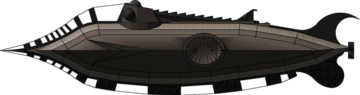 This
is "mikedp"'s take on Goff's iconic Nautilus.
He's kept the general appearance but replaced the vertical rakers with what
appears to be a cable-stabilized set of heavy cogs. The wheelhouse is
similar to Goff's but has a third globular viewport on top and narrow spines
replace the breather panels. The oval salon windows are proportionally
larger compared to a shorter total length. The stylized tail, fancier that
the classic one, ends with a small propeller. Overall this is a heftier if
slightly smaller Nautilus than in the film, but I'd have some concerns
about its integrity in a ram attack. Mikedp's Nautilus is available
for Sketchup here.
This
is "mikedp"'s take on Goff's iconic Nautilus.
He's kept the general appearance but replaced the vertical rakers with what
appears to be a cable-stabilized set of heavy cogs. The wheelhouse is
similar to Goff's but has a third globular viewport on top and narrow spines
replace the breather panels. The oval salon windows are proportionally
larger compared to a shorter total length. The stylized tail, fancier that
the classic one, ends with a small propeller. Overall this is a heftier if
slightly smaller Nautilus than in the film, but I'd have some concerns
about its integrity in a ram attack. Mikedp's Nautilus is available
for Sketchup here.
 Concept
artist Grant Regan wanted his Nautilus to show the sleek cigar
shape described in the novel but have features consistent with real late 19th
century submarine development. From the side the design appears spindle-shaped, but the hull cross-section is more of a flattened diamond
with triangular fairing running its full length, interrupted only by the salon windows.
This fairing constitutes an outer hull and contains the ballast tanks. The
narrow bow features a slender spar, a ram not unlike that
of Greg DeSantis' design, seen above.
Concept
artist Grant Regan wanted his Nautilus to show the sleek cigar
shape described in the novel but have features consistent with real late 19th
century submarine development. From the side the design appears spindle-shaped, but the hull cross-section is more of a flattened diamond
with triangular fairing running its full length, interrupted only by the salon windows.
This fairing constitutes an outer hull and contains the ballast tanks. The
narrow bow features a slender spar, a ram not unlike that
of Greg DeSantis' design, seen above.  Large dive planes are
located far forward on the bow. Just aft of the planes, one of three hatches is positioned atop the
hull. A wide deck rises aft of the hatch. Situated in the middle of
the deck, the retractable wheelhouse has two large ports looking forward and one
aft. Just aft is the main hatch and then the dingy, set in the deck athwartships,
above the salon. Deviating from the novel, Regan has located Nemo's cabin
recessed into the deck aft of the boat. Not visible in my side view, the
cabin has small ports on its sides. The large three-part salon window is set into the main hull where
the wide outer hull fairing is interrupted amidships. The fairing flares out into
horizontal fins at the tail, mimicking the Goff-like vertical fins. The tail
has a four-bladed propeller just forward of a cylindrical prop guard and a small rudder.
The
dive hatch is located in the lower hull just aft of the salon. See Grant's beautiful illustration of the Nautilus
attacked by a kraken at Art
Station.
Large dive planes are
located far forward on the bow. Just aft of the planes, one of three hatches is positioned atop the
hull. A wide deck rises aft of the hatch. Situated in the middle of
the deck, the retractable wheelhouse has two large ports looking forward and one
aft. Just aft is the main hatch and then the dingy, set in the deck athwartships,
above the salon. Deviating from the novel, Regan has located Nemo's cabin
recessed into the deck aft of the boat. Not visible in my side view, the
cabin has small ports on its sides. The large three-part salon window is set into the main hull where
the wide outer hull fairing is interrupted amidships. The fairing flares out into
horizontal fins at the tail, mimicking the Goff-like vertical fins. The tail
has a four-bladed propeller just forward of a cylindrical prop guard and a small rudder.
The
dive hatch is located in the lower hull just aft of the salon. See Grant's beautiful illustration of the Nautilus
attacked by a kraken at Art
Station.
 When
the Abyss Observatory museum in Second Life moved, it lost Reitsuki
Kojima’s Nautilus. Unable to restore that Nautilus, Hajime
Nishimura and members of Abyss designed this replacement following
Jules Verne's description. The new design features a spindle-shaped hull
with a triangular cross-section ram at the bow and a four-bladed propeller at
the stern. The keel extends aft providing a mounting surface for the
rudder. The large oval salon windows are inset in the hull just forward of
the dive planes, which are forward of amidships. A low deck is centered on
the hull with the wheelhouse at the forward end and a smaller lantern housing at
the aft end. Both of these can be withdrawn into the hull. The design
has two dinghies, one on either side of the main hatch. The Abyss Nautilus
has a complete interior, detailed with careful attention to Verne's text.
See high resolution images of the exterior and interior of this Nautilus,
interior layout drawings, and some background on the design on the Abyss
Observatory website.
When
the Abyss Observatory museum in Second Life moved, it lost Reitsuki
Kojima’s Nautilus. Unable to restore that Nautilus, Hajime
Nishimura and members of Abyss designed this replacement following
Jules Verne's description. The new design features a spindle-shaped hull
with a triangular cross-section ram at the bow and a four-bladed propeller at
the stern. The keel extends aft providing a mounting surface for the
rudder. The large oval salon windows are inset in the hull just forward of
the dive planes, which are forward of amidships. A low deck is centered on
the hull with the wheelhouse at the forward end and a smaller lantern housing at
the aft end. Both of these can be withdrawn into the hull. The design
has two dinghies, one on either side of the main hatch. The Abyss Nautilus
has a complete interior, detailed with careful attention to Verne's text.
See high resolution images of the exterior and interior of this Nautilus,
interior layout drawings, and some background on the design on the Abyss
Observatory website.
~ 2016 ~
 The
on-line nautical art shop Naut'Line that features this Nautilus
doesn't directly identify the artist but it may be Jérôme Delaunay.
The hull is spindle shaped and features a sturdy blunt ram and a heavy
keel. The wheelhouse, situated at the forward end of the deck, has a large
port on each side. The structure at the aft end of the deck has a lens or
glass facing aft. The poster actually shows light shining from the
wheelhouse forward port. The large oval salon is located about as
described in the novel and dive planes are approximately amidships. A
second, smaller set of places are located farther aft. A relatively small propeller
is set in the sleek vertical tail.
The
on-line nautical art shop Naut'Line that features this Nautilus
doesn't directly identify the artist but it may be Jérôme Delaunay.
The hull is spindle shaped and features a sturdy blunt ram and a heavy
keel. The wheelhouse, situated at the forward end of the deck, has a large
port on each side. The structure at the aft end of the deck has a lens or
glass facing aft. The poster actually shows light shining from the
wheelhouse forward port. The large oval salon is located about as
described in the novel and dive planes are approximately amidships. A
second, smaller set of places are located farther aft. A relatively small propeller
is set in the sleek vertical tail.
 Artist
"DoctorChevlong" included this Nautilus is a drawing of
Nemo and another diver walking on the ocean bottom. The design has a
somewhat bulbous spindle-shaped hull. A trapezoidal wheelhouse with four
globular ports is located atop the forward hull. There is a large circular
salon window amidships and numerous smaller ports located on two or three levels
on the hull side. There are no dive planes visible but a small rudder is
positioned aft of a small propeller assembly. See the original artwork at DeviantArt.
Artist
"DoctorChevlong" included this Nautilus is a drawing of
Nemo and another diver walking on the ocean bottom. The design has a
somewhat bulbous spindle-shaped hull. A trapezoidal wheelhouse with four
globular ports is located atop the forward hull. There is a large circular
salon window amidships and numerous smaller ports located on two or three levels
on the hull side. There are no dive planes visible but a small rudder is
positioned aft of a small propeller assembly. See the original artwork at DeviantArt.
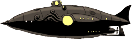 DoctorChevlong"
modified his Nautilus in another drawing referring to the League of
Extraordinary Gentlemen graphic novel by Alan Moore and Kevin O'Neill. This
design may be smaller than the earlier one and the wheelhouse is moved farther
aft. There are several openings, perhaps associated with ballast tanks,
added to the top of the hull but the major change is a giant squid shape in
raised relief on the hull side, incorporating the salon window as its eye.
As the artist says in his commentary, this is clearly a reference to the much
larger squid-shaped Nautilus 2 of the graphic novel. Other features
the earlier design are retained. See this original artwork at DeviantArt.
DoctorChevlong"
modified his Nautilus in another drawing referring to the League of
Extraordinary Gentlemen graphic novel by Alan Moore and Kevin O'Neill. This
design may be smaller than the earlier one and the wheelhouse is moved farther
aft. There are several openings, perhaps associated with ballast tanks,
added to the top of the hull but the major change is a giant squid shape in
raised relief on the hull side, incorporating the salon window as its eye.
As the artist says in his commentary, this is clearly a reference to the much
larger squid-shaped Nautilus 2 of the graphic novel. Other features
the earlier design are retained. See this original artwork at DeviantArt.
 Harry
Duksch conceived this graceful new and different Nautilus. The
profile shows some obvious allusions to Goff but the overall appearance is graceful
Harry
Duksch conceived this graceful new and different Nautilus. The
profile shows some obvious allusions to Goff but the overall appearance is graceful while retaining some lethality in the saw-tooth prow. The larger vertical
arches of this ram would apply the major force in and attack, the smaller
horizontal pair serving to protect the submarine's side fins and salon window housings.
The hull is more or less spindle shaped with the maximum diameter appearing to
be well aft. The retractable wheelhouse, except for the forward arch with
its two lights, resembling Goff's only slightly, has two larger forward-facing
ports and two smaller ports on each side, one of which is in a hatch. The
salon window similarly resembles Goff's from a distance, but is mechanically
distinct when examined up close. The hull has a large keel, again
reminiscent of Goff, but there are two dive hatches, the aft one significantly
larger. There is a row of lights on the lower hull alongside the keel, a
practical consideration on this Nautilus, which is obviously designed
with underwater activity in mind. The stern differs very much from Goff
and from most of the other designs in the catalog. A lower vertical fin
incorporates a long rudder. Two other similarly shaped fins attached to
the upper hull 120 degrees from the lower one emphasize the grace of the overall
shape. The wavy blades of the large propeller assembly remind me of
flowing kelp or perhaps a jellyfish. Combined with the fins these give
this design an organic look.
while retaining some lethality in the saw-tooth prow. The larger vertical
arches of this ram would apply the major force in and attack, the smaller
horizontal pair serving to protect the submarine's side fins and salon window housings.
The hull is more or less spindle shaped with the maximum diameter appearing to
be well aft. The retractable wheelhouse, except for the forward arch with
its two lights, resembling Goff's only slightly, has two larger forward-facing
ports and two smaller ports on each side, one of which is in a hatch. The
salon window similarly resembles Goff's from a distance, but is mechanically
distinct when examined up close. The hull has a large keel, again
reminiscent of Goff, but there are two dive hatches, the aft one significantly
larger. There is a row of lights on the lower hull alongside the keel, a
practical consideration on this Nautilus, which is obviously designed
with underwater activity in mind. The stern differs very much from Goff
and from most of the other designs in the catalog. A lower vertical fin
incorporates a long rudder. Two other similarly shaped fins attached to
the upper hull 120 degrees from the lower one emphasize the grace of the overall
shape. The wavy blades of the large propeller assembly remind me of
flowing kelp or perhaps a jellyfish. Combined with the fins these give
this design an organic look.
In the novel Nemo mentions to Aronnax that he could
have generated his electrical power directly from seawater but chose what he
thought was the simpler approach of processing coal that he mined
underwater. Duksch's design takes that step beyond Verne, using a blue
energy osmosis process to extract power from the sea itself.
 Of concept designer/illustrator Simon Murton's two
Nautilus designs, I prefer this one. The sleek hull has a fishlike
shape, the long observation window on the lower bow, evoking a squinting shark
eye. Looking aft past the stylized gill slits, large dive planes extend
from the keel, resembling pectoral fins. A line of three round ports on
the centerline amidships would be the salon windows. Just below and aft
two-stage vaned propellers provide propulsion. The hull, with smaller
shark-like fins tapers and ends with a large tail. Horizontal fins might
have additional dive planes and winglets at their ends might include
rudders. The long arch and small barbs on it and along the leading edge of
the keel are a nod to Harper Goff. The superstructure at the end of the
arch has a round port on either side and a forward-facing lantern on top.
My graphic doesn't do justice to the original
artwork.
Of concept designer/illustrator Simon Murton's two
Nautilus designs, I prefer this one. The sleek hull has a fishlike
shape, the long observation window on the lower bow, evoking a squinting shark
eye. Looking aft past the stylized gill slits, large dive planes extend
from the keel, resembling pectoral fins. A line of three round ports on
the centerline amidships would be the salon windows. Just below and aft
two-stage vaned propellers provide propulsion. The hull, with smaller
shark-like fins tapers and ends with a large tail. Horizontal fins might
have additional dive planes and winglets at their ends might include
rudders. The long arch and small barbs on it and along the leading edge of
the keel are a nod to Harper Goff. The superstructure at the end of the
arch has a round port on either side and a forward-facing lantern on top.
My graphic doesn't do justice to the original
artwork.
 This
second Nautilus by Simon Murton resembles a
prehistoric, armored fish. The lower hull forms a low ram like an
undershot jaw. Just above that large observation windows could be a set of eyes.
The lower hull flares out with a set of three ports at the widest part.
Farther aft, there is a non-traditional propulsion system with large vaned rotating parts on either side of the
base of the segmented tail. The large finlike superstructure
atop the hull is a wheelhouse/conning tower with the ports forming another set
of eyes. The tower has a set of dive planes on the sides and a row of spikes
near is aft end. Fins on the lower tail might also act as planes. I do find the
upper hull a little jarring, looking like a car that might roll off the lower
hull onto a beach. A front view included in the illustration on Murton's web site
reveal that the large view ports at the bow are angled, looking much less like
wheels.
This
second Nautilus by Simon Murton resembles a
prehistoric, armored fish. The lower hull forms a low ram like an
undershot jaw. Just above that large observation windows could be a set of eyes.
The lower hull flares out with a set of three ports at the widest part.
Farther aft, there is a non-traditional propulsion system with large vaned rotating parts on either side of the
base of the segmented tail. The large finlike superstructure
atop the hull is a wheelhouse/conning tower with the ports forming another set
of eyes. The tower has a set of dive planes on the sides and a row of spikes
near is aft end. Fins on the lower tail might also act as planes. I do find the
upper hull a little jarring, looking like a car that might roll off the lower
hull onto a beach. A front view included in the illustration on Murton's web site
reveal that the large view ports at the bow are angled, looking much less like
wheels.
 Not
typical of her style, art student LumenGlace (Christy) included this
Nautilus in an assignment she did for a perspective class. The hull
is spindle shaped with a sharp ram. There are five large windows of
different sizes, one of which has an iris shutter not unlike the Disney salon
window. This closed window has a ring of lights, giving it additional
significance the largest window doesn't have. There is a ring of other
lights around the stem that appear to point forward. There's a rounded
wheelhouse with what looks like a forward canopy window and a line of ports on
the side. No dive planes are obvious. There are two fins or fairings
along the keel, with a small propeller mounted at the end of the aft-most of
these. The design has an elaborate fish-like tail with with what looks
like a beacon at the tip of the upper fin. There appears to be a sort of
ring structure where the tail joins the hull, but it's almost completely hidden
by a tentacle of the truly giant squid in the artwork, so I've made no attempt
to render it here. See Christy's original artwork at DeviantArt.
Not
typical of her style, art student LumenGlace (Christy) included this
Nautilus in an assignment she did for a perspective class. The hull
is spindle shaped with a sharp ram. There are five large windows of
different sizes, one of which has an iris shutter not unlike the Disney salon
window. This closed window has a ring of lights, giving it additional
significance the largest window doesn't have. There is a ring of other
lights around the stem that appear to point forward. There's a rounded
wheelhouse with what looks like a forward canopy window and a line of ports on
the side. No dive planes are obvious. There are two fins or fairings
along the keel, with a small propeller mounted at the end of the aft-most of
these. The design has an elaborate fish-like tail with with what looks
like a beacon at the tip of the upper fin. There appears to be a sort of
ring structure where the tail joins the hull, but it's almost completely hidden
by a tentacle of the truly giant squid in the artwork, so I've made no attempt
to render it here. See Christy's original artwork at DeviantArt.
 The
Gakken Plus Japanese edition of 20,000 Leagues, with manga illustrations
by Yo Fujishiro. features this Nautilus. It has a nasty,
steampunk can-opener ram with a Goff-inspired raker arch joining it to the top
of the hull. There is a long wheelhouse with two large globular ports just
above the end
of the arch and what appears to be a glass-enclosed gallery running aft. A
wide deck begins approximately amidships and extends almost to the cable-supported tail. Dive planes
are mounted on the large cylindrical propeller shroud. The tail terminates with an
intricate two-part rudder. The polygonal cross-section hull has features of both the Goff classic
and Greg deSantis' Improbable Nautilus, but is proportionally longer with
larger hemispherical, almost churchlike, salon windows. See images of this Nautilus
or even purchase the Japanese-language paperback at Amazon.
(Thanks to Gen who found this Nautilus
and posted it at Nautilus Submarine.)
The
Gakken Plus Japanese edition of 20,000 Leagues, with manga illustrations
by Yo Fujishiro. features this Nautilus. It has a nasty,
steampunk can-opener ram with a Goff-inspired raker arch joining it to the top
of the hull. There is a long wheelhouse with two large globular ports just
above the end
of the arch and what appears to be a glass-enclosed gallery running aft. A
wide deck begins approximately amidships and extends almost to the cable-supported tail. Dive planes
are mounted on the large cylindrical propeller shroud. The tail terminates with an
intricate two-part rudder. The polygonal cross-section hull has features of both the Goff classic
and Greg deSantis' Improbable Nautilus, but is proportionally longer with
larger hemispherical, almost churchlike, salon windows. See images of this Nautilus
or even purchase the Japanese-language paperback at Amazon.
(Thanks to Gen who found this Nautilus
and posted it at Nautilus Submarine.)
 Mike
Gosda created this armored Nautilus design as a scratch-built
model. The angular flat-plate hull, inspired perhaps by Greg deSantis' Improbable Nautilus
(the tail is a near copy), has many features of an earlier steampunk submarine
waterline model built by Gosda. The
wheelhouse, with a large globular port on each side, forms the forward end of the
deck. There are two hatches on the deck, one forward and one aft. There is a narrow side fairing running the length of the hull,
broken only by the salon window located amidships. There is no sign of
dive planes. The aft hull narrows to the
sweeping fish tail and a three-bladed prop protected by a circular ring. Except possibly for the tail and the small,
fragile-looking ram, the overall form of this design is brutal and tank-like. I think the
impression from the deck of a target ship if this Nautilus were bearing
down on it, would be of a frightening armored fish monster.
Mike
Gosda created this armored Nautilus design as a scratch-built
model. The angular flat-plate hull, inspired perhaps by Greg deSantis' Improbable Nautilus
(the tail is a near copy), has many features of an earlier steampunk submarine
waterline model built by Gosda. The
wheelhouse, with a large globular port on each side, forms the forward end of the
deck. There are two hatches on the deck, one forward and one aft. There is a narrow side fairing running the length of the hull,
broken only by the salon window located amidships. There is no sign of
dive planes. The aft hull narrows to the
sweeping fish tail and a three-bladed prop protected by a circular ring. Except possibly for the tail and the small,
fragile-looking ram, the overall form of this design is brutal and tank-like. I think the
impression from the deck of a target ship if this Nautilus were bearing
down on it, would be of a frightening armored fish monster.
 The
Nautilus in the ad for the Living a Book publication El Capitán Nemo
y el Nautilus by JL Knight appears to be derived from the "Sword of the Sea"
from the movie League of Extraordinary Gentlemen, but brings that design
in line with Jules Verne's text. There is a tall sharp prow with elaborate
scrollwork decoration. The cylindrical hull lacks large salon windows, substituting
long rows of small ports. There is a lower deck under the bow with more
widely separated ports that might house the salon. A decorated section on
the hull bottom just aft of this deck might include a dive hatch. The
narrow prow disappears into a separate upper hull segment with dive planes at
the forward end and a tail pilothouse/bridge at the aft end. The
scrollwork-decorated stern narrows to a cylindrical section with vertical fins
that appears to protect a propeller. A second set of planes is positioned
at the narrow transition to this section.
The
Nautilus in the ad for the Living a Book publication El Capitán Nemo
y el Nautilus by JL Knight appears to be derived from the "Sword of the Sea"
from the movie League of Extraordinary Gentlemen, but brings that design
in line with Jules Verne's text. There is a tall sharp prow with elaborate
scrollwork decoration. The cylindrical hull lacks large salon windows, substituting
long rows of small ports. There is a lower deck under the bow with more
widely separated ports that might house the salon. A decorated section on
the hull bottom just aft of this deck might include a dive hatch. The
narrow prow disappears into a separate upper hull segment with dive planes at
the forward end and a tail pilothouse/bridge at the aft end. The
scrollwork-decorated stern narrows to a cylindrical section with vertical fins
that appears to protect a propeller. A second set of planes is positioned
at the narrow transition to this section.
Lyle Simoneaux points out similarities of this design
to Auguste Piccard's 1964 PX-8 submarine indicating it may have been influenced
the illustrator's design.
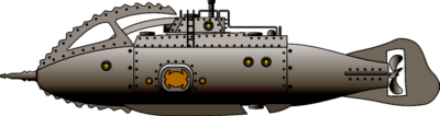 This
is Josef Keller's take on the Harrayhausen Nautilus in the 1961 Mysterious
Island. In the film, we only see it above the waterline, so Joe was
free to imagine the rest of the submarine. Compare Joe's design to my interpretation
of the film original, above. He's added a elegantly turned
ram and divided the hull into three discrete parts. Following the Goff
classic the flying double arch here begins at the bow and is placed outside the
lower arch. Again like Goff, there is a complimentary set of rakers on the
lower hull and a unique abstract sea turtle silhouette salon window. There's a dive
hatch within a double set of fins on the lower hull, mirroring the sets of double arches above the
waterline. Joe has added a large four-bladed propeller
in a nicely shaped tail. The superstructure differs in some details
from the film version, but otherwise is true to it. See photos of this
impressive scratch built model in this thread at nautilussubmarine
(membership required); the first photos of this model are in the 7th
entry near the end of the page. There are more photos on the second
page. Josef has posted photos of all his models on this page
of his Airbrush Artwork web site.
This
is Josef Keller's take on the Harrayhausen Nautilus in the 1961 Mysterious
Island. In the film, we only see it above the waterline, so Joe was
free to imagine the rest of the submarine. Compare Joe's design to my interpretation
of the film original, above. He's added a elegantly turned
ram and divided the hull into three discrete parts. Following the Goff
classic the flying double arch here begins at the bow and is placed outside the
lower arch. Again like Goff, there is a complimentary set of rakers on the
lower hull and a unique abstract sea turtle silhouette salon window. There's a dive
hatch within a double set of fins on the lower hull, mirroring the sets of double arches above the
waterline. Joe has added a large four-bladed propeller
in a nicely shaped tail. The superstructure differs in some details
from the film version, but otherwise is true to it. See photos of this
impressive scratch built model in this thread at nautilussubmarine
(membership required); the first photos of this model are in the 7th
entry near the end of the page. There are more photos on the second
page. Josef has posted photos of all his models on this page
of his Airbrush Artwork web site.
 Gunnar
C. has done some pencil and watercolor artwork that feature this Nautilus.
The design is fishlike with a large triangular cross-section bladed ram
surrounding the bow. The large salon window is in line with the trapezoidal
wheelhouse at the forward end of a slightly raised deck that includes the dinghy
amidships. The lantern housing at the aft end includes a semicircular
retracting mechanism. There are large dive planes amidships and a large
finned tail with a multi-bladed propeller. The lower fin appears to be a
large rudder. Gunnar has added two smaller portholes on the aft hull side
for the crew. He says "to have them live their lives aboard the ship
and have no access to the view outside the sub would be cruel". The
structure on the lower hull is a retractable airlock for divers. It has a
similar retraction mechanism to the lantern housing. There are some small
differences among the depictions of this Nautilus, the most notable being
a tall lantern, similar to a few designs in the catalog, just forward of the
housing in the line drawings. See the
original artwork on Gunnar's FantasyfaxXD
tumblr site.
Gunnar
C. has done some pencil and watercolor artwork that feature this Nautilus.
The design is fishlike with a large triangular cross-section bladed ram
surrounding the bow. The large salon window is in line with the trapezoidal
wheelhouse at the forward end of a slightly raised deck that includes the dinghy
amidships. The lantern housing at the aft end includes a semicircular
retracting mechanism. There are large dive planes amidships and a large
finned tail with a multi-bladed propeller. The lower fin appears to be a
large rudder. Gunnar has added two smaller portholes on the aft hull side
for the crew. He says "to have them live their lives aboard the ship
and have no access to the view outside the sub would be cruel". The
structure on the lower hull is a retractable airlock for divers. It has a
similar retraction mechanism to the lantern housing. There are some small
differences among the depictions of this Nautilus, the most notable being
a tall lantern, similar to a few designs in the catalog, just forward of the
housing in the line drawings. See the
original artwork on Gunnar's FantasyfaxXD
tumblr site.
.
 This
Nautilus by Josef Keller has a double, v-form saw-tooth arch, like
Harryhausen's. The design features an ornate ram with colored running lights on
either side. The bow is a hexagonal cross-section frame with flat glowing
panels. Let's assume that Nemo has rigged the hull plates to glow during
an attack. The bow frame has a serrated fairing on either side. The main hull has a polygonal cross-section
and protruding
salon window housings located above the centerline, protected by serrated
cutwaters. The nicely turned stern tapers to the the large
four-bladed prop set in a gracefully finned tail. There are similarly curved
fins at the centerline on the aft portion of the main hull. The bow arches
rise to protect a rectangular wheelhouse with a sloped front. There is a
large forward-looking port and one on on each side. The deck
has a Goff-like serrated dorsal fin just forward of the deck hatch. See photos of this
found-object, scratch-built model in this thread at nautilussubmarine
(membership required). He has posted photos of all his models
on this page
of his Airbrush Artwork web site.
This
Nautilus by Josef Keller has a double, v-form saw-tooth arch, like
Harryhausen's. The design features an ornate ram with colored running lights on
either side. The bow is a hexagonal cross-section frame with flat glowing
panels. Let's assume that Nemo has rigged the hull plates to glow during
an attack. The bow frame has a serrated fairing on either side. The main hull has a polygonal cross-section
and protruding
salon window housings located above the centerline, protected by serrated
cutwaters. The nicely turned stern tapers to the the large
four-bladed prop set in a gracefully finned tail. There are similarly curved
fins at the centerline on the aft portion of the main hull. The bow arches
rise to protect a rectangular wheelhouse with a sloped front. There is a
large forward-looking port and one on on each side. The deck
has a Goff-like serrated dorsal fin just forward of the deck hatch. See photos of this
found-object, scratch-built model in this thread at nautilussubmarine
(membership required). He has posted photos of all his models
on this page
of his Airbrush Artwork web site.
 This
Nautilus, designed by Paolo Venturi and seen in the Dark Waters episode of the ABC TV series Once Upon a Time, is almost Harper
Goff's design but examination reveals small and larger differences. The
raker teeth are smaller and shaped differently and the arch is thinner than
Goff's. The wheelhouse alligator-eye lights are gone and there's
a platform with railings atop it. There are deck railings alongside the aft section of
the wheelhouse and on the aft deck starting at the hatch. Goff's dorsal fin is
gone. Although the skiff appears to be there it seems it's more of an
elevated deck plaform. The salon window with its ring of lights is almost the same but there are two
large ports just aft. The symmetrical tail differs from Goff's; it
includes horizontal fins and a sort of prop guard cage protecting a four-bladed propeller. (My graphic, without the prop, is an approximation based on some screenshots from
the program.) See the screenshots at nautilussubmarine
(membership required) and a nice graphic of this Nautilus at the bottom
of this page
on Paolo's ArtStation site.
This
Nautilus, designed by Paolo Venturi and seen in the Dark Waters episode of the ABC TV series Once Upon a Time, is almost Harper
Goff's design but examination reveals small and larger differences. The
raker teeth are smaller and shaped differently and the arch is thinner than
Goff's. The wheelhouse alligator-eye lights are gone and there's
a platform with railings atop it. There are deck railings alongside the aft section of
the wheelhouse and on the aft deck starting at the hatch. Goff's dorsal fin is
gone. Although the skiff appears to be there it seems it's more of an
elevated deck plaform. The salon window with its ring of lights is almost the same but there are two
large ports just aft. The symmetrical tail differs from Goff's; it
includes horizontal fins and a sort of prop guard cage protecting a four-bladed propeller. (My graphic, without the prop, is an approximation based on some screenshots from
the program.) See the screenshots at nautilussubmarine
(membership required) and a nice graphic of this Nautilus at the bottom
of this page
on Paolo's ArtStation site.
 Anthony
Testa took the sperm whale as inspiration for this Nautilus, an
appropriate monster when we refer to Verne's text. In the chapter "Cachalots
and Whales" Nemo says of sperm whales (cachalots), "terrible animals ... they are cruel, mischievous
creatures". Like Moby Dick ramming the Pequod, the whale's head,
lined with a row of rakers, rather than a spar, is the weapon of destruction of
this Nautilus. There are two sets of dive planes, one set on the
lower surface of the bow, pectoral fins, and the other on the horizontal tail,
the whale's flukes. The rudder is set on the bottom of the stern.
The design has a double annular propeller just forward of tail. There are
two hatches, the main hatch in the whale's spine in the aft section of the hull,
just forward of the boat. The dive hatch is in the keel, almost directly
below the deck hatch. The only window, situated amidships, is that for the
salon. There is no protruding wheelhouse; outside vision for
navigation is via a system of sensors and mirrors atop the hull. The
lantern is located on the tall pole rising from the tail.
Anthony
Testa took the sperm whale as inspiration for this Nautilus, an
appropriate monster when we refer to Verne's text. In the chapter "Cachalots
and Whales" Nemo says of sperm whales (cachalots), "terrible animals ... they are cruel, mischievous
creatures". Like Moby Dick ramming the Pequod, the whale's head,
lined with a row of rakers, rather than a spar, is the weapon of destruction of
this Nautilus. There are two sets of dive planes, one set on the
lower surface of the bow, pectoral fins, and the other on the horizontal tail,
the whale's flukes. The rudder is set on the bottom of the stern.
The design has a double annular propeller just forward of tail. There are
two hatches, the main hatch in the whale's spine in the aft section of the hull,
just forward of the boat. The dive hatch is in the keel, almost directly
below the deck hatch. The only window, situated amidships, is that for the
salon. There is no protruding wheelhouse; outside vision for
navigation is via a system of sensors and mirrors atop the hull. The
lantern is located on the tall pole rising from the tail.
 Prolific
modeler Josef Keller built this steam-powered Nautilus model,
once again taking advantage of various mechanical parts. The design has a
cylindrical hull with a large keel that turns up into the rudder mount aft of
the large multi-vaned fan propeller. The large salon window is set deep in
the side within a stylized plate that might represent a fish going after a bait
ball, the smaller port just aft. Thick curved fin dive planes are located
amidships. Two stiff braided cables form a double arch to the ornate
superstructure that's topped with a substantial lantern. The oval deck has
a hatch just aft of the superstructure and a curved smokestack that can be
closed for running underwater. By my count this is the fourth explicitly
steam-powered Nautilus in the catalog. See photos of this scratch-built model in this thread at
nautilussubmarine
(membership required). Josef has posted photos of all his models
on this page
of his Airbrush Artwork web site.
Prolific
modeler Josef Keller built this steam-powered Nautilus model,
once again taking advantage of various mechanical parts. The design has a
cylindrical hull with a large keel that turns up into the rudder mount aft of
the large multi-vaned fan propeller. The large salon window is set deep in
the side within a stylized plate that might represent a fish going after a bait
ball, the smaller port just aft. Thick curved fin dive planes are located
amidships. Two stiff braided cables form a double arch to the ornate
superstructure that's topped with a substantial lantern. The oval deck has
a hatch just aft of the superstructure and a curved smokestack that can be
closed for running underwater. By my count this is the fourth explicitly
steam-powered Nautilus in the catalog. See photos of this scratch-built model in this thread at
nautilussubmarine
(membership required). Josef has posted photos of all his models
on this page
of his Airbrush Artwork web site.
 Clearly
inspired by Goff's classic, professional designer and illustrator Tony
Campagna's Nautilus differs in many ways. The hull is longer
and much more organic, even bulbous, than the Disney submarine and the ram,
encompassing the whole bow, is more substantial. The rakers are somewhat
clunkier, with the lower set replaced by two rows placed at an angle on the lower
hull. The side fairing continues aft of the rakers past the salon window
where it continues aft as the hull narrows considerably. There are no
obvious dive planes but room for a set at the end of these fairings. A
six-bladed propeller is located within a protective ring attached to a very
Goff-like tail. The wheelhouse, aft of the raker arch that looks less substantial
than the other rakers, has large globular ports on its angled sides and a
smaller one on its front face. There are two small and one large hatch on
the long deck. See Tony's original artwork at DeviantArt
and download a printable 3D model from TinkerCAD.
Clearly
inspired by Goff's classic, professional designer and illustrator Tony
Campagna's Nautilus differs in many ways. The hull is longer
and much more organic, even bulbous, than the Disney submarine and the ram,
encompassing the whole bow, is more substantial. The rakers are somewhat
clunkier, with the lower set replaced by two rows placed at an angle on the lower
hull. The side fairing continues aft of the rakers past the salon window
where it continues aft as the hull narrows considerably. There are no
obvious dive planes but room for a set at the end of these fairings. A
six-bladed propeller is located within a protective ring attached to a very
Goff-like tail. The wheelhouse, aft of the raker arch that looks less substantial
than the other rakers, has large globular ports on its angled sides and a
smaller one on its front face. There are two small and one large hatch on
the long deck. See Tony's original artwork at DeviantArt
and download a printable 3D model from TinkerCAD.
(Thanks
to Mikel Sauve who brought this design to my attention.)
 This
sleek Nautilus built by Josef Keller began life as a Zeppelin model.
Clearly inspired by the Goff classic, this design, intended for exploration and
not battle, lacks the imposing raker teeth of the original. The upper
vertical fairing forms a graceful flying arch, perhaps intended for breaking
through ice in the polar regions. The horizontal fairing curves gently into
the hull just forward of the round salon window. The lower, nicely curved
fairing is interrupted for the divers' hatch before continuing to the Goff-like
tail. The eight-bladed propeller has no guard. The wheelhouse has
oval ports on the canted forward sides, flatter than the classic, and is simpler
overall. There is a low, sail-like fin at the end of the deck, just aft of the
hatch, similar to horizontal fins on the stern. See a photo of Joe's model
at nautilussubmarine
(free membership needed). Josef has posted photos of all his models
on this page
of his Airbrush Artwork web site.
This
sleek Nautilus built by Josef Keller began life as a Zeppelin model.
Clearly inspired by the Goff classic, this design, intended for exploration and
not battle, lacks the imposing raker teeth of the original. The upper
vertical fairing forms a graceful flying arch, perhaps intended for breaking
through ice in the polar regions. The horizontal fairing curves gently into
the hull just forward of the round salon window. The lower, nicely curved
fairing is interrupted for the divers' hatch before continuing to the Goff-like
tail. The eight-bladed propeller has no guard. The wheelhouse has
oval ports on the canted forward sides, flatter than the classic, and is simpler
overall. There is a low, sail-like fin at the end of the deck, just aft of the
hatch, similar to horizontal fins on the stern. See a photo of Joe's model
at nautilussubmarine
(free membership needed). Josef has posted photos of all his models
on this page
of his Airbrush Artwork web site.
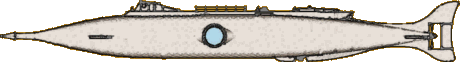 Bob
Martin started with Greg Sharpe's original Nautilus (1990
above) and while more or less keeping to Jules Verne's description he added
some new elements and incorporated some of Harper Goff's concepts. This Nautilus
has an elevated deck with two searchlights at its forward end. The wheelhouse is
similar to Goff's but has a large forward looking viewport and a smaller one on
each side. Bob has adopted Goff's skiff position at the aft end of the
deck but replaced the skiff with an electric minisub that can be entered from
within the Nautilus, like Verne's sail-powered canot. The minisub
can be configured for surface running. Like the wheelhouse
ports, the salon windows are spherical for strength and protected during ram
attacks by protruding shields. See illustrations of Bob's digital and
physical prototypes at nautilussubmarine
(free membership required).
Bob
Martin started with Greg Sharpe's original Nautilus (1990
above) and while more or less keeping to Jules Verne's description he added
some new elements and incorporated some of Harper Goff's concepts. This Nautilus
has an elevated deck with two searchlights at its forward end. The wheelhouse is
similar to Goff's but has a large forward looking viewport and a smaller one on
each side. Bob has adopted Goff's skiff position at the aft end of the
deck but replaced the skiff with an electric minisub that can be entered from
within the Nautilus, like Verne's sail-powered canot. The minisub
can be configured for surface running. Like the wheelhouse
ports, the salon windows are spherical for strength and protected during ram
attacks by protruding shields. See illustrations of Bob's digital and
physical prototypes at nautilussubmarine
(free membership required).
 Artist
Jeffrey Thompson has included this Nautilus in several of
his woodcut images. The elaborate Victorian design features somewhat
fanciful ram with several Goff-homage barbs. The deck has a long, low
wheelhouse and a similar, smaller lantern, aft. The hull narrows and then
flares into an asymmetrical fishtail with flourishes similar to the
ram. The prop is appropriately Verne-sized. The hull features
a large circular salon window and a line of smaller ports extending aft to the
tail.
Artist
Jeffrey Thompson has included this Nautilus in several of
his woodcut images. The elaborate Victorian design features somewhat
fanciful ram with several Goff-homage barbs. The deck has a long, low
wheelhouse and a similar, smaller lantern, aft. The hull narrows and then
flares into an asymmetrical fishtail with flourishes similar to the
ram. The prop is appropriately Verne-sized. The hull features
a large circular salon window and a line of smaller ports extending aft to the
tail.
 Artist
Ana Sofia Chi depicted this very whale-like "undersea expeditions" Nautilus
in a drawing surrounded by whales. Verne's Nautilus was mistaken
for a sea monster by eye witnesses who have never seen anything like it; this Nautilus
looks like a whale in order to explore their habitat. But for its
fin-like dive pane located amidships it has little to do with Verne. There
are are ports of different sizes on the forward hull, perhaps two hatches on the
upper hull and a diving hatch on the side. There may be a light on the aft
tip of the dorsal fin. Unless the whale's tail is articulated there's no
indication of the propulsion system. Not too much Verne, but interesting nonetheless.
See Ana Sofia's original artwork at DeviantArt.
Artist
Ana Sofia Chi depicted this very whale-like "undersea expeditions" Nautilus
in a drawing surrounded by whales. Verne's Nautilus was mistaken
for a sea monster by eye witnesses who have never seen anything like it; this Nautilus
looks like a whale in order to explore their habitat. But for its
fin-like dive pane located amidships it has little to do with Verne. There
are are ports of different sizes on the forward hull, perhaps two hatches on the
upper hull and a diving hatch on the side. There may be a light on the aft
tip of the dorsal fin. Unless the whale's tail is articulated there's no
indication of the propulsion system. Not too much Verne, but interesting nonetheless.
See Ana Sofia's original artwork at DeviantArt.
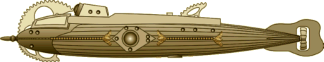 Josef Keller
built this ornate Nautilus starting again from a Zeppelin model.
What looks like the wheelhouse at the forward end of the deck is actually the searchlight housing. The
wheelhouse, with its large trapezoidal side windows, is inset in the forward hull
below the circular sawtooth arch. The deck features a raised bulwark aft
of the searchlight housing. The main hatch, not visible behind the
bulwark, is located at the end of the deck aft of the sawtooth dorsal fin.
The design features elaborate ornamentation from the nicely turned ram to the
curvy tail with its multi-bladed propeller. Like many of Keller's scratch
built models, this Nautilus is rigged so that the many portholes and and
lights illuminate and continue to glow when power is removed. See a photo
of Joe's model at nautilussubmarine
(free membership needed). He has posted photos of all his models on
this page
of his Airbrush Artwork web site.
Josef Keller
built this ornate Nautilus starting again from a Zeppelin model.
What looks like the wheelhouse at the forward end of the deck is actually the searchlight housing. The
wheelhouse, with its large trapezoidal side windows, is inset in the forward hull
below the circular sawtooth arch. The deck features a raised bulwark aft
of the searchlight housing. The main hatch, not visible behind the
bulwark, is located at the end of the deck aft of the sawtooth dorsal fin.
The design features elaborate ornamentation from the nicely turned ram to the
curvy tail with its multi-bladed propeller. Like many of Keller's scratch
built models, this Nautilus is rigged so that the many portholes and and
lights illuminate and continue to glow when power is removed. See a photo
of Joe's model at nautilussubmarine
(free membership needed). He has posted photos of all his models on
this page
of his Airbrush Artwork web site.
 Going
back to the novel, but adding his own touches
Going
back to the novel, but adding his own touches  and
drawing on Goff, "andrewsbestship" created this Nautilus
as a 3D model. The spindle-shaped hull has fairings running along the
sides and bottom all the way to the tail fins and atop the hull to the
wheelhouse. The fairings are adorned with very Goff-like rakers along the
keel up to the wheelhouse and a short distance along the sides. The wheel
house has window sets at the forward and aft ends and midway, including on
top. A raised deck with small and large hatches and a lantern about three
quarters of the way aft ends with a boat in Goff's position, but entered from
inside the submarine, as in the novel. The boat top has four
windows. The side fairing breaks about a quarter of the way aft for rectangular
salon windows forward of large swept back dive planes. The designer as has
added small propeller units in the side fairings amidships "that can act
as turbines" to provide power or motors for more speed or control.
The tail structure has additional small dive planes, encloses a large
five-bladed prop and ends with a large rudder. The hull has two rows of
small ports and a dive hatch in the keel directly below the hatch to the
boat. The model, available at 3D
Warehouse, has a very detailed interior.
and
drawing on Goff, "andrewsbestship" created this Nautilus
as a 3D model. The spindle-shaped hull has fairings running along the
sides and bottom all the way to the tail fins and atop the hull to the
wheelhouse. The fairings are adorned with very Goff-like rakers along the
keel up to the wheelhouse and a short distance along the sides. The wheel
house has window sets at the forward and aft ends and midway, including on
top. A raised deck with small and large hatches and a lantern about three
quarters of the way aft ends with a boat in Goff's position, but entered from
inside the submarine, as in the novel. The boat top has four
windows. The side fairing breaks about a quarter of the way aft for rectangular
salon windows forward of large swept back dive planes. The designer as has
added small propeller units in the side fairings amidships "that can act
as turbines" to provide power or motors for more speed or control.
The tail structure has additional small dive planes, encloses a large
five-bladed prop and ends with a large rudder. The hull has two rows of
small ports and a dive hatch in the keel directly below the hatch to the
boat. The model, available at 3D
Warehouse, has a very detailed interior.
(Thanks to Lyle Simoneaux who pointed out this
design.)
~ 2017 ~
 CapStrax"
has re-imagined the Nautilus as a spaceship for the Space Engineers
game. Granted it's not a submarine, but this design is based on and so
resembles the Goff classic that it qualifies for the catalog. Retaining
Goff's look, the design is bigger but less elegant with straighter lines. The
ram appears almost flimsy, but the saw-toothed rakers would be effective.
The wheelhouse is more massive and set on a recessed deck. The salon
window is there, with the familiar pattern of lights. The overall
steampunk look of the original is gone, replaced by Star Wars detail
appropriate to the game. If Nemo had been born into this universe, this
might have been his vessel.
CapStrax"
has re-imagined the Nautilus as a spaceship for the Space Engineers
game. Granted it's not a submarine, but this design is based on and so
resembles the Goff classic that it qualifies for the catalog. Retaining
Goff's look, the design is bigger but less elegant with straighter lines. The
ram appears almost flimsy, but the saw-toothed rakers would be effective.
The wheelhouse is more massive and set on a recessed deck. The salon
window is there, with the familiar pattern of lights. The overall
steampunk look of the original is gone, replaced by Star Wars detail
appropriate to the game. If Nemo had been born into this universe, this
might have been his vessel.
 This
elaborate variation of the classic design, by "Shaduf", evokes
an ornamental fish with diaphanous fins. Harper Goff's basic form is still
there, but Shaduf has added many more view ports, especially for a large viewing
gallery below the bow. A slightly smaller dome below the filigree arch
hints at a compartment with a glass ceiling. These new ports are not practical
for a warship, so although the pointed ram remains, perhaps Nemo has turned
exclusively to exploration. The wheelhouse remains, almost unchanged, as
does the salon window, but with a different light pattern. The dorsal fin
is very large and more fishlike and the boat compartment has been replaced with
more filigree. Perhaps consistent with the new more peaceful purpose
of this Nautilus, the four-bladed prop is no longer protected by a
ring. See Shaduf's original artwork at DeviantArt.
This
elaborate variation of the classic design, by "Shaduf", evokes
an ornamental fish with diaphanous fins. Harper Goff's basic form is still
there, but Shaduf has added many more view ports, especially for a large viewing
gallery below the bow. A slightly smaller dome below the filigree arch
hints at a compartment with a glass ceiling. These new ports are not practical
for a warship, so although the pointed ram remains, perhaps Nemo has turned
exclusively to exploration. The wheelhouse remains, almost unchanged, as
does the salon window, but with a different light pattern. The dorsal fin
is very large and more fishlike and the boat compartment has been replaced with
more filigree. Perhaps consistent with the new more peaceful purpose
of this Nautilus, the four-bladed prop is no longer protected by a
ring. See Shaduf's original artwork at DeviantArt.
 In
the text accompanying his art work, multimedia artist Dani Lebeaux
(Raining Crow) laments the fact that so many depictions of the Nautilus
resemble the Disney version, and sets about to create one that's true to the
spirit of the novel and doesn't draw on Harper Goff for inspiration.
Looks like he succeeded. "Designed to resemble an aquatic
animal", Lebeaux's Nautilus has a cigar-shaped hull that is narrower than
it is high (of course not noticeable in my side view - in fact, from the top the
shape might be a squid). He's moved the salon window forward to resemble
an eye and the design has both a dorsal and anal fin. A pair of triangular
dive planes are forward, just beneath the salon windows. There's a pair of
much larger, trapezoidal fins aft that may be a second set of dive planes. The sword-like
ram is set high, almost at deck level, with a triangular shield to protect the
windows of the wheelhouse. There's a surface bridge atop the tower
just aft of the wheelhouse and a smaller structure at the aft end of deck.
This design either has two propellers on the same shaft or some exotic
propulsion system. I've left out many details in my graphic of Lebeaux's design,
including the hull seams resulting from its manufacture in different factories for
secret assembly by Nemo and his crew. See the original artwork at DeviantArt.
In
the text accompanying his art work, multimedia artist Dani Lebeaux
(Raining Crow) laments the fact that so many depictions of the Nautilus
resemble the Disney version, and sets about to create one that's true to the
spirit of the novel and doesn't draw on Harper Goff for inspiration.
Looks like he succeeded. "Designed to resemble an aquatic
animal", Lebeaux's Nautilus has a cigar-shaped hull that is narrower than
it is high (of course not noticeable in my side view - in fact, from the top the
shape might be a squid). He's moved the salon window forward to resemble
an eye and the design has both a dorsal and anal fin. A pair of triangular
dive planes are forward, just beneath the salon windows. There's a pair of
much larger, trapezoidal fins aft that may be a second set of dive planes. The sword-like
ram is set high, almost at deck level, with a triangular shield to protect the
windows of the wheelhouse. There's a surface bridge atop the tower
just aft of the wheelhouse and a smaller structure at the aft end of deck.
This design either has two propellers on the same shaft or some exotic
propulsion system. I've left out many details in my graphic of Lebeaux's design,
including the hull seams resulting from its manufacture in different factories for
secret assembly by Nemo and his crew. See the original artwork at DeviantArt.
 The
3D modeler with the unfortunate handle "EbolaRocks08" created
this Nautilus in Sketchup. The designer leaves convention behind, equipping
the raised spar with an explosive-filled torpedo, not unlike the Civil War era David
torpedo boats and Hunley submarine. Only slightly less original, the
deck has two retractable gun turrets based on R.S. Noah's real submarine gun turret
patent. The cigar-shaped hull has an octagonal cross-section and fore and aft dive planes.
In addition to a Goff-inspired
The
3D modeler with the unfortunate handle "EbolaRocks08" created
this Nautilus in Sketchup. The designer leaves convention behind, equipping
the raised spar with an explosive-filled torpedo, not unlike the Civil War era David
torpedo boats and Hunley submarine. Only slightly less original, the
deck has two retractable gun turrets based on R.S. Noah's real submarine gun turret
patent. The cigar-shaped hull has an octagonal cross-section and fore and aft dive planes.
In addition to a Goff-inspired salon window, the design has a row of small ports amidships. A large four-bladed
propeller is protected by a cylindrical shroud just forward of a large
rudder. The low octagonal, slope-sided wheelhouse has a narrow rectangular
port on each side. The railings on the wide deck fold down for a clean
deck when the turrets are withdrawn or to widen the guns field of fire when in use
on the surface. There are four hatches atop the hull, one just forward of
the wheelhouse, two on the deck forward and aft of the central turret, and one
aft of the deck. This is the "modernised" version of the design.
There is a steampunk version with smokestacks and air intakes that are sealed
but not retracted when submerged. We can think of it as the Victorian
version of a diesel submarine, with steam power used on the surface and to
charge the batteries and electric power used submerged. This Nautilus
is available at the 3D
Warehouse.
salon window, the design has a row of small ports amidships. A large four-bladed
propeller is protected by a cylindrical shroud just forward of a large
rudder. The low octagonal, slope-sided wheelhouse has a narrow rectangular
port on each side. The railings on the wide deck fold down for a clean
deck when the turrets are withdrawn or to widen the guns field of fire when in use
on the surface. There are four hatches atop the hull, one just forward of
the wheelhouse, two on the deck forward and aft of the central turret, and one
aft of the deck. This is the "modernised" version of the design.
There is a steampunk version with smokestacks and air intakes that are sealed
but not retracted when submerged. We can think of it as the Victorian
version of a diesel submarine, with steam power used on the surface and to
charge the batteries and electric power used submerged. This Nautilus
is available at the 3D
Warehouse.
(Thanks to Ishmael for pointing out this design.)
 After
rereading 20,000 Leagues under the Sea, Josef Keller decided to
scratch build a Nautilus that followed the description in the
novel. Joe's latest effort has a spindle-shaped hull with a heavy, pointed
ram bolted to the bow. There's a large circular salon window approximately
amidships, with a smaller port or light a little aft, just forward of the dive
plane. A large five-bladed propeller is mounted on the stern. A heavy keel
begins just aft of amidships and provides mounting for the large rudder.
Joe has placed a narrow deck atop the hull with a hatch at its forward end, just
forward of the diamond shaped wheelhouse that pays homage to Harper Goff.
It has two large canted viewports forward and two smaller ports on the aft
sides, true to Verne's description of four ports. The structure has a
subtle extension aft with a hatch, again referencing Goff. Following the
text, the boat is mounted in the deck just aft of the hatch and forward of the
lantern structure that has a large forward-facing light. Joe has located
small anchors on the forward hull and placed a dive hatch on the lower port-side
hull. There's a small port or light next to this hatch. See photos of this
model at nautilussubmarine
(free membership needed) or on
this page
of Joe's Airbrush Artwork web site with photos of all his models.
After
rereading 20,000 Leagues under the Sea, Josef Keller decided to
scratch build a Nautilus that followed the description in the
novel. Joe's latest effort has a spindle-shaped hull with a heavy, pointed
ram bolted to the bow. There's a large circular salon window approximately
amidships, with a smaller port or light a little aft, just forward of the dive
plane. A large five-bladed propeller is mounted on the stern. A heavy keel
begins just aft of amidships and provides mounting for the large rudder.
Joe has placed a narrow deck atop the hull with a hatch at its forward end, just
forward of the diamond shaped wheelhouse that pays homage to Harper Goff.
It has two large canted viewports forward and two smaller ports on the aft
sides, true to Verne's description of four ports. The structure has a
subtle extension aft with a hatch, again referencing Goff. Following the
text, the boat is mounted in the deck just aft of the hatch and forward of the
lantern structure that has a large forward-facing light. Joe has located
small anchors on the forward hull and placed a dive hatch on the lower port-side
hull. There's a small port or light next to this hatch. See photos of this
model at nautilussubmarine
(free membership needed) or on
this page
of Joe's Airbrush Artwork web site with photos of all his models.
 Canadian
artist
Andrew
King designed this Nautilus to commemorate
Canadian
artist
Andrew
King designed this Nautilus to commemorate  the
sesquicentennial of the voyage narrated in 20,000 Leagues under the Sea.
He began with the description in the novel and enhanced it with features to
"make this a formidable craft worthy of sailing the seven seas with Captain
Nemo in command". He drew inspiration from marine creatures: the
hammerhead shark inspired the look of the large forward-located dive planes, the
swordfish for the profile, and even the giant squid for the top-down
shape. The vicious ram incorporates a long extension from the thick
spindle hull and a heavy saw-tooth fairing that runs up the bow, ending at the
smooth arch that protects the wheelhouse. The mirrored fairing on the
lower hull is smooth and extends almost to the diving hatch dome
amidships. One of the drawings describes this as bottom rest. The
narrow and smooth side fairings continue only as far as the wide dive planes
that are positioned far forward. The large salon windows are forward of
amidships. There's a large stationary wheelhouse with two forward facing
floodlights on top. A long deck extends aft from here. The boat is
mounded in the deck amidships just forward of the main hatch. Horizontal
stabilizers, smaller than the dive planes, but of similar shape extend from the
aft hull. A vertical fairing begins a little aft of the where the spindle
narrows and extends to the large, abstractly fishtail-shaped rudder. The
four-bladed propeller is protected by a short cylindrical ring. Divers
leave the submarine from a hatch in the spherical chamber on the lower hull,
their way illuminated by two downward-facing lights. Although Andrew
King intentionally avoided existing designs, I see some very subtle hints of
Harper Goff in this Nautilus.
the
sesquicentennial of the voyage narrated in 20,000 Leagues under the Sea.
He began with the description in the novel and enhanced it with features to
"make this a formidable craft worthy of sailing the seven seas with Captain
Nemo in command". He drew inspiration from marine creatures: the
hammerhead shark inspired the look of the large forward-located dive planes, the
swordfish for the profile, and even the giant squid for the top-down
shape. The vicious ram incorporates a long extension from the thick
spindle hull and a heavy saw-tooth fairing that runs up the bow, ending at the
smooth arch that protects the wheelhouse. The mirrored fairing on the
lower hull is smooth and extends almost to the diving hatch dome
amidships. One of the drawings describes this as bottom rest. The
narrow and smooth side fairings continue only as far as the wide dive planes
that are positioned far forward. The large salon windows are forward of
amidships. There's a large stationary wheelhouse with two forward facing
floodlights on top. A long deck extends aft from here. The boat is
mounded in the deck amidships just forward of the main hatch. Horizontal
stabilizers, smaller than the dive planes, but of similar shape extend from the
aft hull. A vertical fairing begins a little aft of the where the spindle
narrows and extends to the large, abstractly fishtail-shaped rudder. The
four-bladed propeller is protected by a short cylindrical ring. Divers
leave the submarine from a hatch in the spherical chamber on the lower hull,
their way illuminated by two downward-facing lights. Although Andrew
King intentionally avoided existing designs, I see some very subtle hints of
Harper Goff in this Nautilus.
See much more about this Nautilus at King's 20,000
Leagues under the Sea
web site. Read his thoughts about the novel, look at his many
illustrations, including the interior arrangements, and maybe purchase a
print, or one of his books that feature the many illustrations he's done
for the novel.
 Josef Keller
refitted his Mysterious Island scratch-built Nautilus (above)
to better match the 1961 film Harryhausen design. Joe has extended the
hull and added an after deck level on the extension. He's also extensively
re-done the flying arch structure, made some changes to the ram, the salon
window and the lower hull. Overall this is a very nice design. Like
many of his models, this one is now refitted with a lamp base so that all the
ports can be illuminated. See photos of this
model (and one of the original model) at nautilussubmarine
(free membership needed) or on
this page
of Joe's Airbrush Artwork web site with photos of all his models.
Josef Keller
refitted his Mysterious Island scratch-built Nautilus (above)
to better match the 1961 film Harryhausen design. Joe has extended the
hull and added an after deck level on the extension. He's also extensively
re-done the flying arch structure, made some changes to the ram, the salon
window and the lower hull. Overall this is a very nice design. Like
many of his models, this one is now refitted with a lamp base so that all the
ports can be illuminated. See photos of this
model (and one of the original model) at nautilussubmarine
(free membership needed) or on
this page
of Joe's Airbrush Artwork web site with photos of all his models.
 Here's
a Nautilus design that closely follows Jules Verne's description,
avoiding all elaborations, with only a minor technical adjustment. Macy
VanDeusen spent three months scratch-building this 1/77 scale model. The design has
a spindle-shaped hull with a relatively small wheelhouse at the forward end of
the deck. There is a large hatch aft of the wheelhouse and forward of the
boat, which is set into the hull. The lantern housing at the aft end of
the deck is similarly sized to the wheelhouse, as described in the
novel. The wheelhouse lacks an aft port for the valid consideration
that the lantern shining into such a port would be blinding. As per the novel,
the prow is sharpened into a triangular ram (not noticeable in my graphic).
The salon windows have an oval-cornered oblong shape and the rectangular
dive planes are located amidships. The large rudder is attached to a
vertical fairing that extend from the tapered stern. VanDeusen admits to
being a little lazy in using a 3D-printed five-bladed Goff propeller from David
McCamant rather than the four-bladed
prop described in the novel. See photos of this
model at nautilussubmarine
(free membership needed).
Here's
a Nautilus design that closely follows Jules Verne's description,
avoiding all elaborations, with only a minor technical adjustment. Macy
VanDeusen spent three months scratch-building this 1/77 scale model. The design has
a spindle-shaped hull with a relatively small wheelhouse at the forward end of
the deck. There is a large hatch aft of the wheelhouse and forward of the
boat, which is set into the hull. The lantern housing at the aft end of
the deck is similarly sized to the wheelhouse, as described in the
novel. The wheelhouse lacks an aft port for the valid consideration
that the lantern shining into such a port would be blinding. As per the novel,
the prow is sharpened into a triangular ram (not noticeable in my graphic).
The salon windows have an oval-cornered oblong shape and the rectangular
dive planes are located amidships. The large rudder is attached to a
vertical fairing that extend from the tapered stern. VanDeusen admits to
being a little lazy in using a 3D-printed five-bladed Goff propeller from David
McCamant rather than the four-bladed
prop described in the novel. See photos of this
model at nautilussubmarine
(free membership needed).
Lyle Simoneaux has made Macy's Nautilus
available as a small 3-D printed model at Shapeways.
Read about the process at nautilussubmarine.
 Paul
Kreutzer went to Verne's description, to 19th century naval warfare
technology, and to designers like Ron Miller and Jean Gagneux to create
this Nautilus. The hull is spindle-shaped with a hefty, triangular
cross-section ram at the bow. The oblong salon window is positioned about
a third of the way back and has a searchlight positioned just above it.
Kreutzer has placed small, fixed canards just forward of the dive planes to
protect them during attacks.
The keel, of Verne's dimensions, extends slightly below the lower hull. There is a
large vertical stabilizing fin on the lower aft hull, forward of the small rudder,
and a smaller one on the upper hull above the rudder. Similarly shaped horizontal
stabilizers are located on the sides. The stabilizer fins provide some
protection for the four-bladed propeller during attacks. The diving hatch
is positioned on the lower hull, just below the lantern, which provides a beacon for divers returning in the dark depths. The wheelhouse, with ports on each of
its five sides, withdraws vertically so that it is flush with the raised deck,
its forward ports still clear for navigation. The boat is set into the
deck amidships, forward of the main hatch. Not evident in the graphic,
Kreutzer conceives a unique design for the lantern, with the lighting element
located well below the deck and focused by a system of mirrors and lenses in the
housing, which can be rotated flush with the deck.
Paul
Kreutzer went to Verne's description, to 19th century naval warfare
technology, and to designers like Ron Miller and Jean Gagneux to create
this Nautilus. The hull is spindle-shaped with a hefty, triangular
cross-section ram at the bow. The oblong salon window is positioned about
a third of the way back and has a searchlight positioned just above it.
Kreutzer has placed small, fixed canards just forward of the dive planes to
protect them during attacks.
The keel, of Verne's dimensions, extends slightly below the lower hull. There is a
large vertical stabilizing fin on the lower aft hull, forward of the small rudder,
and a smaller one on the upper hull above the rudder. Similarly shaped horizontal
stabilizers are located on the sides. The stabilizer fins provide some
protection for the four-bladed propeller during attacks. The diving hatch
is positioned on the lower hull, just below the lantern, which provides a beacon for divers returning in the dark depths. The wheelhouse, with ports on each of
its five sides, withdraws vertically so that it is flush with the raised deck,
its forward ports still clear for navigation. The boat is set into the
deck amidships, forward of the main hatch. Not evident in the graphic,
Kreutzer conceives a unique design for the lantern, with the lighting element
located well below the deck and focused by a system of mirrors and lenses in the
housing, which can be rotated flush with the deck.
Paul Kreutzer has provided an illustrated narrative on
the analysis behind this design. Read it here.
 3-D
modeler "bakarsinan10" visualizes the Nautilus as a
modernized
3-D
modeler "bakarsinan10" visualizes the Nautilus as a
modernized but still recognizable
variation on the classic Goff design. The Goff raker fairings, fins and
tail are here part of the hull and realized by extending hull panels
horizontally or vertically, resulting in a more angular appearance, reminiscent
of the F-117 stealth fighter. The grating on the salon windows is more
elaborate and the same pattern is used for the lights around the windows and the
ports on the integrated wheelhouse. The salon windows themselves are set
back in the hull rather than extending from it. The propulsion system is
very modern, consisting of turbines on each side of the lower forward hull and a
slightly different turbine with a set of propellers in the tail.
but still recognizable
variation on the classic Goff design. The Goff raker fairings, fins and
tail are here part of the hull and realized by extending hull panels
horizontally or vertically, resulting in a more angular appearance, reminiscent
of the F-117 stealth fighter. The grating on the salon windows is more
elaborate and the same pattern is used for the lights around the windows and the
ports on the integrated wheelhouse. The salon windows themselves are set
back in the hull rather than extending from it. The propulsion system is
very modern, consisting of turbines on each side of the lower forward hull and a
slightly different turbine with a set of propellers in the tail.
See the 3-D model at Turbosquid.
 The
Nautilus in the game The Pirate: Plague of the Dead from
Home Net Games at first glance looks like Goff's classic. Besides apparently
riding higher in the water (in some views the side fairings are at the surface),
a closer look reveals many significant differences. The wheelhouse has no ports
but instead a heavy periscope. The deck is very narrow with no obvious hatches; a
rotating heavy cannon is positioned approximately where Goff placed the aft
hatch. The dorsal fin is wider and heavier, possibly designed to protect the
cannon when ramming. The salon window, half visible in some screenshots, is
heavily armored and may not be a window at all. In keeping with the description
that accompanied its introduction to the game, this Nautilus is configured for
heavy battle. None of the screen shots I've seen show the submarine below
the surface so I've left unseen areas off my image. See this Nautilus
on the surface with the announcement
of its introduction.
The
Nautilus in the game The Pirate: Plague of the Dead from
Home Net Games at first glance looks like Goff's classic. Besides apparently
riding higher in the water (in some views the side fairings are at the surface),
a closer look reveals many significant differences. The wheelhouse has no ports
but instead a heavy periscope. The deck is very narrow with no obvious hatches; a
rotating heavy cannon is positioned approximately where Goff placed the aft
hatch. The dorsal fin is wider and heavier, possibly designed to protect the
cannon when ramming. The salon window, half visible in some screenshots, is
heavily armored and may not be a window at all. In keeping with the description
that accompanied its introduction to the game, this Nautilus is configured for
heavy battle. None of the screen shots I've seen show the submarine below
the surface so I've left unseen areas off my image. See this Nautilus
on the surface with the announcement
of its introduction.
(Thanks to Brennan Rasmusson who pointed out this
design.)
~ 2018 ~
 Inspired
by the movie back before much information was available about Harper Goff's Nautilus,
Lyle Simoneaux began a poster-board model around 1980, his third
try. The other two are lost, but he recently rediscovered the incomplete model and finally finished it. Rather
than trying to correct inaccuracies, he retained the simplicity and naïveté of
the model when he added the missing parts, resulting in a unique homage to
Harper Goff. There's another nod as well, this one to Josef Keller in the
lamp finial adopted for the the ram. Read Lyle's story about the
model and see photos of the unfinished and finished model at
nautilussubmarine
(free membership needed).
Inspired
by the movie back before much information was available about Harper Goff's Nautilus,
Lyle Simoneaux began a poster-board model around 1980, his third
try. The other two are lost, but he recently rediscovered the incomplete model and finally finished it. Rather
than trying to correct inaccuracies, he retained the simplicity and naïveté of
the model when he added the missing parts, resulting in a unique homage to
Harper Goff. There's another nod as well, this one to Josef Keller in the
lamp finial adopted for the the ram. Read Lyle's story about the
model and see photos of the unfinished and finished model at
nautilussubmarine
(free membership needed).
 Designer
and illustrator Yasmin Ayumi designed this Nautilus for a Mundo
Estranho (Strange World) article. The cutaway illustration
shows the design follows the text of the novel fairly closely. The hull is
cylindrical with conical ends. The triangular ram has the form of dart
head on a somewhat slender spar. The large circular salon windows are
positioned consistent with the text and the large dive planes are mounted
amidships and low on the hull. The four-bladed props matches the text but,
oddly, there is no rudder. The pentagular wheelhouse, located near the
forward end of a raised deck, has five large viewports, two angled forward, one
on each side and one facing aft. The boat is mounted inverted aft of
the wheelhouse, just forward of a small deck hatch, which is just forward of a
large lantern housing with a single forward-facing searchlight. The
cutaway shows the diving hatch on the lower aft hull, close to the transition
from cylinder to cone. See Yasmin's illustrations in Rodrigo Vieira's
Portuguese article here.
Designer
and illustrator Yasmin Ayumi designed this Nautilus for a Mundo
Estranho (Strange World) article. The cutaway illustration
shows the design follows the text of the novel fairly closely. The hull is
cylindrical with conical ends. The triangular ram has the form of dart
head on a somewhat slender spar. The large circular salon windows are
positioned consistent with the text and the large dive planes are mounted
amidships and low on the hull. The four-bladed props matches the text but,
oddly, there is no rudder. The pentagular wheelhouse, located near the
forward end of a raised deck, has five large viewports, two angled forward, one
on each side and one facing aft. The boat is mounted inverted aft of
the wheelhouse, just forward of a small deck hatch, which is just forward of a
large lantern housing with a single forward-facing searchlight. The
cutaway shows the diving hatch on the lower aft hull, close to the transition
from cylinder to cone. See Yasmin's illustrations in Rodrigo Vieira's
Portuguese article here.
 This
Nautilus, designed by by Russian artist Asamat Baltaev,
appears
This
Nautilus, designed by by Russian artist Asamat Baltaev,
appears  on
the first of four limited edition coins released by the Czech Mint to
commemorate the works of Jules Verne. The design has a ram with a narrow
spar on the bow of the squat, three-part, cigar-shaped hull. The center
part of the hull is more or less rectangular but sculpted with three large
windows protected by a simple grate. The aft part resumes the interrupted
spindle shape and ends with a small four-bladed propeller protected by a narrow
vertical and horizontal tail. The forward part features small dive planes
and upper fairing slightly reminiscent of Goff's rakers. The fairing
transitions to a deck that extends to the aft hull. The wheelhouse appears
to have a large globular window on its forward end and a round port on either
side. There is a cicular hatch atop the structure and another in the center
of the deck forward of the dorsal fin that is surely inspired by Goff.
Read about the coin and see images of both sides here.
on
the first of four limited edition coins released by the Czech Mint to
commemorate the works of Jules Verne. The design has a ram with a narrow
spar on the bow of the squat, three-part, cigar-shaped hull. The center
part of the hull is more or less rectangular but sculpted with three large
windows protected by a simple grate. The aft part resumes the interrupted
spindle shape and ends with a small four-bladed propeller protected by a narrow
vertical and horizontal tail. The forward part features small dive planes
and upper fairing slightly reminiscent of Goff's rakers. The fairing
transitions to a deck that extends to the aft hull. The wheelhouse appears
to have a large globular window on its forward end and a round port on either
side. There is a cicular hatch atop the structure and another in the center
of the deck forward of the dorsal fin that is surely inspired by Goff.
Read about the coin and see images of both sides here.
(Thanks to Lyle Simoneaux who pointed out this
design.)
 For
this scratch-built Nautilus Josef Keller decided to follow
(mostly) the text of Verne's novel.
The hull has a cylindrical cigar shape with a fairly long, triangular
cross-section ram at the bow. Neither the wheel house, at the forward end
of the deck, or the lantern, aft, are retractable but instead are protected by substantial
fairings. The wheelhouse has a circular port on each side and one aft, and
a large rectangular port looking forward. Nemo's boat is embedded in the
deck amidships and the main hatch is just aft. The lantern housing has
openings on each side and forward. Joe has embellished the oblong salon
window with five spotlights and added a protective guard just forward of the
midships dive plane. The keel is broken below the planes only for practical
reasons. Like Joe's other models, this one is illuminated by a lamp
inserted through the keel. Almost invisible in my graphic, the dive hatch
is located on the lower side of the hull just aft of the break. The keel
melds with the vertical fin on the stern. The opening in the fins mounts
the rudder and provides an opening for the four-bladed prop. Graceful
triangular horizontal fins complete the design. See photos of the
model at nautilussubmarine
(free membership needed) or on
this page
of Joe's Airbrush Artwork web site with photos of all his models.
For
this scratch-built Nautilus Josef Keller decided to follow
(mostly) the text of Verne's novel.
The hull has a cylindrical cigar shape with a fairly long, triangular
cross-section ram at the bow. Neither the wheel house, at the forward end
of the deck, or the lantern, aft, are retractable but instead are protected by substantial
fairings. The wheelhouse has a circular port on each side and one aft, and
a large rectangular port looking forward. Nemo's boat is embedded in the
deck amidships and the main hatch is just aft. The lantern housing has
openings on each side and forward. Joe has embellished the oblong salon
window with five spotlights and added a protective guard just forward of the
midships dive plane. The keel is broken below the planes only for practical
reasons. Like Joe's other models, this one is illuminated by a lamp
inserted through the keel. Almost invisible in my graphic, the dive hatch
is located on the lower side of the hull just aft of the break. The keel
melds with the vertical fin on the stern. The opening in the fins mounts
the rudder and provides an opening for the four-bladed prop. Graceful
triangular horizontal fins complete the design. See photos of the
model at nautilussubmarine
(free membership needed) or on
this page
of Joe's Airbrush Artwork web site with photos of all his models.
 Writer,
director and SFX artist Brett Piper built this Nautilus model for
an animated 20,000 Leagues under the Sea. The first impression is
of a large fish or aquatic animal. A closer look reveals considerable
ornate metal work embellishing the high-mounted, tusk-like spar, the eye-like
salon window, the four smaller portholes along the side of the hull, and
the vertical tail fins. The function of the structures on the elevated
deck is uncertain. Compared to the ladder on the side they may be a large
hatch and a lookout platform or an embedded boat and a hatch. The forward
one may even be a retracted wheelhouse. The tail has a small three-bladed
prop. See animations of this Nautilus at Vimeo here
and here.
Writer,
director and SFX artist Brett Piper built this Nautilus model for
an animated 20,000 Leagues under the Sea. The first impression is
of a large fish or aquatic animal. A closer look reveals considerable
ornate metal work embellishing the high-mounted, tusk-like spar, the eye-like
salon window, the four smaller portholes along the side of the hull, and
the vertical tail fins. The function of the structures on the elevated
deck is uncertain. Compared to the ladder on the side they may be a large
hatch and a lookout platform or an embedded boat and a hatch. The forward
one may even be a retracted wheelhouse. The tail has a small three-bladed
prop. See animations of this Nautilus at Vimeo here
and here.
 An
inspired teacher and modeler, Lyle Simoneaux has re-imagined the
1954 View-Master Nautilus (see above) and began a fascinating discussion about this Nautilus
at NautilusSubmarine.com
(free membership required) featuring several different interpretations with
plans and illustrations. This is Lyle's version, modeled in TinkerCAD. He's retained the
double row of saw teeth that border the deck but added some detail to the sides
of the hull which he rendered cigar-shaped as pictured in the original
art. He's added features to the stern, which is either not shown or very
simply presented in the View-Master package and reels. He's extended the
side fins and stern planes and placed a row of port holes just above as well as
some deck details. New vertical fins include a rudder and there's also a prop,
not visible in the image here. Lyle's redesigned stern reminds me of a 50s
rocket ship. See photos of this 3-D-printed
and painted
model at NautilusSubmarine.
An
inspired teacher and modeler, Lyle Simoneaux has re-imagined the
1954 View-Master Nautilus (see above) and began a fascinating discussion about this Nautilus
at NautilusSubmarine.com
(free membership required) featuring several different interpretations with
plans and illustrations. This is Lyle's version, modeled in TinkerCAD. He's retained the
double row of saw teeth that border the deck but added some detail to the sides
of the hull which he rendered cigar-shaped as pictured in the original
art. He's added features to the stern, which is either not shown or very
simply presented in the View-Master package and reels. He's extended the
side fins and stern planes and placed a row of port holes just above as well as
some deck details. New vertical fins include a rudder and there's also a prop,
not visible in the image here. Lyle's redesigned stern reminds me of a 50s
rocket ship. See photos of this 3-D-printed
and painted
model at NautilusSubmarine.
 Wayne
Orlicki envisioned the View-Master Nautilus this way. He presents
a sleek, modified spindle-shaped hull with the structures on each side slightly reduced
in size. He's added a graceful tail that incorporates a large rudder
and paddle-shaped dive planes. There are dual four-bladed propellers, one
on each side of the lower stern. Not visible in the illustration here,
there is a wide, nearly flat deck between the saw-tooth fins and extending to
the tail.
Wayne
Orlicki envisioned the View-Master Nautilus this way. He presents
a sleek, modified spindle-shaped hull with the structures on each side slightly reduced
in size. He's added a graceful tail that incorporates a large rudder
and paddle-shaped dive planes. There are dual four-bladed propellers, one
on each side of the lower stern. Not visible in the illustration here,
there is a wide, nearly flat deck between the saw-tooth fins and extending to
the tail.
See
Wayne's detailed five-view plans at this NautilusSubmarine
posting (free membership needed).
 Participating
in the extended discussion at NautilusSubmarine, Lyle Simoneaux
interpreted the View-Master Nautilus again, this time staying close to
the features shown on the reels. The lower stern is not shown in any
images, so this area is open to speculation. Lyle has added dual
four-bladed propellers, each with a fairing just forward, and moved the dive
planes down to either side of the rudder from their assumed positions on the
horizontal fins. Some
of the View-Master images of the sub on the surface show a but narrow
conning tower or sail. Lyle's included this sail on one version of the
sub. Both versions (with sail and without) are realized in TinkerCAD with
some features thickened to permit 3-D printing of a small model. See
images of this Nautilus at and explanations of the design at NautilusSubmarine
(yes, free membership needed).
Participating
in the extended discussion at NautilusSubmarine, Lyle Simoneaux
interpreted the View-Master Nautilus again, this time staying close to
the features shown on the reels. The lower stern is not shown in any
images, so this area is open to speculation. Lyle has added dual
four-bladed propellers, each with a fairing just forward, and moved the dive
planes down to either side of the rudder from their assumed positions on the
horizontal fins. Some
of the View-Master images of the sub on the surface show a but narrow
conning tower or sail. Lyle's included this sail on one version of the
sub. Both versions (with sail and without) are realized in TinkerCAD with
some features thickened to permit 3-D printing of a small model. See
images of this Nautilus at and explanations of the design at NautilusSubmarine
(yes, free membership needed).
 Josef
Keller looked at the plans and CG interpretations of the View-Master Nautilus
at NautilusSubmarine, and scratch-built this beautiful model. He
incorporated the sail with its full complement of masts as seen in the
reels. It's not retractable as the original appears to be but it is
removable to match the underwater appearance in the reels. There are a few
small differences from the other interpretations; the vertical fin and rudder
differ, as does the shape of the hull, and the dive planes/horizontal fins are
above the dual props rather than astern. Removing the deck hatch reveals
interior details, and there are crew figures behind the glass on the side
structures that Joe has interpreted as pilot stations. See photos of this Nautilus at
NautilusSubmarine
(free membership) and on Joe's Airbrush Artwork web site.
Josef
Keller looked at the plans and CG interpretations of the View-Master Nautilus
at NautilusSubmarine, and scratch-built this beautiful model. He
incorporated the sail with its full complement of masts as seen in the
reels. It's not retractable as the original appears to be but it is
removable to match the underwater appearance in the reels. There are a few
small differences from the other interpretations; the vertical fin and rudder
differ, as does the shape of the hull, and the dive planes/horizontal fins are
above the dual props rather than astern. Removing the deck hatch reveals
interior details, and there are crew figures behind the glass on the side
structures that Joe has interpreted as pilot stations. See photos of this Nautilus at
NautilusSubmarine
(free membership) and on Joe's Airbrush Artwork web site.
 Snow-Monster"
created a poster for 20,000 Leagues under the Sea featuring this Nautilus.
The design has a somewhat stubby cigar-shaped hull with a long pointed ram. The
wheelhouse features large round ports on the sides and and two more probably
slanted forward. The dive planes are located forward and the salon window
almost amidships and high on the hull. There are two fins amidships on the
top and bottom of the hull that mimic the trapezoidal rudder. See Snow-Monster's original artwork at DeviantArt.
Snow-Monster"
created a poster for 20,000 Leagues under the Sea featuring this Nautilus.
The design has a somewhat stubby cigar-shaped hull with a long pointed ram. The
wheelhouse features large round ports on the sides and and two more probably
slanted forward. The dive planes are located forward and the salon window
almost amidships and high on the hull. There are two fins amidships on the
top and bottom of the hull that mimic the trapezoidal rudder. See Snow-Monster's original artwork at DeviantArt.
 This
printable 3D design by "Mateo Rz" has a cigar-shaped hull but
diverges from Verne by adding what looks like lots of glass. Mateo's Nautilus
has a hefty conical ram, and a salon window surrounded by lights, surely
inspired by Goff. The pilothouse has an elongated dome at its forward
end. What appear to be two observation domes are on the upper hull aft of
the pilothouse and forward of a mysterious array of hexagonal structures, where
Goff located the dingy. What may be six large windows take up much of the
forward hull. There's another mysterious weave structure on the sides of the aft
hull just forward of the four-bladed propeller. The after part of the
stern fairing around the prop is probably the rudder but there are no dive
planes. All-in-all, this is a visually interesting if
impractical-for-ramming sub. You can view and download Mateo's Nautilus
at Tinkercad..
This
printable 3D design by "Mateo Rz" has a cigar-shaped hull but
diverges from Verne by adding what looks like lots of glass. Mateo's Nautilus
has a hefty conical ram, and a salon window surrounded by lights, surely
inspired by Goff. The pilothouse has an elongated dome at its forward
end. What appear to be two observation domes are on the upper hull aft of
the pilothouse and forward of a mysterious array of hexagonal structures, where
Goff located the dingy. What may be six large windows take up much of the
forward hull. There's another mysterious weave structure on the sides of the aft
hull just forward of the four-bladed propeller. The after part of the
stern fairing around the prop is probably the rudder but there are no dive
planes. All-in-all, this is a visually interesting if
impractical-for-ramming sub. You can view and download Mateo's Nautilus
at Tinkercad..
 This
is artist
Eric Kowalick 's take on the Nautilus. He elaborated
on Verne's "utilitarian" description ending up with a sea monster
that, as he says, resembles a prehistoric pteraspis.
The slightly downturned ram features vicious Goff-homage rakers. The large
eyelike light at the base of the ram would make for a terrifying sight as the Nautilus
bore down on its target. The low-profile wheelhouse atop the hull is
scarcely higher than the ridges that run aft to a slim dorsal fin. The
hull has several fishlike features including fins that might serve as dive planes.
There is a relatively small Goff-like window below the forward fins and a much
larger polygonal salon window amidships. The large spiral propeller si
similar to some others in the catalog. See Kowalick's original artwork at DeviantArt.
This
is artist
Eric Kowalick 's take on the Nautilus. He elaborated
on Verne's "utilitarian" description ending up with a sea monster
that, as he says, resembles a prehistoric pteraspis.
The slightly downturned ram features vicious Goff-homage rakers. The large
eyelike light at the base of the ram would make for a terrifying sight as the Nautilus
bore down on its target. The low-profile wheelhouse atop the hull is
scarcely higher than the ridges that run aft to a slim dorsal fin. The
hull has several fishlike features including fins that might serve as dive planes.
There is a relatively small Goff-like window below the forward fins and a much
larger polygonal salon window amidships. The large spiral propeller si
similar to some others in the catalog. See Kowalick's original artwork at DeviantArt.
 Roman
and Rose Ceano have imagined a fish-shaped Nautilus, very much like Monturiol's Ictineo. There
is a short but sturdy ram on the centerline and near the bow a more-or-less
hemispherical wheelhouse. From there the hull slopes up to its cylindrical
center section. There is a boat (not visible in this graphic) embedded in
the hull at the forward end of this section and a possibly retractable
hemispherical lantern at the aft end. The hull tapers in from here, but a
wide fairing extends aft to support the tall fish-tail rudder. A large
prop is mounded below the centerline forward of the rudder. The hull has a
large keel and a tall, rectangular salon window (on the port side only).
Roman
and Rose Ceano have imagined a fish-shaped Nautilus, very much like Monturiol's Ictineo. There
is a short but sturdy ram on the centerline and near the bow a more-or-less
hemispherical wheelhouse. From there the hull slopes up to its cylindrical
center section. There is a boat (not visible in this graphic) embedded in
the hull at the forward end of this section and a possibly retractable
hemispherical lantern at the aft end. The hull tapers in from here, but a
wide fairing extends aft to support the tall fish-tail rudder. A large
prop is mounded below the centerline forward of the rudder. The hull has a
large keel and a tall, rectangular salon window (on the port side only).
Ceano has created a back story for this Nautilus:
Cyrus Smith is the
leader of the Civil War balloonists who are marooned on Lincoln Island and meet
the aged Captain Nemo in Jules Verne's Mysterious Island. What if,
in addition to the diamonds Nemo gave him, he also brought back documents about
the Nautilus? Read Ceano's very short story about the this
possibility, with illustrations, here.
 Illustrator
Bruce Richardson included this design in a 20,000 Leagues
under the Sea poster. The poster depicts the Nautilus enwrapped
by a squid's arms so some of the details in my graphic are speculative. The design has
a sleek, speedboat-like aspect, but the size of the Goff-inspired salon window
shows the true scale. The upper and lower bow have some long
barbs that are probably repeated along the sides. The notch in the lower
hull calls to mind Goff's keel with its discontinuity for the divers'
hatch. It isn't clear in the graphic but this Nautilus appears to have
a hatch there as well, on the aft slope of the notch. The aft portion of
Goff's deck and dorsal fin appears here as a swept-back bulwark. The fishtail, also
swept back, enhancing the speedy look, is clearly Goff. See the original poster
artwork here.
Illustrator
Bruce Richardson included this design in a 20,000 Leagues
under the Sea poster. The poster depicts the Nautilus enwrapped
by a squid's arms so some of the details in my graphic are speculative. The design has
a sleek, speedboat-like aspect, but the size of the Goff-inspired salon window
shows the true scale. The upper and lower bow have some long
barbs that are probably repeated along the sides. The notch in the lower
hull calls to mind Goff's keel with its discontinuity for the divers'
hatch. It isn't clear in the graphic but this Nautilus appears to have
a hatch there as well, on the aft slope of the notch. The aft portion of
Goff's deck and dorsal fin appears here as a swept-back bulwark. The fishtail, also
swept back, enhancing the speedy look, is clearly Goff. See the original poster
artwork here.
 The
Anderson Design Group 20,000 Leagues Under the Sea poster, by Derek and
Joel Anderson, features this Nautilus. The rakers
running up the bow and maybe some other features can be attributed to Goff, but
the diamond-shaped hull and the rest of the design are original. The spar
seems flimsy, especially compared to the solidity of the rest of the
submarine. The lower part of the hull has an organic, bumpy, cellular
texture. The upper forward part is armor plate, but the aft part has a
more or less organic pattern. There's a large salon window with sets of
three smaller ports above it and a light that may be moveable just aft and below
it. An oval deck with a low rail is located atop the hull. The
design has a large dorsal fin and a fish tail but no propulsion or dive planes
are visible. See and maybe purchase the poster on the Anderson
Design Group website.
The
Anderson Design Group 20,000 Leagues Under the Sea poster, by Derek and
Joel Anderson, features this Nautilus. The rakers
running up the bow and maybe some other features can be attributed to Goff, but
the diamond-shaped hull and the rest of the design are original. The spar
seems flimsy, especially compared to the solidity of the rest of the
submarine. The lower part of the hull has an organic, bumpy, cellular
texture. The upper forward part is armor plate, but the aft part has a
more or less organic pattern. There's a large salon window with sets of
three smaller ports above it and a light that may be moveable just aft and below
it. An oval deck with a low rail is located atop the hull. The
design has a large dorsal fin and a fish tail but no propulsion or dive planes
are visible. See and maybe purchase the poster on the Anderson
Design Group website.
 Concept
Artist and illustrator Marta Medina posted several variations of a
steampunk submarine at ArtStation. Although they have a sort of Jasper
Morello look, to me they seem fragile, inspired by fairy shrimp or
mayflies. They have saw tooth rakers that might do damage to a giant
squid's tentacles but they could not stand up to a ships hull. Any of
these might
be an explorer's submarine but not the ship of a revenge-seeking
warrior. This is the most substantial of the three, with intricate arch
systems at the bow and stern and small sail-like fins amidships. There's a
large round window there with a row of small portholes above. There is a
similar but much smaller window forward, below the smaller arch, and a row of
even smaller portholes just aft of it. The sub has a large propeller but
no obvious rudder or dive-planes. See all three original illustrations at ArtStation.
Concept
Artist and illustrator Marta Medina posted several variations of a
steampunk submarine at ArtStation. Although they have a sort of Jasper
Morello look, to me they seem fragile, inspired by fairy shrimp or
mayflies. They have saw tooth rakers that might do damage to a giant
squid's tentacles but they could not stand up to a ships hull. Any of
these might
be an explorer's submarine but not the ship of a revenge-seeking
warrior. This is the most substantial of the three, with intricate arch
systems at the bow and stern and small sail-like fins amidships. There's a
large round window there with a row of small portholes above. There is a
similar but much smaller window forward, below the smaller arch, and a row of
even smaller portholes just aft of it. The sub has a large propeller but
no obvious rudder or dive-planes. See all three original illustrations at ArtStation.
 Here's
another design by Marta Medina. This variation appears much more
fragile than the first, although the forward-facing barbs on the double arch
look viciously sharp. There's an elaborate system of sail-like fins that
could be used for control. The rounded cone at the base of the stern fin
might provide propulsion, but the feature on the bottom of the center hull could
be a propeller. Like the other variations, the hull appears to have three
segments that might be articulated. The middle segment has a large salon
window and four smaller spoked portholes. The forward hull has two similar
portholes below a railed deck. This section may have a very small prop
below the portholes.
The aft hull segment has three simple portholes. See the original artwork at ArtStation.
Here's
another design by Marta Medina. This variation appears much more
fragile than the first, although the forward-facing barbs on the double arch
look viciously sharp. There's an elaborate system of sail-like fins that
could be used for control. The rounded cone at the base of the stern fin
might provide propulsion, but the feature on the bottom of the center hull could
be a propeller. Like the other variations, the hull appears to have three
segments that might be articulated. The middle segment has a large salon
window and four smaller spoked portholes. The forward hull has two similar
portholes below a railed deck. This section may have a very small prop
below the portholes.
The aft hull segment has three simple portholes. See the original artwork at ArtStation.
 Marta Medina's
most elaborate variation appears in two color illustrations. The forward
segment has a glassed in wheelhouse protected by a spiked arch above and below, with
two portholes on the side. The section has a large forward-facing searchlight
and a row of smaller light on the lower hull. The center segment has a
large salon window and a smaller porthole fore and aft, and a deck along its length.
The aft segment has three portholes on the main hull and a row of small lights
on the lower. an elaborate sail system probably provides both propulsion and
control.
Marta Medina's
most elaborate variation appears in two color illustrations. The forward
segment has a glassed in wheelhouse protected by a spiked arch above and below, with
two portholes on the side. The section has a large forward-facing searchlight
and a row of smaller light on the lower hull. The center segment has a
large salon window and a smaller porthole fore and aft, and a deck along its length.
The aft segment has three portholes on the main hull and a row of small lights
on the lower. an elaborate sail system probably provides both propulsion and
control.
See the original artwork at ArtStation.
 Tiffany Morineau
conceived this organic Nautilus that looks to me very much like an
oddly shaped dirigible airship. It does look like it might be an unusual
sea creature, but doesn't appear to be rugged enough for a ram attack. Morineau has addressed this by including "missiles"
that I interpret as torpedoes in the chin of the beast. She labels the
large, apparently glassed structures as sonars. Perhaps I misunderstand a
French idiom, but I see the large upper structure as a large underwater control
room, an elaborate wheelhouse, and the smaller lower structure as Nemo's
observation room, a replacement for the salon, which, located amidships in the
main hull, has no windows. There is a row of windows on the lower part of
this hull, implying perhaps a gallery, but the cutaway does not identify
it. A periscope and radar mast are identified, but other features of the
hull remain mysteries. There are no obvious control surfaces or
propellers, but the two features at the stern resemble race car spoilers, and
four small circles on the structure protruding from the bottom of the main hull
might be part of a propulsion system. Of course, such an exotic Nautilus
might have an even more exotic means of propulsion and control.
Tiffany Morineau
conceived this organic Nautilus that looks to me very much like an
oddly shaped dirigible airship. It does look like it might be an unusual
sea creature, but doesn't appear to be rugged enough for a ram attack. Morineau has addressed this by including "missiles"
that I interpret as torpedoes in the chin of the beast. She labels the
large, apparently glassed structures as sonars. Perhaps I misunderstand a
French idiom, but I see the large upper structure as a large underwater control
room, an elaborate wheelhouse, and the smaller lower structure as Nemo's
observation room, a replacement for the salon, which, located amidships in the
main hull, has no windows. There is a row of windows on the lower part of
this hull, implying perhaps a gallery, but the cutaway does not identify
it. A periscope and radar mast are identified, but other features of the
hull remain mysteries. There are no obvious control surfaces or
propellers, but the two features at the stern resemble race car spoilers, and
four small circles on the structure protruding from the bottom of the main hull
might be part of a propulsion system. Of course, such an exotic Nautilus
might have an even more exotic means of propulsion and control.
 Lyle
Simoneaux has updated the cuttlefish Nautilus he first imagined in the 1990s.
The new design is a concept featuring a single recessed propeller hidden
underneath. The wheelhouse is meant to be retractable, as are the two
lanterns (as with the 1990s version). The side rakers are a heavier
interpretation of the drill concept - now also suggesting the contour of ocean
waves. The center arch is also heavier, as are the tentacle ridges which
blanket the bow. There is a hatch just behind the wheelhouse. The
salon window is shielded in a circular frame, but no longer has a sliding panel
to cover it. Compare the new design to the original here.
Lyle
Simoneaux has updated the cuttlefish Nautilus he first imagined in the 1990s.
The new design is a concept featuring a single recessed propeller hidden
underneath. The wheelhouse is meant to be retractable, as are the two
lanterns (as with the 1990s version). The side rakers are a heavier
interpretation of the drill concept - now also suggesting the contour of ocean
waves. The center arch is also heavier, as are the tentacle ridges which
blanket the bow. There is a hatch just behind the wheelhouse. The
salon window is shielded in a circular frame, but no longer has a sliding panel
to cover it. Compare the new design to the original here.
 Looking
to Jules Verne and taking some inspiration from Paul Kreutzer,
Josef Keller designed this Nautilus and realized it as a
scratch-built 40-inch model. The design has a cylindrical hull with
tapered ends. There is a triangular ram at the prow and the reinforced
extension of the tail cone serves as a sort of reverse ram, a feature that might
have helped the Nautilus escape when it was trapped under the Antarctic
ice. The design has a rectangular salon window, dive planes amidships,
protected by study fins, and vertical and horizontal fins at the tail protecting
the four-bladed prop. The lower fin supports the rudder. The divers'
hatch on the lower aft hull opens downward and includes stairs and
railings. The raised deck has a wheelhouse with a large forward-looking
port and smaller ports on the sides. Going aft along the deck we see a
small round hatch, the boat embedded in the deck, the large main hatch, and a
triangular lantern housing with a large, forward-facing light. Both the
wheelhouse and the lantern withdraw into the hull. When withdrawn, the
wheelhouse port provides a view for the steersman, the port protected by a small
vertical canard. The model features such other details as opening hatches
with stairs in the main hatch and a ladder in the round one. See
photos of his Nautilus models on this page
of Joe's Airbrush Artwork web site. Photos are also available at NautilusSubmarine
(free membership). (Joe has since modified this Nautilus as
described below.)
Looking
to Jules Verne and taking some inspiration from Paul Kreutzer,
Josef Keller designed this Nautilus and realized it as a
scratch-built 40-inch model. The design has a cylindrical hull with
tapered ends. There is a triangular ram at the prow and the reinforced
extension of the tail cone serves as a sort of reverse ram, a feature that might
have helped the Nautilus escape when it was trapped under the Antarctic
ice. The design has a rectangular salon window, dive planes amidships,
protected by study fins, and vertical and horizontal fins at the tail protecting
the four-bladed prop. The lower fin supports the rudder. The divers'
hatch on the lower aft hull opens downward and includes stairs and
railings. The raised deck has a wheelhouse with a large forward-looking
port and smaller ports on the sides. Going aft along the deck we see a
small round hatch, the boat embedded in the deck, the large main hatch, and a
triangular lantern housing with a large, forward-facing light. Both the
wheelhouse and the lantern withdraw into the hull. When withdrawn, the
wheelhouse port provides a view for the steersman, the port protected by a small
vertical canard. The model features such other details as opening hatches
with stairs in the main hatch and a ladder in the round one. See
photos of his Nautilus models on this page
of Joe's Airbrush Artwork web site. Photos are also available at NautilusSubmarine
(free membership). (Joe has since modified this Nautilus as
described below.)
 Demetri
Capetanopoulos, a nuclear submarine engineer, has s
Demetri
Capetanopoulos, a nuclear submarine engineer, has s pent
considerable effort studying Jules Verne and applying his knowledge of submarines
to develop this version of the Nautilus. The design has a
spindle-shaped hull with a heavy triangular ram positioned on the bow above the
centerline. The retractable, five-sided wheelhouse, located at the fore
end of the deck, has circular ports on the two forward and port and starboard
sides. The boat, embedded in the deck aft of the main hatch, has a mechanism
to assist its launching on the surface. Just aft of the deck, the lantern
has a forward-facing lens and is also retractable. There are two sets of
trapezoidal dive planes, the forward set located on the surface waterline and
the larger aft set on the centerline. There is a large rudder below the
stern and a large four-bladed prop positioned as described by Verne. Capetanopoulos has documented his analysis of the Nautilus in a richly
illustrated book, available at Amazon.
pent
considerable effort studying Jules Verne and applying his knowledge of submarines
to develop this version of the Nautilus. The design has a
spindle-shaped hull with a heavy triangular ram positioned on the bow above the
centerline. The retractable, five-sided wheelhouse, located at the fore
end of the deck, has circular ports on the two forward and port and starboard
sides. The boat, embedded in the deck aft of the main hatch, has a mechanism
to assist its launching on the surface. Just aft of the deck, the lantern
has a forward-facing lens and is also retractable. There are two sets of
trapezoidal dive planes, the forward set located on the surface waterline and
the larger aft set on the centerline. There is a large rudder below the
stern and a large four-bladed prop positioned as described by Verne. Capetanopoulos has documented his analysis of the Nautilus in a richly
illustrated book, available at Amazon.
 Game
designer Ian
Cooper created this Nautilus as a fictional add-on for his solo
World War I war game Raiders of the Deep: U-boats of the Great War, 1914-18.
Cooper's premise is that the Nautilus has survived into the early 20th
century and the elderly Captain Nemo is inspired to resume his vendetta against
imperialism. The shape of this Nautilus is generally true to the
novel and although Nemo has made some modifications for more modern submarine
warfare, its method of attack is still ramming. Among the modifications is
an anti-submarine-net cutter on the bow and a periscope atop a possibly enlarged
wheelhouse. The wheelhouse/conning tower has good sized ports for the
helmsman (these may be a lantern) and a row of smaller ports along the
side. The basic Nautilus has a ram set above the centerline and a
deck that runs nearly the full length of the boat with an inverted launch amidships
just forward of the main hatch. There are two sets of dive planes on the centerline,
one set forward and one far aft. The large salon window is located a third
of the way aft and the design has a large keel. The stern departs from Verne
with dual small propellers set low on the hull in line with the rudder located
below the stern very much in keeping with the WW I theme of the game. You
can download Cooper's game add-on with a nice graphic of the Nautilus as
a pdf or jpg at BoardGameGeek
(free membership required).
Game
designer Ian
Cooper created this Nautilus as a fictional add-on for his solo
World War I war game Raiders of the Deep: U-boats of the Great War, 1914-18.
Cooper's premise is that the Nautilus has survived into the early 20th
century and the elderly Captain Nemo is inspired to resume his vendetta against
imperialism. The shape of this Nautilus is generally true to the
novel and although Nemo has made some modifications for more modern submarine
warfare, its method of attack is still ramming. Among the modifications is
an anti-submarine-net cutter on the bow and a periscope atop a possibly enlarged
wheelhouse. The wheelhouse/conning tower has good sized ports for the
helmsman (these may be a lantern) and a row of smaller ports along the
side. The basic Nautilus has a ram set above the centerline and a
deck that runs nearly the full length of the boat with an inverted launch amidships
just forward of the main hatch. There are two sets of dive planes on the centerline,
one set forward and one far aft. The large salon window is located a third
of the way aft and the design has a large keel. The stern departs from Verne
with dual small propellers set low on the hull in line with the rudder located
below the stern very much in keeping with the WW I theme of the game. You
can download Cooper's game add-on with a nice graphic of the Nautilus as
a pdf or jpg at BoardGameGeek
(free membership required).
(Thanks to Ron
Freda who pointed out this
design.)
~ 2019 ~
 Thierry
Claveau (mactiti) sticks close to Verne's text with this Nautilus
(I hope I got his name right). The wheelhouse and lantern are positioned
per the novel, although the wheelhouse has only three ports. The boat is
positioned amidships in the deck just forward of the hatch. The salon
window is located consistent with the text but there is also a row of five
smaller ports along the hull. The design has a large four-bladed propeller
with a good-sized rudder mounted below the hull, just forward of the prop.
Rather than a single set of dive planes amidships, this Nautilus has
planes fore and aft. See Claveau's Nautilus at the Thingiverse.
Thierry
Claveau (mactiti) sticks close to Verne's text with this Nautilus
(I hope I got his name right). The wheelhouse and lantern are positioned
per the novel, although the wheelhouse has only three ports. The boat is
positioned amidships in the deck just forward of the hatch. The salon
window is located consistent with the text but there is also a row of five
smaller ports along the hull. The design has a large four-bladed propeller
with a good-sized rudder mounted below the hull, just forward of the prop.
Rather than a single set of dive planes amidships, this Nautilus has
planes fore and aft. See Claveau's Nautilus at the Thingiverse.
 IJNRedshirt
drew on the Winans cigar ships and the Bayou St. John submarine hulk as well as
the novel and and the original illustrations for this design. The hull is
cigar-shaped with a visible keel. The relatively small salon window on the
forward hull is fitted with protective shutters (modeled after the New
Ironsides gun ports). Dive planes are located amidships as in the
novel just above the dive chamber that has a hatch on side of the lower
hull. The raised deck has very large scuppers, making it more of a
platform. The low wheelhouse at the forward end has at least four small
viewports. There's a hatch halfway between it and the boat, located amidships.
A forward-facing lantern is near the aft end of the deck. Not visible in
the graphic, the designer mentions blow-off valves that make the waterspouts
described in the novel and his own addition of skegs on the keel to keep the sub
steady when sitting on the sea floor. See the original
artwork at DeviantArt.
IJNRedshirt
drew on the Winans cigar ships and the Bayou St. John submarine hulk as well as
the novel and and the original illustrations for this design. The hull is
cigar-shaped with a visible keel. The relatively small salon window on the
forward hull is fitted with protective shutters (modeled after the New
Ironsides gun ports). Dive planes are located amidships as in the
novel just above the dive chamber that has a hatch on side of the lower
hull. The raised deck has very large scuppers, making it more of a
platform. The low wheelhouse at the forward end has at least four small
viewports. There's a hatch halfway between it and the boat, located amidships.
A forward-facing lantern is near the aft end of the deck. Not visible in
the graphic, the designer mentions blow-off valves that make the waterspouts
described in the novel and his own addition of skegs on the keel to keep the sub
steady when sitting on the sea floor. See the original
artwork at DeviantArt.
 Josef Keller
decided to make changes to one of his scratch-built Nautilus models (above)
to look like this. The new wheelhouse and lantern are enough to qualify as
a new design. It has a cylindrical hull with
tapered ends and a triangular ram at the prow. There is a rectangular salon
window with a small port or light above it, dive planes amidships
protected by study fins, and vertical and horizontal fins at the tail protecting
the four-bladed prop. The lower fin supports the rudder. The raised deck has a
somewhat diamond-shaped wheelhouse protected by a graceful double arch. The
wheelhouse has two round ports looking forward, something like Goff's, and slightly
smaller ports on the sides. Aft along the deck are a round hatch, the boat,
inverted and embedded in the deck, the rectangular main hatch, and a hemispherical
lantern housing. Not obvious in my graphic, there is a diver's hatch on
the lower hull in line with the
lantern. The arch extends forward on the bow as a simple fairing and there
are similar fairings on the hull side running almost to the salon window. See
photos of this and his other models on this page
of Joe's Airbrush Artwork web site. Photos and an explanation of the
changes and riveting technique are posted at NautilusSubmarine
(free membership).
Josef Keller
decided to make changes to one of his scratch-built Nautilus models (above)
to look like this. The new wheelhouse and lantern are enough to qualify as
a new design. It has a cylindrical hull with
tapered ends and a triangular ram at the prow. There is a rectangular salon
window with a small port or light above it, dive planes amidships
protected by study fins, and vertical and horizontal fins at the tail protecting
the four-bladed prop. The lower fin supports the rudder. The raised deck has a
somewhat diamond-shaped wheelhouse protected by a graceful double arch. The
wheelhouse has two round ports looking forward, something like Goff's, and slightly
smaller ports on the sides. Aft along the deck are a round hatch, the boat,
inverted and embedded in the deck, the rectangular main hatch, and a hemispherical
lantern housing. Not obvious in my graphic, there is a diver's hatch on
the lower hull in line with the
lantern. The arch extends forward on the bow as a simple fairing and there
are similar fairings on the hull side running almost to the salon window. See
photos of this and his other models on this page
of Joe's Airbrush Artwork web site. Photos and an explanation of the
changes and riveting technique are posted at NautilusSubmarine
(free membership).
 This
ornamented Nautilus by "Moosiki",
with its very large domes, is built more for exploration than combat, though the
upper prow might serve as a ram. The designer call sit a redesign, so we
may consider a reformed Nemo, having found peace, building a new Nautilus
dedicated only to exploring and enjoying the sea. The ornate bow evokes
the open mouth of a giant camouflaged sea creature or perhaps, consistent with a
reformed Nemo, simply a plant reverse-camouflaged not to be eaten. There
is a circular port where we'd expect the salon window but this is hardly noticeable
relative to the huge globular domes of what must be a large gallery with views
in all directions. There are many, much smaller, rectangular windows,
indicating that this is a truly large, multi-decked vessel. The stern has
a cruciform tail with dive planes in the horizontal fins, and similar control
surfaces the vertical fins. The actual large, Hunley-like rudder is
aft of the propeller, which is hidden in a protective ring. See the
original artwork at DeviantArt.
This
ornamented Nautilus by "Moosiki",
with its very large domes, is built more for exploration than combat, though the
upper prow might serve as a ram. The designer call sit a redesign, so we
may consider a reformed Nemo, having found peace, building a new Nautilus
dedicated only to exploring and enjoying the sea. The ornate bow evokes
the open mouth of a giant camouflaged sea creature or perhaps, consistent with a
reformed Nemo, simply a plant reverse-camouflaged not to be eaten. There
is a circular port where we'd expect the salon window but this is hardly noticeable
relative to the huge globular domes of what must be a large gallery with views
in all directions. There are many, much smaller, rectangular windows,
indicating that this is a truly large, multi-decked vessel. The stern has
a cruciform tail with dive planes in the horizontal fins, and similar control
surfaces the vertical fins. The actual large, Hunley-like rudder is
aft of the propeller, which is hidden in a protective ring. See the
original artwork at DeviantArt.
 This
design appears in the Yorushika video "Nautilus", a haunting,
if rather sad, song in Japanese. The video, created by MORIE Inc.,
lists Kazuki Matoba, Naoto Tomita, Kei Kidera, and Marie
Shirai as modelers. It's likely that one of more of these artists designed
this Nautilus. The Nautilus appears as an airship in the
video but the name and its appearance make it appropriate for the catalog.
The more or less cigar-shaped hull has a polygonal cross-section, similar
to the Goff classic but with more sides. There is a long spar with a
conical ram. Besides the globular salon window set low on the hull,
there's a similarly-shaped, smaller port on the forward upper hull and three
portholes along the lower hull. There are no dive planes but the features
on the lower aft hull might provide this control. For an airship they
might be jets with a simple grill protecting the compressor. As a
submarine, these could be turbine impellers. The design also has a large
five-bladed propeller at the stern and a D-shaped rudder attached to the lower
vertical fin. There is a gracefully-shaped fin atop the stern. The
views of the Nautilus in the video are from below so the features on
raised deck are mostly hidden and speculated here. The wheelhouse may be
spherical with two large facing-facing ports. You can see the video on YouTube.
The Nautilus appears about three minutes in.
This
design appears in the Yorushika video "Nautilus", a haunting,
if rather sad, song in Japanese. The video, created by MORIE Inc.,
lists Kazuki Matoba, Naoto Tomita, Kei Kidera, and Marie
Shirai as modelers. It's likely that one of more of these artists designed
this Nautilus. The Nautilus appears as an airship in the
video but the name and its appearance make it appropriate for the catalog.
The more or less cigar-shaped hull has a polygonal cross-section, similar
to the Goff classic but with more sides. There is a long spar with a
conical ram. Besides the globular salon window set low on the hull,
there's a similarly-shaped, smaller port on the forward upper hull and three
portholes along the lower hull. There are no dive planes but the features
on the lower aft hull might provide this control. For an airship they
might be jets with a simple grill protecting the compressor. As a
submarine, these could be turbine impellers. The design also has a large
five-bladed propeller at the stern and a D-shaped rudder attached to the lower
vertical fin. There is a gracefully-shaped fin atop the stern. The
views of the Nautilus in the video are from below so the features on
raised deck are mostly hidden and speculated here. The wheelhouse may be
spherical with two large facing-facing ports. You can see the video on YouTube.
The Nautilus appears about three minutes in.
(Thanks to Una who pointed out this
Nautilus.)
 Modeler
Josef Keller has built another Nautilus model more or less true to
the novel. The design has a cigar-shaped hull with a ram reinforced
by a system of ribs on the bow. The upper rib incorporates a slim
arch to the top of the Goff-shaped wheelhouse, which has two large navigation
ports forward and smaller ports on the sides. Immediately aft on the
raised deck is a large rectangular main hatch, a launch that swings over the
side with a mechanism similar to the last one described on my Nautilus
Dinghy page, and a smaller circular hatch.
There's a prism-shaped lantern with a forward facing lamp at the aft end of the
deck. The deck has a low bulwark not shown well in my graphic as it would likely
obscure the hatches. The stern has a large fishtail, reminiscent of
Goff's, the rudder, and a large centerline-mounted, four-bladed prop.
Along the side, the hull has a long fairing that ends just forward of the large
salon window. The dive plane is located amidships aft of the window.
A horizontal fin is located farther aft on the stern. A diver's hatch with
integral stair is set in the lower hull between the dive plane and the
fin. See photos of this Nautilus at Nautilussubmarine.
Modeler
Josef Keller has built another Nautilus model more or less true to
the novel. The design has a cigar-shaped hull with a ram reinforced
by a system of ribs on the bow. The upper rib incorporates a slim
arch to the top of the Goff-shaped wheelhouse, which has two large navigation
ports forward and smaller ports on the sides. Immediately aft on the
raised deck is a large rectangular main hatch, a launch that swings over the
side with a mechanism similar to the last one described on my Nautilus
Dinghy page, and a smaller circular hatch.
There's a prism-shaped lantern with a forward facing lamp at the aft end of the
deck. The deck has a low bulwark not shown well in my graphic as it would likely
obscure the hatches. The stern has a large fishtail, reminiscent of
Goff's, the rudder, and a large centerline-mounted, four-bladed prop.
Along the side, the hull has a long fairing that ends just forward of the large
salon window. The dive plane is located amidships aft of the window.
A horizontal fin is located farther aft on the stern. A diver's hatch with
integral stair is set in the lower hull between the dive plane and the
fin. See photos of this Nautilus at Nautilussubmarine.
 Andrew Lewis
drew inspiration from Ian Williams and RocktManTan
for his Nautilus deign, but it was mostly driven by his desire to match the salon windows
to the salon walls. This led him to change the internal layout although
the exterior remains reasonably close to Verne's description. The hull is
spindle-shaped with a cylindrical midsection. The retractable wheelhouse,
the top of which can rotate 45 degrees side-to-side for better visibility, and
lantern are each two meters in diameter. Rather than amidships, the dive
planes are at the stern, symmetrical with the two-part rudder. Internally,
the large windows are located in an observation room forward of the salon.
There are many other interior changes, including an airlock chamber to facilitate
launching the dinghy. I've presented his 70-meter design here.
Andrew has also designed 60- and 80- meter versions with additional interior
variations. You can find the original artwork, including the interior layout
at DeviantArt.
The 60- and 80-meter versions are here
and here.
Andrew Lewis
drew inspiration from Ian Williams and RocktManTan
for his Nautilus deign, but it was mostly driven by his desire to match the salon windows
to the salon walls. This led him to change the internal layout although
the exterior remains reasonably close to Verne's description. The hull is
spindle-shaped with a cylindrical midsection. The retractable wheelhouse,
the top of which can rotate 45 degrees side-to-side for better visibility, and
lantern are each two meters in diameter. Rather than amidships, the dive
planes are at the stern, symmetrical with the two-part rudder. Internally,
the large windows are located in an observation room forward of the salon.
There are many other interior changes, including an airlock chamber to facilitate
launching the dinghy. I've presented his 70-meter design here.
Andrew has also designed 60- and 80- meter versions with additional interior
variations. You can find the original artwork, including the interior layout
at DeviantArt.
The 60- and 80-meter versions are here
and here.
 For
a concept design school project Feilong Yang decided to create a new
design for the Nautilus based loosely on the description in the novel and
drawing inspiration form the catalog. He "went for an alien-esque
appeal that drew on some features from various sea life, including whales,
armored fish, goblin sharks as well as the submarine's namesake mollusk".
The overall shape is organic with armored sea creature, shell-like hull
plating. The high-mounted ram projects over the main bridge, which has
five large oval ports. There appears to be a smaller surface bridge just
above the ram. The large salon window is located just aft of the main
bridge. There are small dive planes on the hull sides forward of amidships
and twin propellers mounted on small fins on the tail. The tail has
several other fin projections and a large rudder on the lower fin. The dinghy,
with some features as a tribute to Harper Goff's skiff, is located in a
hatch-covered compartment atop the hull just forward of the lantern
housing. You can see the original Nautilus artwork here
on Feilong's school's website, and a couple of interior cutaways here
and here.
For
a concept design school project Feilong Yang decided to create a new
design for the Nautilus based loosely on the description in the novel and
drawing inspiration form the catalog. He "went for an alien-esque
appeal that drew on some features from various sea life, including whales,
armored fish, goblin sharks as well as the submarine's namesake mollusk".
The overall shape is organic with armored sea creature, shell-like hull
plating. The high-mounted ram projects over the main bridge, which has
five large oval ports. There appears to be a smaller surface bridge just
above the ram. The large salon window is located just aft of the main
bridge. There are small dive planes on the hull sides forward of amidships
and twin propellers mounted on small fins on the tail. The tail has
several other fin projections and a large rudder on the lower fin. The dinghy,
with some features as a tribute to Harper Goff's skiff, is located in a
hatch-covered compartment atop the hull just forward of the lantern
housing. You can see the original Nautilus artwork here
on Feilong's school's website, and a couple of interior cutaways here
and here.
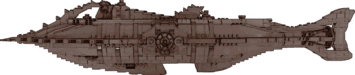 This
one-of-a-kind LEGO Nautilus was released to the collectables
market for the 65th anniversary of the Disney film. Erik Varszegi
is credited as the Lead Model Designer. The design clearly evokes Goff's
iconic design, but besides the unavoidable LEGO chunkiness, it has several significant
variations. The pointed ram is shorter than Goff's. The raker teeth
are sparser on the top and sides and omitted on the bottom. Vents have
been added between the teeth on the side rakers. The dive hatch amidships
in the keel is missing, but a new hatch is positioned atop the wheelhouse.
There are gaps in the side fairings where the Goff Nautilus has dive
planes but no planes in this design.
This
one-of-a-kind LEGO Nautilus was released to the collectables
market for the 65th anniversary of the Disney film. Erik Varszegi
is credited as the Lead Model Designer. The design clearly evokes Goff's
iconic design, but besides the unavoidable LEGO chunkiness, it has several significant
variations. The pointed ram is shorter than Goff's. The raker teeth
are sparser on the top and sides and omitted on the bottom. Vents have
been added between the teeth on the side rakers. The dive hatch amidships
in the keel is missing, but a new hatch is positioned atop the wheelhouse.
There are gaps in the side fairings where the Goff Nautilus has dive
planes but no planes in this design.
~ 2021 ~
 Images
of this
Nautilus from the game Verne: The Shape of Fantasy may
have appeared late in 2020 although the game was not available for years.
The design most resembles the Nautilus from the League of
Extraordinary Gentlemen graphic novel but shows many differences on
examination. The graphic novel design might be described as a giant
squid atop a submarine; this one could be called a giant octopus captured by a
sub. There is a very large plow-shaped ram (with an octopus sculpture) on
the bow. Many tentacles with downward facing lights and evenly spaced portholes
are positioned to present a trapped monster. There are at least five main
decks and a pilothouse on the forward deck and a conning tower with periscopes
and other equipment farther aft. The aft end of the deck resembles
the carapace of some sea creature. The main deck has a long rectangular
view port and a large circular one. There are two sets of dive planes near
the centerline aft. The stern, with several searchlights, encloses a
rather small four-stage propeller and a woefully inadequate rudder. What
might be an enormous searchlight or viewport is located on the lower hull,
amidships.
Images
of this
Nautilus from the game Verne: The Shape of Fantasy may
have appeared late in 2020 although the game was not available for years.
The design most resembles the Nautilus from the League of
Extraordinary Gentlemen graphic novel but shows many differences on
examination. The graphic novel design might be described as a giant
squid atop a submarine; this one could be called a giant octopus captured by a
sub. There is a very large plow-shaped ram (with an octopus sculpture) on
the bow. Many tentacles with downward facing lights and evenly spaced portholes
are positioned to present a trapped monster. There are at least five main
decks and a pilothouse on the forward deck and a conning tower with periscopes
and other equipment farther aft. The aft end of the deck resembles
the carapace of some sea creature. The main deck has a long rectangular
view port and a large circular one. There are two sets of dive planes near
the centerline aft. The stern, with several searchlights, encloses a
rather small four-stage propeller and a woefully inadequate rudder. What
might be an enormous searchlight or viewport is located on the lower hull,
amidships.
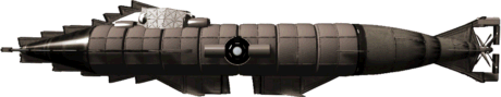 This
Nautilus, posted by "VentosMentos" evokes the Goff
classic with its saw-tooth rakers and arch, salon window and split keel. It
features a set of two dive planes on the side rakers forward of the salon
window, another on the aft hull, one more on the stern just forward of the dual
propeller, and another set at the bottom of the keel, fore and aft of the
rectangular split. The wheelhouse is larger than Goff's and more rectangular.
There's no flat deck and several semi-cylindrical structures atop the hull and
fore and aft of the salon windows. The design has an odd, apparently split
rudder and a small, somewhat fragile (compared to the heavy rakers) cruciform spar. You can see two images of this Nautilus
on Reddit.
This
Nautilus, posted by "VentosMentos" evokes the Goff
classic with its saw-tooth rakers and arch, salon window and split keel. It
features a set of two dive planes on the side rakers forward of the salon
window, another on the aft hull, one more on the stern just forward of the dual
propeller, and another set at the bottom of the keel, fore and aft of the
rectangular split. The wheelhouse is larger than Goff's and more rectangular.
There's no flat deck and several semi-cylindrical structures atop the hull and
fore and aft of the salon windows. The design has an odd, apparently split
rudder and a small, somewhat fragile (compared to the heavy rakers) cruciform spar. You can see two images of this Nautilus
on Reddit.
 Kentaro
Kameda visualized this
Nautilus for a personal project. At first glance, the design shows
a resemblance to the Sword of the Ocean Nautilus from the League of
Extraordinary Gentlemen film, but considerably scaled back. The shape of
the bow is different but features similar scrollwork and the overall profile has
similarities. However, a perspective view shows that the hatchet-shaped
bow is narrow but the aft two thirds of the hull is essentially cigar
shaped. The lower aft hull has a notch for the diver's hatch that calls to
mind Goff's classic design. There is a conning tower with a windowed
pilothouse at its forward end. The large circular salon window bears some
resemblance to Goff's. The stern, decorated with more scrollwork, has a
five-bladed propeller and horizontal fins but no obvious rudder.
Searchlights are position on the bow, stern and below the salon window.
Kentaro
Kameda visualized this
Nautilus for a personal project. At first glance, the design shows
a resemblance to the Sword of the Ocean Nautilus from the League of
Extraordinary Gentlemen film, but considerably scaled back. The shape of
the bow is different but features similar scrollwork and the overall profile has
similarities. However, a perspective view shows that the hatchet-shaped
bow is narrow but the aft two thirds of the hull is essentially cigar
shaped. The lower aft hull has a notch for the diver's hatch that calls to
mind Goff's classic design. There is a conning tower with a windowed
pilothouse at its forward end. The large circular salon window bears some
resemblance to Goff's. The stern, decorated with more scrollwork, has a
five-bladed propeller and horizontal fins but no obvious rudder.
Searchlights are position on the bow, stern and below the salon window.
 Artist/hobbyist
Mark Corderoy offered his take on the unseen hull of the Nautilus
featured in the 2005 Hallmark Channel production of Mysterious Island,
featured here in the catalog. Besides showing a
spindle-shaped hull with a large propeller and rudder, he's added a few minor
features to the superstructure and a wide flared extension to the bow, not
obvious in the small side view image here. There appears to me to be
spotlights on either side of the salon window and a small porthole in the
bow. The concept includes a divers' hatch under the salon. See the
original artwork at DeviantArt.
Artist/hobbyist
Mark Corderoy offered his take on the unseen hull of the Nautilus
featured in the 2005 Hallmark Channel production of Mysterious Island,
featured here in the catalog. Besides showing a
spindle-shaped hull with a large propeller and rudder, he's added a few minor
features to the superstructure and a wide flared extension to the bow, not
obvious in the small side view image here. There appears to me to be
spotlights on either side of the salon window and a small porthole in the
bow. The concept includes a divers' hatch under the salon. See the
original artwork at DeviantArt.
 This
fishlike Nautilus was realized by MEZCO as a model included with
their Captain Nemo action figure. At first view it appears to be a minisub
but a cutaway drawing provided with the set shows that the large round port that
looks in on what is identified as the main bridge is actually twenty feet or
more in diameter. Another drawing reveals that the corkscrew ram telescopes
to a quarter its length and the saw-tooth rakers atop the bridge arch and on the
hull below it retract. There is a row of ports on the lower hull and the tail
fins are identified as rudders. Otherwise there is no sign of dive planes,
a propeller or an alternate method of propulsion. See some photos of this
design at nautilussubmarine
(free membership required). See more photos via links to Flickr in later
posts here
and here.
This
fishlike Nautilus was realized by MEZCO as a model included with
their Captain Nemo action figure. At first view it appears to be a minisub
but a cutaway drawing provided with the set shows that the large round port that
looks in on what is identified as the main bridge is actually twenty feet or
more in diameter. Another drawing reveals that the corkscrew ram telescopes
to a quarter its length and the saw-tooth rakers atop the bridge arch and on the
hull below it retract. There is a row of ports on the lower hull and the tail
fins are identified as rudders. Otherwise there is no sign of dive planes,
a propeller or an alternate method of propulsion. See some photos of this
design at nautilussubmarine
(free membership required). See more photos via links to Flickr in later
posts here
and here.
 Greg
Merkle conceived this sleek Nautilus following Jules Verne's text,
but keeping in mind the technology of the time. The hull has a modified
spindle shape - the ends are upturned to account for the Scotia accident
narrative discrepancy that some others have addressed by mounting the ram atop a
tapered hull. The heavy ram itself has the triangular shape of the hole in
the Scotia's side. The design is shown in ramming configuration
with the wheelhouse and lantern withdrawn into the deck and the oval salon
window cover in place. The deck itself is not a separate structure but a
flattened section of the hull. Only the cover of the dinghy is visible
amidships in this configuration. Consistent with protecting the operation
of the Nautilus in an attack, the dive planes have a heavy guard on their
forward end and the propeller is housed within an armored cylinder. The
long apparatus visible on the aft upper hull is a folding mast for the trawling
nets that Aronnax mentions in the novel. A single anchor is visible under
the bow. The mechanism under the aft hull is a propeller-type ship's log to
measure speed. The large rectangular features on the sides of the aft hull
is a copper radiator. At the speeds Nemo claims for the Nautilus
the propulsion system would generate considerable heat.
Greg
Merkle conceived this sleek Nautilus following Jules Verne's text,
but keeping in mind the technology of the time. The hull has a modified
spindle shape - the ends are upturned to account for the Scotia accident
narrative discrepancy that some others have addressed by mounting the ram atop a
tapered hull. The heavy ram itself has the triangular shape of the hole in
the Scotia's side. The design is shown in ramming configuration
with the wheelhouse and lantern withdrawn into the deck and the oval salon
window cover in place. The deck itself is not a separate structure but a
flattened section of the hull. Only the cover of the dinghy is visible
amidships in this configuration. Consistent with protecting the operation
of the Nautilus in an attack, the dive planes have a heavy guard on their
forward end and the propeller is housed within an armored cylinder. The
long apparatus visible on the aft upper hull is a folding mast for the trawling
nets that Aronnax mentions in the novel. A single anchor is visible under
the bow. The mechanism under the aft hull is a propeller-type ship's log to
measure speed. The large rectangular features on the sides of the aft hull
is a copper radiator. At the speeds Nemo claims for the Nautilus
the propulsion system would generate considerable heat.
Greg has generously provided a full explanation of his
of his Nautilus, both exterior and interior. Read it here.
~ 2022 ~
 This
Nautilus by concept
artist and illustrator Jakub Chelstowski is a modern take with its
conning tower and dual propellers. Its diamond-shaped ram keeps to Verne
and the saw-tooth rakers and spike and the bottom of the bow lend lethality to
ram attacks. There appears to be a wheelhouse with large viewports just forward
of the conning tower. The gallery atop the tower may be for observation
only. In General the fragile looking features on the tower seem
inappropriate for a submerged ram attack as described in the novel. A hatch at the back of the tower opens onto a long, two-level
deck. The hull narrows at the stern with dive planes at about the
level of the dual props. The rudder is mounted at the aft end of the large trapezoidal
fin on the lower hull. There may also be a smaller rudder in the tail
between the props. The power system is complex with large intakes on
either side of the bow and
three exhaust assemblies port and starboard on the hull above the trapezoidal fin. Instead of a salon window this Nautilus
has a line of rectangular windows on the upper hull forward of the power
section. See the original artwork
on DeviantArt.
This ArtStation page
shows how Chelstowski created this artwork and includes over a dozen other
design concepts for the Nautilus.
This
Nautilus by concept
artist and illustrator Jakub Chelstowski is a modern take with its
conning tower and dual propellers. Its diamond-shaped ram keeps to Verne
and the saw-tooth rakers and spike and the bottom of the bow lend lethality to
ram attacks. There appears to be a wheelhouse with large viewports just forward
of the conning tower. The gallery atop the tower may be for observation
only. In General the fragile looking features on the tower seem
inappropriate for a submerged ram attack as described in the novel. A hatch at the back of the tower opens onto a long, two-level
deck. The hull narrows at the stern with dive planes at about the
level of the dual props. The rudder is mounted at the aft end of the large trapezoidal
fin on the lower hull. There may also be a smaller rudder in the tail
between the props. The power system is complex with large intakes on
either side of the bow and
three exhaust assemblies port and starboard on the hull above the trapezoidal fin. Instead of a salon window this Nautilus
has a line of rectangular windows on the upper hull forward of the power
section. See the original artwork
on DeviantArt.
This ArtStation page
shows how Chelstowski created this artwork and includes over a dozen other
design concepts for the Nautilus.
 Concept
artist Keith Christensen designed this Nautilus for an old film project.
There's a little bit of Verne in the organic hull shape. I can almost see a
whale's head in the far aft placement of the salon window. The bow is
fairly vicious with lower raker barbs and and an upper secondary ram. The
wheelhouse with a globular window on each side is set atop the hull
amidships. A narrow vertical fin aft of the wheelhouse may be intended to
inflict more damage in a ramming attack. The fin arches over the stern to incorporate
a double rudder aft of a fairly large propeller. Christensen's two
slightly different bow-on views in his artwork show downward angled fins that
could incorporate diving planes on the aft hull. See the original artwork
on ArtStation.
Concept
artist Keith Christensen designed this Nautilus for an old film project.
There's a little bit of Verne in the organic hull shape. I can almost see a
whale's head in the far aft placement of the salon window. The bow is
fairly vicious with lower raker barbs and and an upper secondary ram. The
wheelhouse with a globular window on each side is set atop the hull
amidships. A narrow vertical fin aft of the wheelhouse may be intended to
inflict more damage in a ramming attack. The fin arches over the stern to incorporate
a double rudder aft of a fairly large propeller. Christensen's two
slightly different bow-on views in his artwork show downward angled fins that
could incorporate diving planes on the aft hull. See the original artwork
on ArtStation.
 This
Nautilus, very similar to the previous design, was also done by Keith
Christensen for the same project, and is part of the same artwork. To me,
the hull is more shark-like with the salon windows much farther forward,
protected by a brow-like overhang that flares outward. The bow
incorporates a narrower ram with barbs on the upper and lower hull. There
are searchlights on either side of the bow. The wheelhouse with its two
windows is like that of the other design but the structure extends farther
aft. The vertical fin is similar bout less pronounced in this design and
transitions to a single but larger rudder. The propeller is smaller. There is a
pronounced keel amidships but neither the side view nor the two front views show
any horizontal fins or drive planes. This second design is seen in the
same artwork at ArtStation.
This
Nautilus, very similar to the previous design, was also done by Keith
Christensen for the same project, and is part of the same artwork. To me,
the hull is more shark-like with the salon windows much farther forward,
protected by a brow-like overhang that flares outward. The bow
incorporates a narrower ram with barbs on the upper and lower hull. There
are searchlights on either side of the bow. The wheelhouse with its two
windows is like that of the other design but the structure extends farther
aft. The vertical fin is similar bout less pronounced in this design and
transitions to a single but larger rudder. The propeller is smaller. There is a
pronounced keel amidships but neither the side view nor the two front views show
any horizontal fins or drive planes. This second design is seen in the
same artwork at ArtStation.
 Designed
for tabletop gaming this Nautilus from James Gilmer, owner of
TheByzantineMage, is built on the theme of a nautilus sea creature. The
bow, aft section, and stern mimic a nautilus shell and the upper hull mimics nautilus
tentacles. Rather than a ram, the submarine has a raker
arch. There's a large blister window on either side of the wheelhouse and similar,
smaller windows below it on the lower hull. Propulsion is provided by a
scroll-like paddlewheel in the lower stern, just forward on a rudder that again
mimics the nautilus shell.
Designed
for tabletop gaming this Nautilus from James Gilmer, owner of
TheByzantineMage, is built on the theme of a nautilus sea creature. The
bow, aft section, and stern mimic a nautilus shell and the upper hull mimics nautilus
tentacles. Rather than a ram, the submarine has a raker
arch. There's a large blister window on either side of the wheelhouse and similar,
smaller windows below it on the lower hull. Propulsion is provided by a
scroll-like paddlewheel in the lower stern, just forward on a rudder that again
mimics the nautilus shell.
 Robert
Blanda (Cybertenko) used an AI to design this Nautilus and then
reworked the design to meet his specific criteria. The design, with the
hydrodynamic shape of a fish, while not conforming line for line with the
description in the novel, has many of the features Verne described. Nemo's
cabin in the bow, in the head of the fish, has three large view ports.
Just aft, the fish's articulated flippers are used for stabilization and depth
control. The Victorianesque superstructure, which reminds me a little of
the Nautilus in Captain Nemo and the Underwater City, incorporates
the wheelhouse with three large ports forward, a periscope and snorkel, and the
main hatchway on its aft side, a bit like Goff's. The long deck, which
extends all the way to the stern, includes an inset boat and a second,
engineering, hatch. The fish's tail, rather than having fins, is upturned
with a transparent globe protecting a rotating searchlight at the tip. The
lower stern has a large rudder and multi-bladed propeller. There are two
diver's hatches about halfway forward and large salon window's just forward of
these. The bow has a wide completely retractable ram where the
fish's mouth would be. The design
maintains a nice balance between the intricate organic image produced by the AI
and practical considerations consistent with the novel. See more images of
this Nautilus at Renderosity.
Robert
Blanda (Cybertenko) used an AI to design this Nautilus and then
reworked the design to meet his specific criteria. The design, with the
hydrodynamic shape of a fish, while not conforming line for line with the
description in the novel, has many of the features Verne described. Nemo's
cabin in the bow, in the head of the fish, has three large view ports.
Just aft, the fish's articulated flippers are used for stabilization and depth
control. The Victorianesque superstructure, which reminds me a little of
the Nautilus in Captain Nemo and the Underwater City, incorporates
the wheelhouse with three large ports forward, a periscope and snorkel, and the
main hatchway on its aft side, a bit like Goff's. The long deck, which
extends all the way to the stern, includes an inset boat and a second,
engineering, hatch. The fish's tail, rather than having fins, is upturned
with a transparent globe protecting a rotating searchlight at the tip. The
lower stern has a large rudder and multi-bladed propeller. There are two
diver's hatches about halfway forward and large salon window's just forward of
these. The bow has a wide completely retractable ram where the
fish's mouth would be. The design
maintains a nice balance between the intricate organic image produced by the AI
and practical considerations consistent with the novel. See more images of
this Nautilus at Renderosity.
~ 2023~
 This
is artist John E. Kaufmann's visualization of the Nautilus.
As seen in the artist's detailed plan the design closely follows Jules Verne's
text. Like some other designs in the catalog, the long spar is raised
above the hull centerline. The wheelhouse withdraws into the raised deck,
but Kaufmann has added ports at the forward end of the deck to provide
visibility for the helmsman in the lowered position. The plan shows that
the boat, set into the deck about three-quarters of the way back just aft of the
hatch, can be entered through a special hatch while submerged, as described in
the novel. The tall lantern near the end of the deck folds down into a
recess, leaving a small section visible resembling some of the original
illustrations. See the detailed plan on the artist's website here,
and an underwater impression here.
This
is artist John E. Kaufmann's visualization of the Nautilus.
As seen in the artist's detailed plan the design closely follows Jules Verne's
text. Like some other designs in the catalog, the long spar is raised
above the hull centerline. The wheelhouse withdraws into the raised deck,
but Kaufmann has added ports at the forward end of the deck to provide
visibility for the helmsman in the lowered position. The plan shows that
the boat, set into the deck about three-quarters of the way back just aft of the
hatch, can be entered through a special hatch while submerged, as described in
the novel. The tall lantern near the end of the deck folds down into a
recess, leaving a small section visible resembling some of the original
illustrations. See the detailed plan on the artist's website here,
and an underwater impression here.
 Nekomata
(Justin Colley) added steampunk elements to to the Hallmark
TV Nautilus for this commissioned design. With a retracted
wheelhouse, this Nautilus has all the features of the TV film but
includes prominent ribs and somewhat enlarged ports. This is a nicely
detailed physical miniature (about 2 1/4 inches long)
intended for gaming. See some photos on the NekoDyne
Miniatures website. It's available for purchase at Etsy.
Nekomata
(Justin Colley) added steampunk elements to to the Hallmark
TV Nautilus for this commissioned design. With a retracted
wheelhouse, this Nautilus has all the features of the TV film but
includes prominent ribs and somewhat enlarged ports. This is a nicely
detailed physical miniature (about 2 1/4 inches long)
intended for gaming. See some photos on the NekoDyne
Miniatures website. It's available for purchase at Etsy.
 3D
artist Anastasia Nastenko created this Nautilus as 3D
model. The design is notional fishlike wiht an impractically slender,
sword-like, perhaps Narwhal-inspired ram. The ram transitions to an
ornate, almost delicate arch over the forward deck. The cylindrical
wheelhouse, with lots of glass
3D
artist Anastasia Nastenko created this Nautilus as 3D
model. The design is notional fishlike wiht an impractically slender,
sword-like, perhaps Narwhal-inspired ram. The ram transitions to an
ornate, almost delicate arch over the forward deck. The cylindrical
wheelhouse, with lots of glass  is located in the middle of the deck. The
deck has a pair of hatches at its forward end and two more by what is probably
the lantern at its aft end. The forward part of the hull encloses a large salon
with a big circular window on each side and a pair of eye-like windows in the
bow. A row of smaller ports runs along the side of the
hull and there's likely a diver hatch in
the hull bottom. There are large fin-like dive planes just forward of
amidships, a pair of enclosed propellers where the hull begins to transition to
the stern, and the fishlike tail is the rudder. Examine Nastenko's design
in 3D at Sketchfad.
is located in the middle of the deck. The
deck has a pair of hatches at its forward end and two more by what is probably
the lantern at its aft end. The forward part of the hull encloses a large salon
with a big circular window on each side and a pair of eye-like windows in the
bow. A row of smaller ports runs along the side of the
hull and there's likely a diver hatch in
the hull bottom. There are large fin-like dive planes just forward of
amidships, a pair of enclosed propellers where the hull begins to transition to
the stern, and the fishlike tail is the rudder. Examine Nastenko's design
in 3D at Sketchfad.
 Benjamin
Rinelli designed this Nautilus after reading Merkle's and Kreutzer's
discussions. It is essentially true to Jules Verne's text with a
spindle-shaped hull, retractable pilot house and lantern, triangular ram,
four-bladed propeller,
and other features described in the novel. And, as Benjamin says in his
detailed description, there is even a "happy
accident ... evoking Goff’s raker arch". Read Benjamin's
description here.
Benjamin
Rinelli designed this Nautilus after reading Merkle's and Kreutzer's
discussions. It is essentially true to Jules Verne's text with a
spindle-shaped hull, retractable pilot house and lantern, triangular ram,
four-bladed propeller,
and other features described in the novel. And, as Benjamin says in his
detailed description, there is even a "happy
accident ... evoking Goff’s raker arch". Read Benjamin's
description here.
~ 2024~
 This
Nautilus, described only as a watercolor with no attribution nor any
other identifying information. The overall profile reminds us of the
classic Harper Goff design but differs in almost every detail. The bow
tapers smoothly from a sharp conical ram to a more or less cylindrical hull with
flared side fairings and a large keel. The keel is split, Goff-like, for a
dive hatch and then extends far aft. The lower hull does not taper in
order to accommodate relatively small dual propellers. The stern has
fish-like vertical fins that incorporate a rudder. The side fairings have
notches forward that might contain Goff-like dive planes. A very long deck
widens amidships aft of a long wheelhouse that has large ports forward and
smaller ports aft, including a row of portholes near the aft end. There is
no arch. A large fish-like fin amidships dominates the deck forward
of a deck hatch. The circular salon window is set low and far forward on
the lower hull, near several portholes.
This
Nautilus, described only as a watercolor with no attribution nor any
other identifying information. The overall profile reminds us of the
classic Harper Goff design but differs in almost every detail. The bow
tapers smoothly from a sharp conical ram to a more or less cylindrical hull with
flared side fairings and a large keel. The keel is split, Goff-like, for a
dive hatch and then extends far aft. The lower hull does not taper in
order to accommodate relatively small dual propellers. The stern has
fish-like vertical fins that incorporate a rudder. The side fairings have
notches forward that might contain Goff-like dive planes. A very long deck
widens amidships aft of a long wheelhouse that has large ports forward and
smaller ports aft, including a row of portholes near the aft end. There is
no arch. A large fish-like fin amidships dominates the deck forward
of a deck hatch. The circular salon window is set low and far forward on
the lower hull, near several portholes.
 Wayne
Brant envisioned this Nautilus for a poster. There's not much of
Verne but lots of imagination. The overall shape is almost shark-like with a
sleeker nose that must taper to a ram. The downward-slanting fins fore and aft might
be dive planes and the upward-slanting pair aft might serve as rudders. There
appears to be a diving hatch on the lower hull forward of amidships while the
larger bulges aft are mysterious. Might they be for observations? The
superstructure has a pilothouse with a side hatch forward and a raised deck aft.
Oddly, a large crane dominates the deck with a small gun emplacement at the aft end.
Unless the narrow oval on the upper hull is a forward-facing port and not an
intake of some kind, there's no salon window, instead a set of small portholes.
No propeller is visible but the feature in the stern might be a turbine exhaust.
Wayne
Brant envisioned this Nautilus for a poster. There's not much of
Verne but lots of imagination. The overall shape is almost shark-like with a
sleeker nose that must taper to a ram. The downward-slanting fins fore and aft might
be dive planes and the upward-slanting pair aft might serve as rudders. There
appears to be a diving hatch on the lower hull forward of amidships while the
larger bulges aft are mysterious. Might they be for observations? The
superstructure has a pilothouse with a side hatch forward and a raised deck aft.
Oddly, a large crane dominates the deck with a small gun emplacement at the aft end.
Unless the narrow oval on the upper hull is a forward-facing port and not an
intake of some kind, there's no salon window, instead a set of small portholes.
No propeller is visible but the feature in the stern might be a turbine exhaust.
 This
second design by 3D
artist Anastasia Nastenko, realized as a cutaway, has a tapered
cylindrical hull with a multiply barbed spike ram. A structure atop
the forward hull is hard to interpret. It may be a retracted deck
gun or possibly a crane.
This
second design by 3D
artist Anastasia Nastenko, realized as a cutaway, has a tapered
cylindrical hull with a multiply barbed spike ram. A structure atop
the forward hull is hard to interpret. It may be a retracted deck
gun or possibly a crane.  Further aft an arch protects the circular
forward port on
the cylindrical wheelhouse. Just aft the main hatch has a hemispherical
cover. The boat is embedded in the hull a bit further aft. Next a
delicate arch rises over some complicated structures, some of which appear to be
associated with the the power section, directly below. The vertical
cylinder protects what may be a second deck gun. The hull tapers to a
vertical fish tail aft of upper and lower rudders. Small dual propellers
are located on the lower hull. The circular salon window is protected by
several small arches. Dive planes embedded in a fixed frame are located on
the lower hull forward of amidships. The interior more or less follows the
novel with some notable exceptions. Examine Nastenko's interior and exterior
in 3D at Sketchfab.
Further aft an arch protects the circular
forward port on
the cylindrical wheelhouse. Just aft the main hatch has a hemispherical
cover. The boat is embedded in the hull a bit further aft. Next a
delicate arch rises over some complicated structures, some of which appear to be
associated with the the power section, directly below. The vertical
cylinder protects what may be a second deck gun. The hull tapers to a
vertical fish tail aft of upper and lower rudders. Small dual propellers
are located on the lower hull. The circular salon window is protected by
several small arches. Dive planes embedded in a fixed frame are located on
the lower hull forward of amidships. The interior more or less follows the
novel with some notable exceptions. Examine Nastenko's interior and exterior
in 3D at Sketchfab.
 Designer
Matt Davidson conceived this Nautilus for his graphic novel 20,000
Leagues Under the Sea. On the surface this design resembles a
monstrous fish. Instead of an arch, the front rakers form an imposing
ridge on the monster's skull between wide-set "eyes". A large hatch
opens in the back of the skull onto a broad deck. Expanding on Goff's
articulated breathers just aft of the wheelhouse, this Nautilus has a set
mechanical gills for bringing in fresh air that rise across the deck. Both
of these represent a mechanical improvement over Verne's concept of simply
opening the hatches to exchange air. There is a set of dive planes low on
the hull forward of the salon window complex. A rather small screw and
rudder are set within the large fishtail stern. There's no real
resemblance, but the placement of round salon window, the diving hatch on the
hull bottom, and the large dorsal fin correspond more or less to Goff's although
his were farther forward. Overall, this Nautilus has the appearance of
the big, dangerous sea monster Verne portrayed. Follow
Matt's graphic novel at Comic
Fury.
Designer
Matt Davidson conceived this Nautilus for his graphic novel 20,000
Leagues Under the Sea. On the surface this design resembles a
monstrous fish. Instead of an arch, the front rakers form an imposing
ridge on the monster's skull between wide-set "eyes". A large hatch
opens in the back of the skull onto a broad deck. Expanding on Goff's
articulated breathers just aft of the wheelhouse, this Nautilus has a set
mechanical gills for bringing in fresh air that rise across the deck. Both
of these represent a mechanical improvement over Verne's concept of simply
opening the hatches to exchange air. There is a set of dive planes low on
the hull forward of the salon window complex. A rather small screw and
rudder are set within the large fishtail stern. There's no real
resemblance, but the placement of round salon window, the diving hatch on the
hull bottom, and the large dorsal fin correspond more or less to Goff's although
his were farther forward. Overall, this Nautilus has the appearance of
the big, dangerous sea monster Verne portrayed. Follow
Matt's graphic novel at Comic
Fury.
 Igor
Spajic looked closely at the novel and evaluated features of many
other designs to envision this Nautilus. The cigar shape of the
hull is consistent with the text and supports an interior with dimensions
described by Verne. The triangular ram is augmented by serrated fairings
on the forward hull. This is a more subtle approach than used by
Goff. The oblong salon window has external sliding covers for use during a
ram attack, and the dive planes, positioned just forward of center, have a fixed
leading edge for protection. The keel has parallel strakes on either
side for stability when the Nautilus sits on the ocean floor. The
wedge-shaped wheelhouse, with circular ports forward and on both sides,
rotates on a front hinge into the hull for ramming. Not visible in my rendering, Igor has
included a low periscope port for navigation in attack configuration. The
long deck, formed by a slight flattening of the upper hull enclosed by a low
ridge on
either side, encompasses the dingy, two hatches, and the lantern, which retracts
below deck level. The diving hatch, situated in the lower hull aft, has a
small lantern above it to facilitate under sea excursions. A similar
lantern, positioned above the salon window aids observations. The rudder, positioned just aft of the large four-bladed propeller,
has a unique configuration. This is Igor's interpretation of the elevation
drawing visible in Nemo's lap in one of de Neuville's
original engravings. Read Igor's rationale for this design here.
Igor
Spajic looked closely at the novel and evaluated features of many
other designs to envision this Nautilus. The cigar shape of the
hull is consistent with the text and supports an interior with dimensions
described by Verne. The triangular ram is augmented by serrated fairings
on the forward hull. This is a more subtle approach than used by
Goff. The oblong salon window has external sliding covers for use during a
ram attack, and the dive planes, positioned just forward of center, have a fixed
leading edge for protection. The keel has parallel strakes on either
side for stability when the Nautilus sits on the ocean floor. The
wedge-shaped wheelhouse, with circular ports forward and on both sides,
rotates on a front hinge into the hull for ramming. Not visible in my rendering, Igor has
included a low periscope port for navigation in attack configuration. The
long deck, formed by a slight flattening of the upper hull enclosed by a low
ridge on
either side, encompasses the dingy, two hatches, and the lantern, which retracts
below deck level. The diving hatch, situated in the lower hull aft, has a
small lantern above it to facilitate under sea excursions. A similar
lantern, positioned above the salon window aids observations. The rudder, positioned just aft of the large four-bladed propeller,
has a unique configuration. This is Igor's interpretation of the elevation
drawing visible in Nemo's lap in one of de Neuville's
original engravings. Read Igor's rationale for this design here.
Do you know of a Nautilus design not featured here?
Please
e-mail me.

T
his
is very much disputed, but according to
Jerry Pavano, Gustav Zédé constructed this interesting model "in collaboration with Jules Verne" in 1868.
Very likely not (Jean Gagneux pointed out the model's resemblance to the
submarine Gymnote), but if the date, a year before Verne wrote 20,000 Leagues under the Sea,
were accurate, and one applies considerable imagination, this model could almost
have been a forerunner to the Nautilus. Although considerably smaller, it has the cigar shape, the central diving planes, longboat, wheelhouse, lantern, and deck platform of the Nautilus.
The boat is at the aft end of the platform and the lantern is located on a tower just behind the wheelhouse, an arrangement I find especially interesting.
The model also has two metal rings on the deck, apparently on the hatch. Aronnax and his companion castaways clung to just such a ring when the Nautilus deck when it got underway early in the novel.
There are no side windows or ram and the keel is very large relative to the hull.
Jerry wrote an article about this model for the Subcommittee Report many
years ago.
See
photos of my scratch-built replica and other views of my 3D Zédé
model here.
Except as noted,
this page and contents © Copyright 1998, 1999, 2002, 2003, 2004, 2006, 2007,
2008, 2009, 2010, 2011, 2012, 2013, 2014, 2015, 2016, 2017, 2018, 2019, 2020,
2021, 2022, 2023, 2024, 2025
Michael & Karen Crisafulli.
All rights reserved.
Updated 19 Jun 25


